The Amateur Feminist Library
Research/ coding/ installation/ editorial
2023
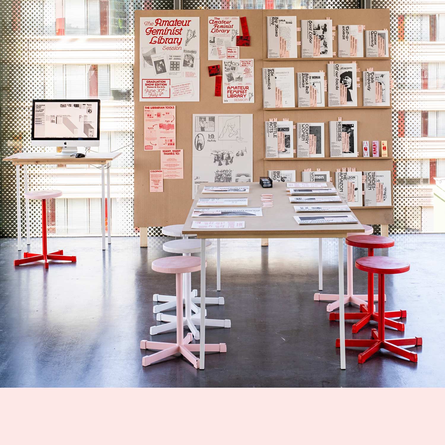
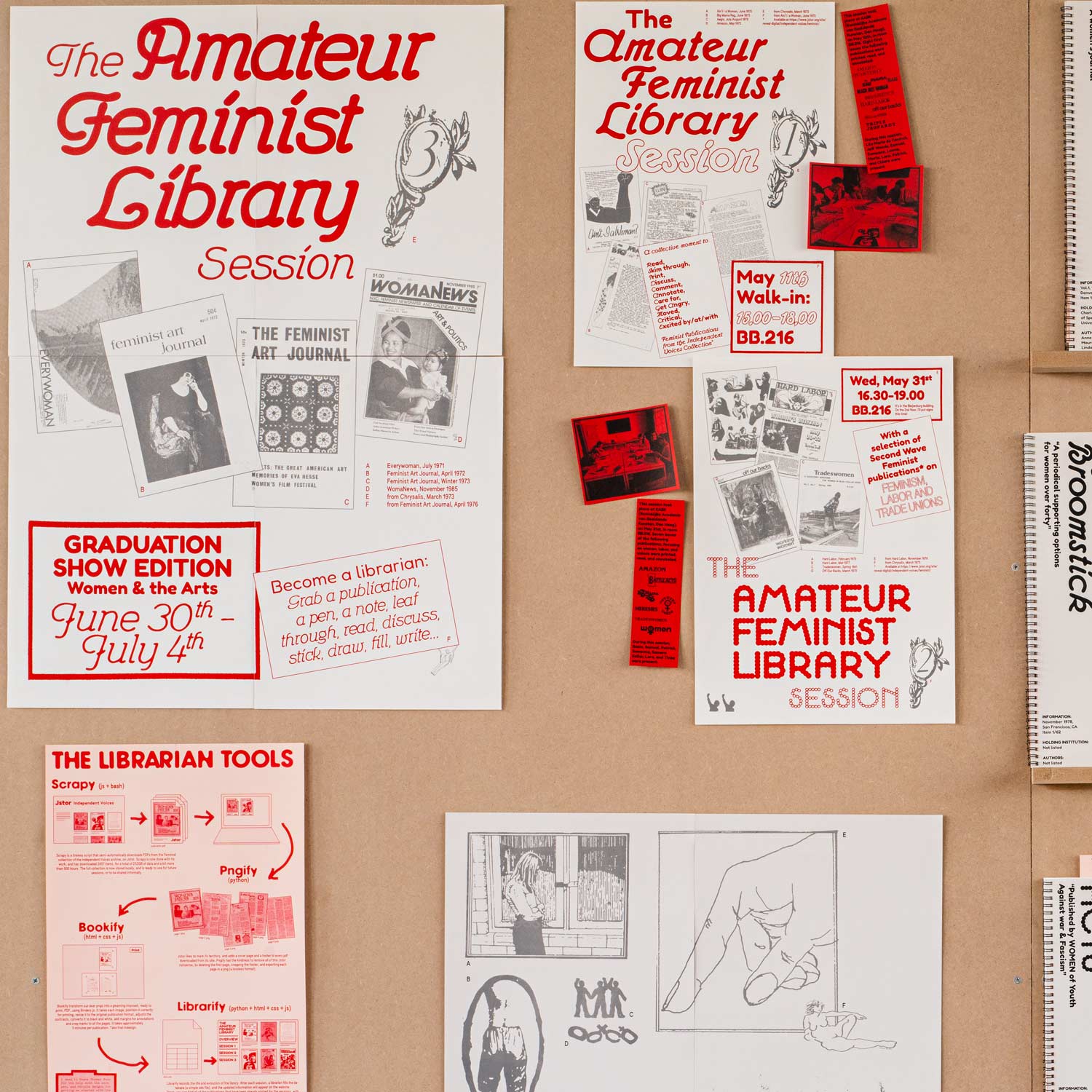
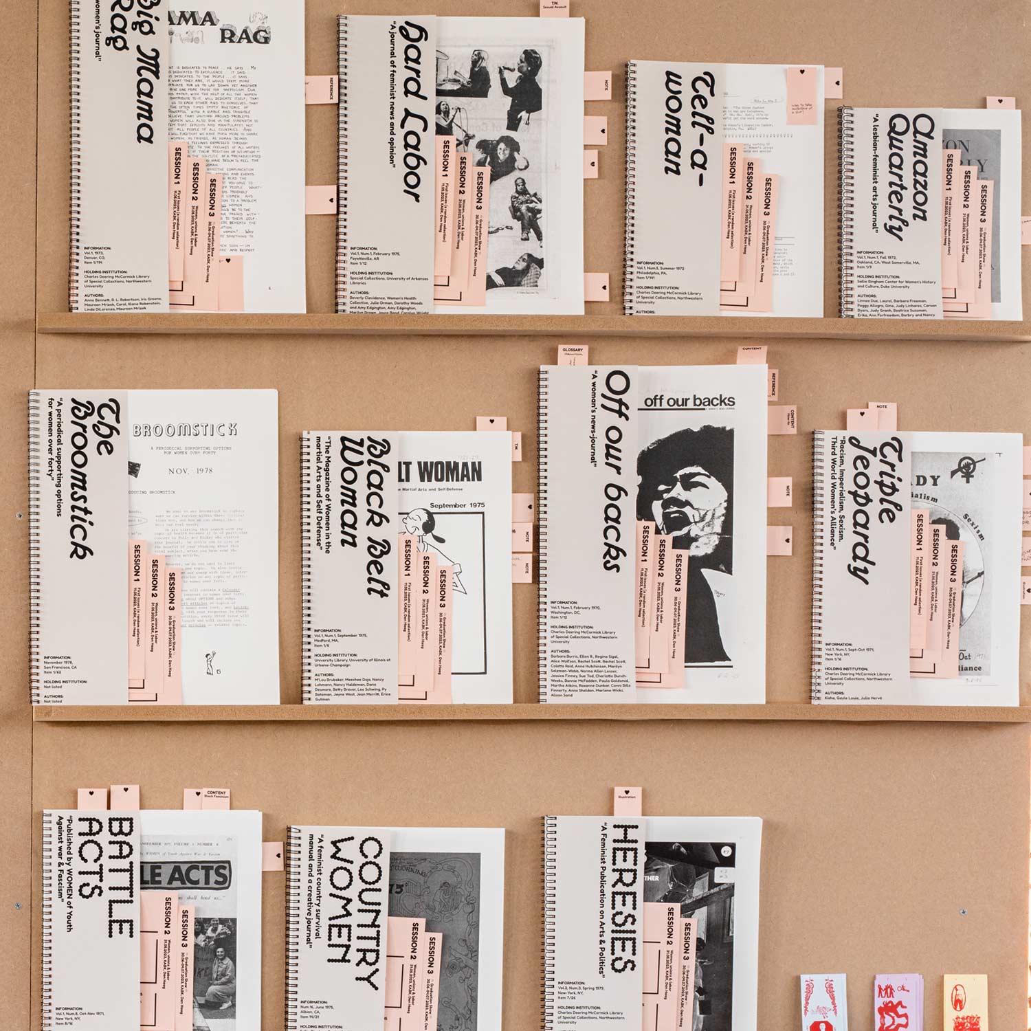
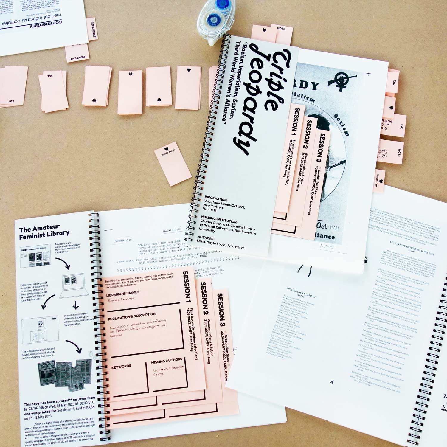
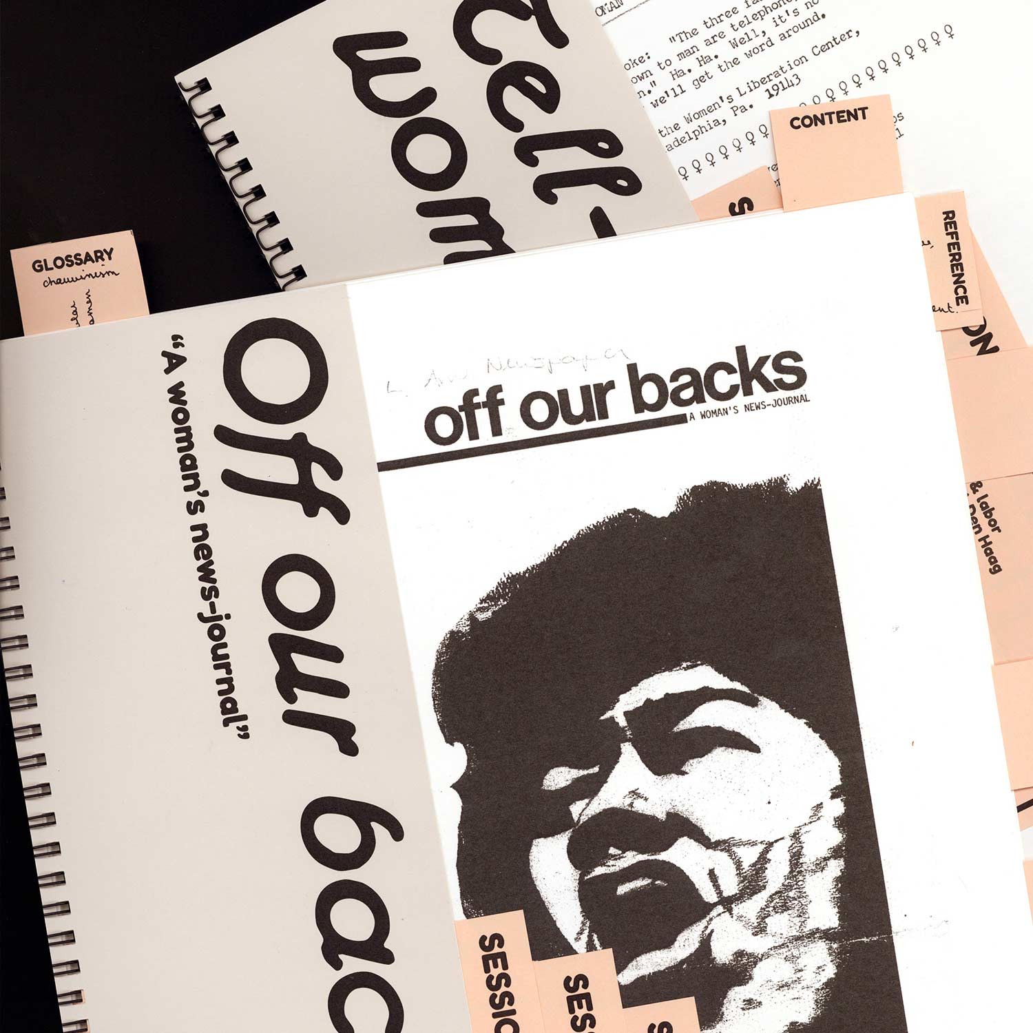
Feminism is a fragile archive, fragmentary, scattered here and there, confined in boxes, attics, and memories. The Feminist Amateur Library aims to bring these shatters and splatters into the physical world, allowing us to touch them and to be touched by them*. Departing from a digital collection of North-American feminist periodicals (dating from 1968-1992), the library decided to take this collection into its own hands, or rather, to put it in the hands of communities, aiming to make these publications more accessible.
Joke Smit & Jos Brink Prijs
Editorial Design
2023
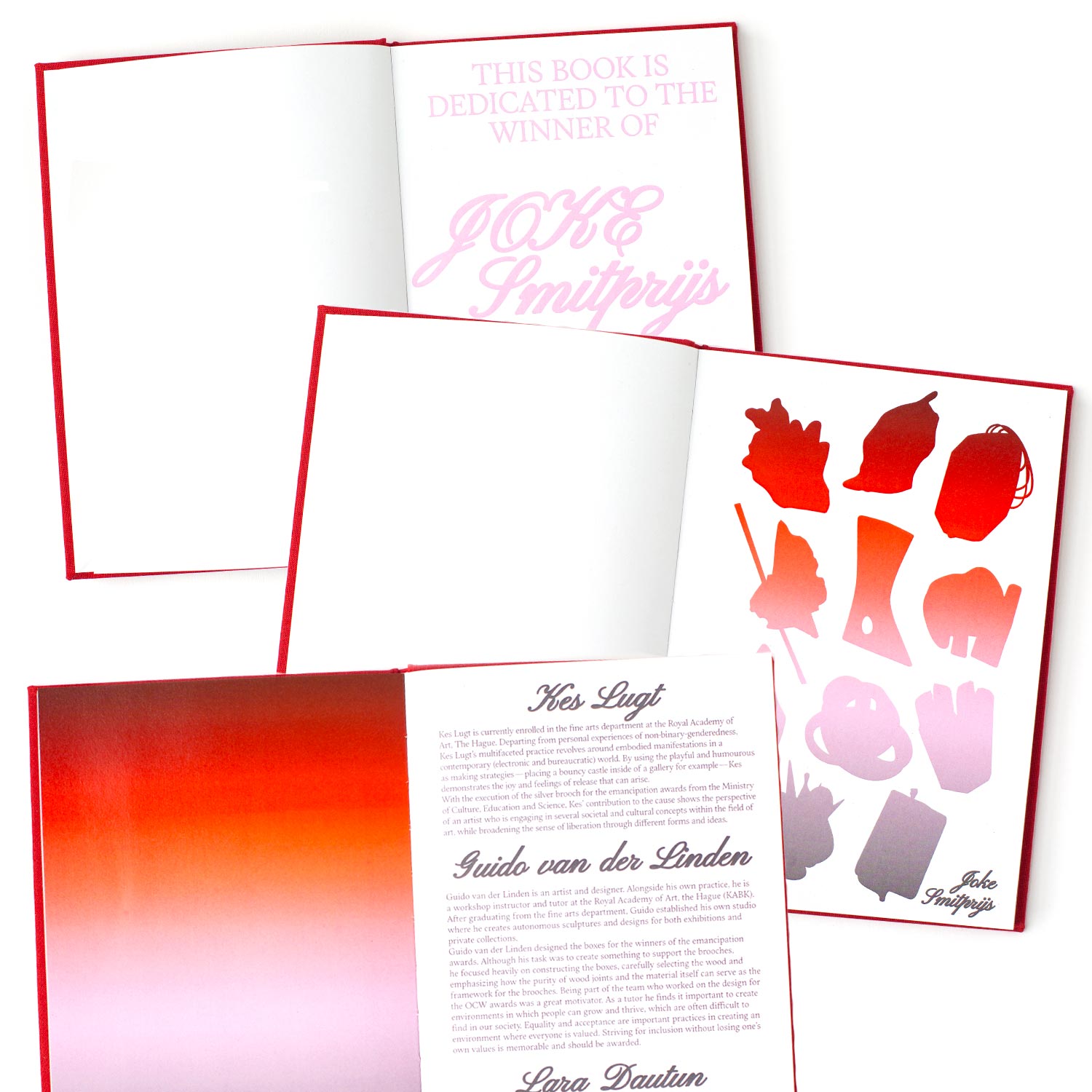
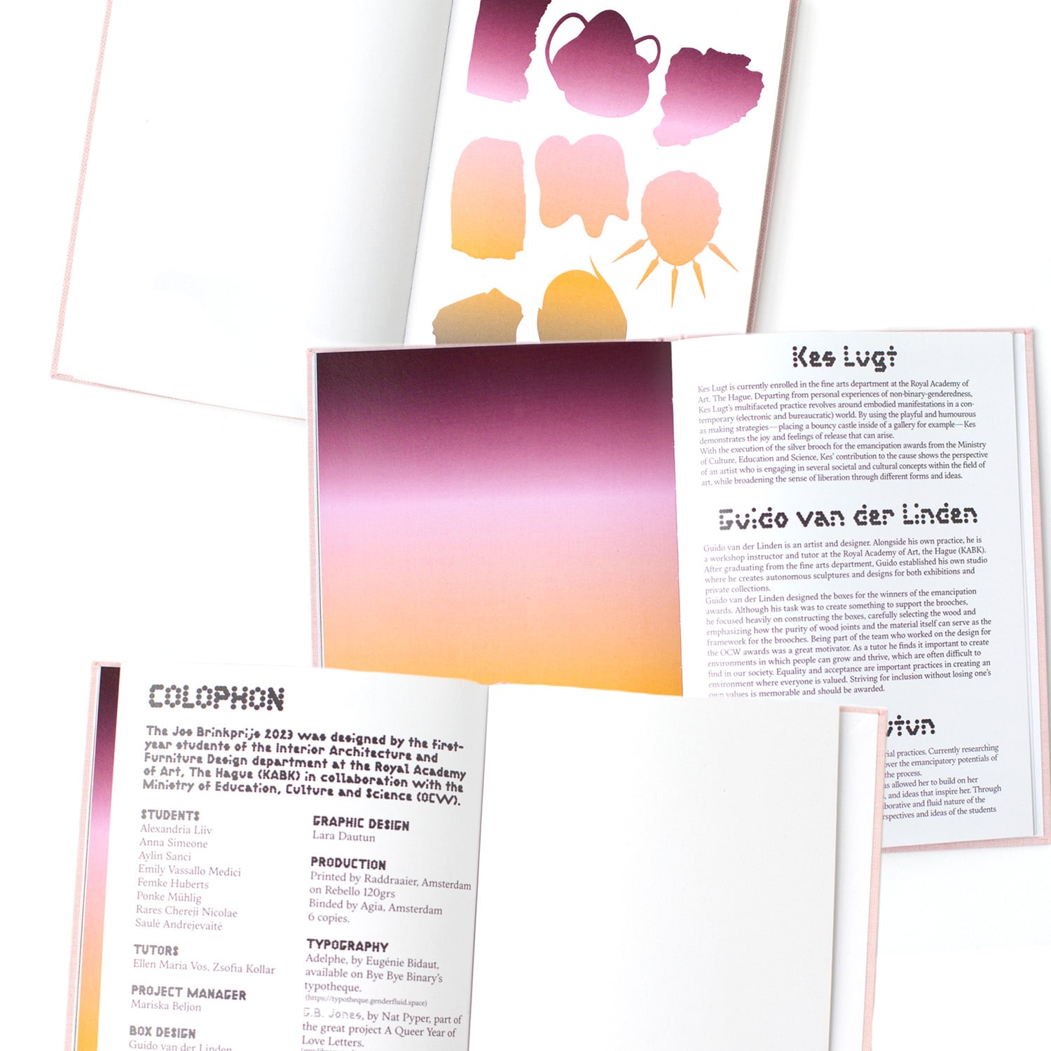
Two books presenting the students’ processes and proposals for the trophies awarded to the winners of the Joke Smit Prijs (Women’s Emancipation Prize), and the Jos Brink Prijs (LGBTQIA+ Emancipation Prize), granted by the Dutch Ministry of Education, Culture and Science (OCW).
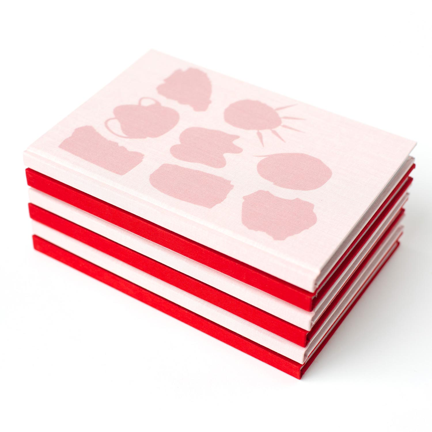
Agrafes & bouts de ficelles
Editorial Design
2022, in collaboration with Lissa Choukrane and Loraine Furter, 120 copies, 240 x 155 mm
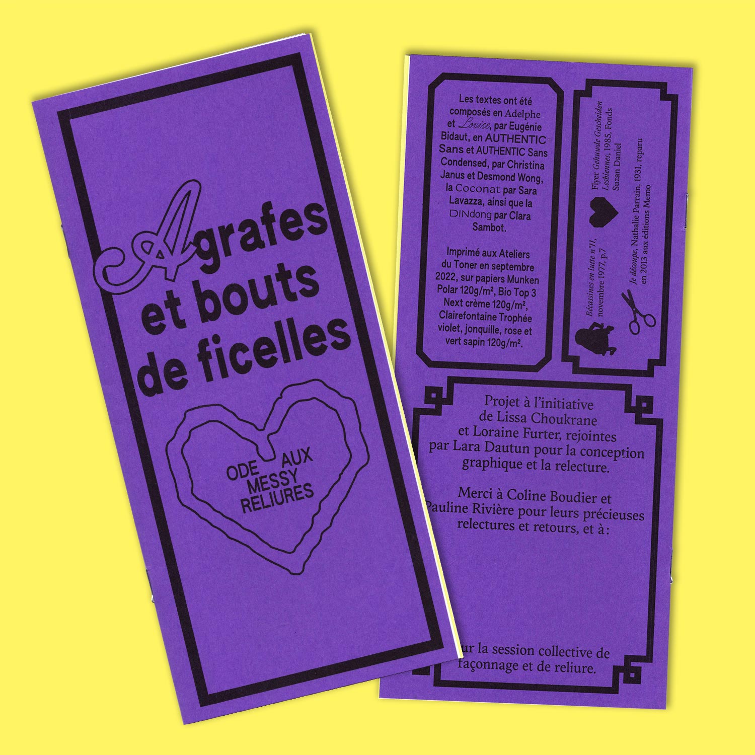
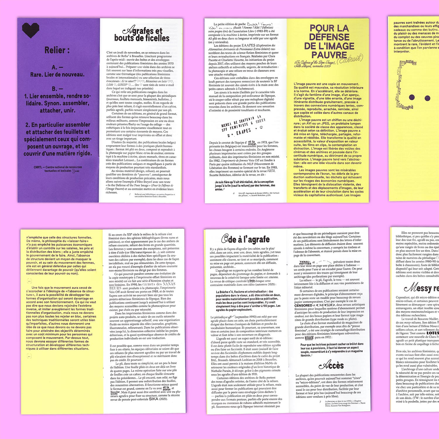
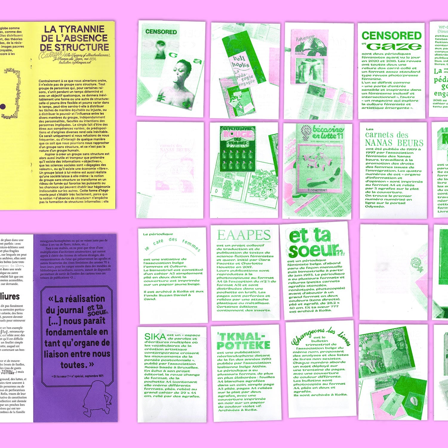
Design and production for a research project by Lissa Choukrane and Loraine Furter on the bindings of Belgian feminist periodicals: *Agrafes & bouts de ficelles* presents a research on the soft, messy bindings of Belgian feminist publications contained in local archives.
Serendipitous Editorial Encounters Publishing
Editorial Design/ Editing
Potential Bookmarks, 115 × 205 mm, 180 pages,
The Metabooxtual Society, 115 × 170 mm, 55 pages,
Art which can’t be Art, 105 × 205 mm, 8 pages
The Metabooxtual Society, 115 × 170 mm, 55 pages,
Art which can’t be Art, 105 × 205 mm, 8 pages
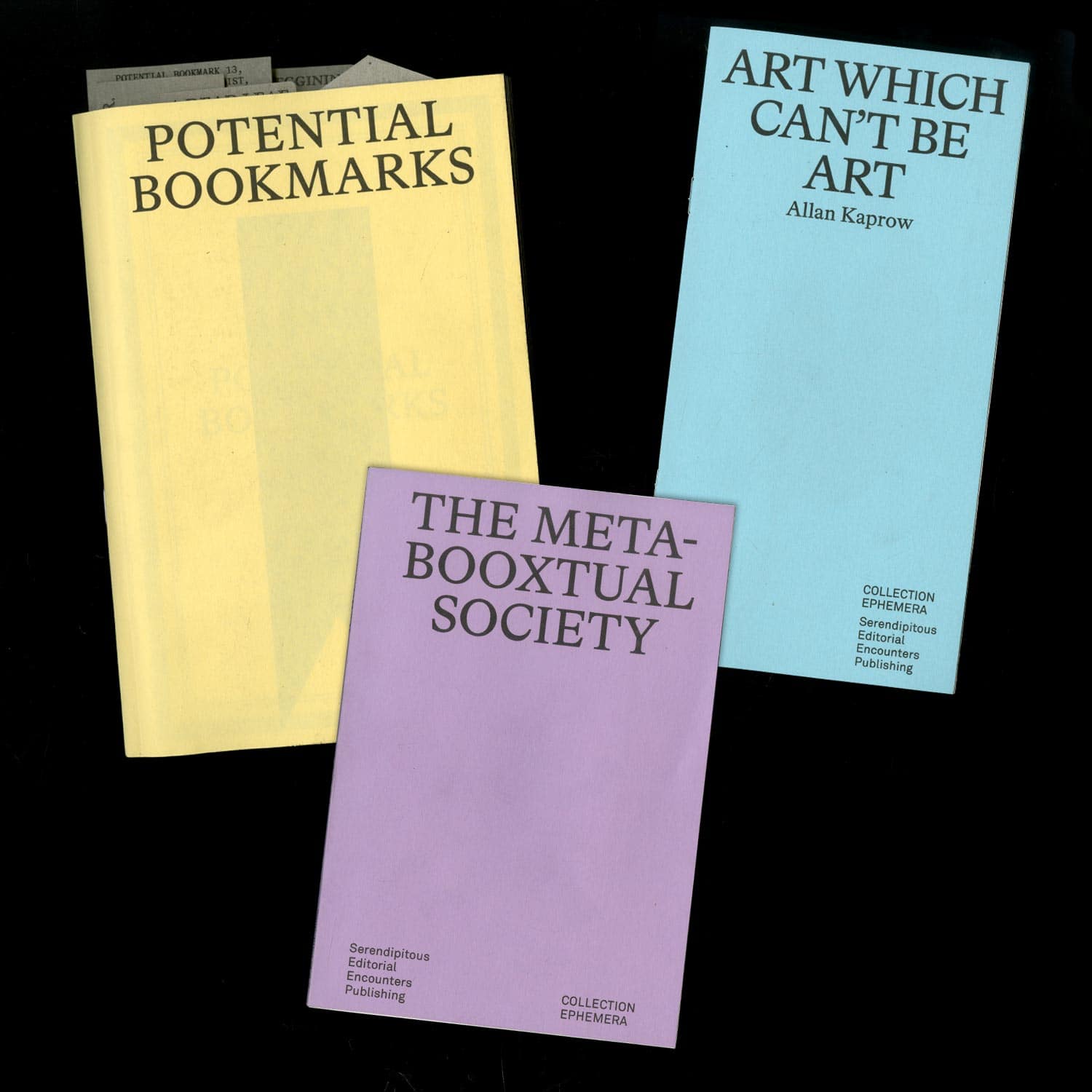
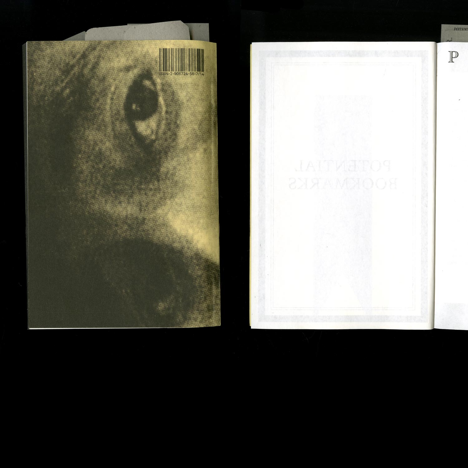
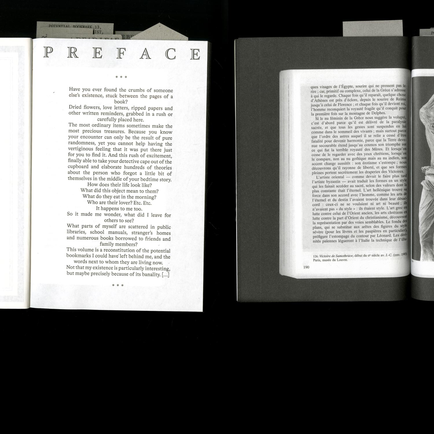
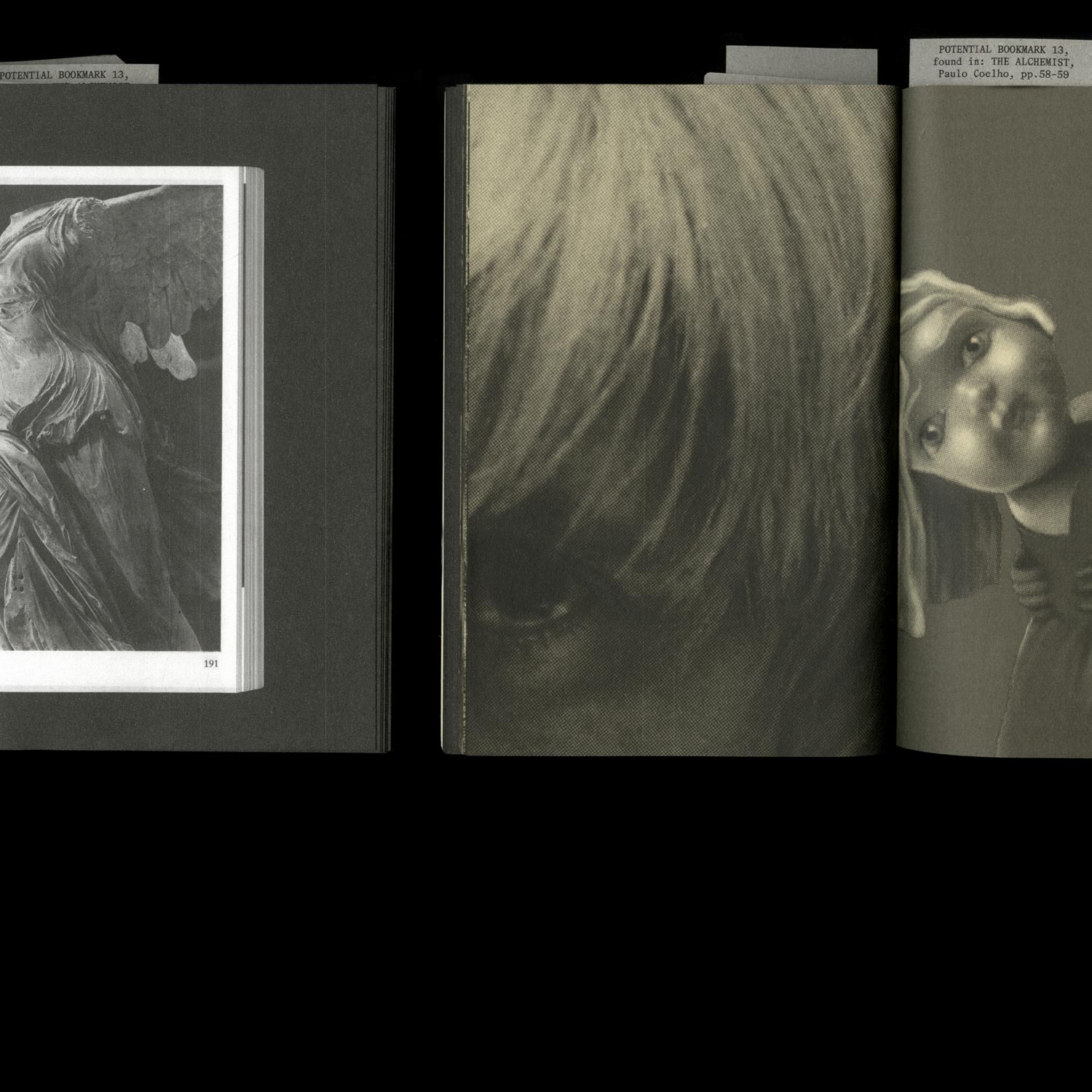
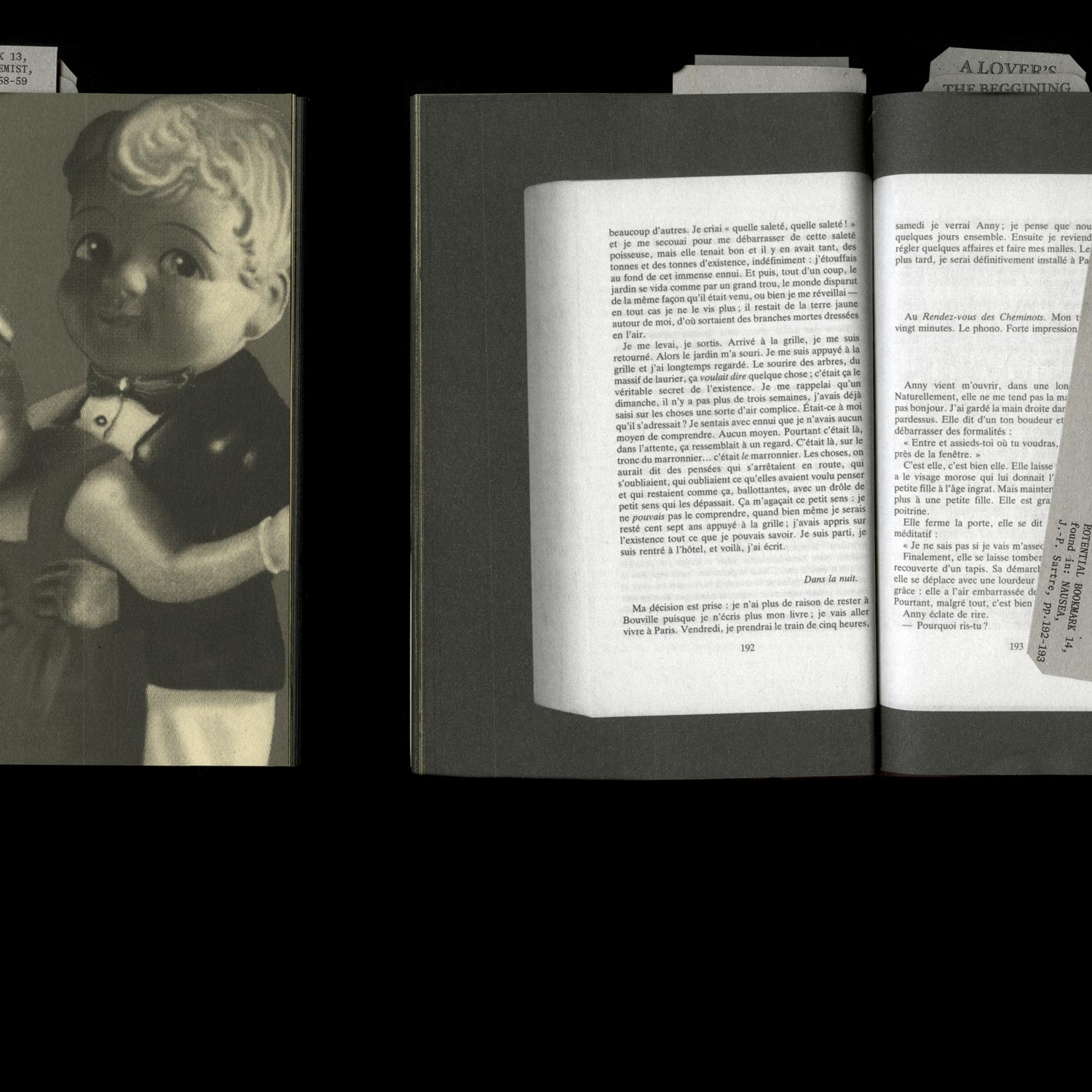
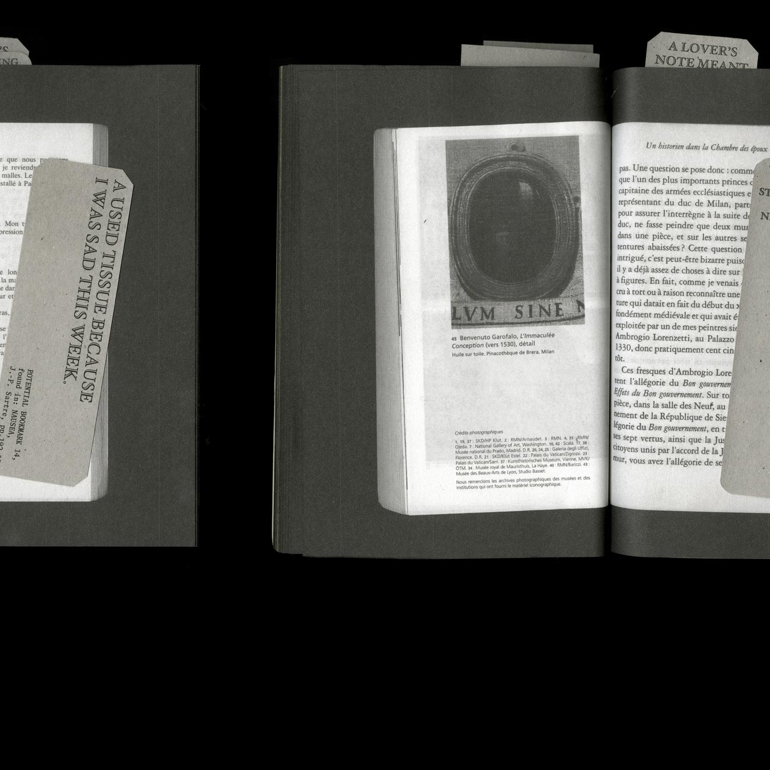
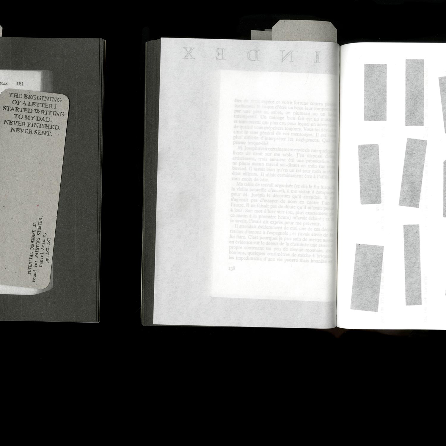
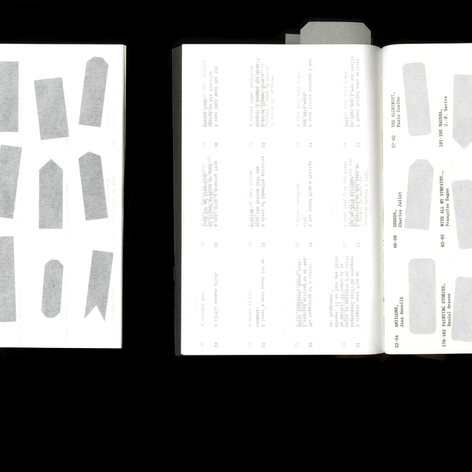
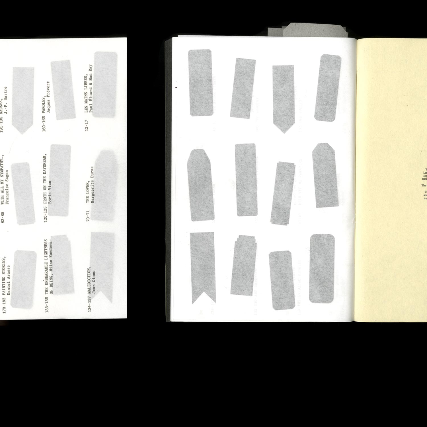
A series of books published by the (fictional) publishing house Serendipitous Editorial Encounters, specialising in the various objects that people forget, or deliberately leave in books.
Who is afraid of the Witch?
Editorial Design/ Editing
2021, 262 pages, 130 × 180 mm
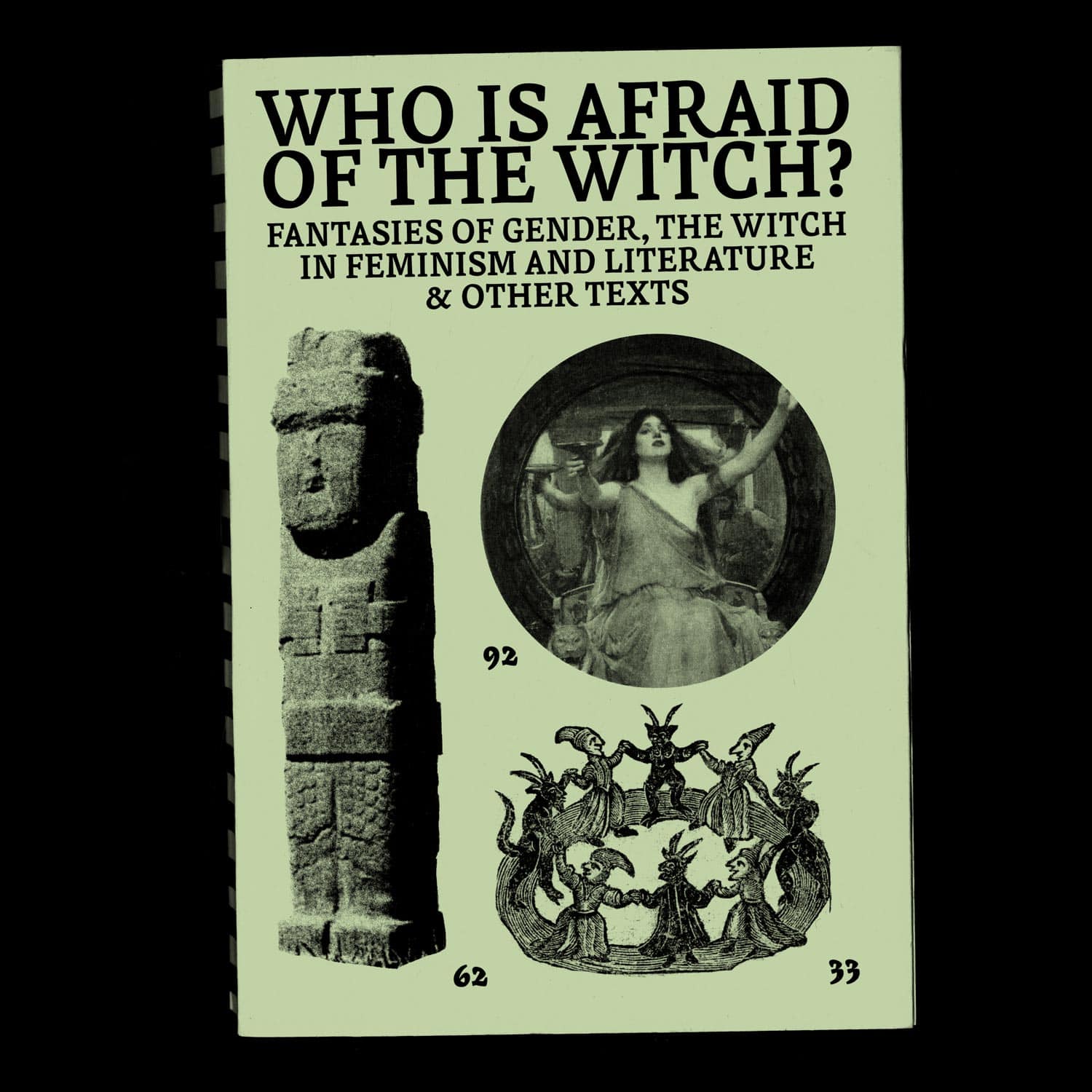
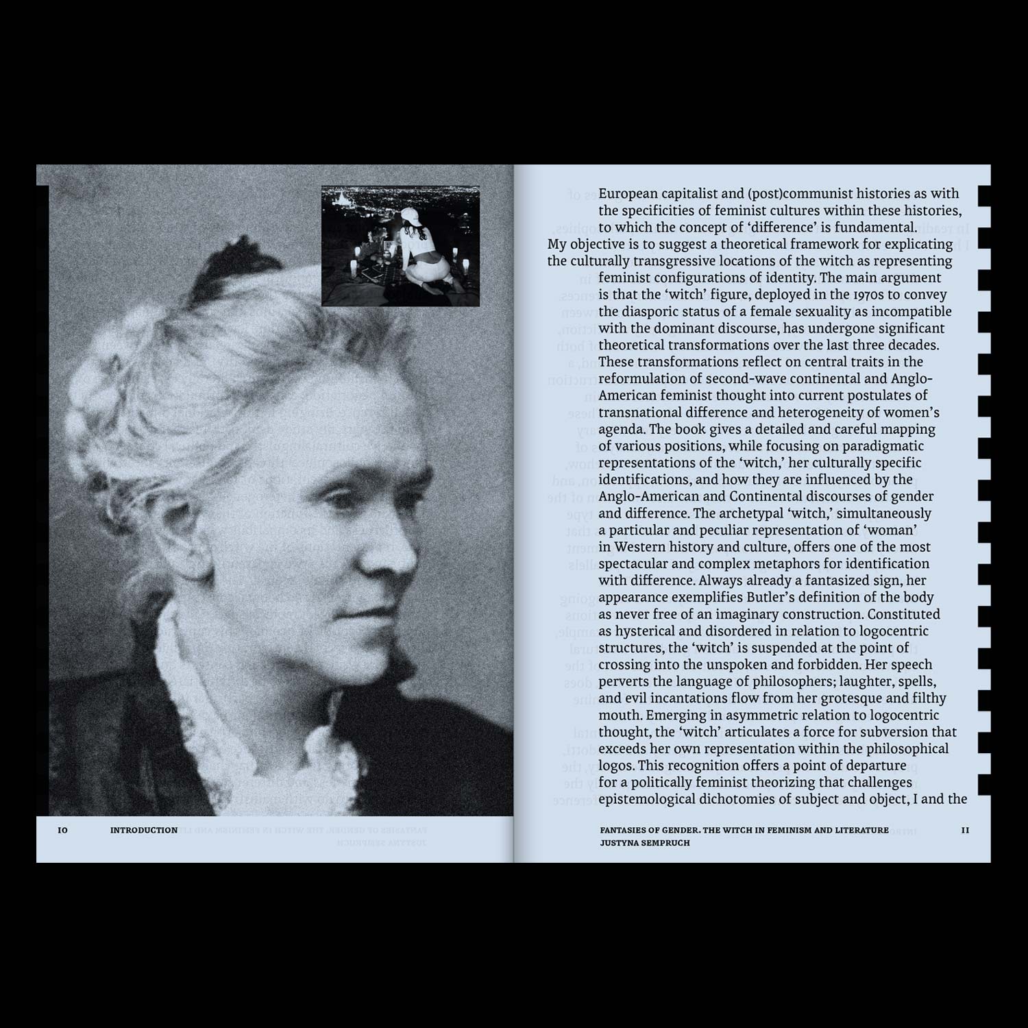
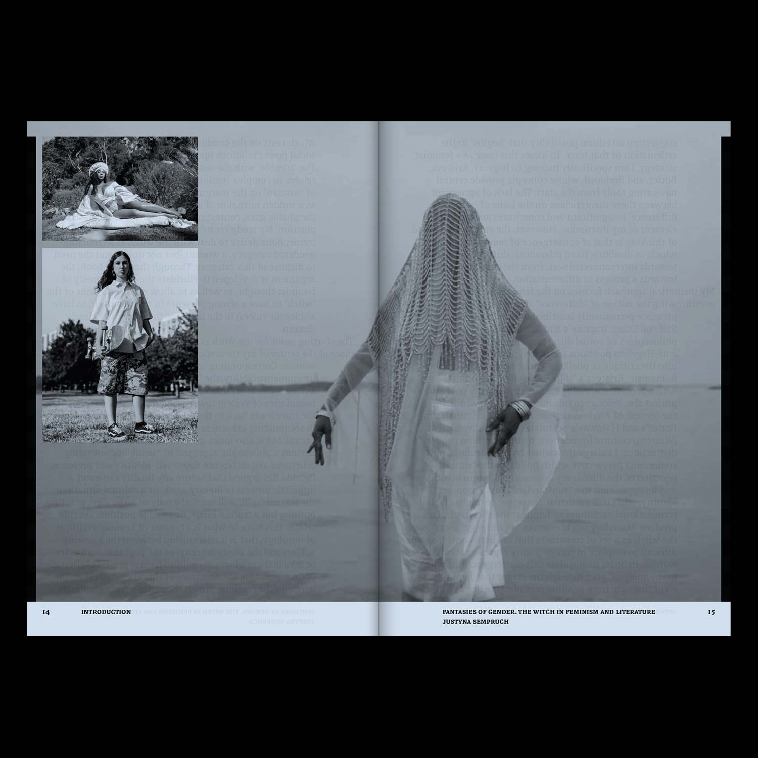
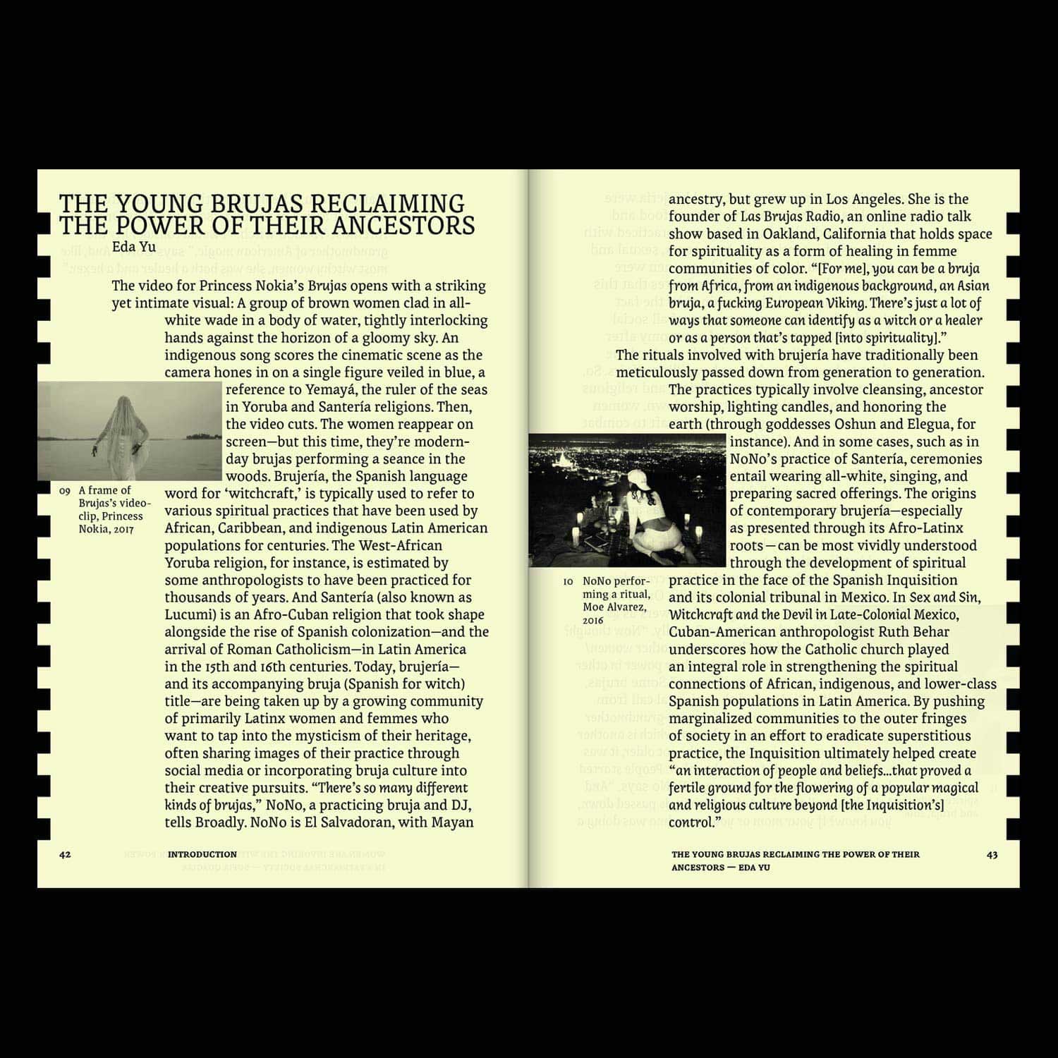
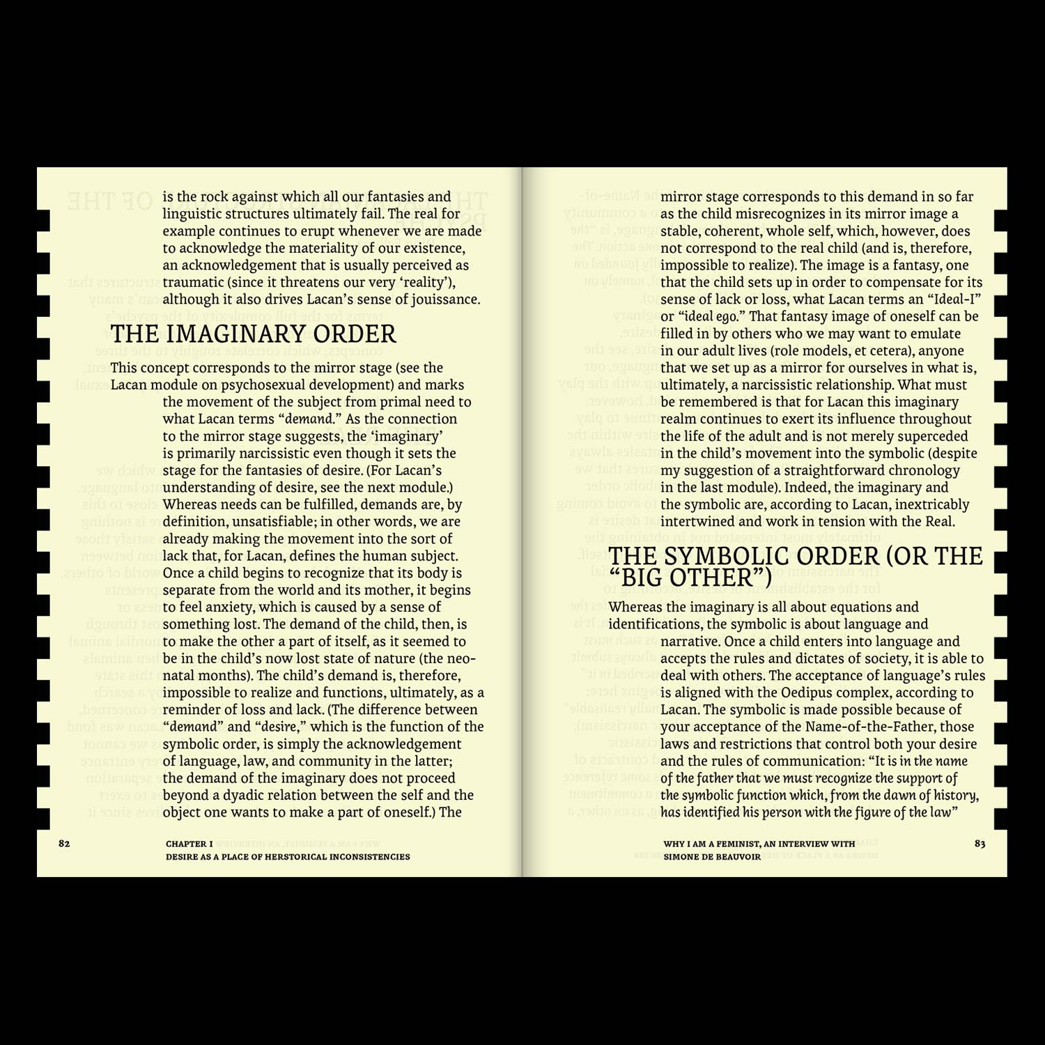
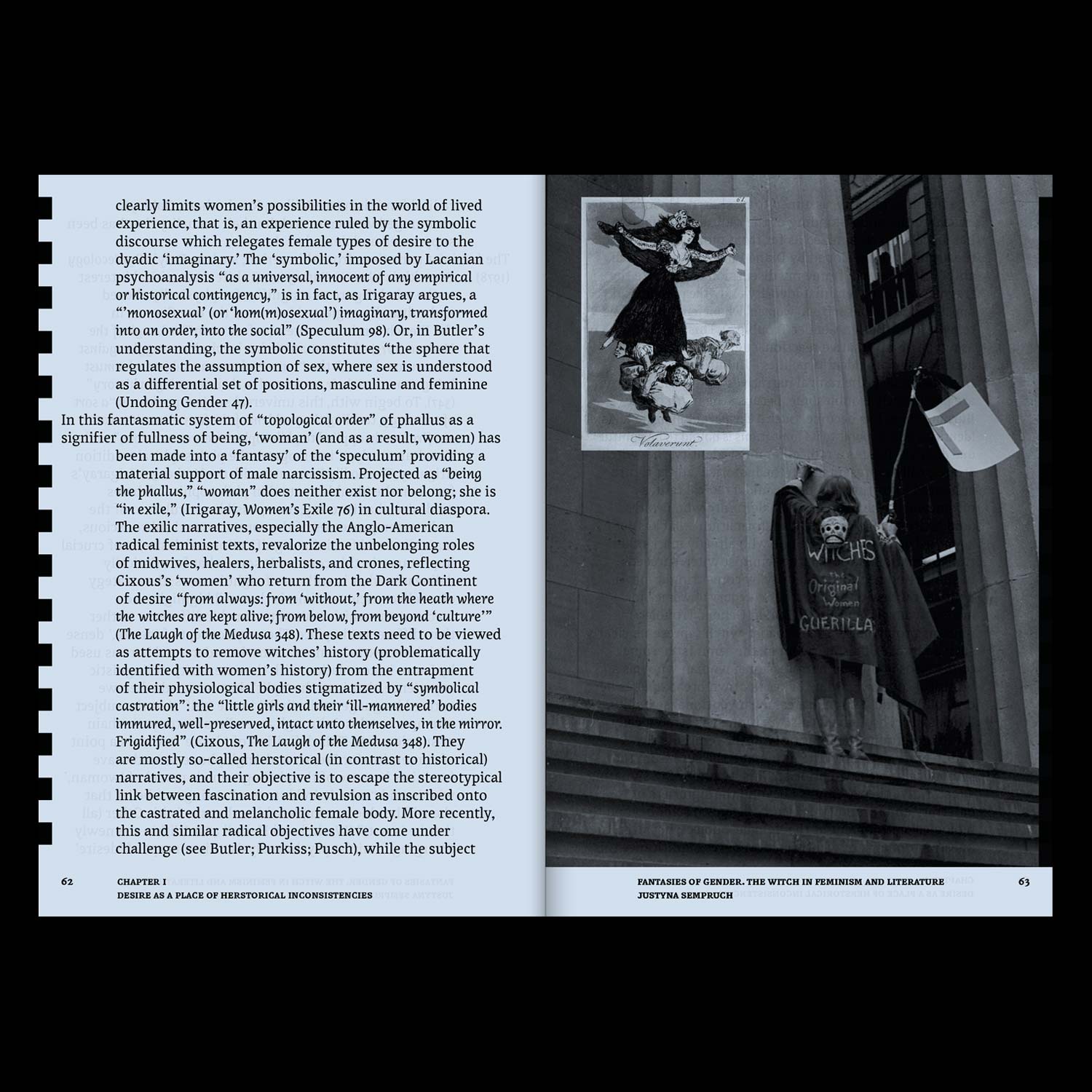

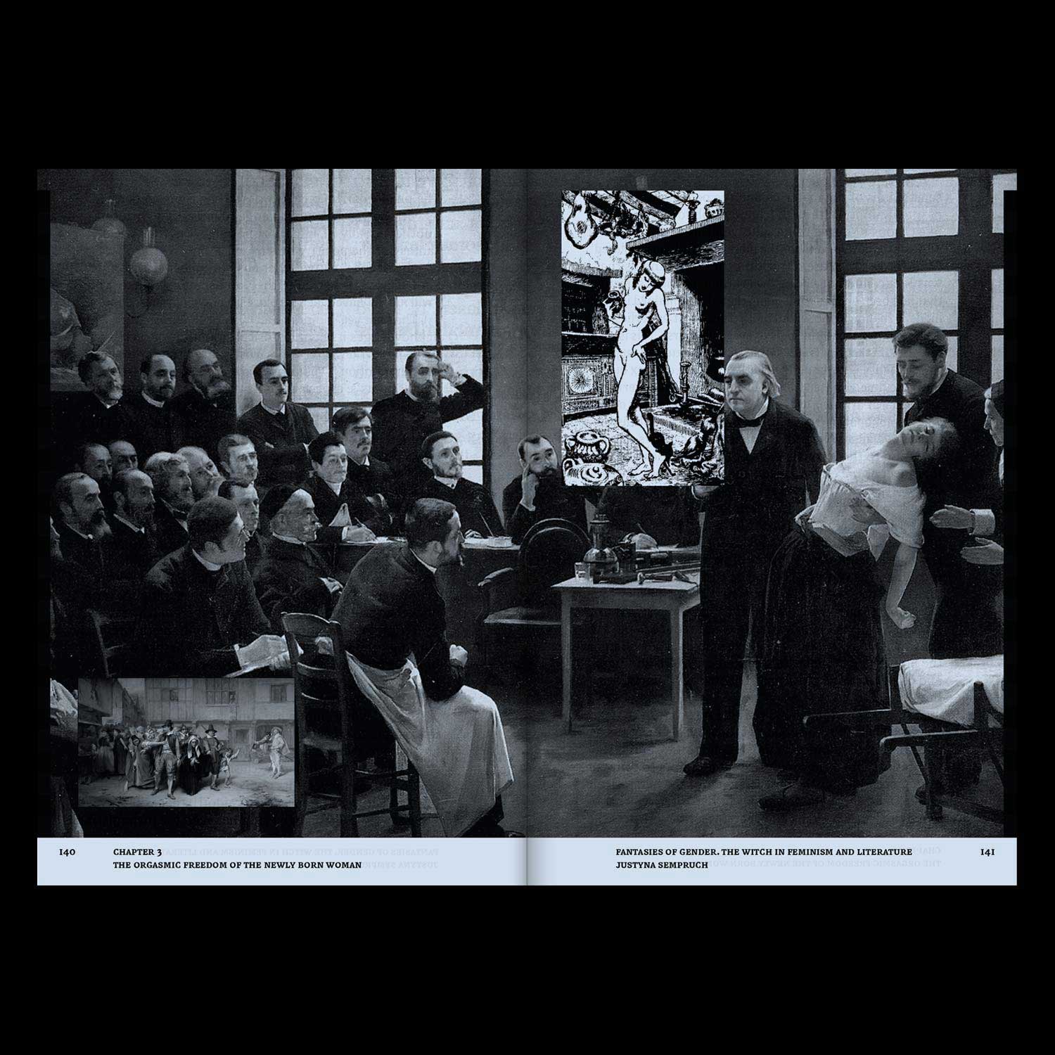
*Who is afraid of the Witch?* is an editorial project articulating academic writing, articles and iconographic materials, all dealing with the figure of the witch in feminist movements and in literature.
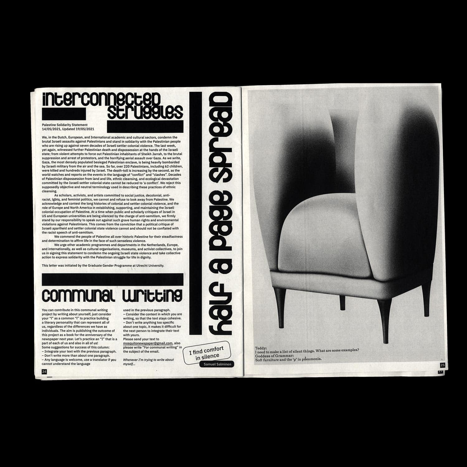
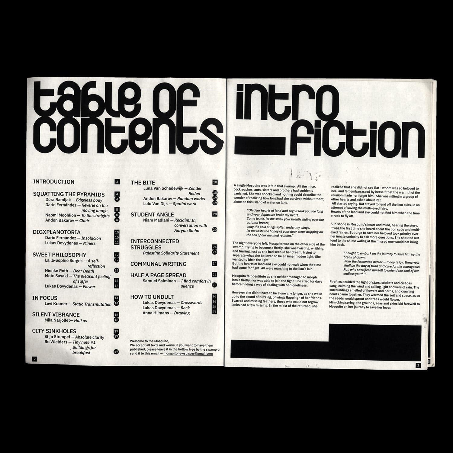
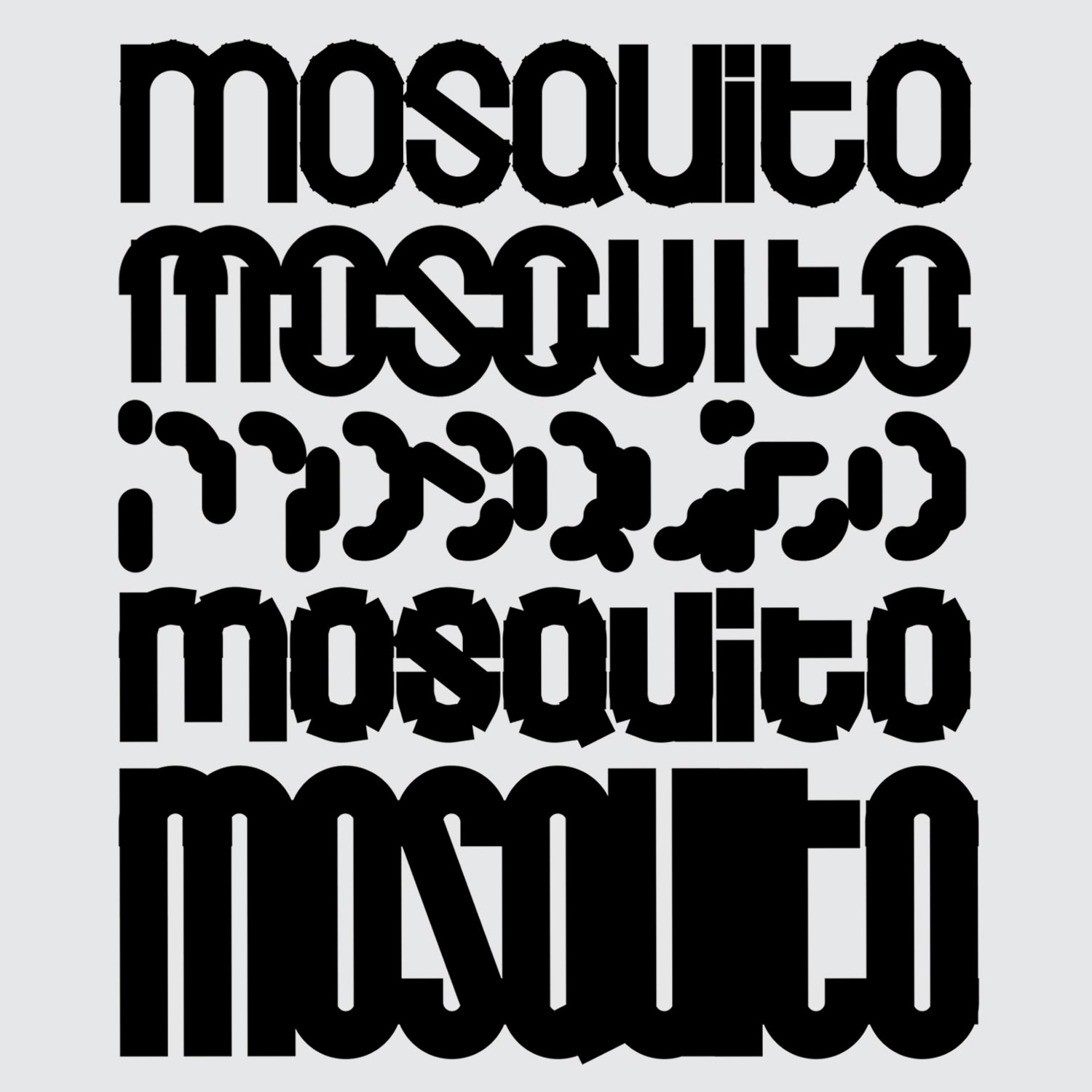
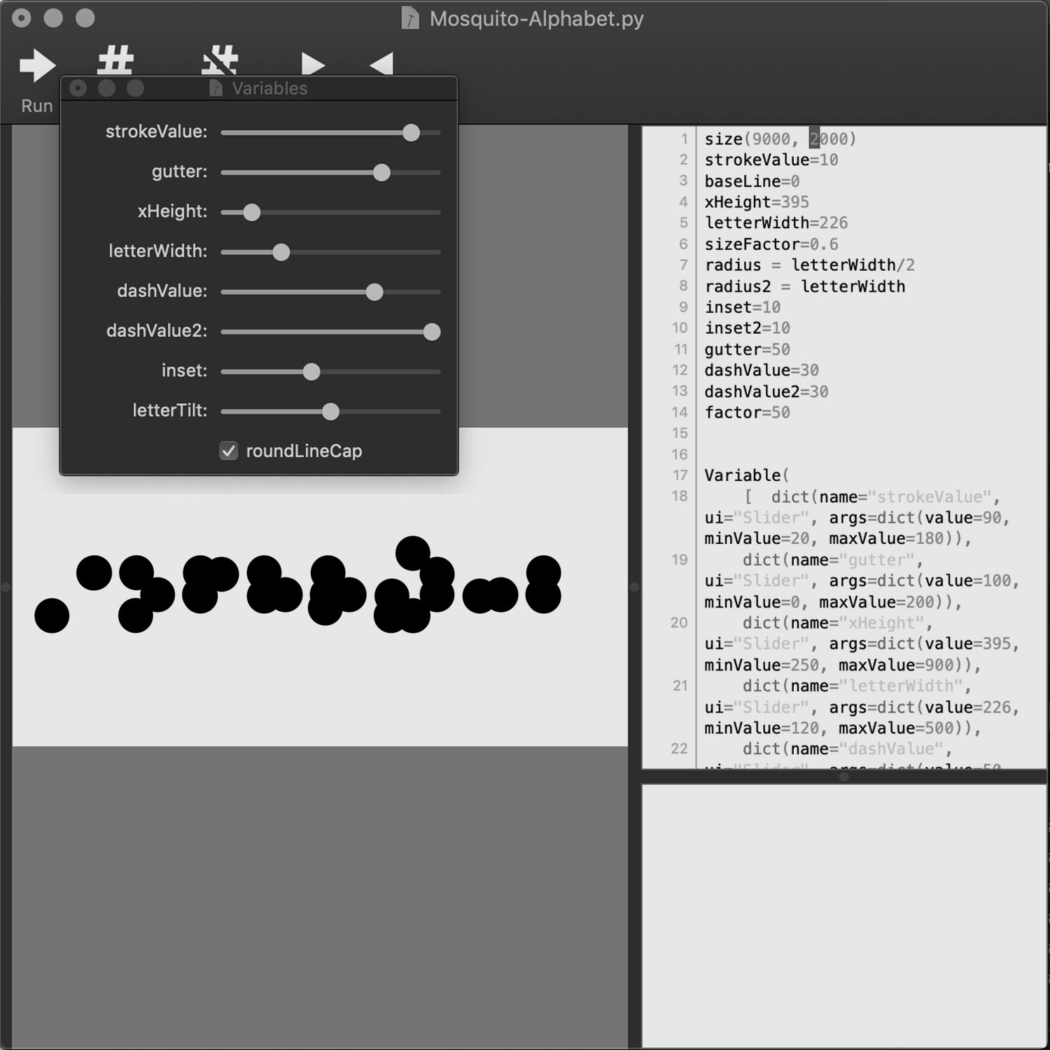
The Mosquito Newspaper
Identity/ Editorial Design/ Typography
2021, 32 pages, 210 × 297 mm
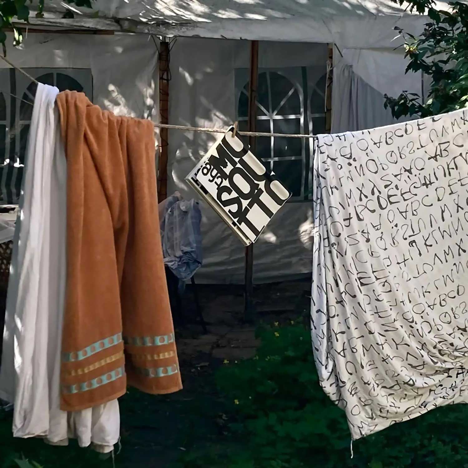
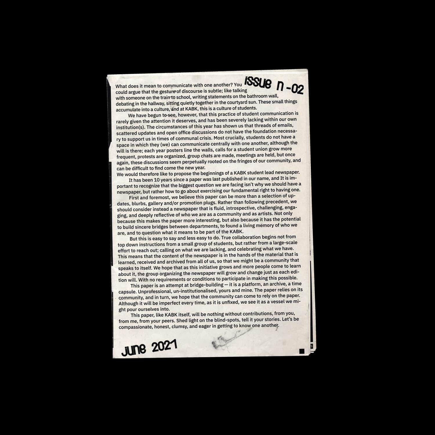
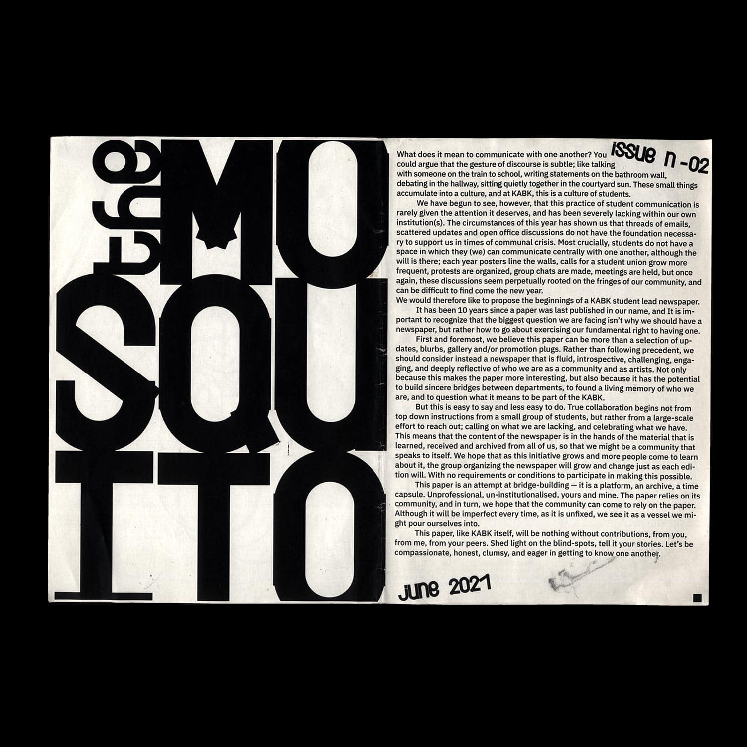
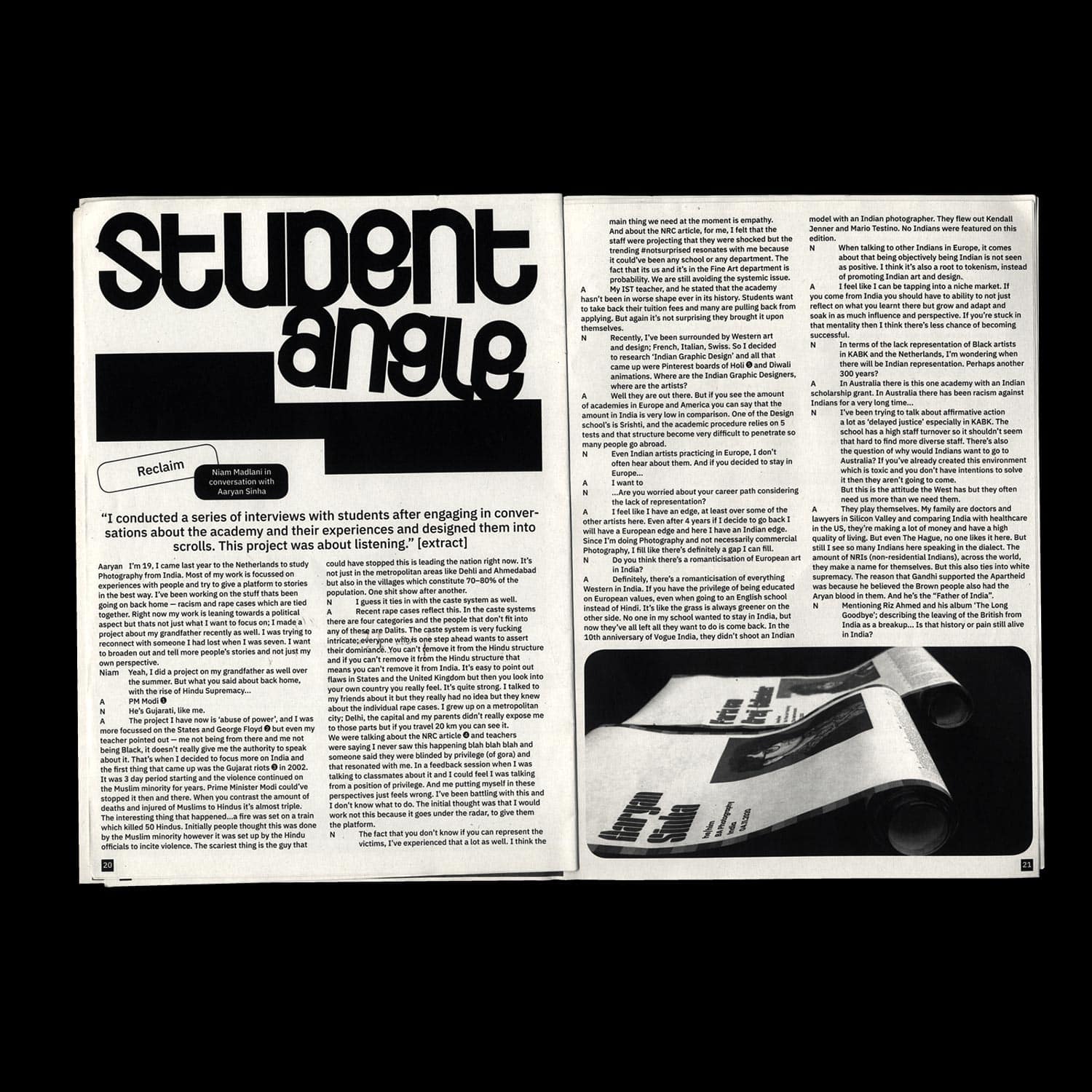
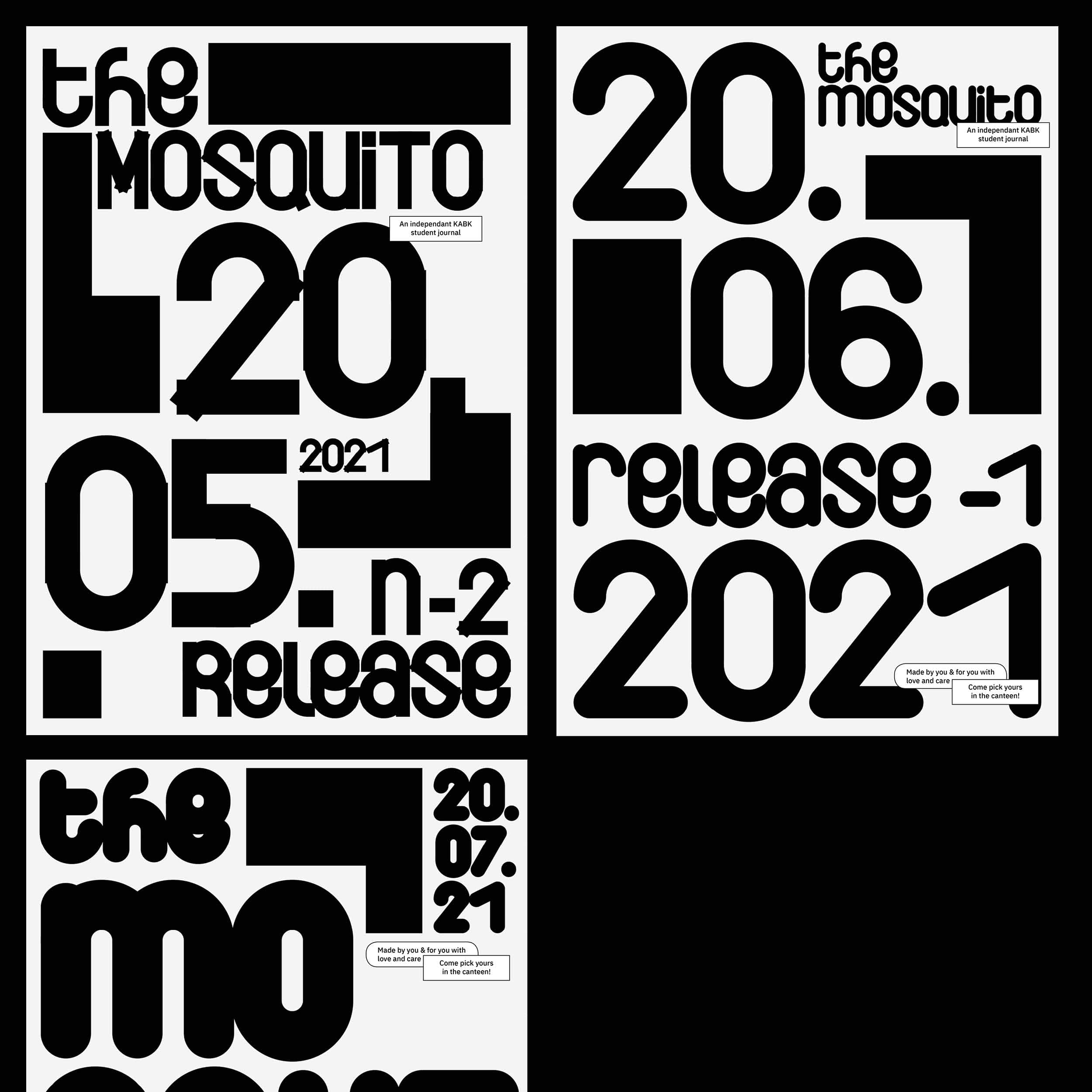
An open-ended and open-source identity for KABK's (Royal Academy of Arts The Hague) independent student
newspaper. Flexible, collective and collaborative rather than authoritarian and restrictive, this protean
identity intends to leave space for interpretation and evolve through time, along with the groups of
students constituting the Journal team.
Vernacular Photography in Conversation
Editorial Design/ Editing
2020, 56 pages, 10 × 29,7 cm
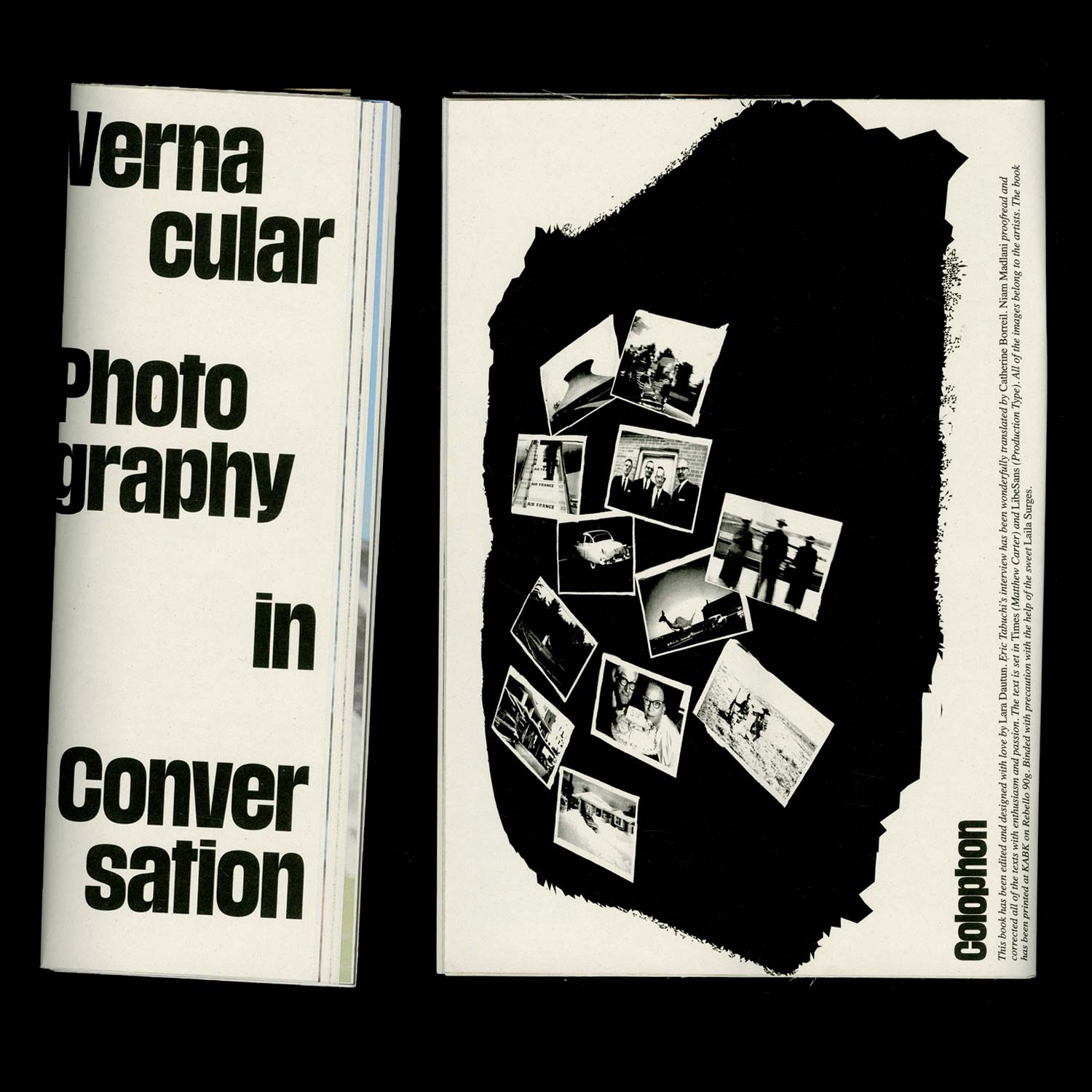
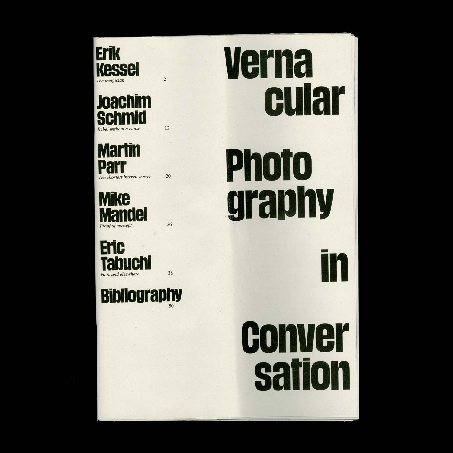
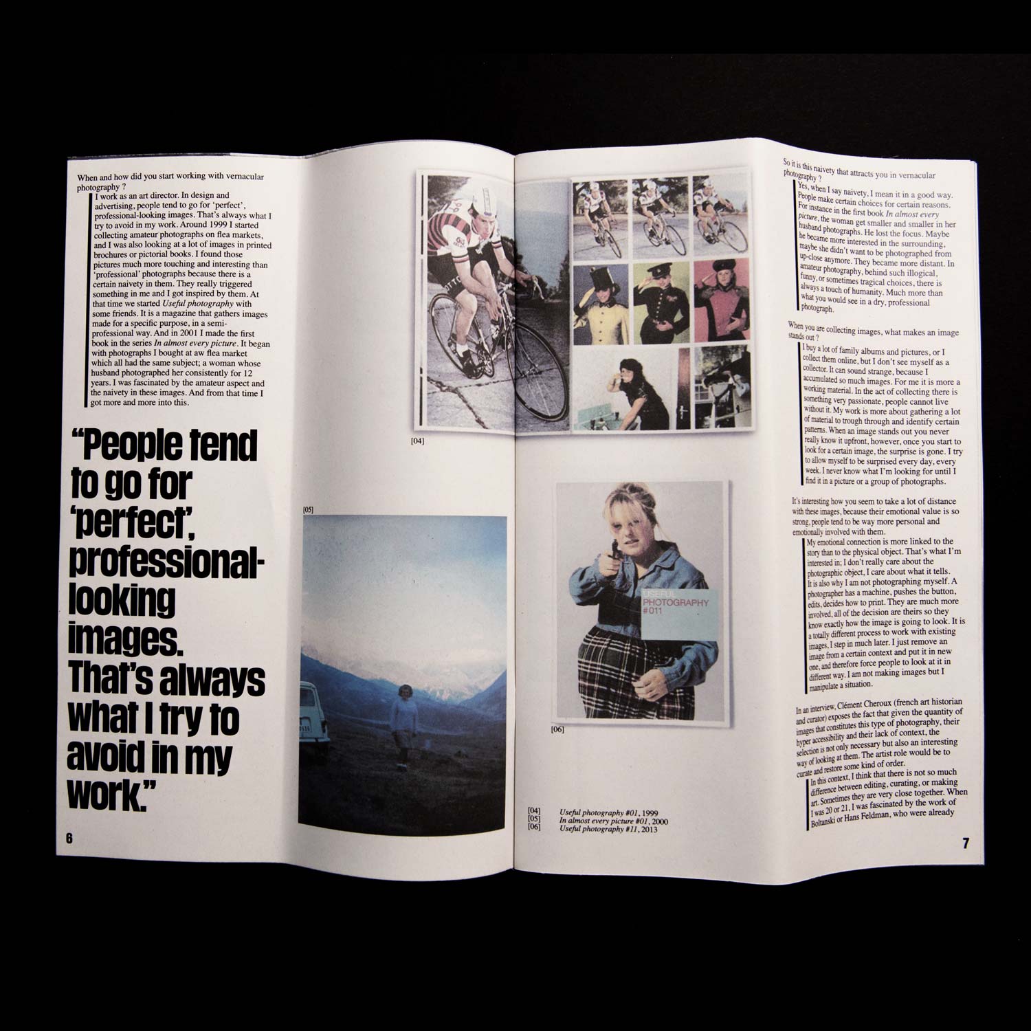
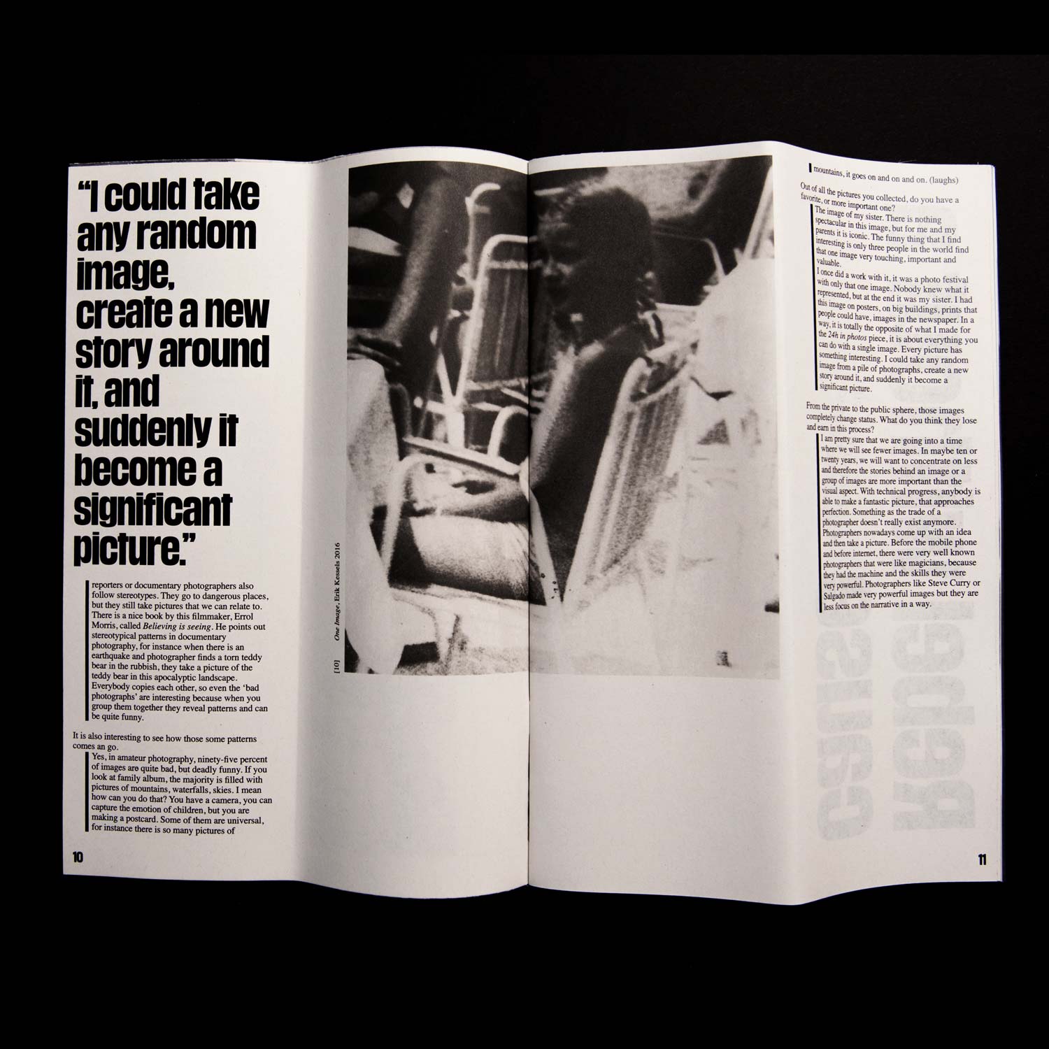
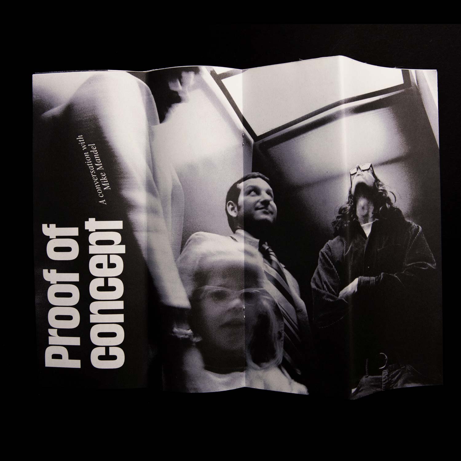
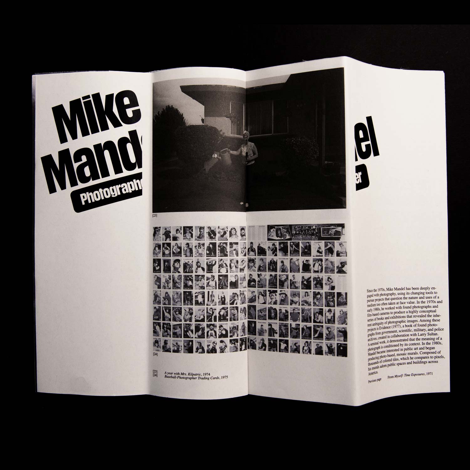
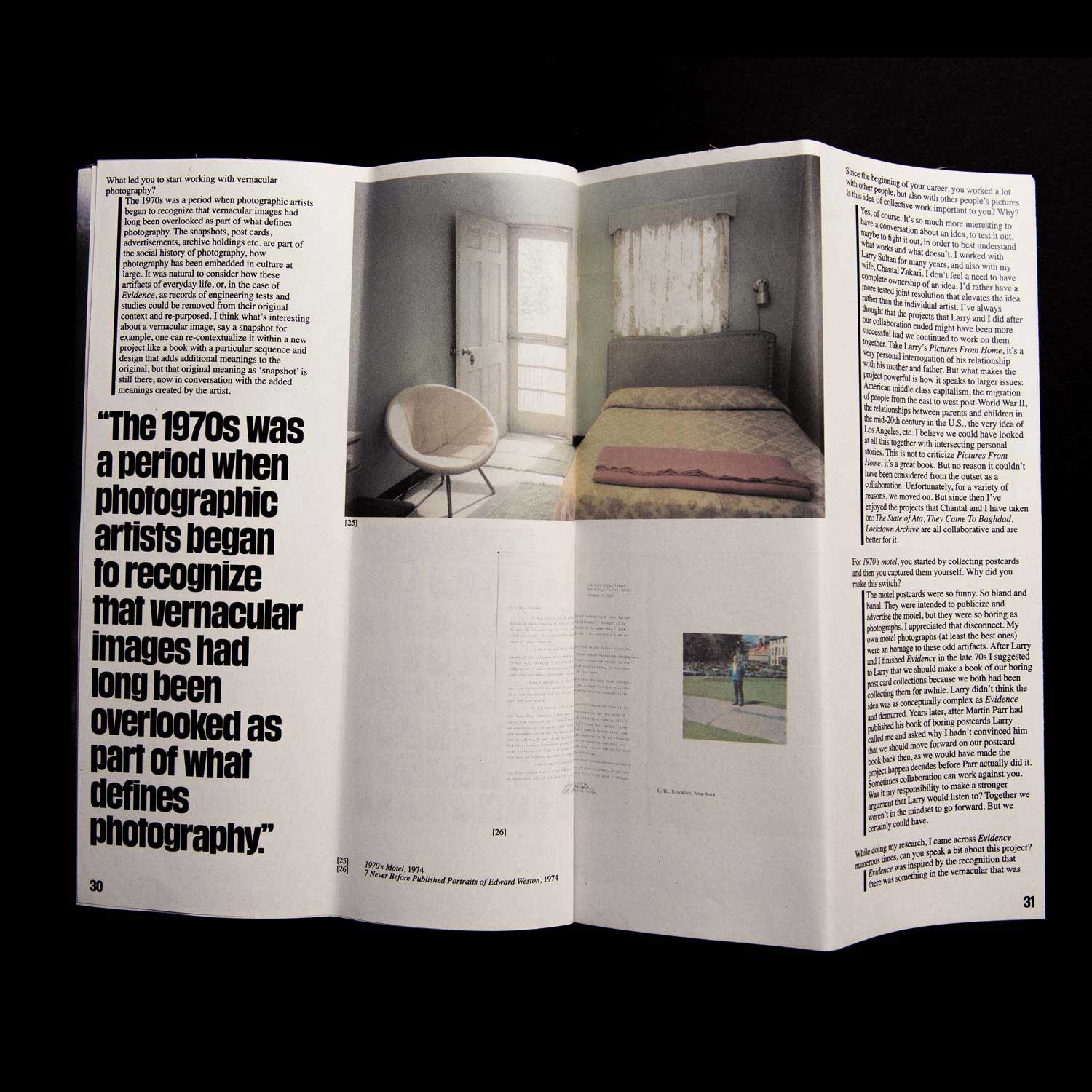
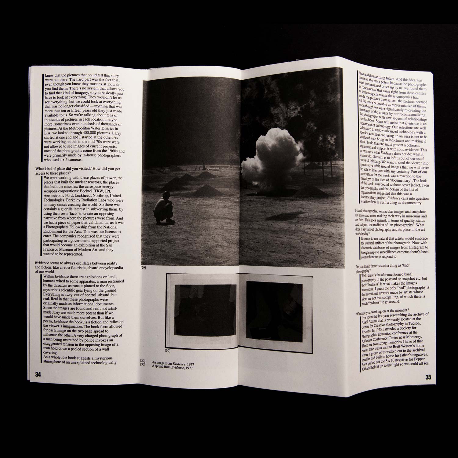
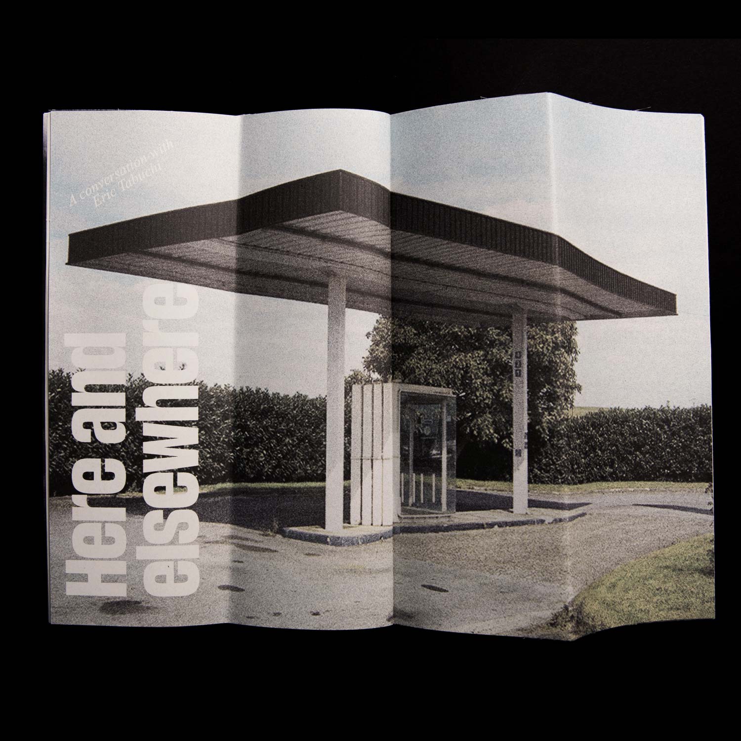
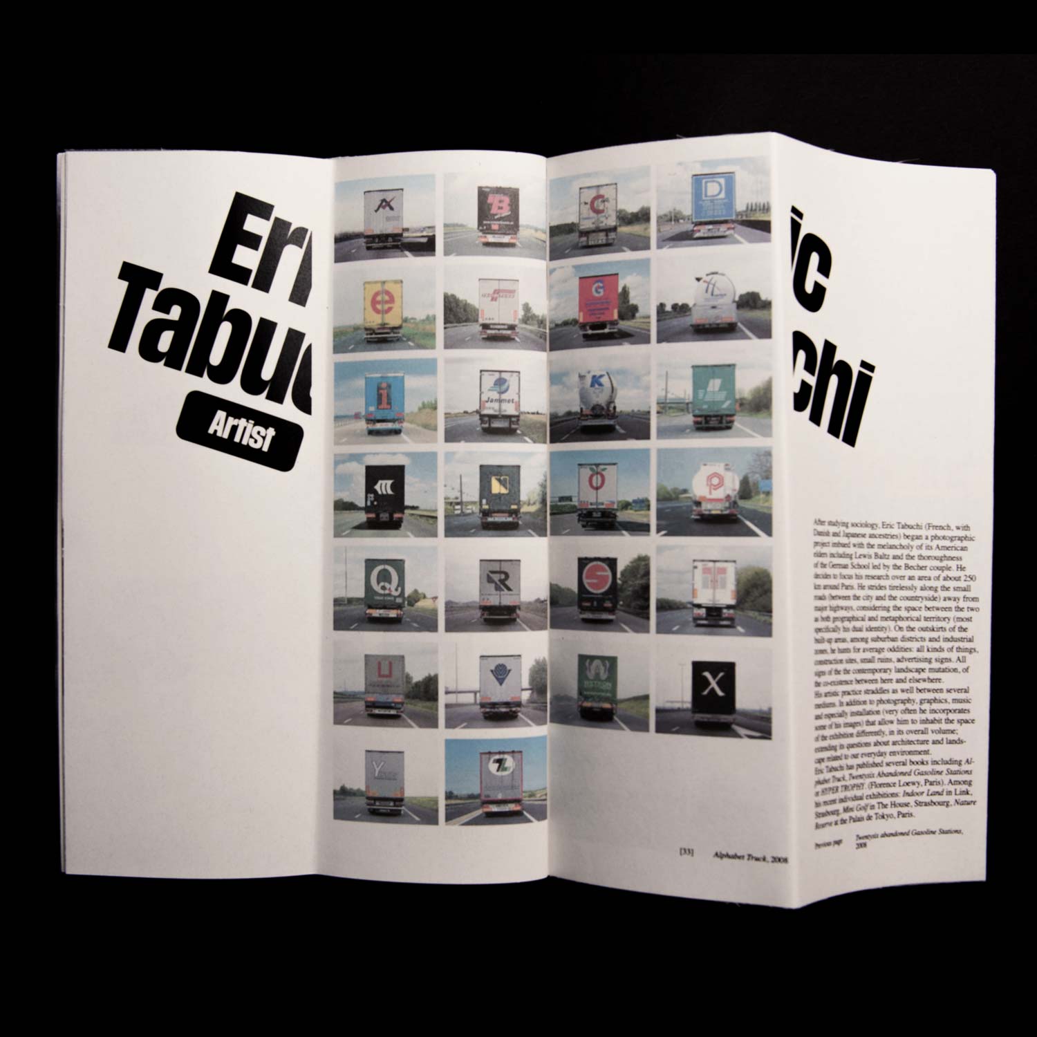
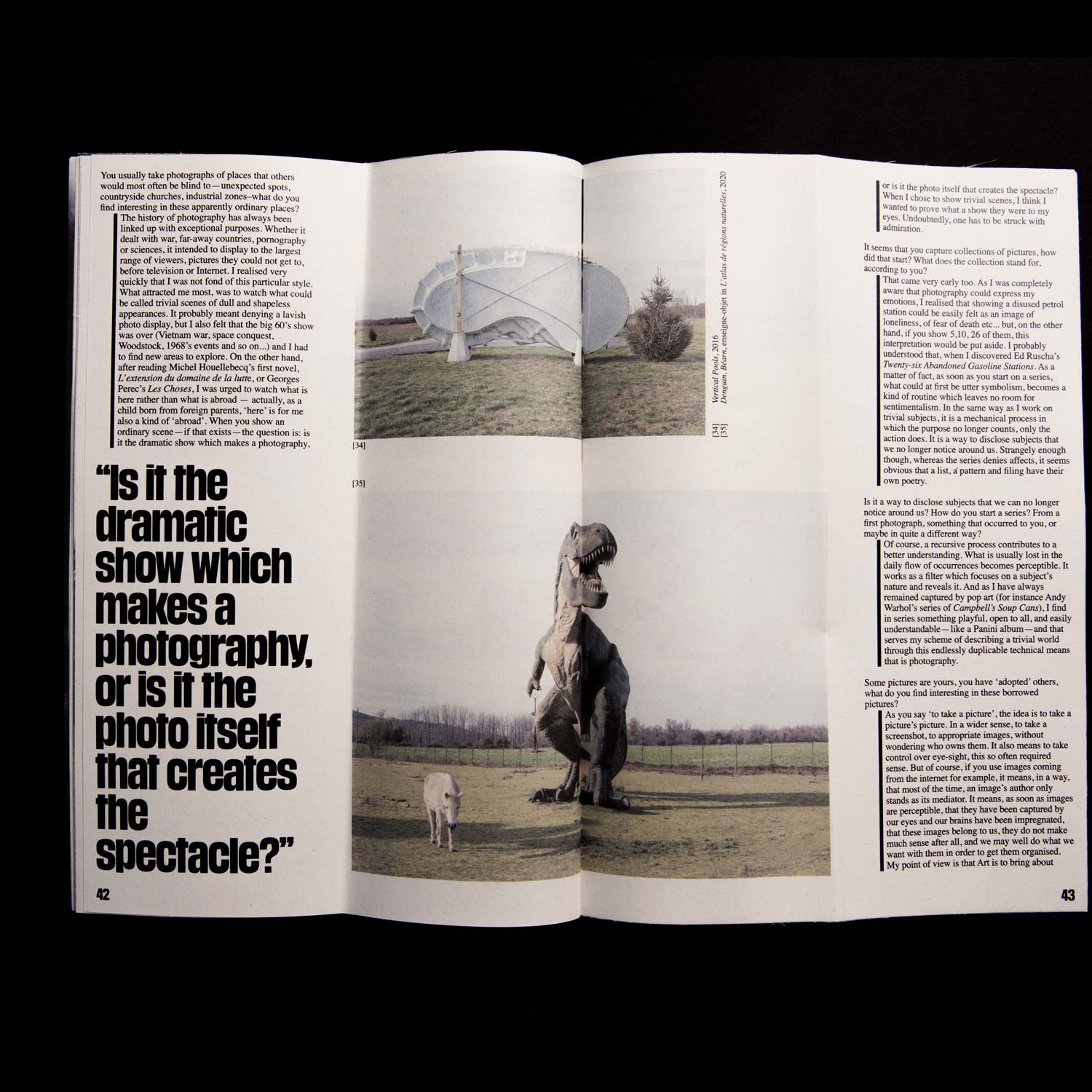
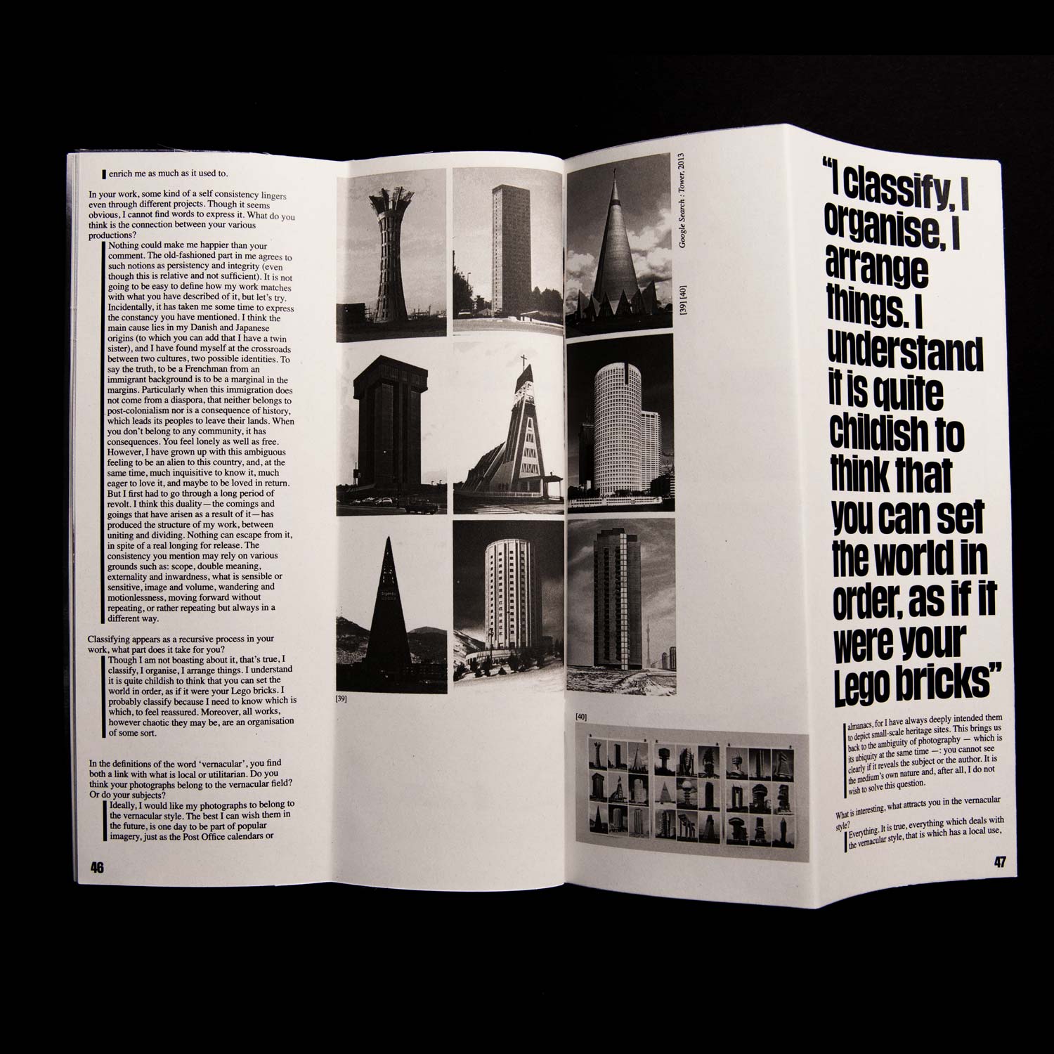
A study of vernacular photography, through a series of interviews with the ones who make it and/or use it as
an artistic medium. All of the interviews were prepared, conducted and transcribed exclusively for this
publication.
Two Colours: A Risographic Exploration
Editorial Design/ Printing
2021, in collaboration with
Barbara Strzeżek, 243 pages, 78 × 136 mm
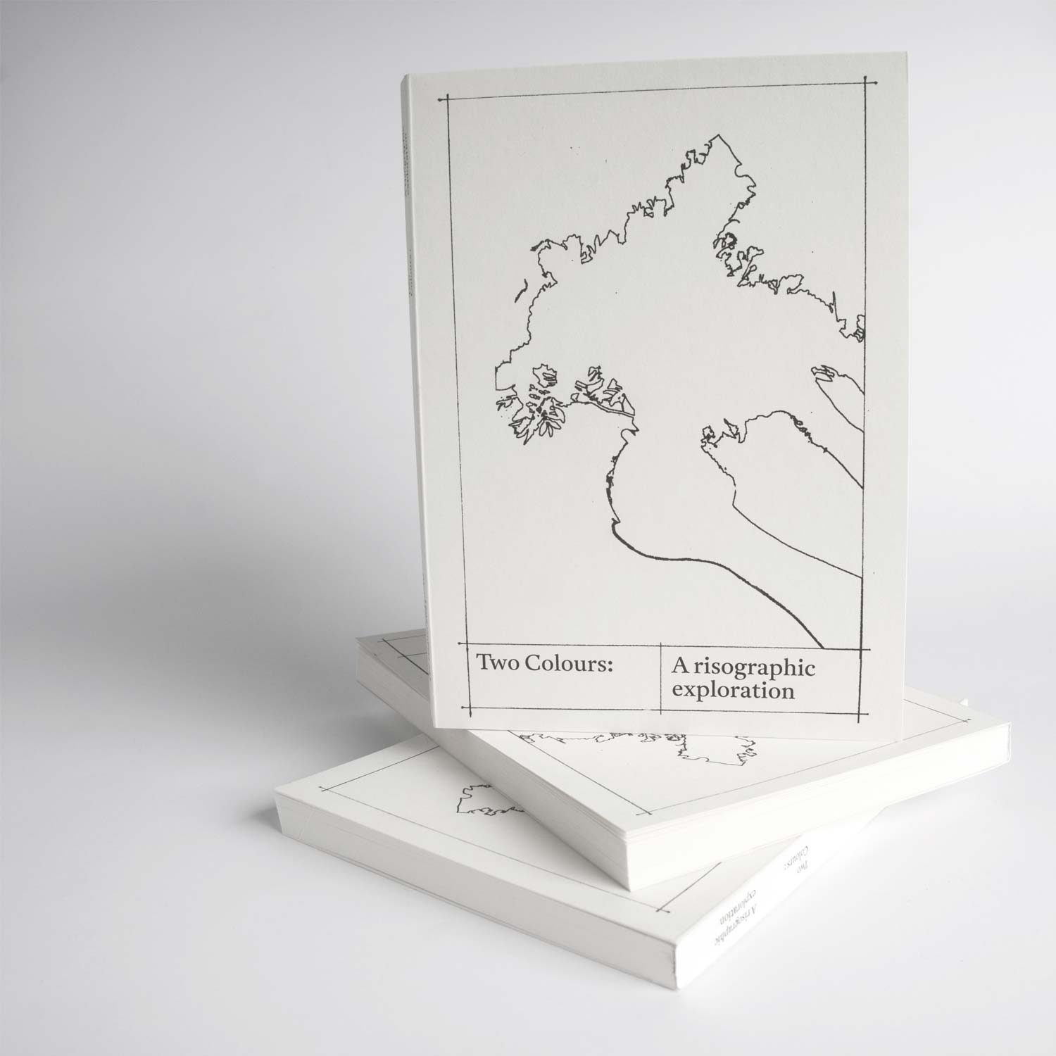
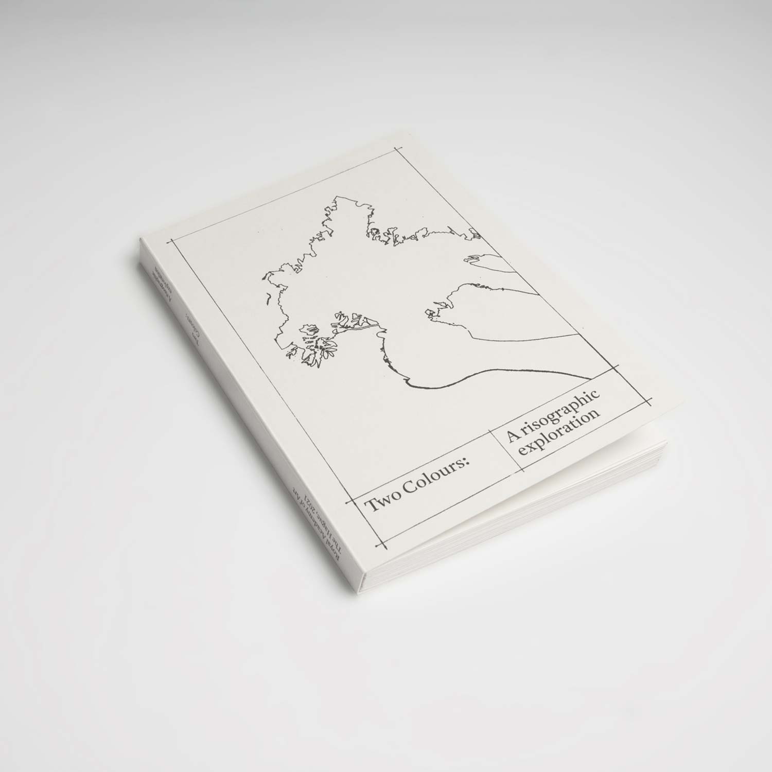
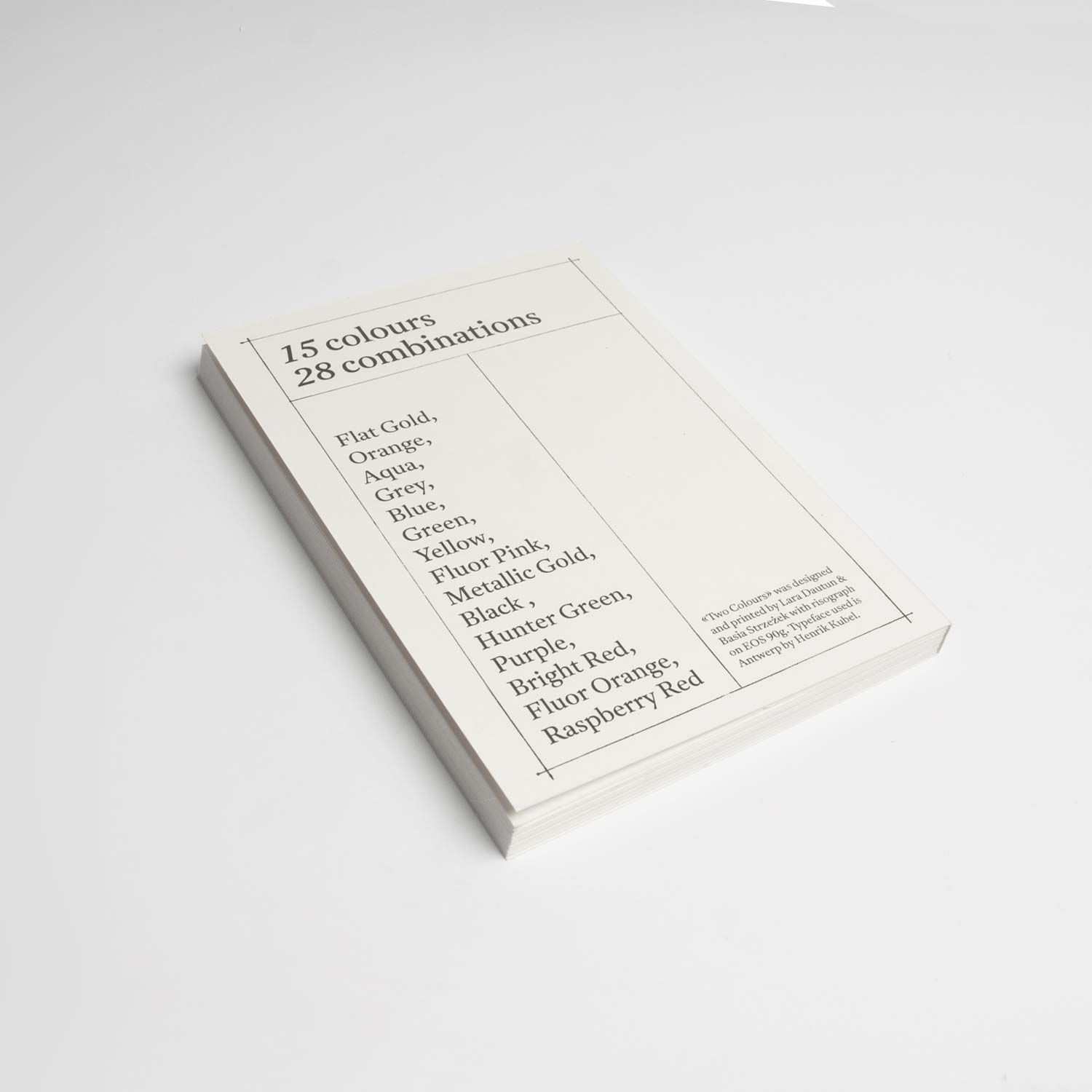
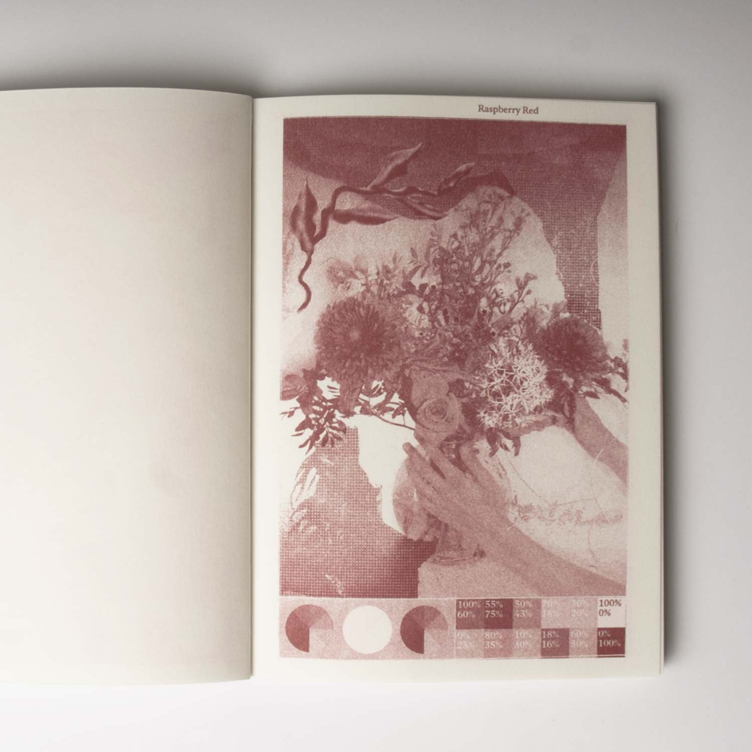
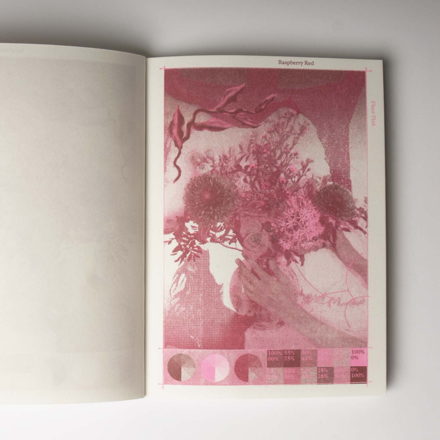
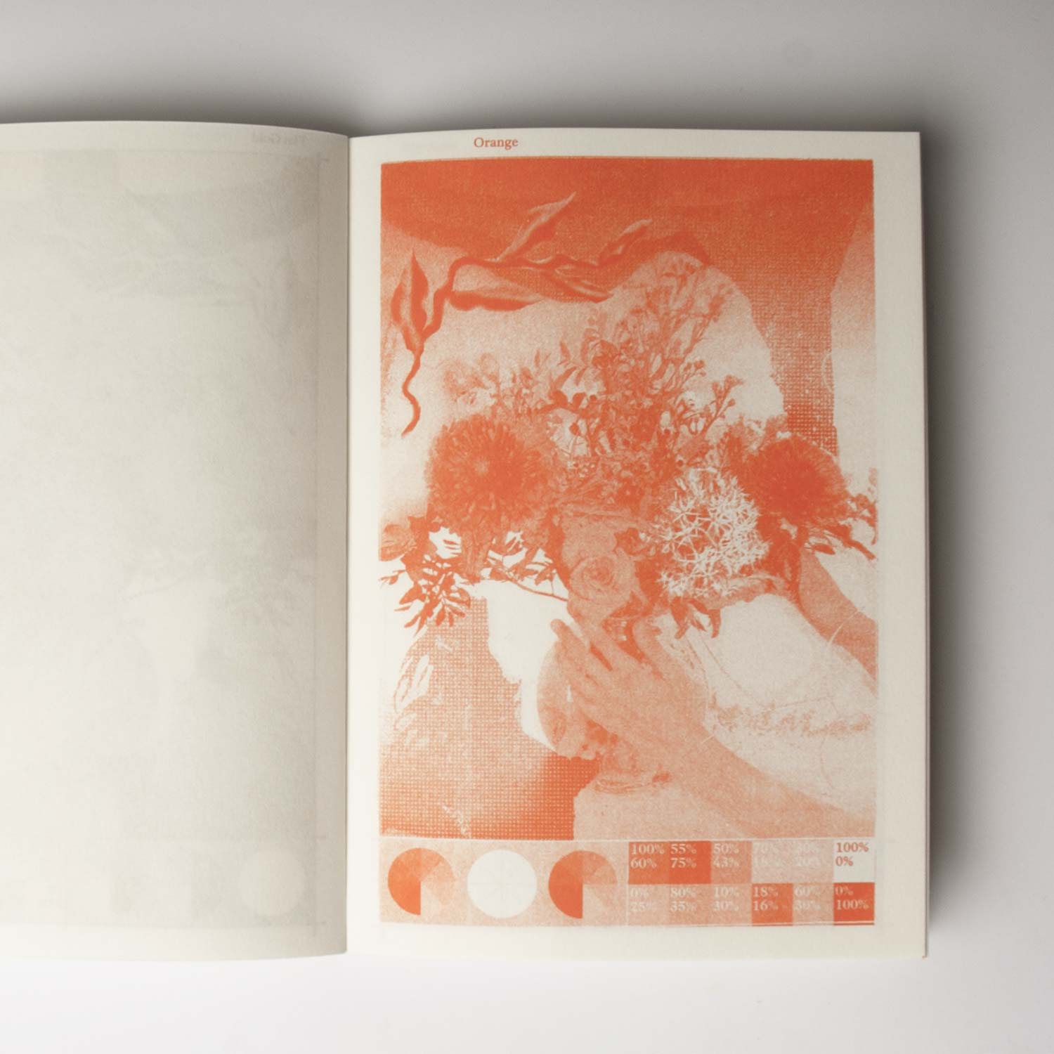
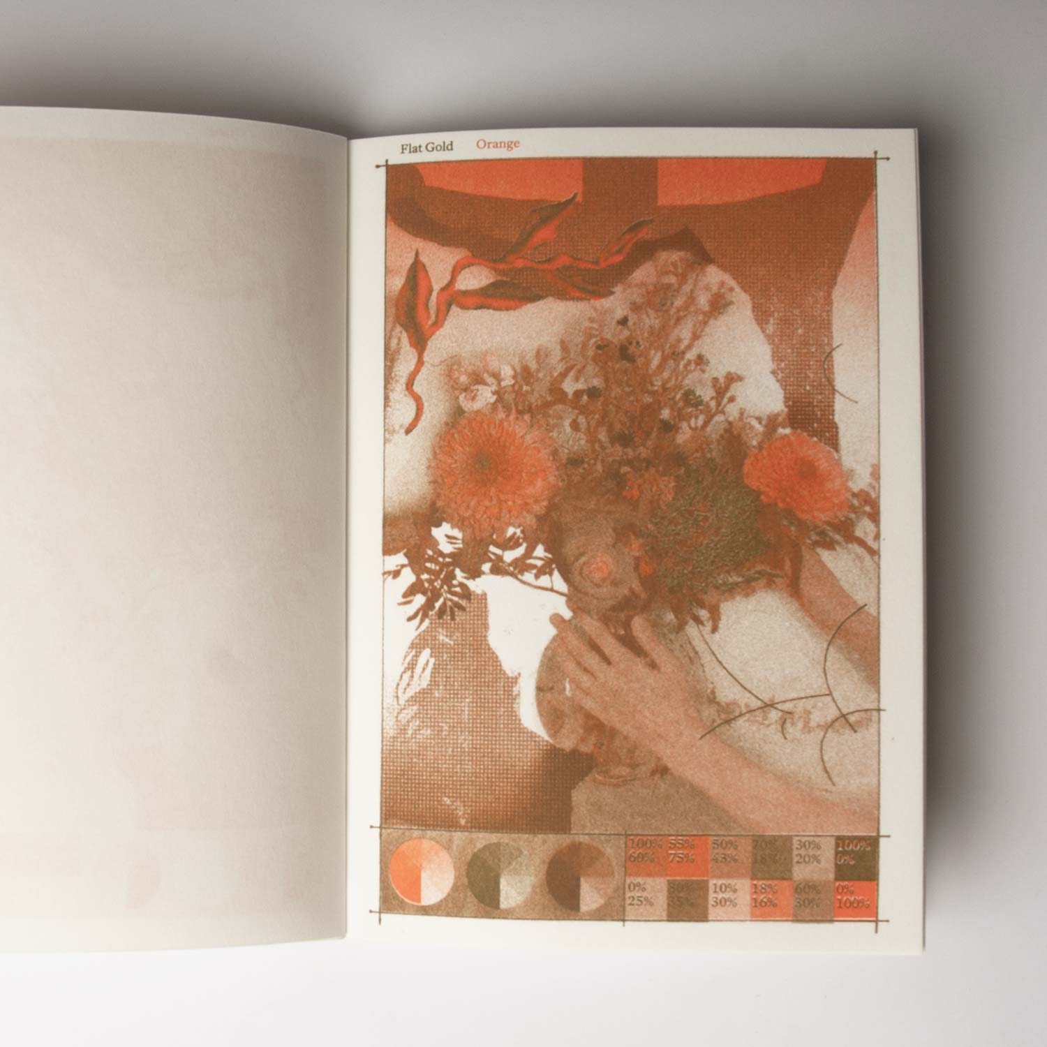
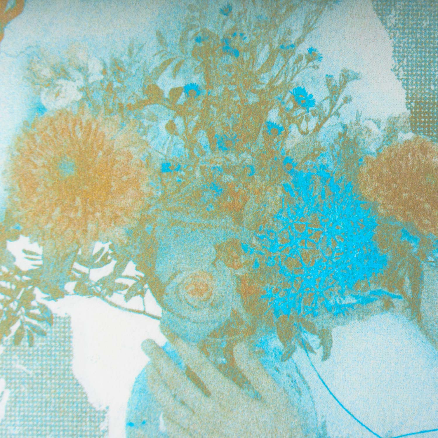
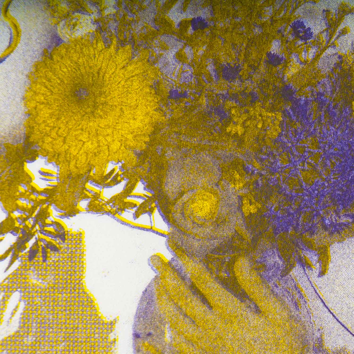
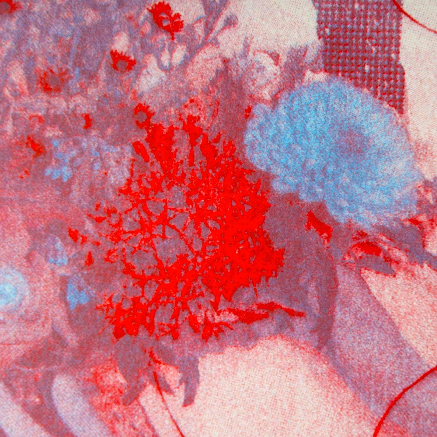
15 colours, 28 combinations, and a good dozen of hours spent with the Risograph. Imagined in collaboration
with Barbara Strzezek, Two Colours is a technical and chromatic guide exploring colour associations and (a
part of) the range of visual potentials specific to this technology.
Hiterto
Editorial Design/ Editing
2021, Collaborative publication, 32 pages, 210 × 297 mm
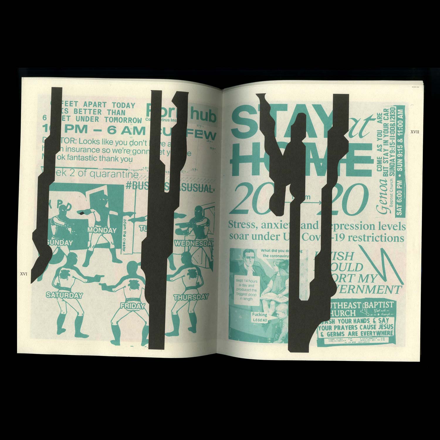
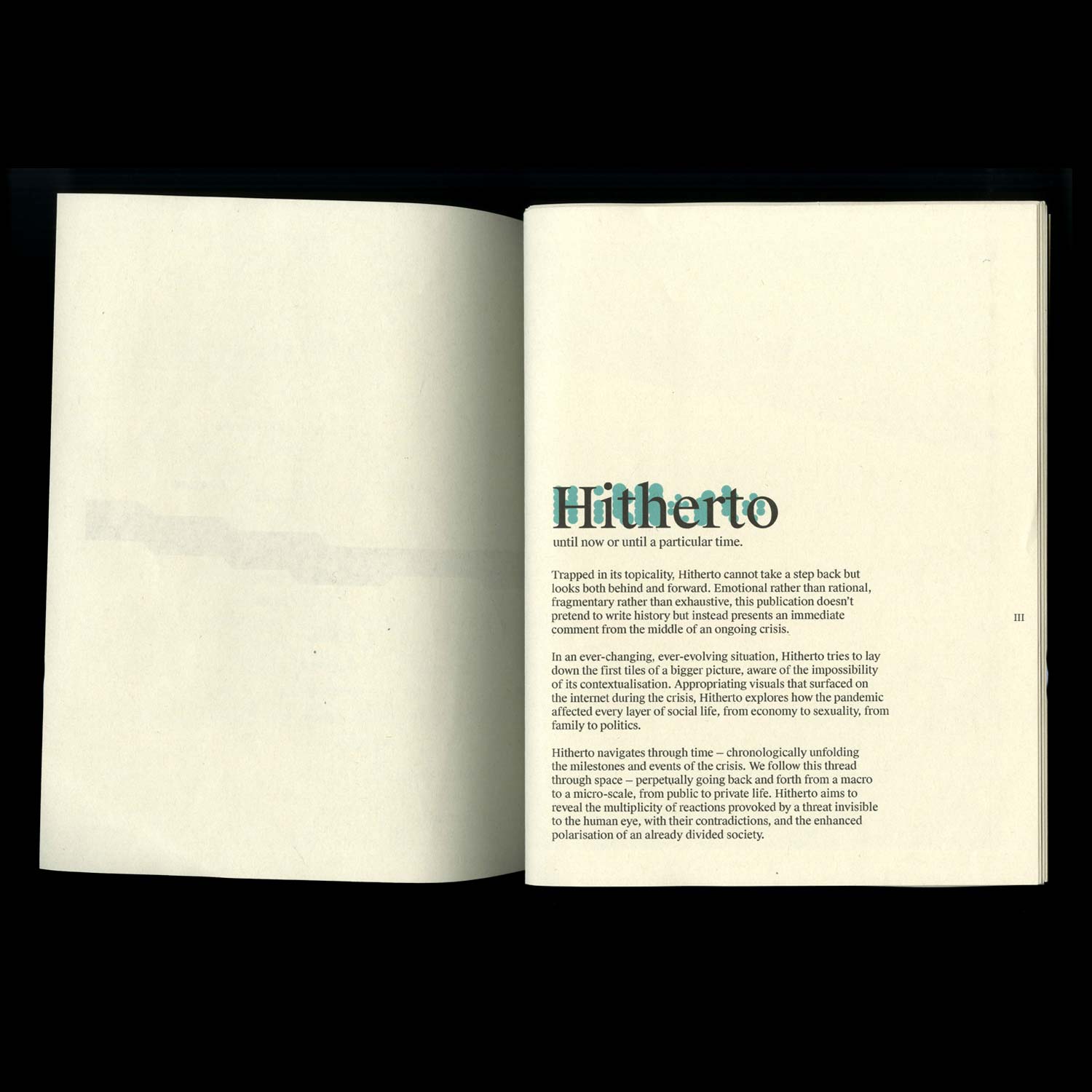
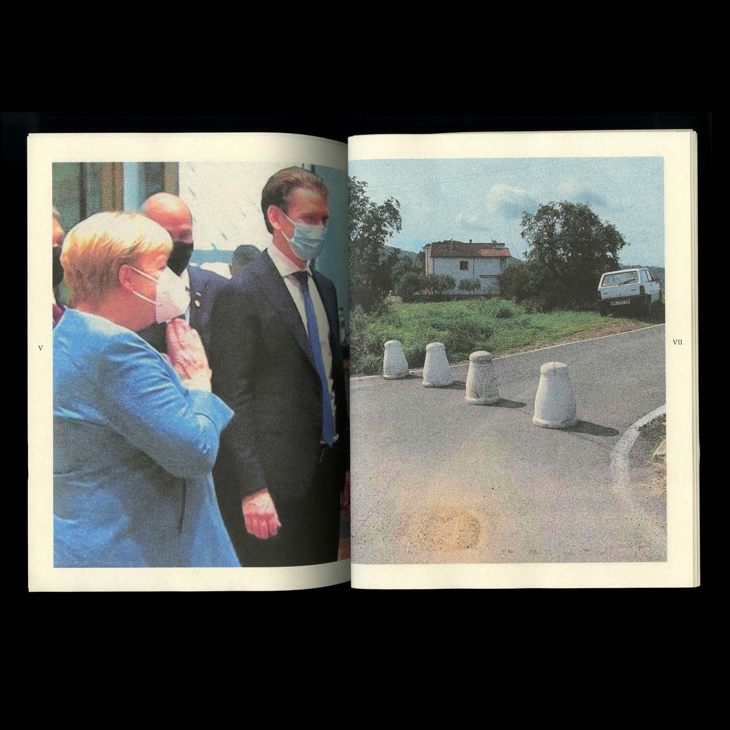
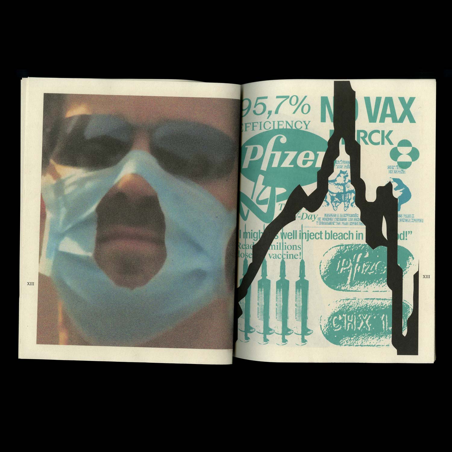
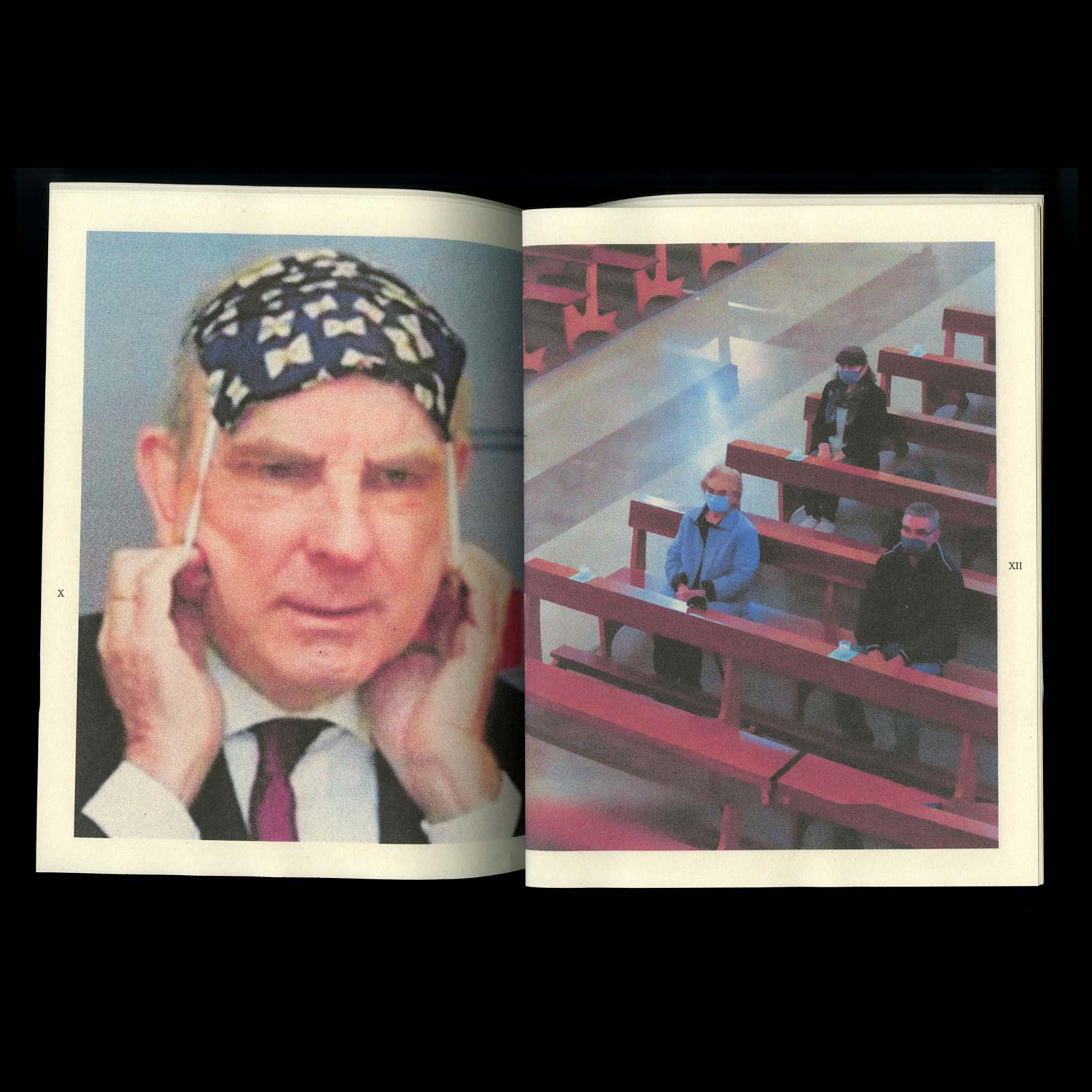
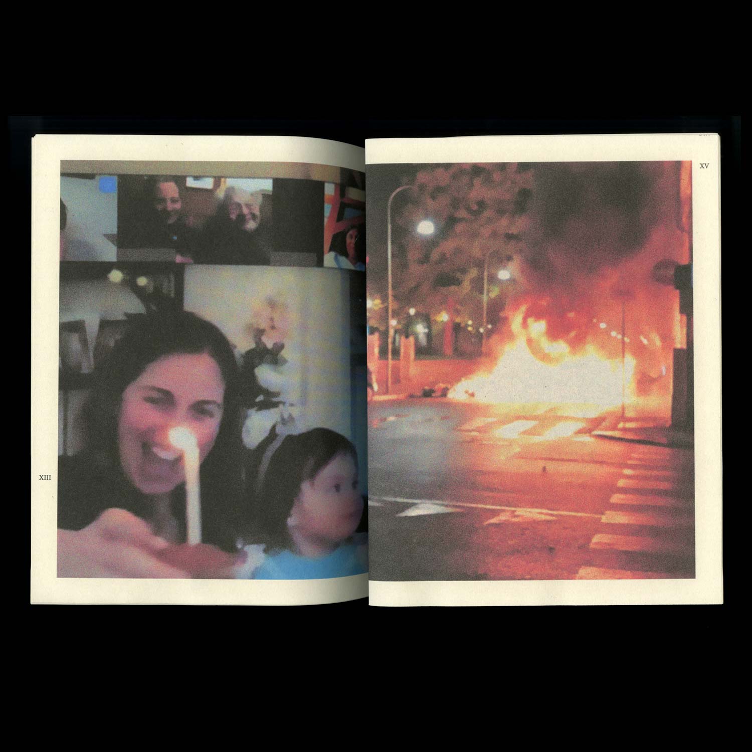
Hiterto (until now or until a particular time)
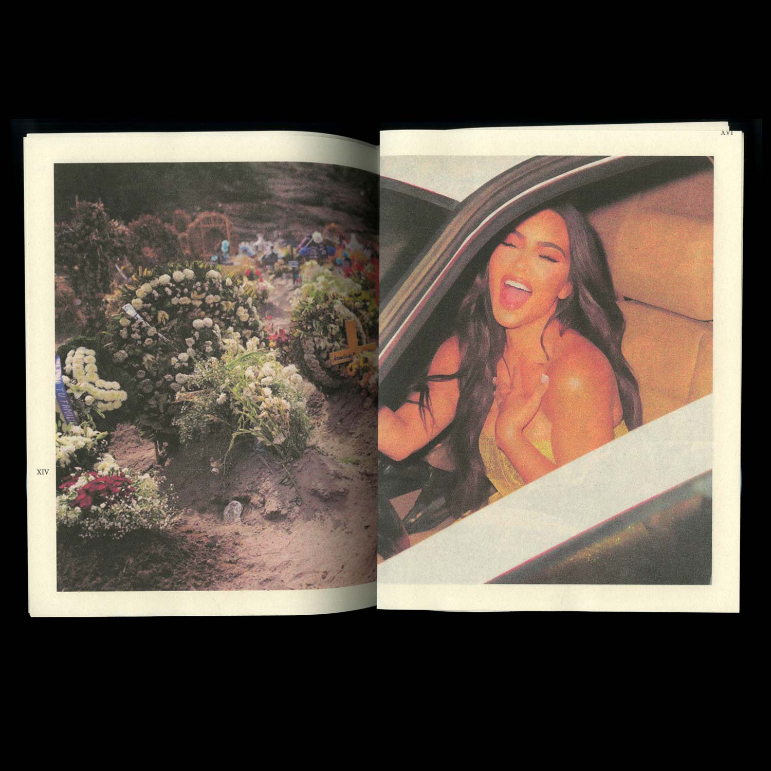
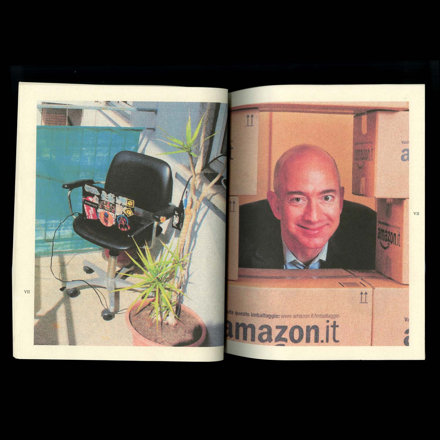
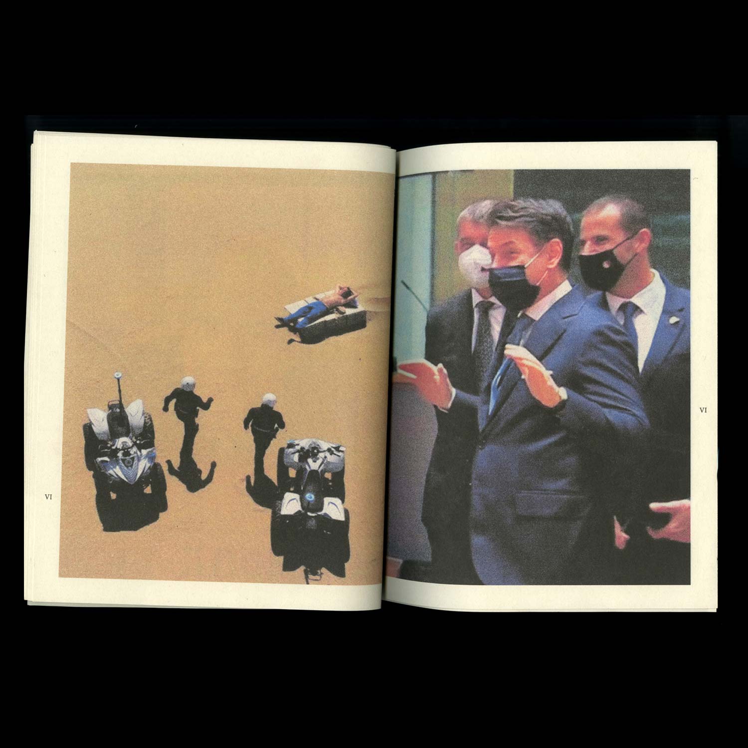
This collective publication — created in the midst of the first lockdown — explores the multiplicity of reactions provoked by a threat invisible to the human eye, with their contradictions, their complexity and the enhanced polarisation of an already divided society.
This collective publication — created in the midst of the first lockdown — explores the multiplicity of reactions provoked by a threat invisible to the human eye, with their contradictions, their complexity and the enhanced polarisation of an already divided society.
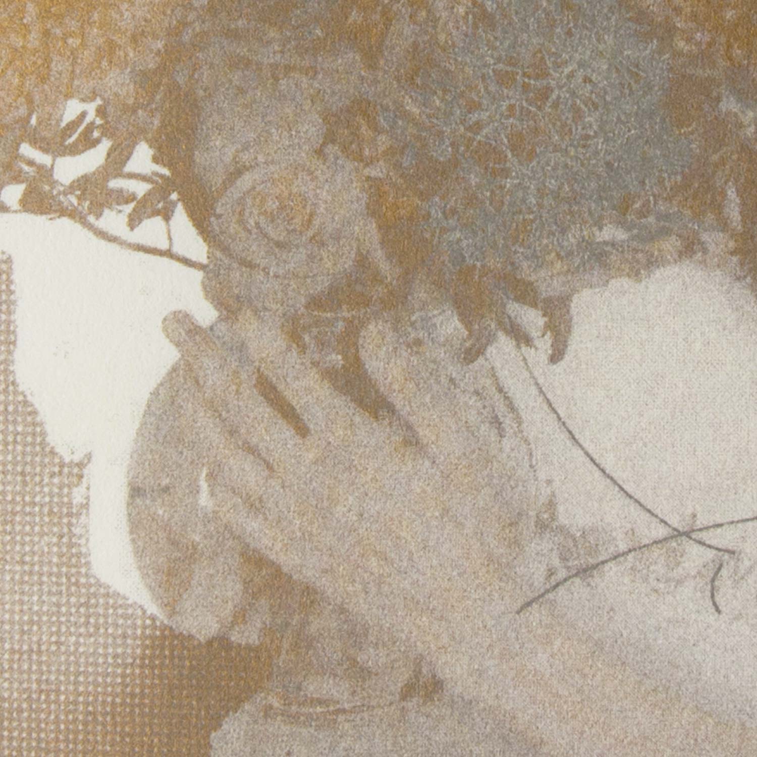
Red
Image/ Editing
2020, 70 pages, 290 × 594 mm
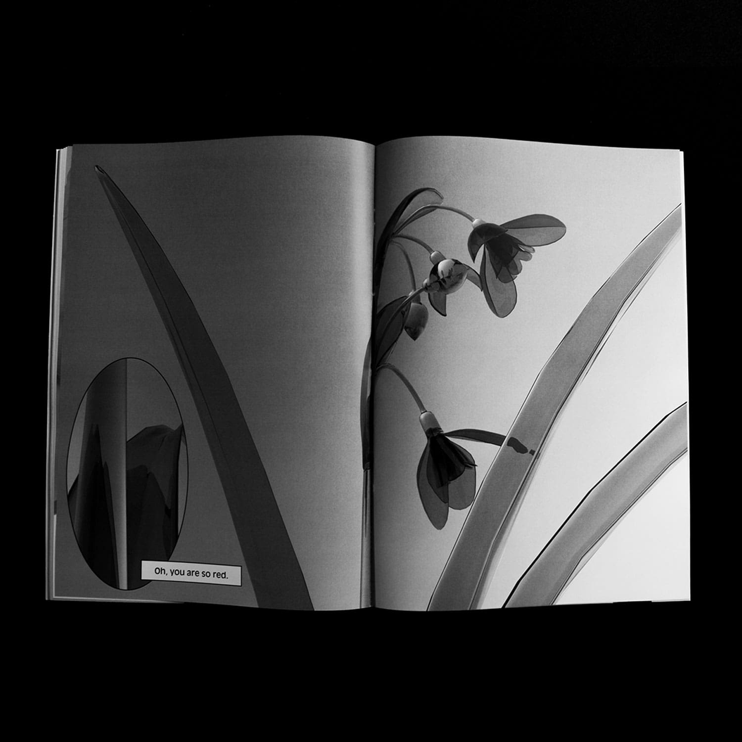
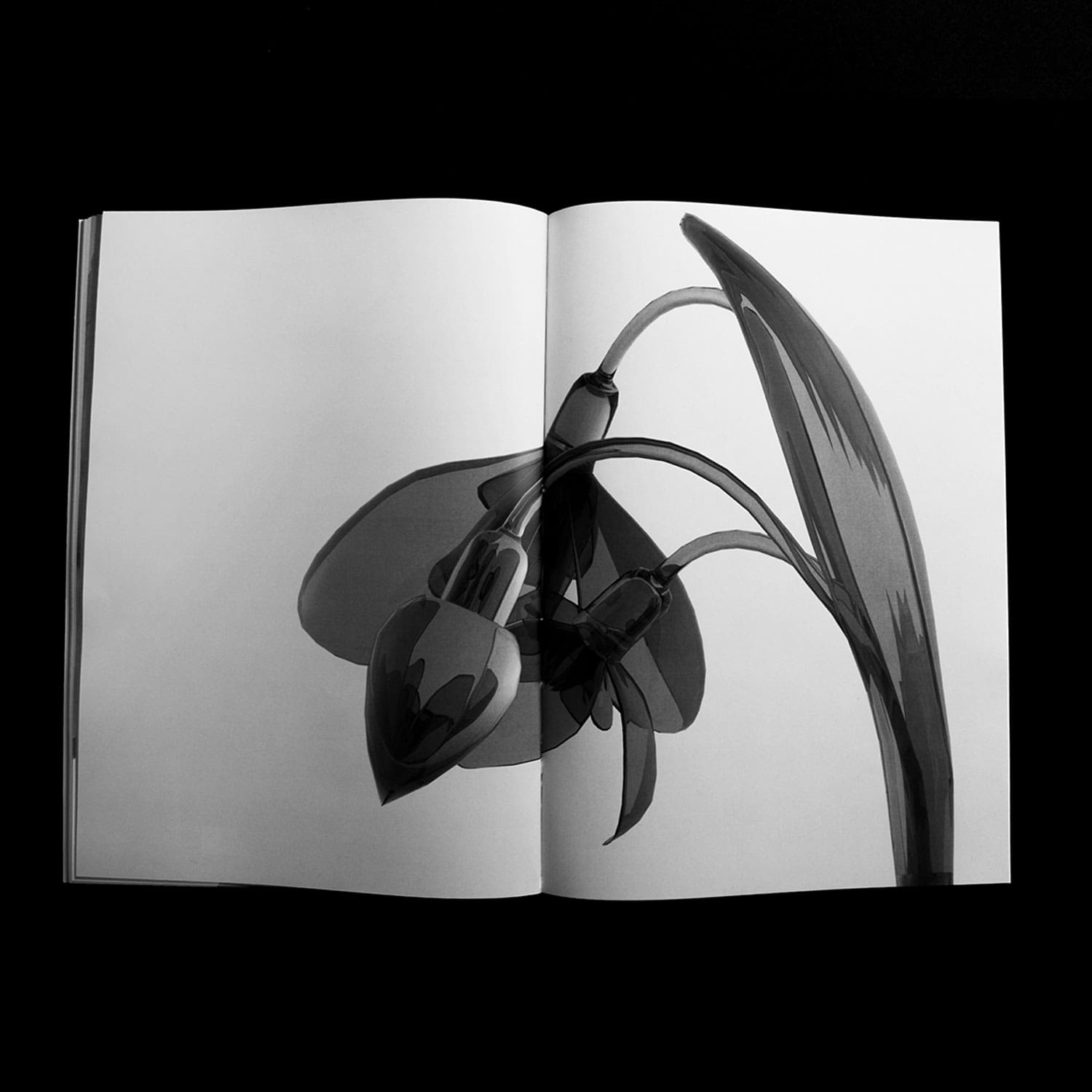
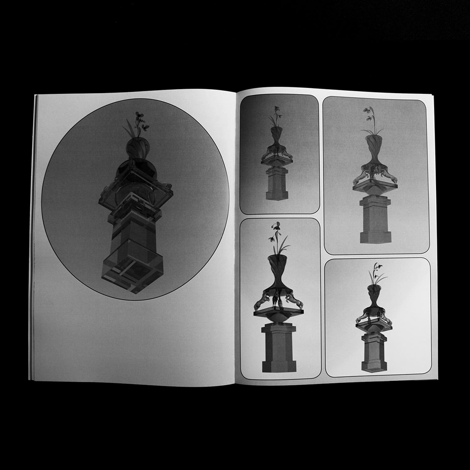
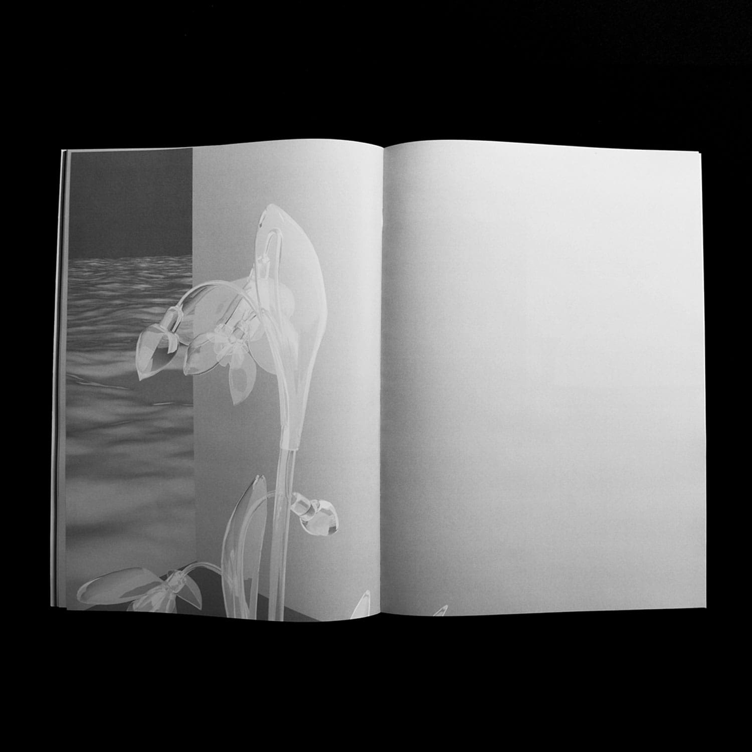
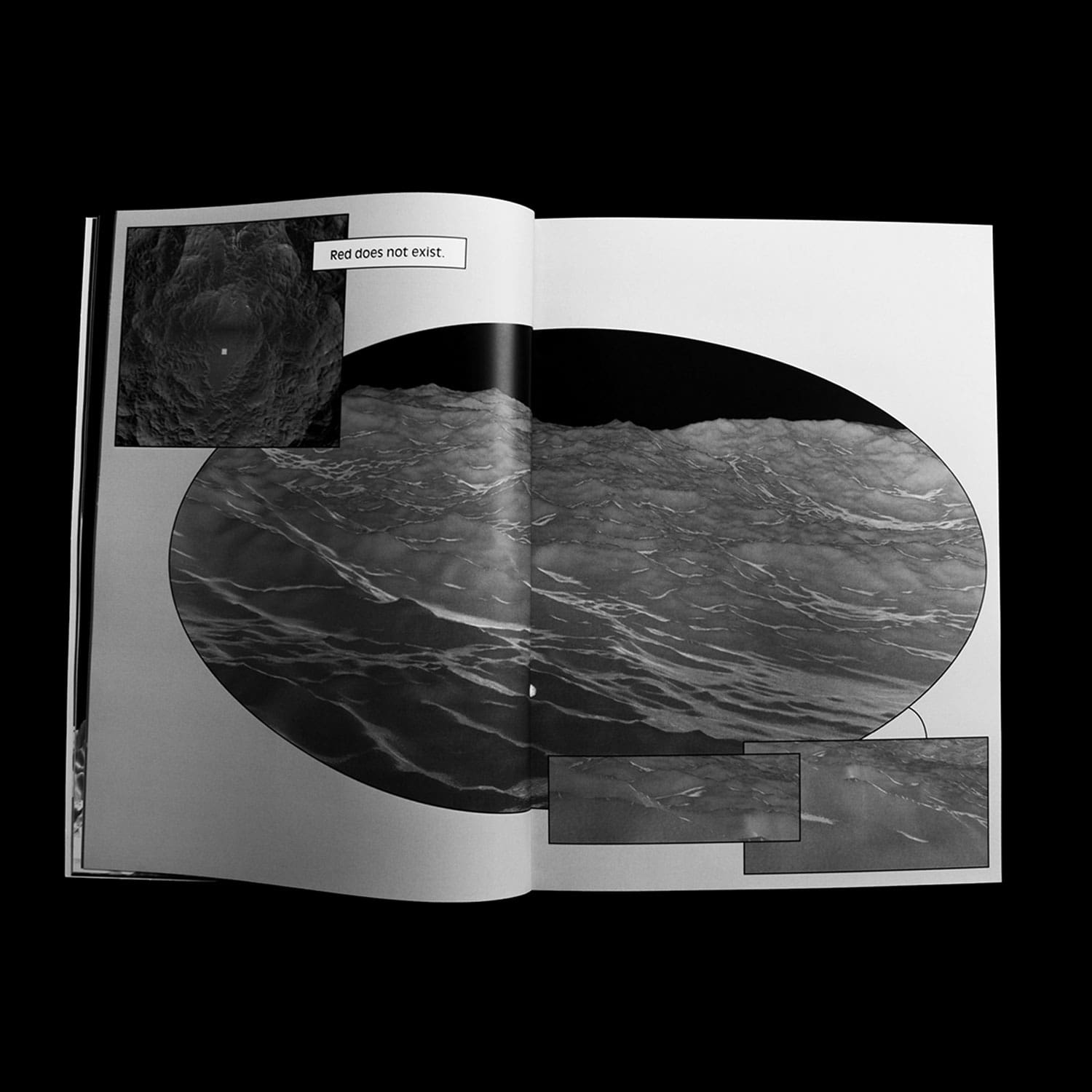
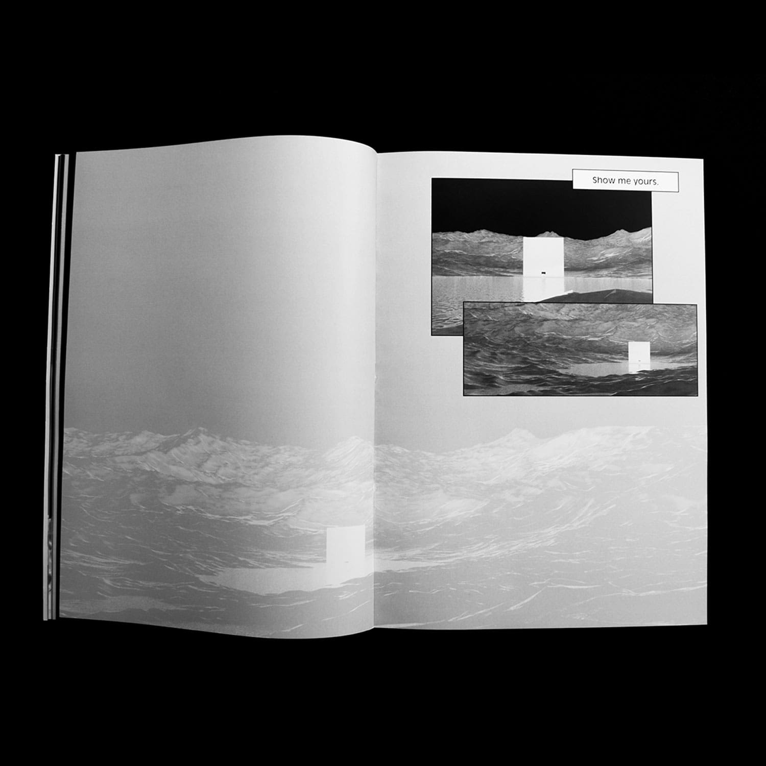
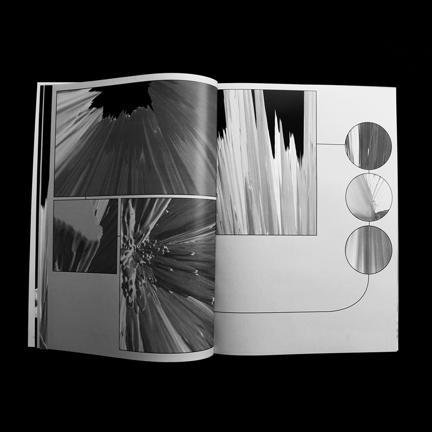
If colours are qualia (individual instances of subjective, conscious experience) — and thus escape language
by nature — can images fill the gap between speech and perception? A perceptive exploration of the colour
red.
Choreographer Portraits — Lucinda Childs
Editorial Design/ Type Design
2019, Publication, 135 pages, 220 × 285 mm, Collection of 12 signs and Posters (400 × 600 mm) in
collaboration with Hugo Le Corre
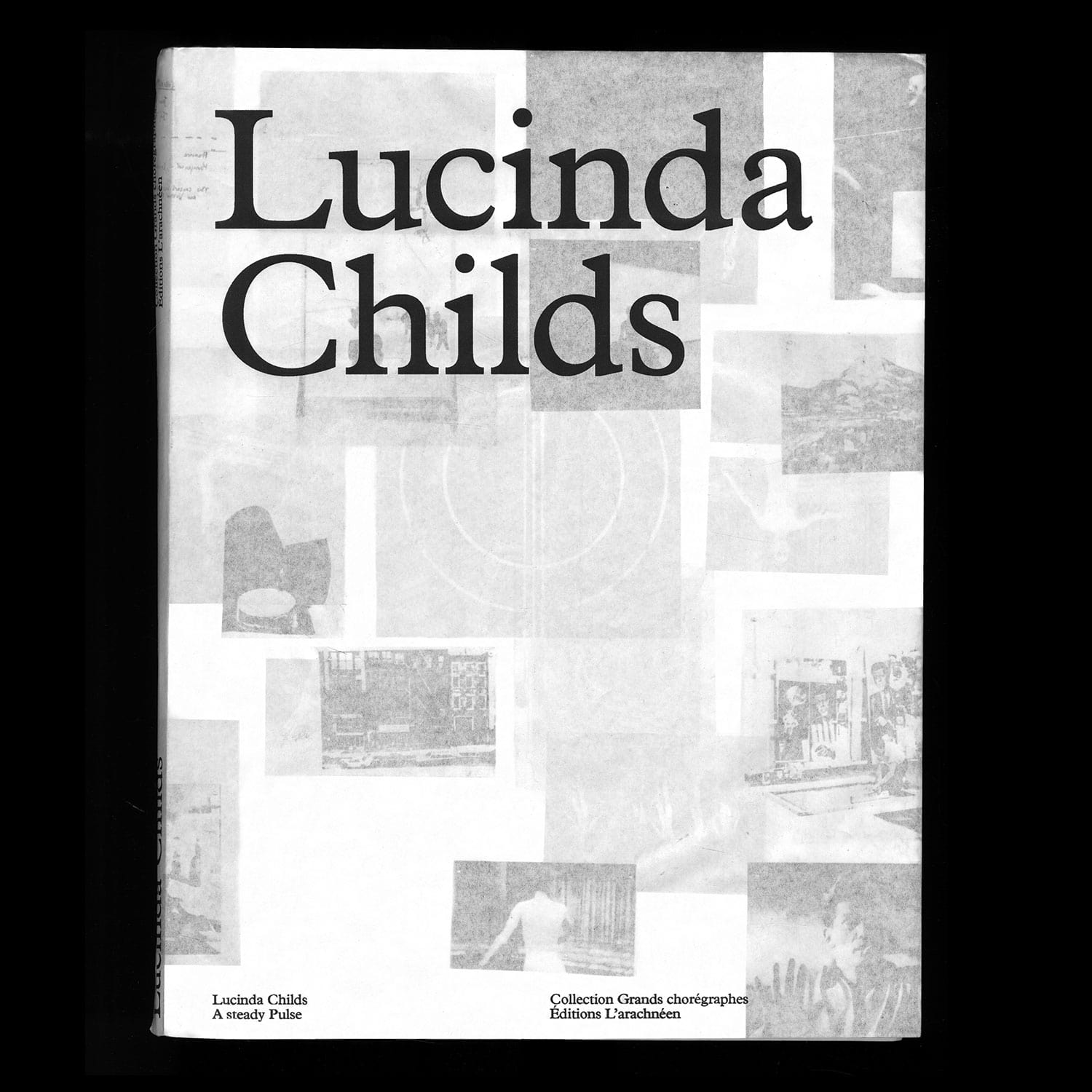
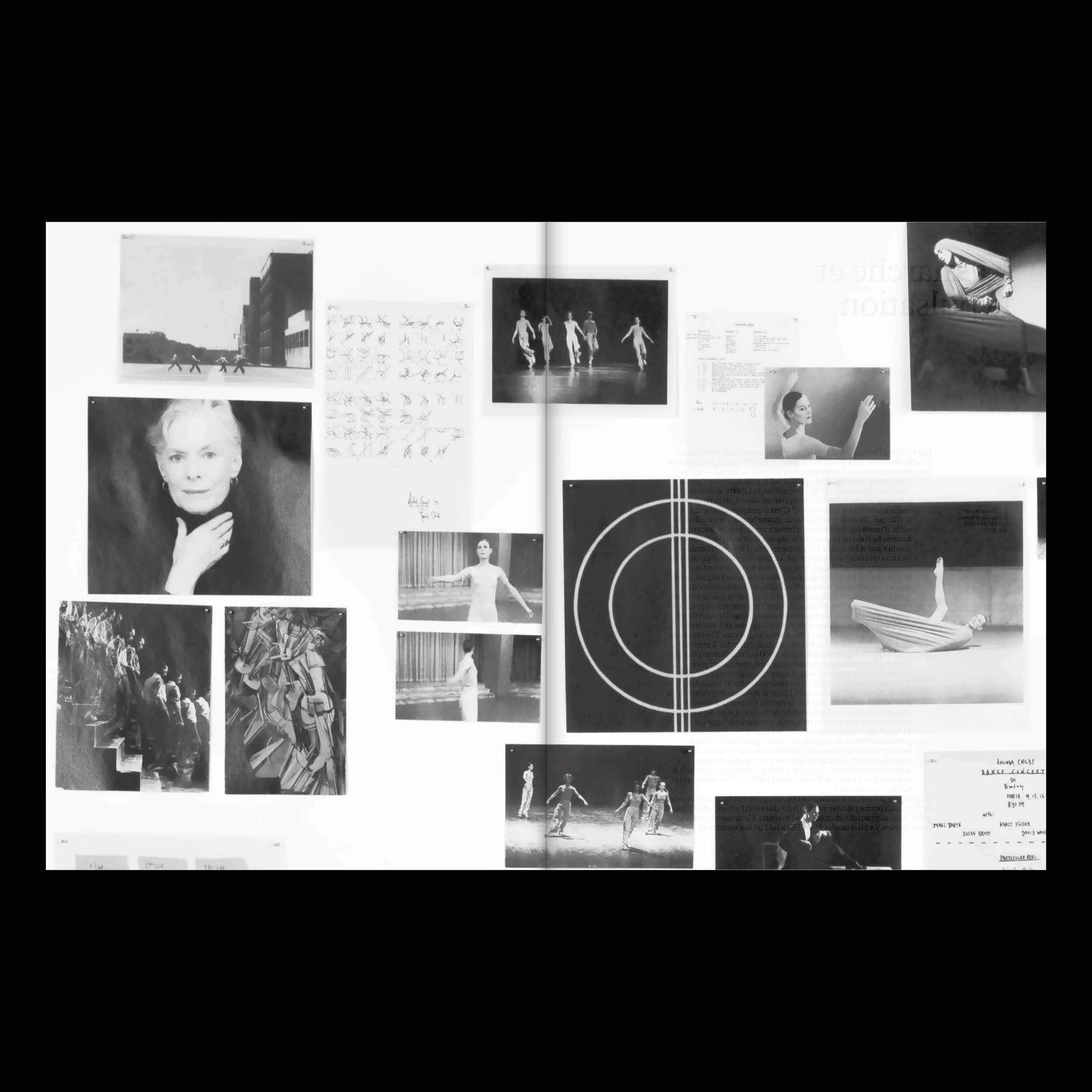
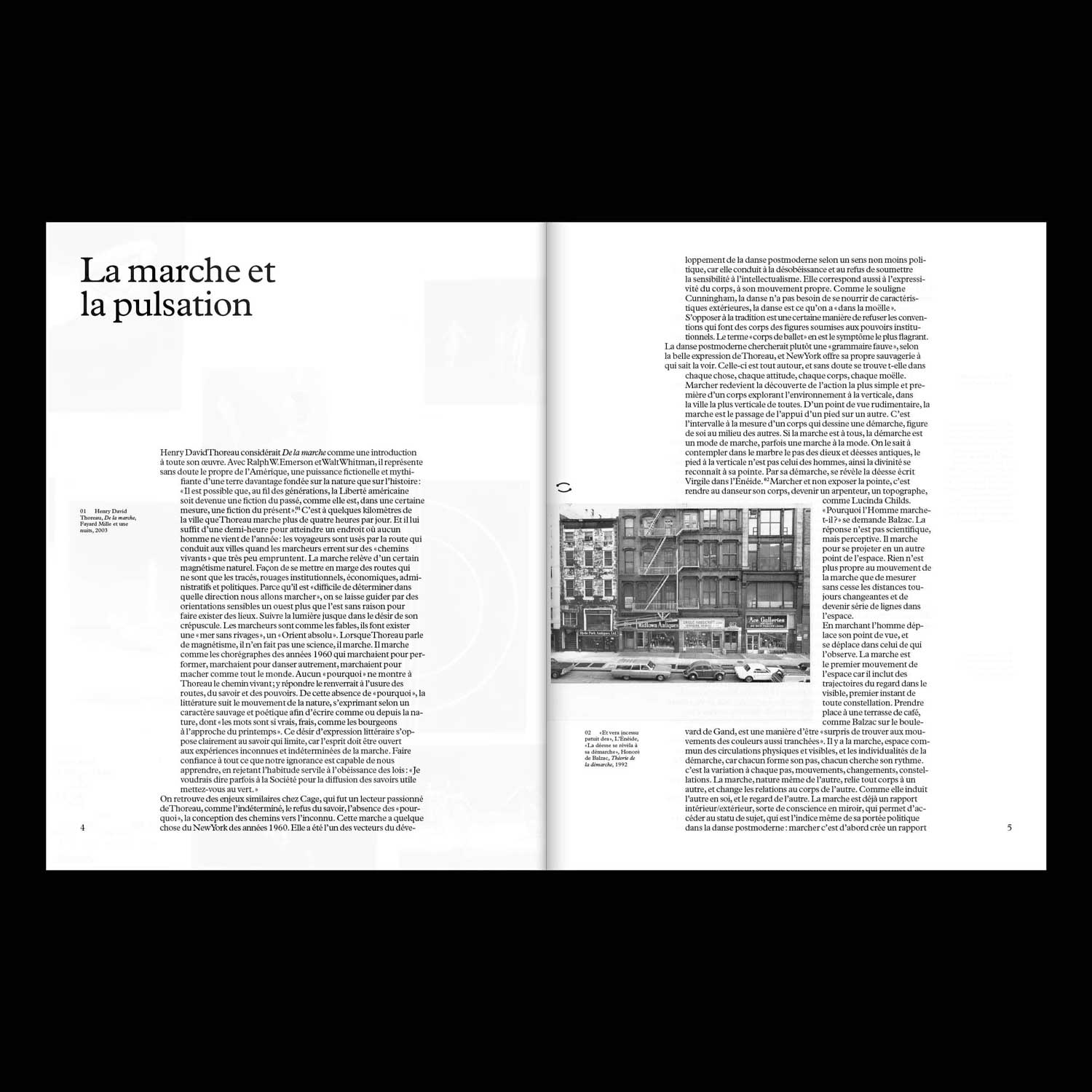
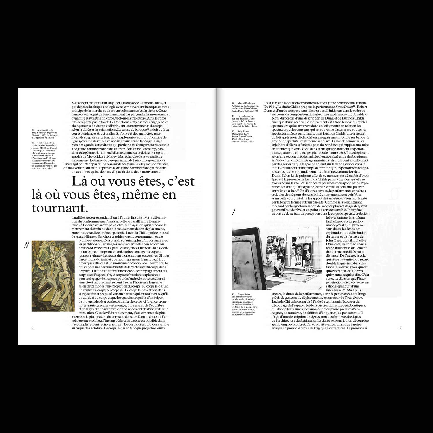
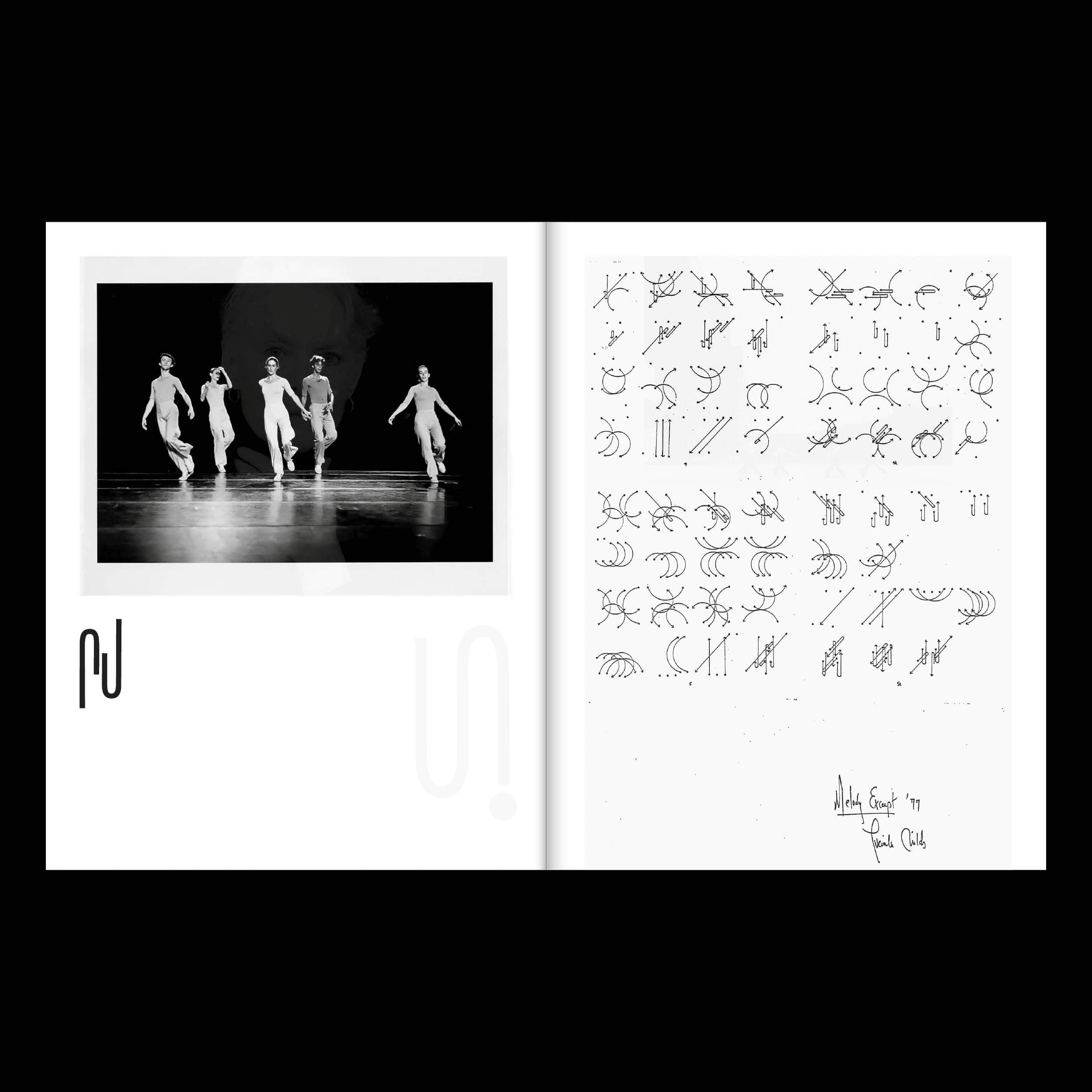
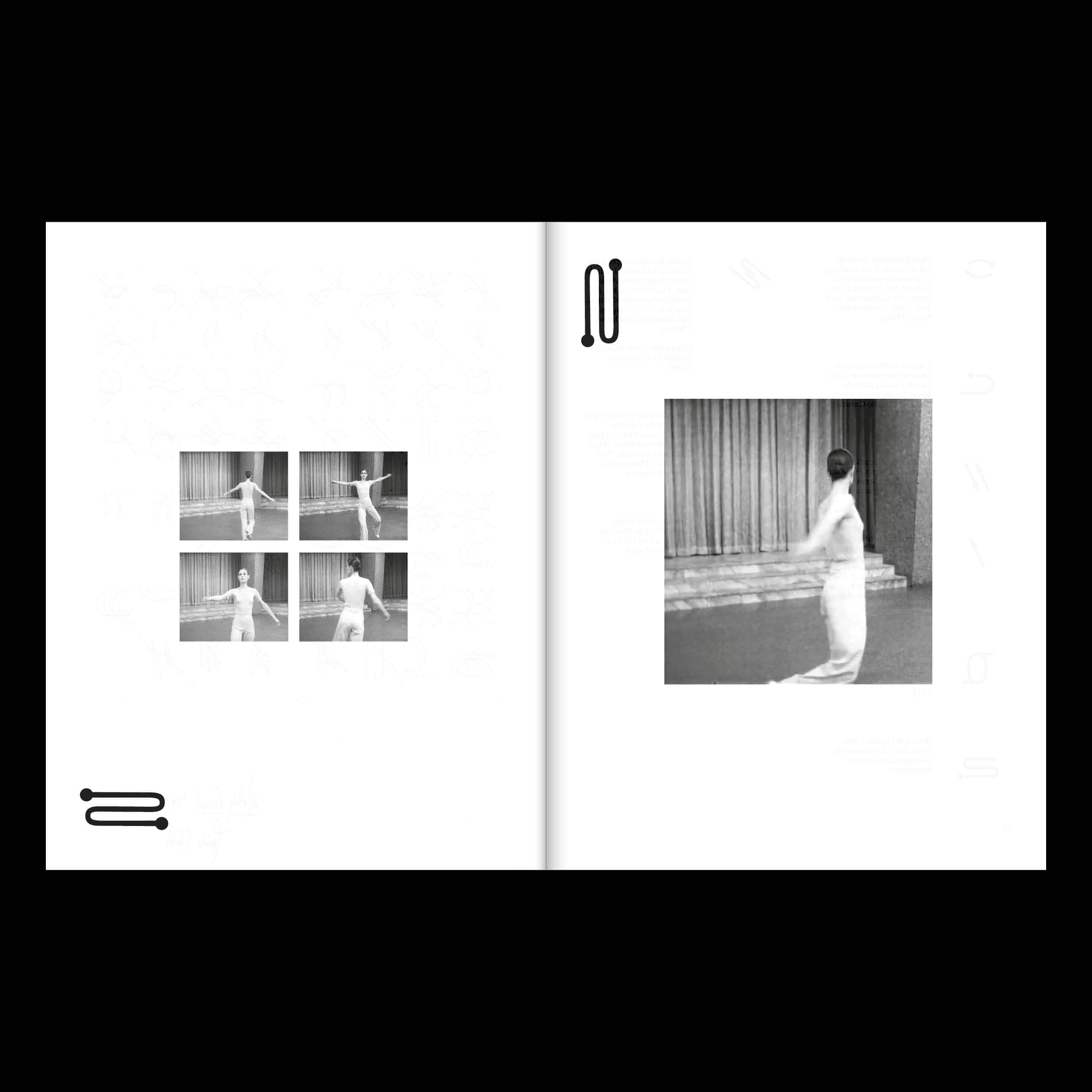
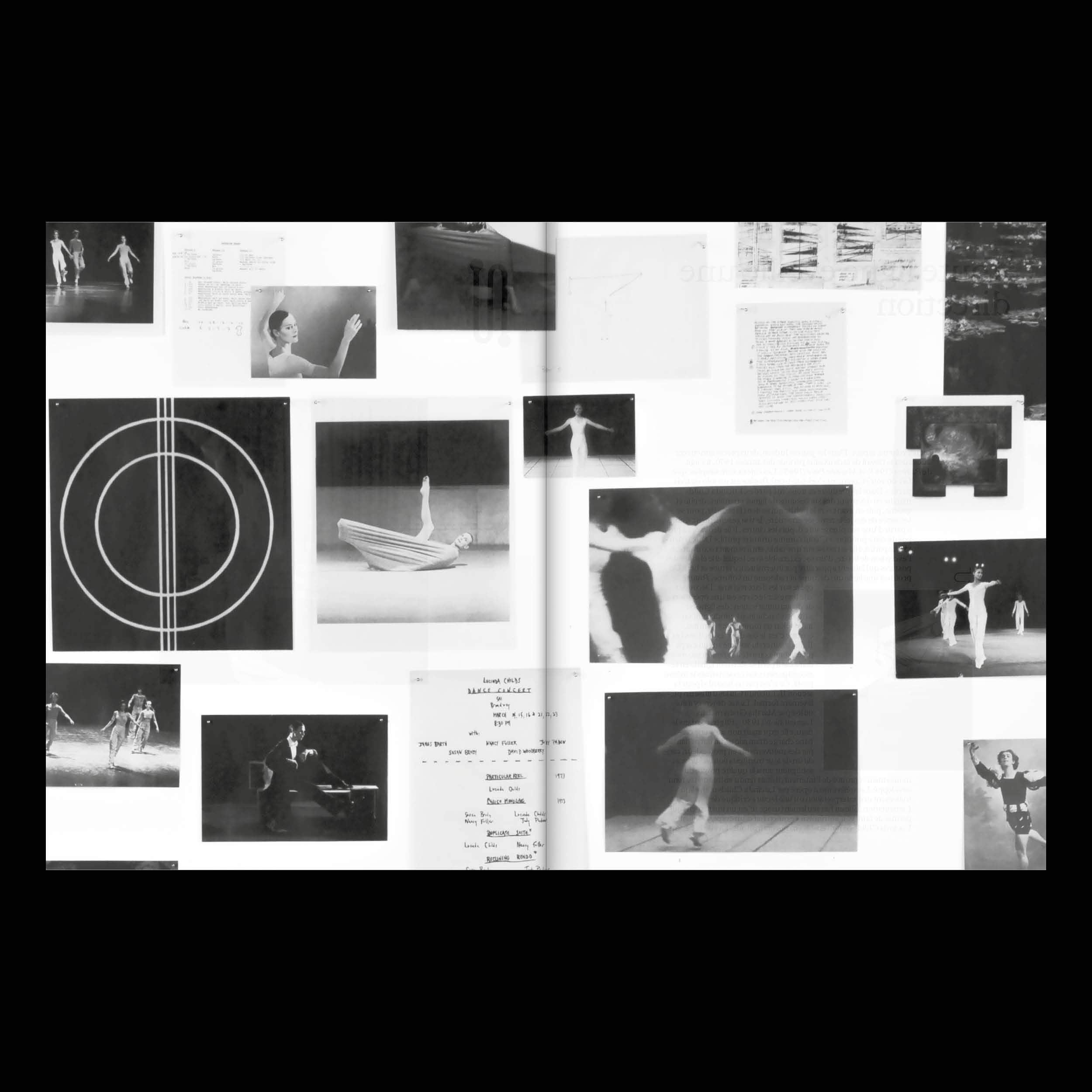
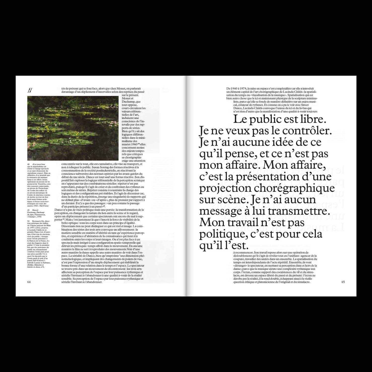
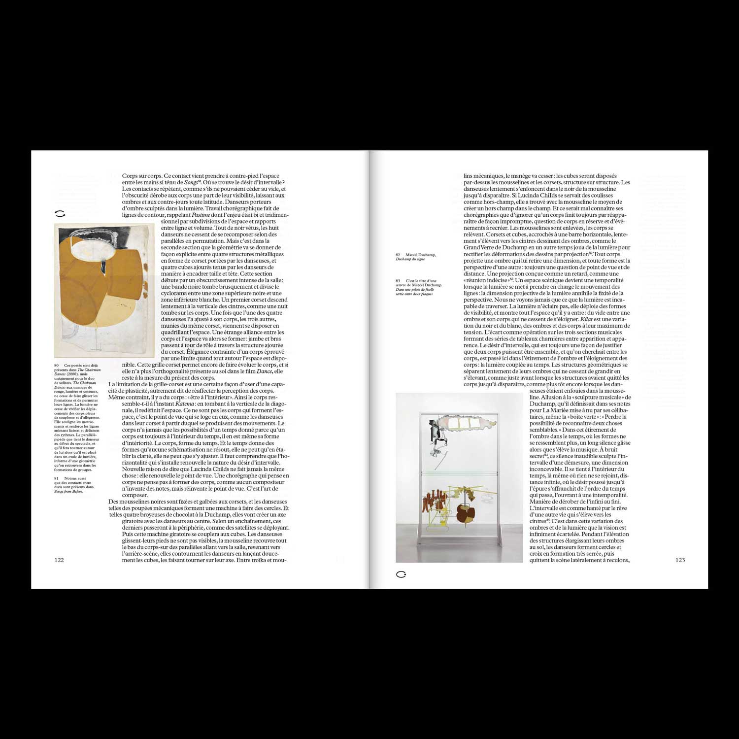
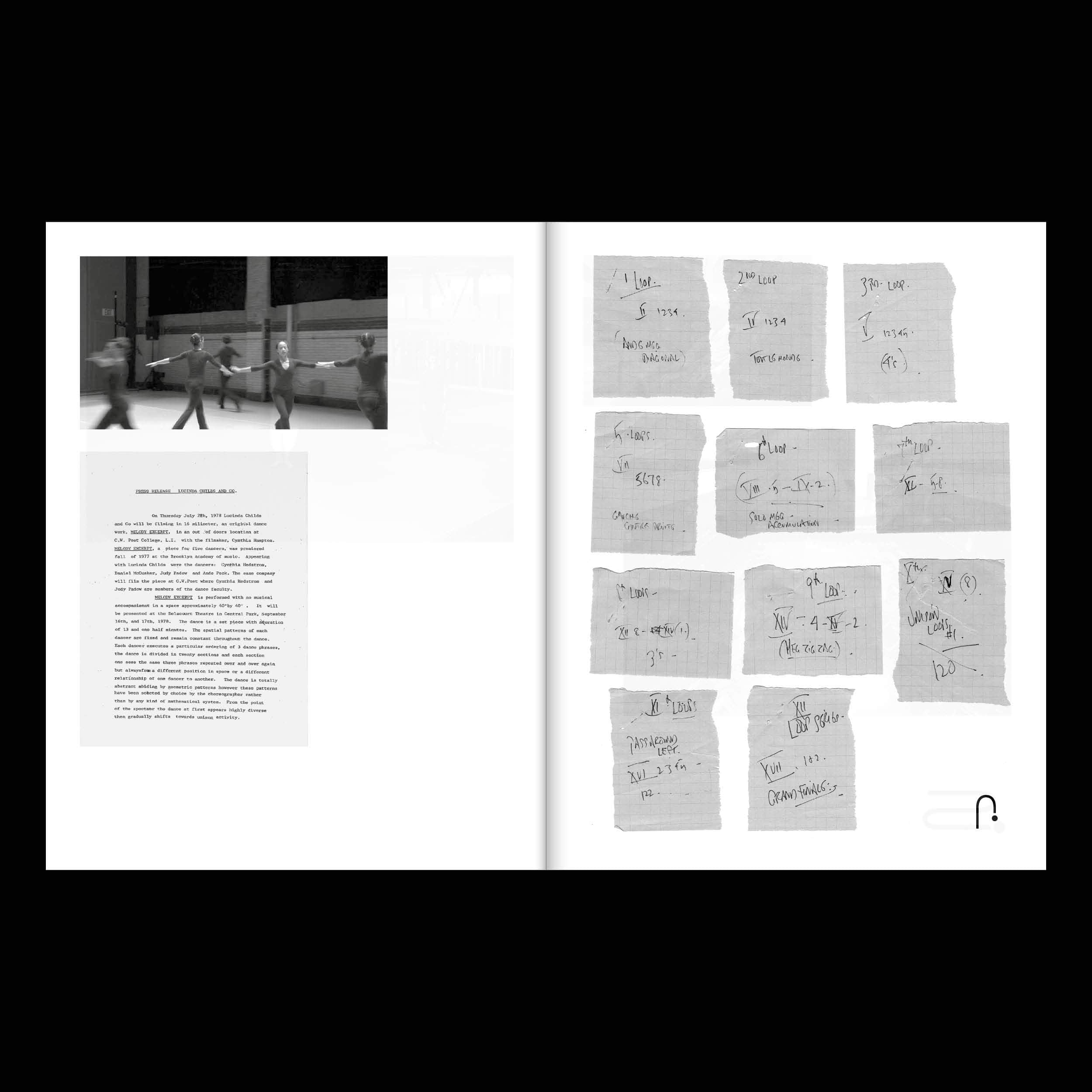
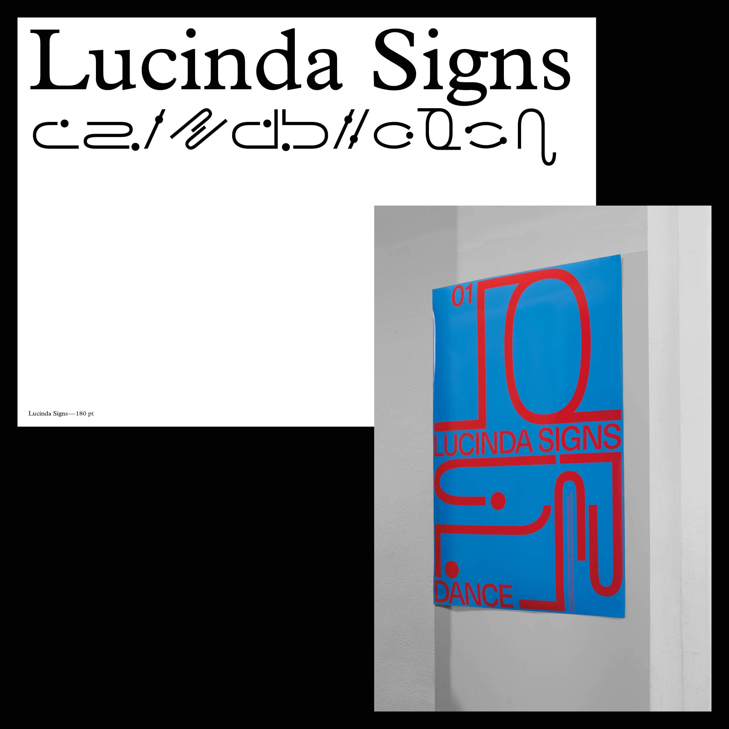
First piece of a collection dedicated to great choreographers of the late twentieth century, this
publication focuses on Lucinda Childs' life-long work and collaborations.