Comment j’ai appris à ne plus m’en faire et à aimer la révolution (Horologium Florae)
Website/ Coding
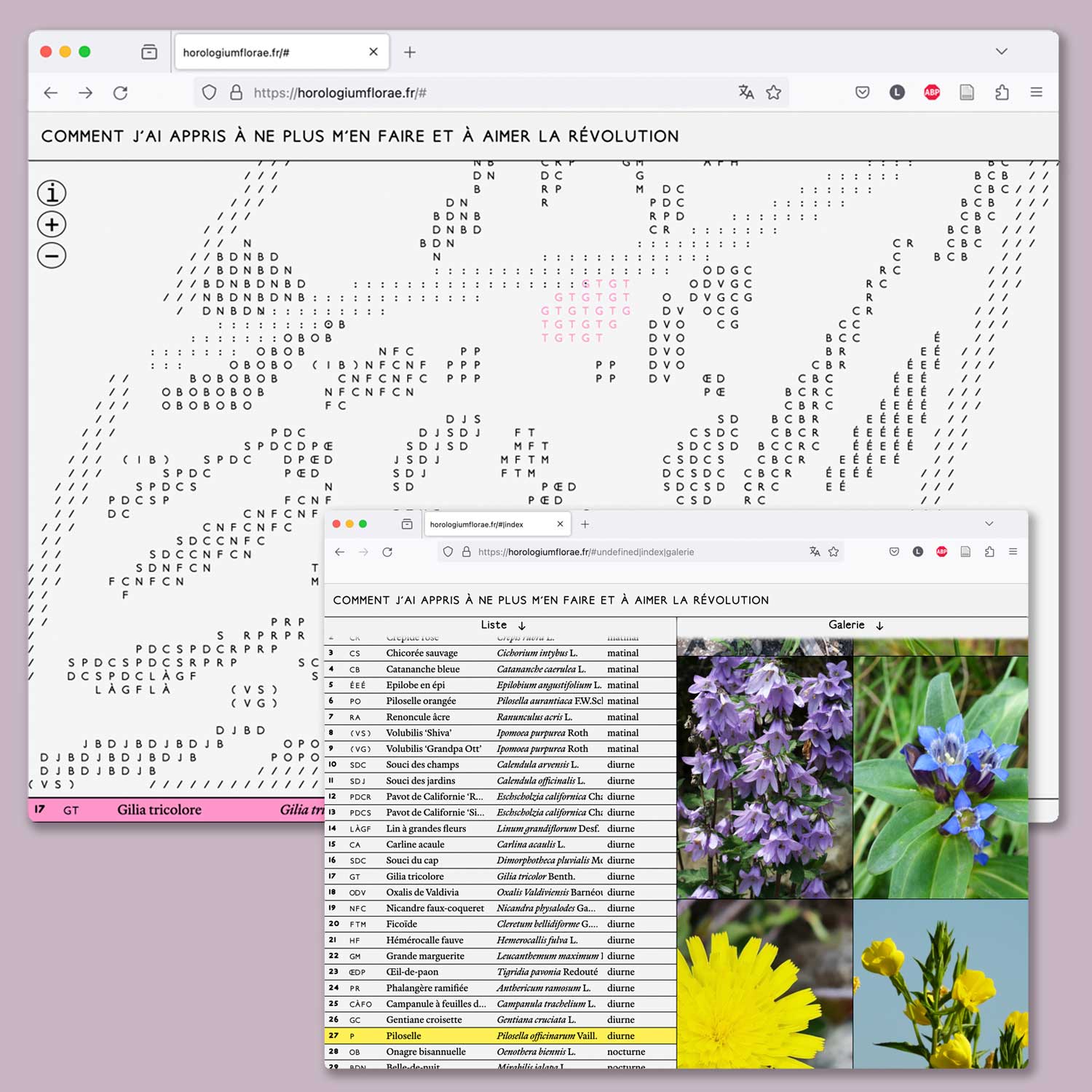
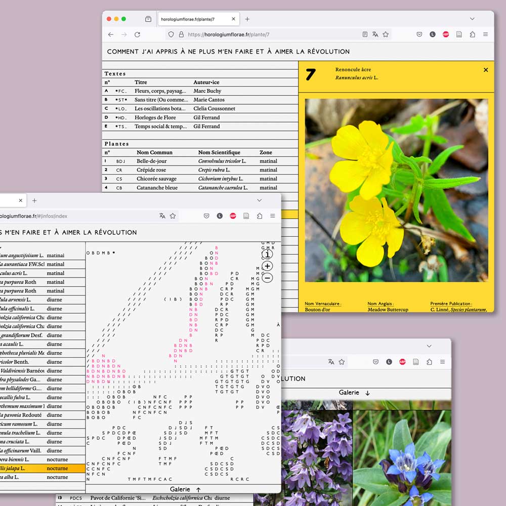
Website-documentation of the in situ piece “Comment j’ai appris à ne plus m’en faire et à aimer la révolution” by Marc Buchy, in Besançon, France.
The Amateur Feminist Library
Research/ coding/ installation/ editorial
2023
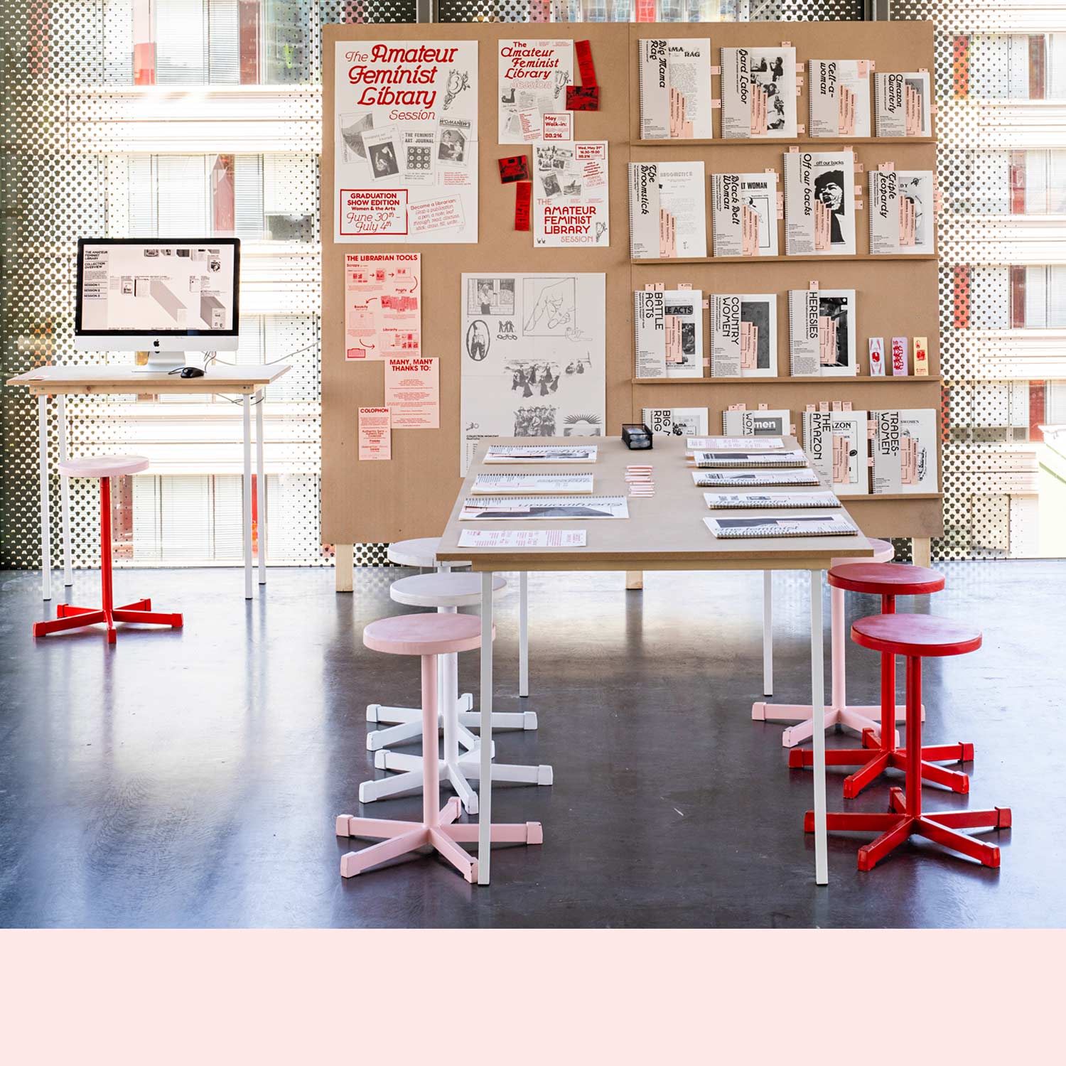
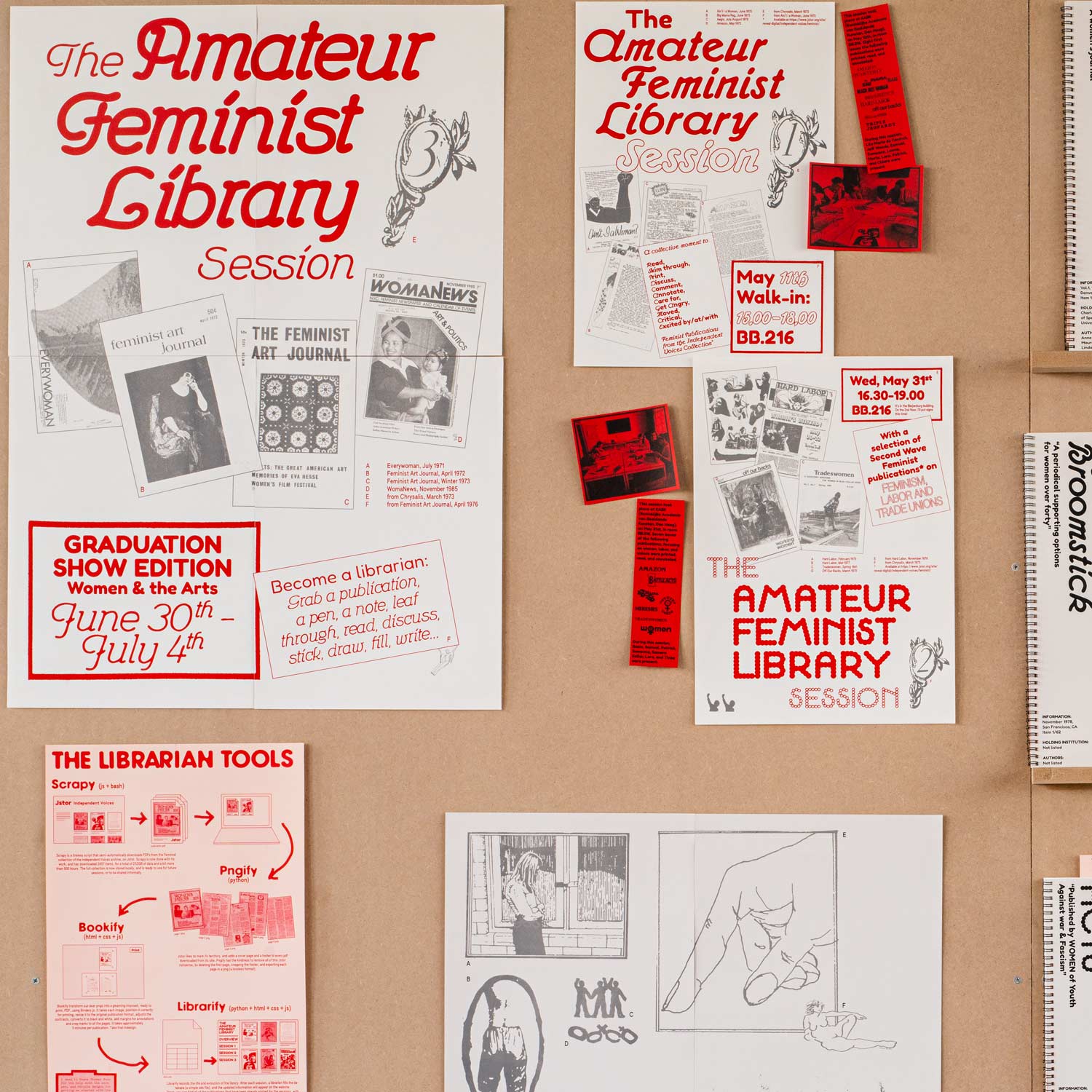
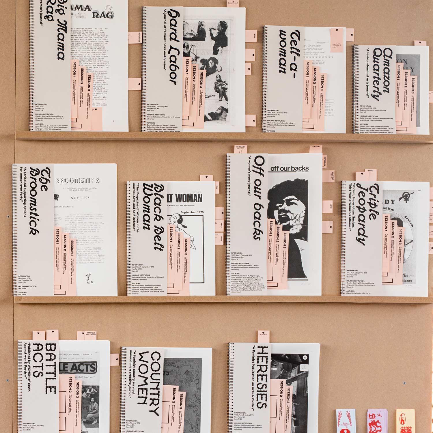
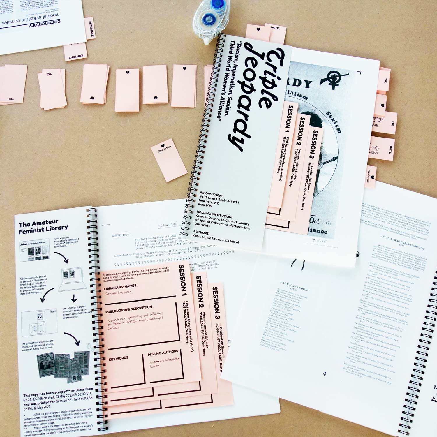
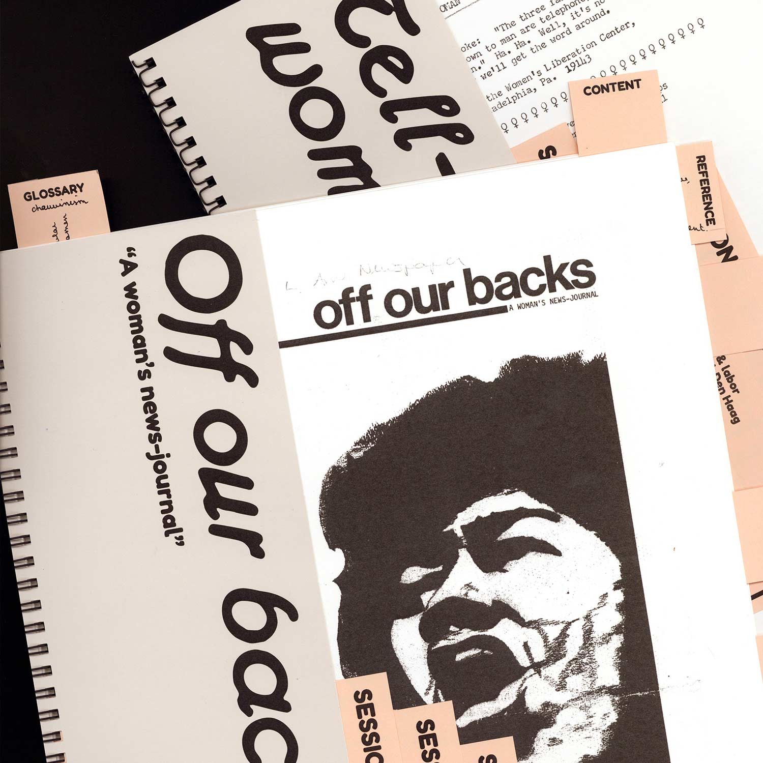
Feminism is a fragile archive, fragmentary, scattered here and there, confined in boxes, attics, and memories. The Feminist Amateur Library aims to bring these shatters and splatters into the physical world, allowing us to touch them and to be touched by them*. Departing from a digital collection of North-American feminist periodicals (dating from 1968-1992), the library decided to take this collection into its own hands, or rather, to put it in the hands of communities, aiming to make these publications more accessible.
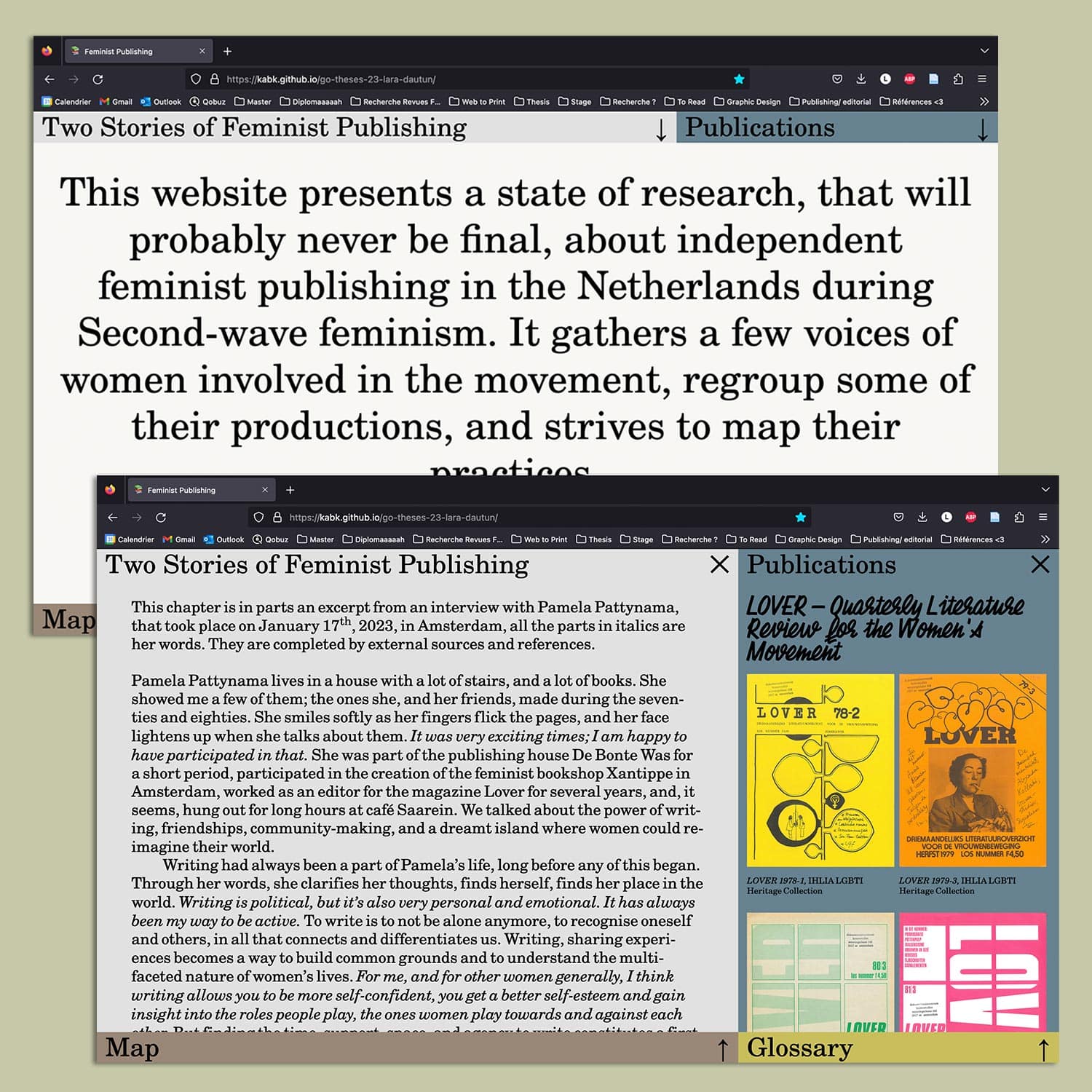
Bachelor thesis and documentation. This research focused on the Women in Print Movement in the Netherlands during the second feminist wave. Its aim was to shed light on histories unjustly excluded from the book history, highlighting their relevance and resonances in contemporary design and publishing practices. Through the analysis of the movement's archives, but also through interviews with its participants, emerge a rich and varied reservoir of ideas and approaches for more sustainable, inclusive and emancipatory publishing practices, but also stories of love, friendship and solidarity.
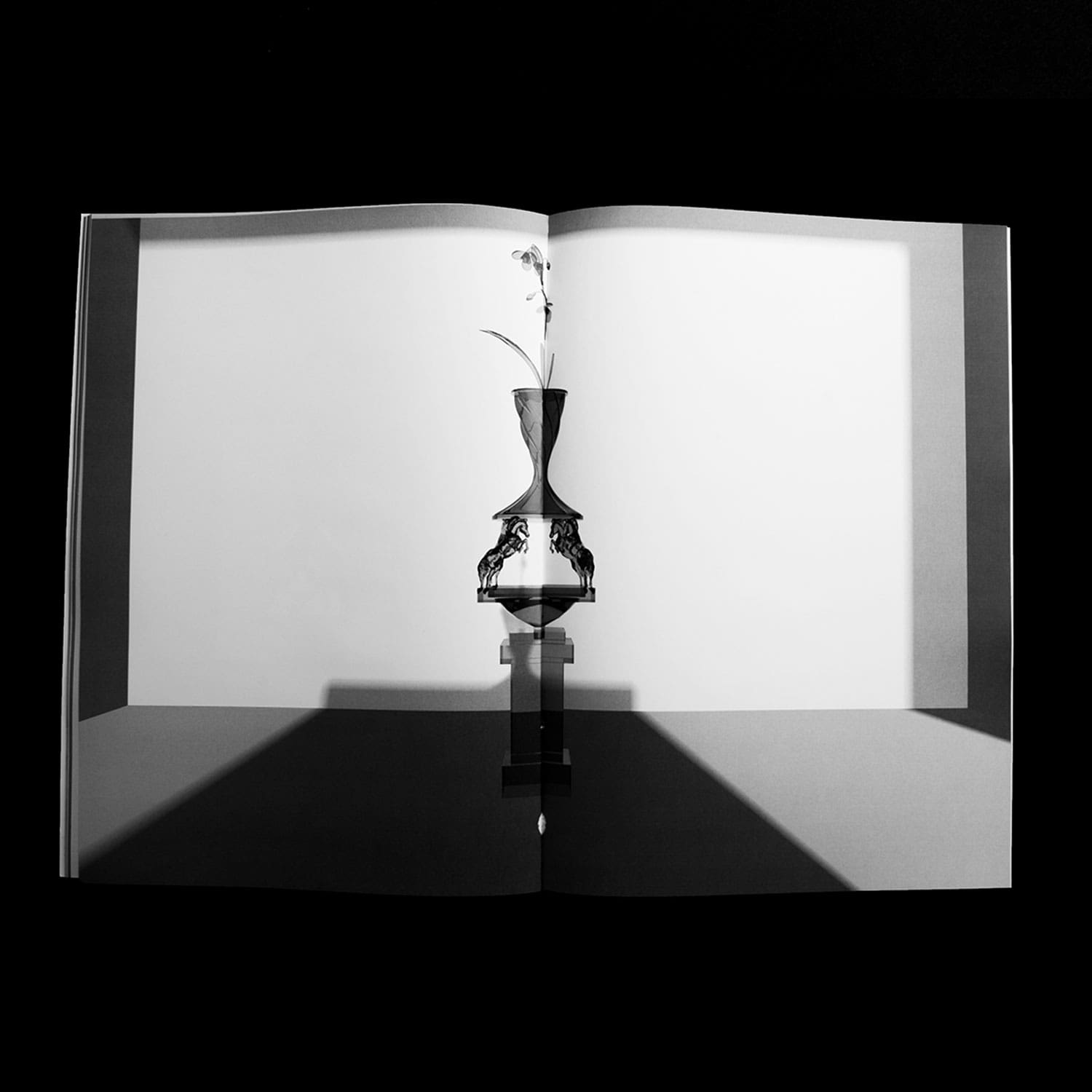
Joke Smit & Jos Brink Prijs
Editorial Design
2023
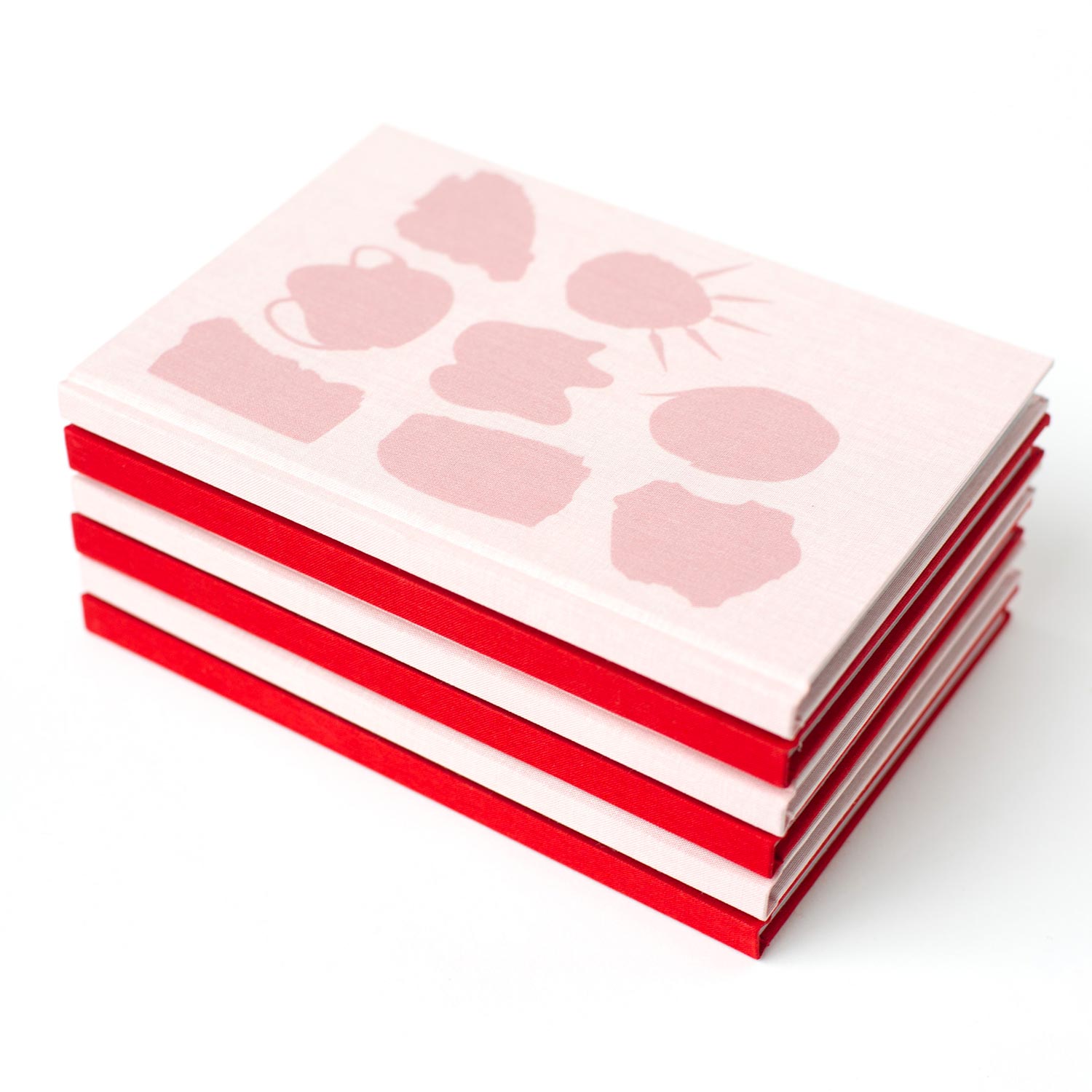
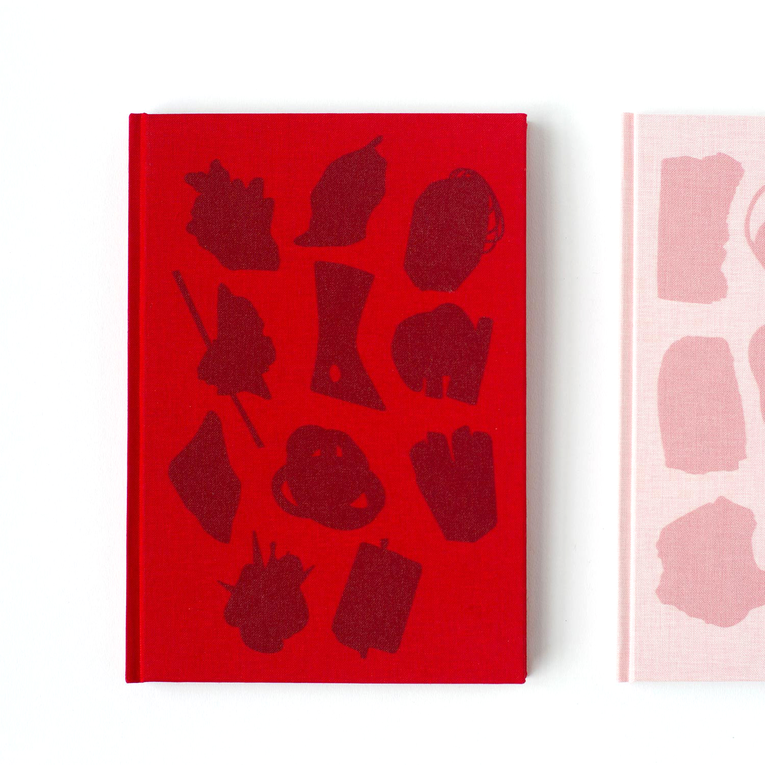
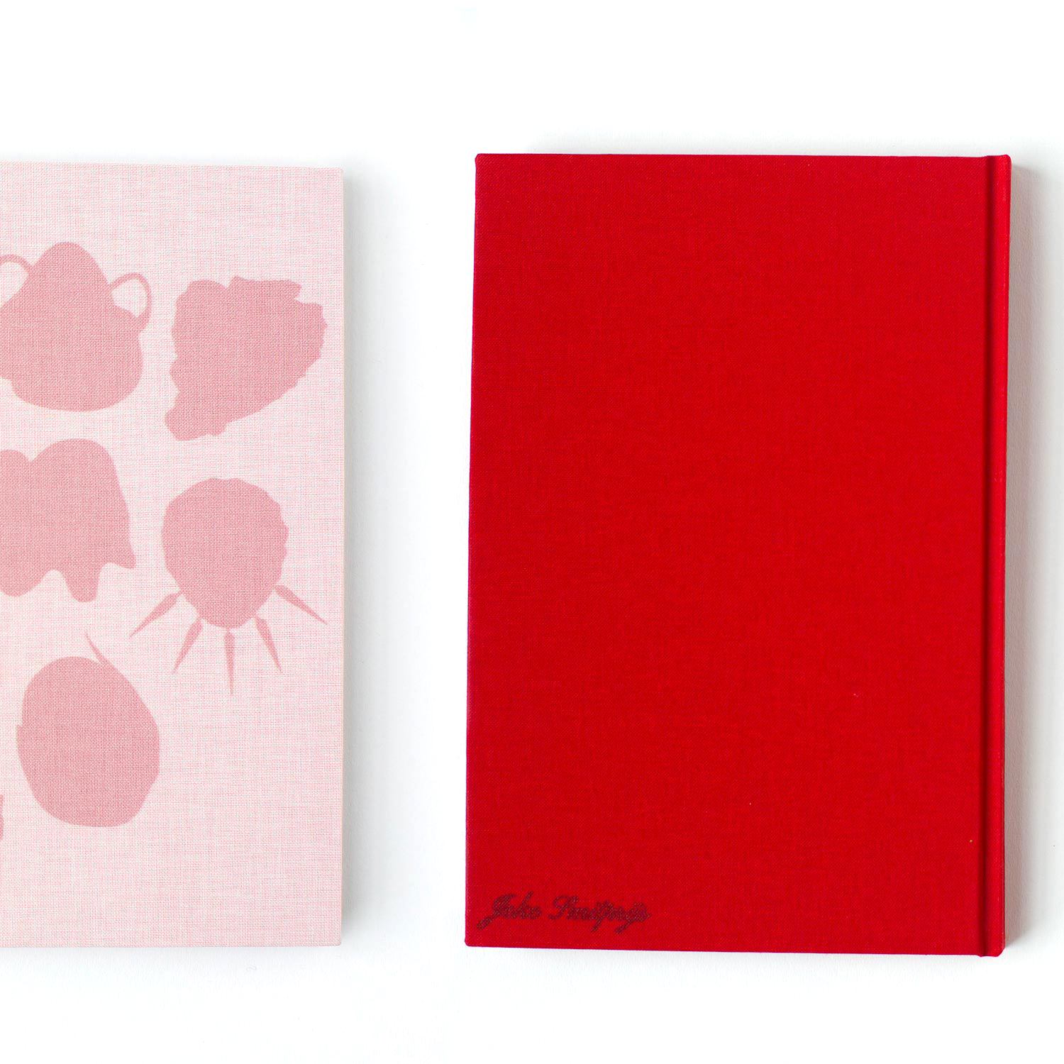
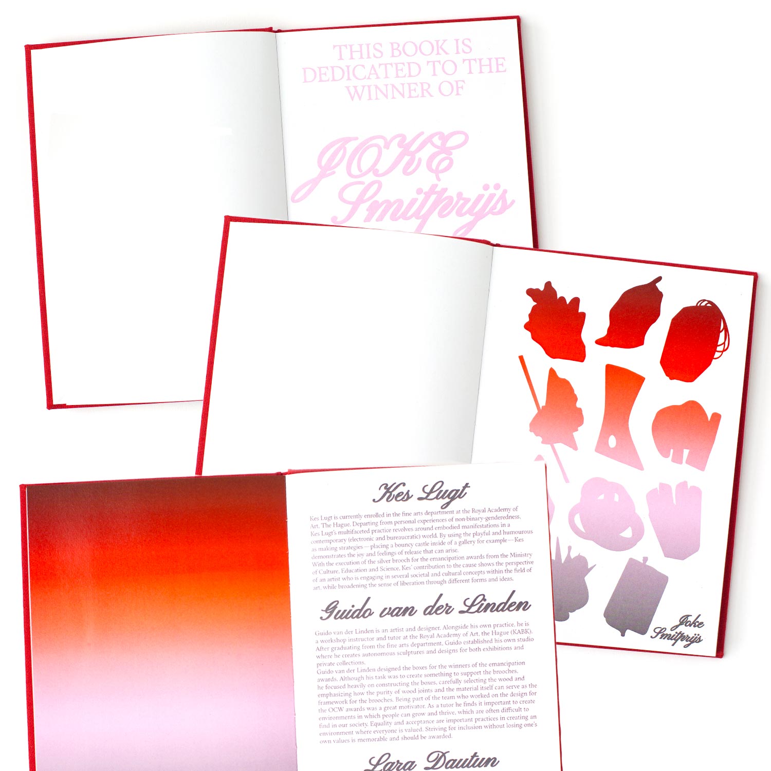
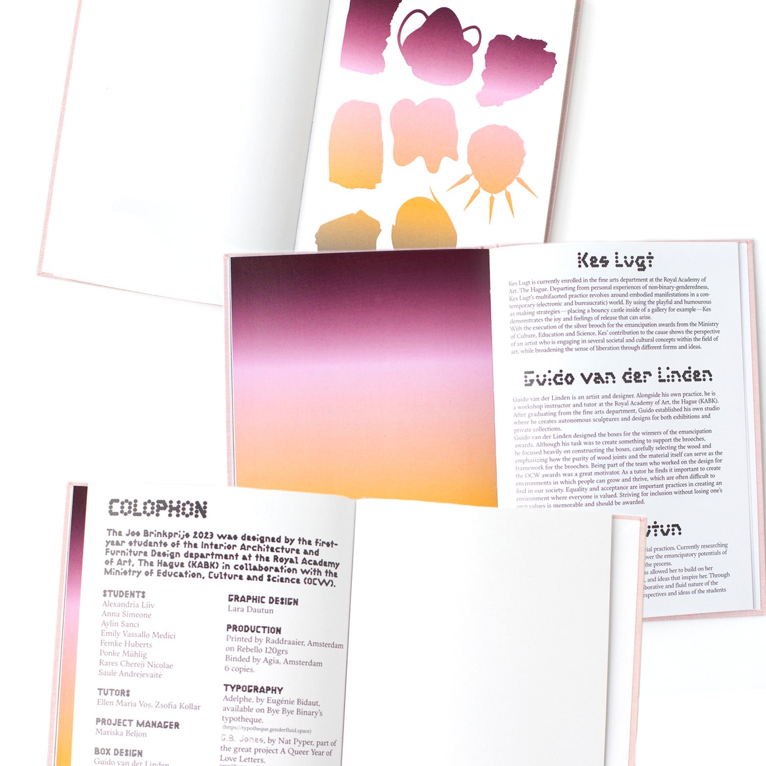
Two books presenting the students’ processes and proposals for the trophies awarded to the winners of the Joke Smit Prijs (Women’s Emancipation Prize), and the Jos Brink Prijs (LGBTQIA+ Emancipation Prize), granted by the Dutch Ministry of Education, Culture and Science (OCW).
Agrafes & bouts de ficelles
Editorial Design
2022, in collaboration with Lissa Choukrane and Loraine Furter, 120 copies, 240 x 155 mm
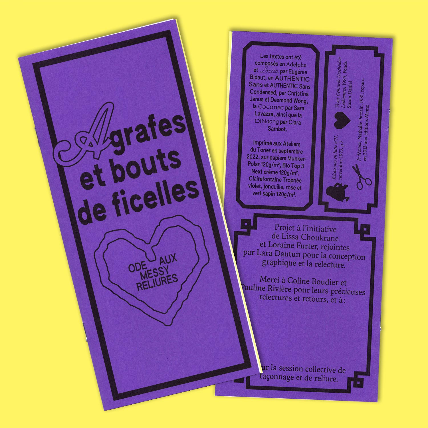
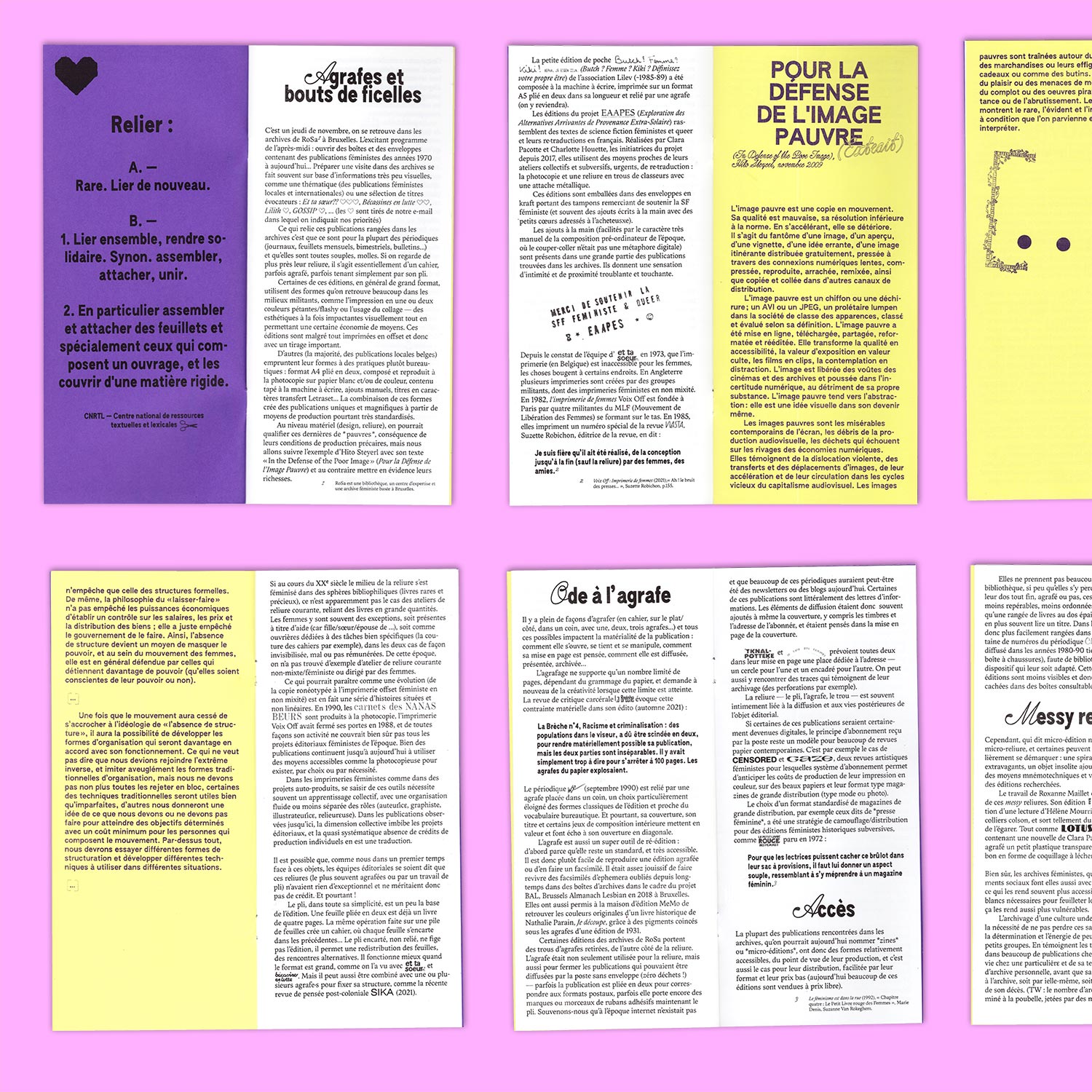
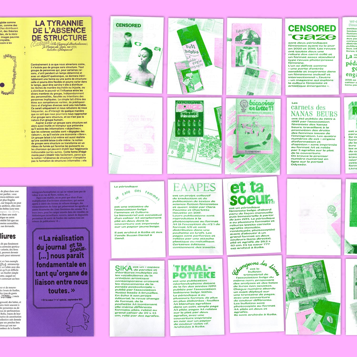
Design and production for a research project by Lissa Choukrane and Loraine Furter on the bindings of Belgian feminist periodicals: *Agrafes & bouts de ficelles* presents a research on the soft, messy bindings of Belgian feminist publications contained in local archives.
Serendipitous Editorial Encounters Publishing
Editorial Design/ Editing
Potential Bookmarks, 115 × 205 mm, 180 pages,
The Metabooxtual Society, 115 × 170 mm, 55 pages,
Art which can’t be Art, 105 × 205 mm, 8 pages
The Metabooxtual Society, 115 × 170 mm, 55 pages,
Art which can’t be Art, 105 × 205 mm, 8 pages
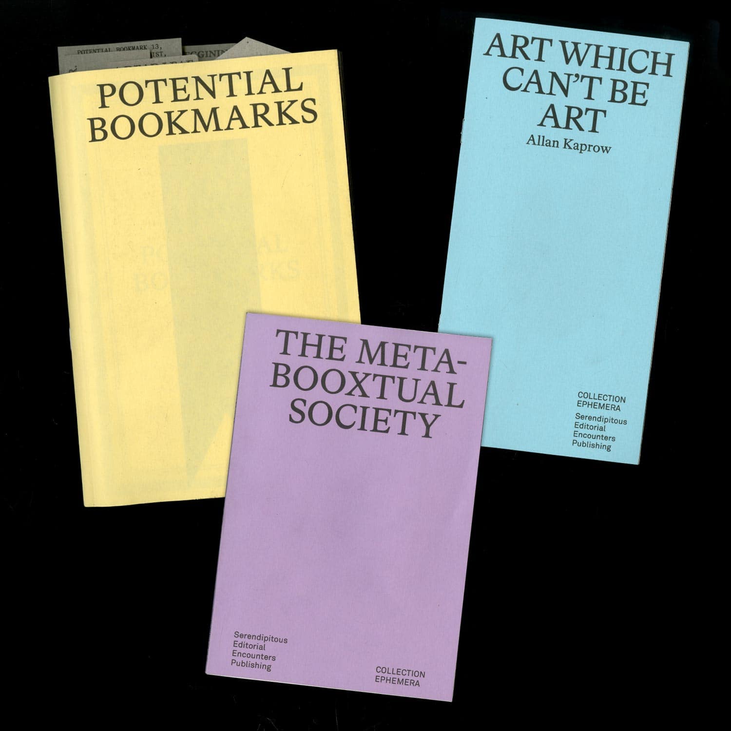
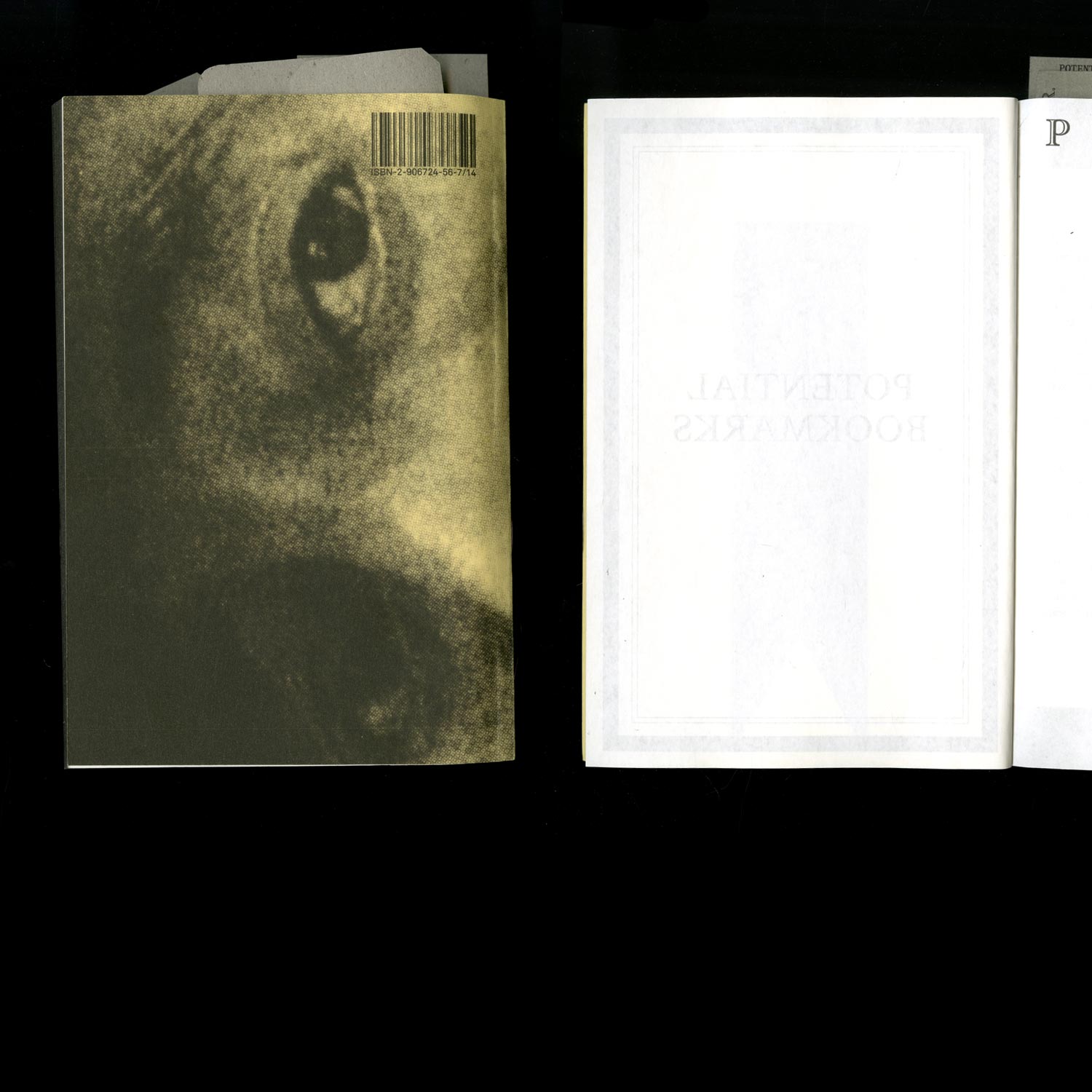
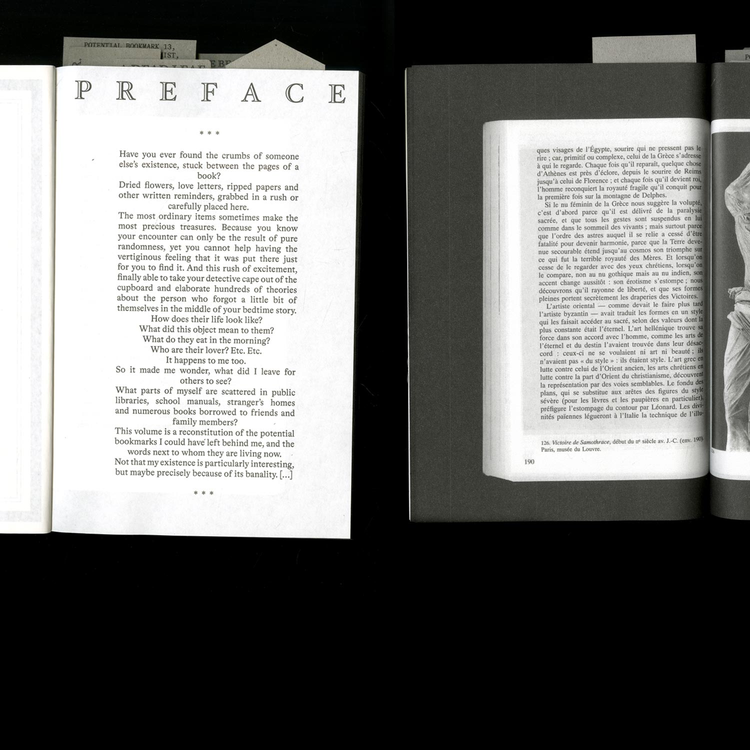
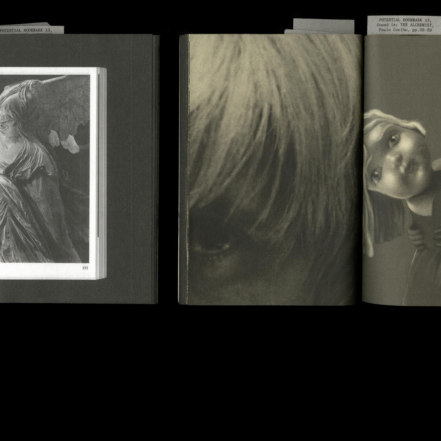
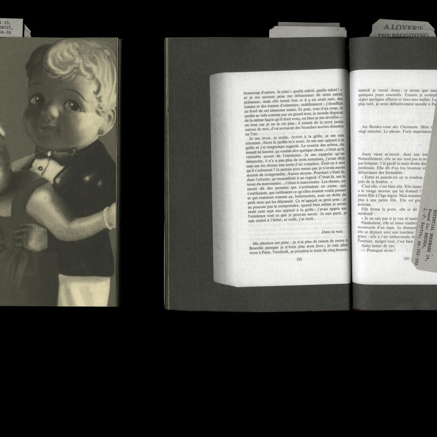
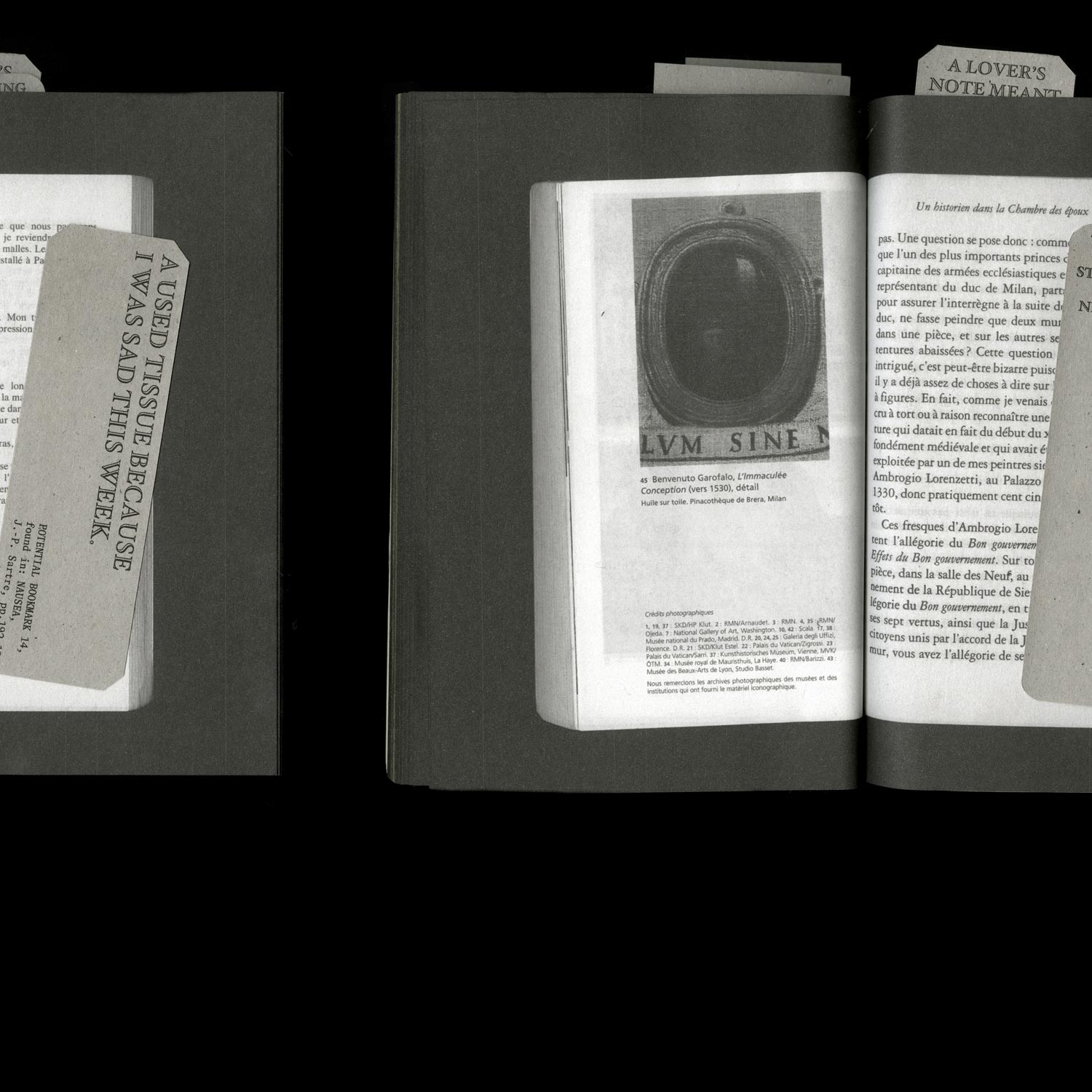
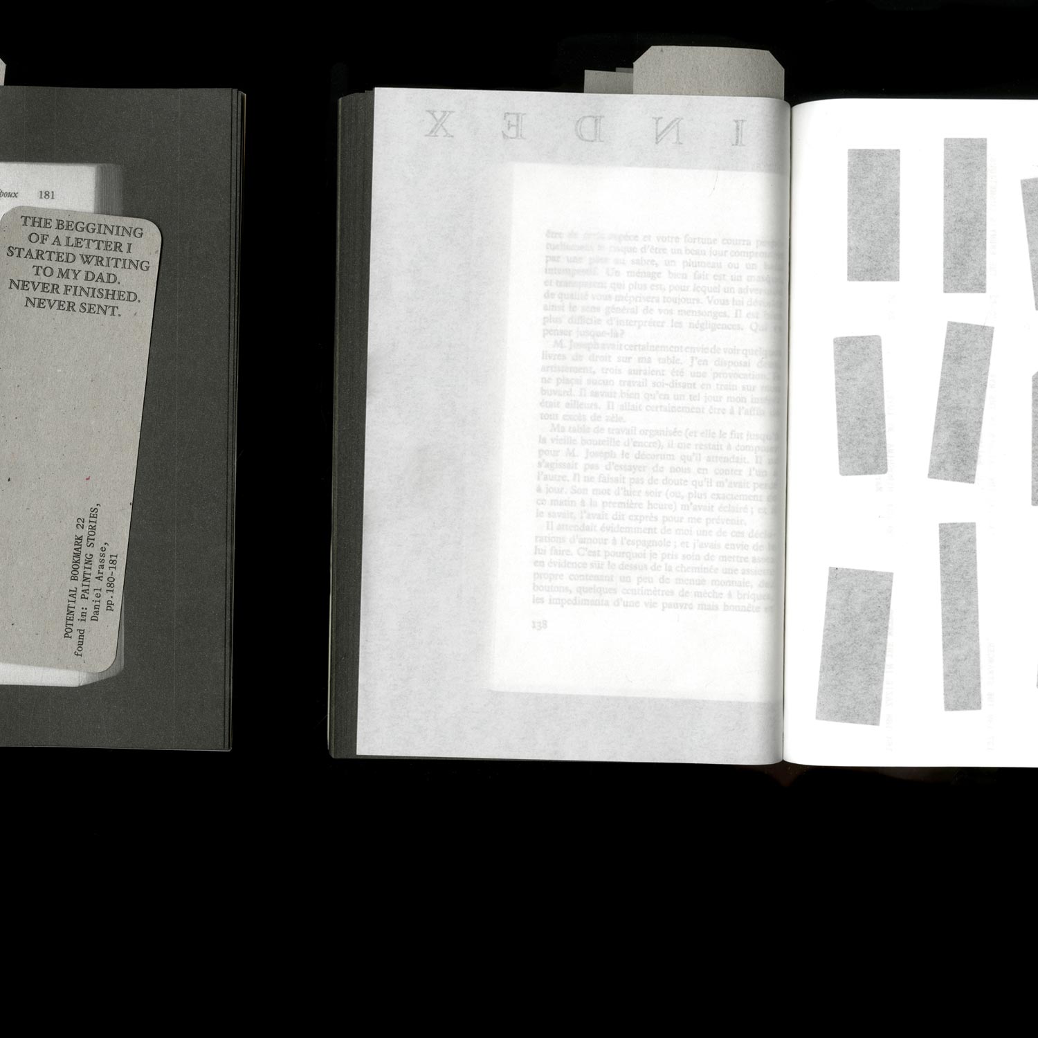
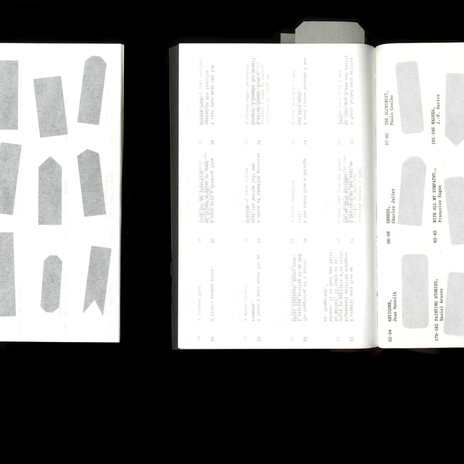
A series of books published by the (fictional) publishing house Serendipitous Editorial Encounters, specialising in the various objects that people forget, or deliberately leave in books.
De Lacrymarum Regia
(The Unfinished and approximate Palace of Tears)
Typography/ Identity
2022, 150 x 150 cm
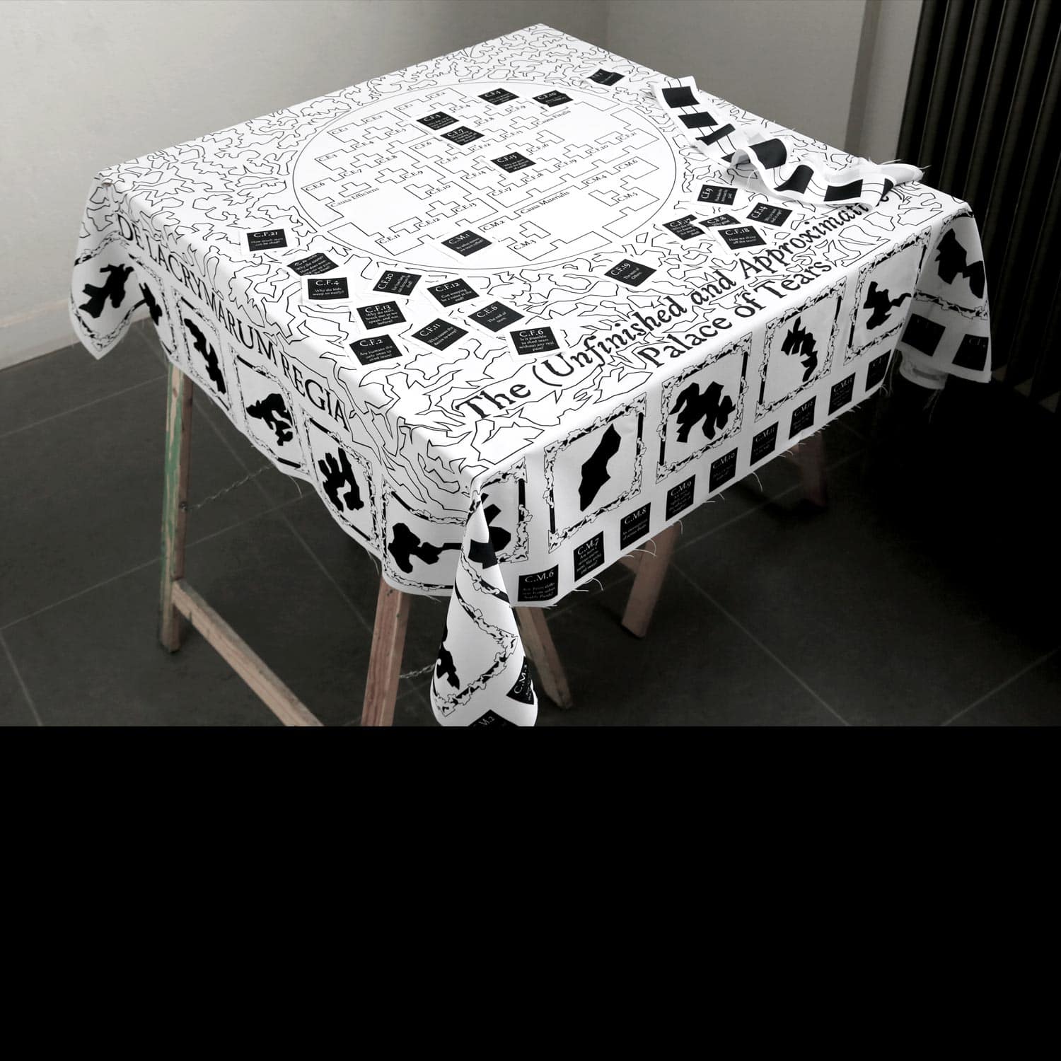
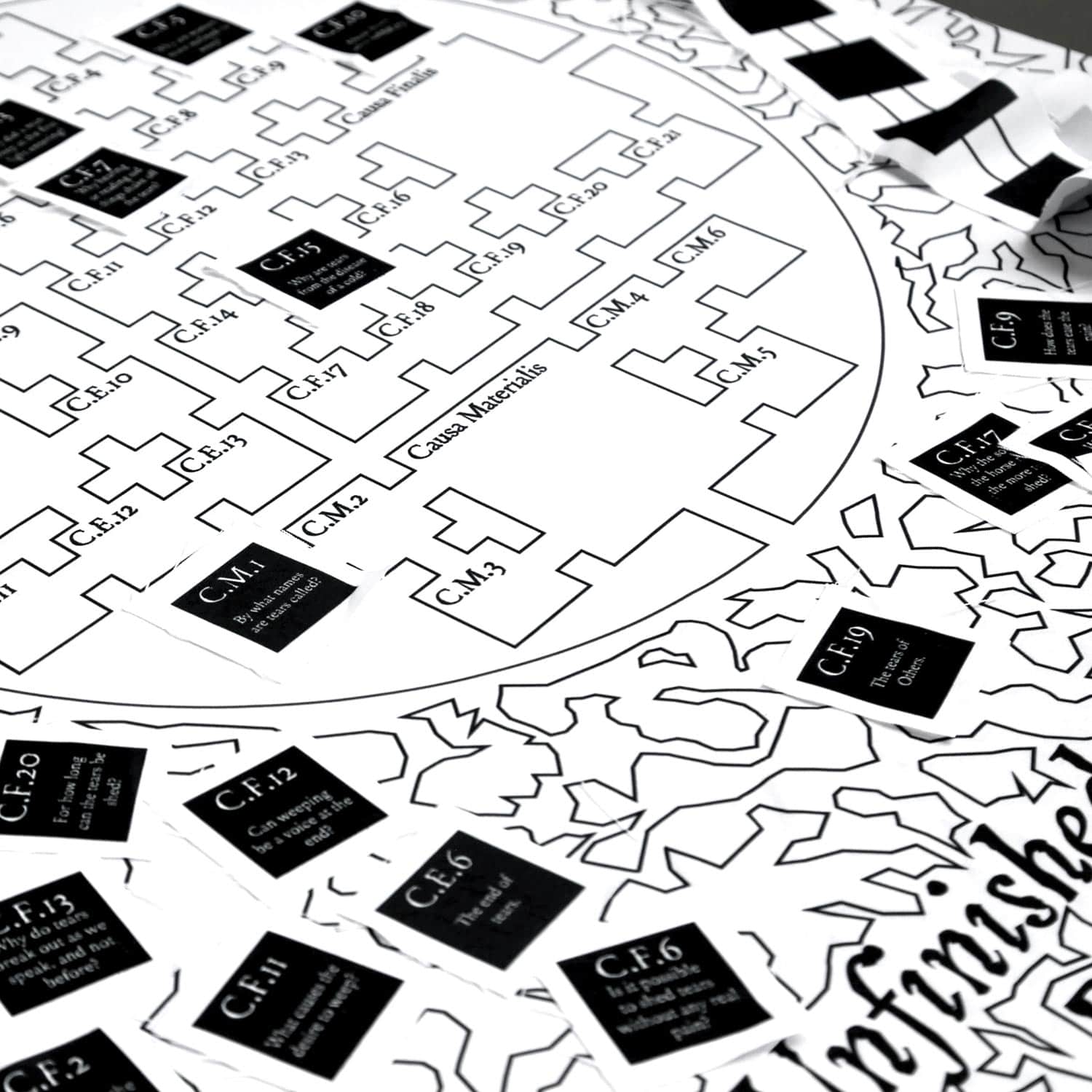
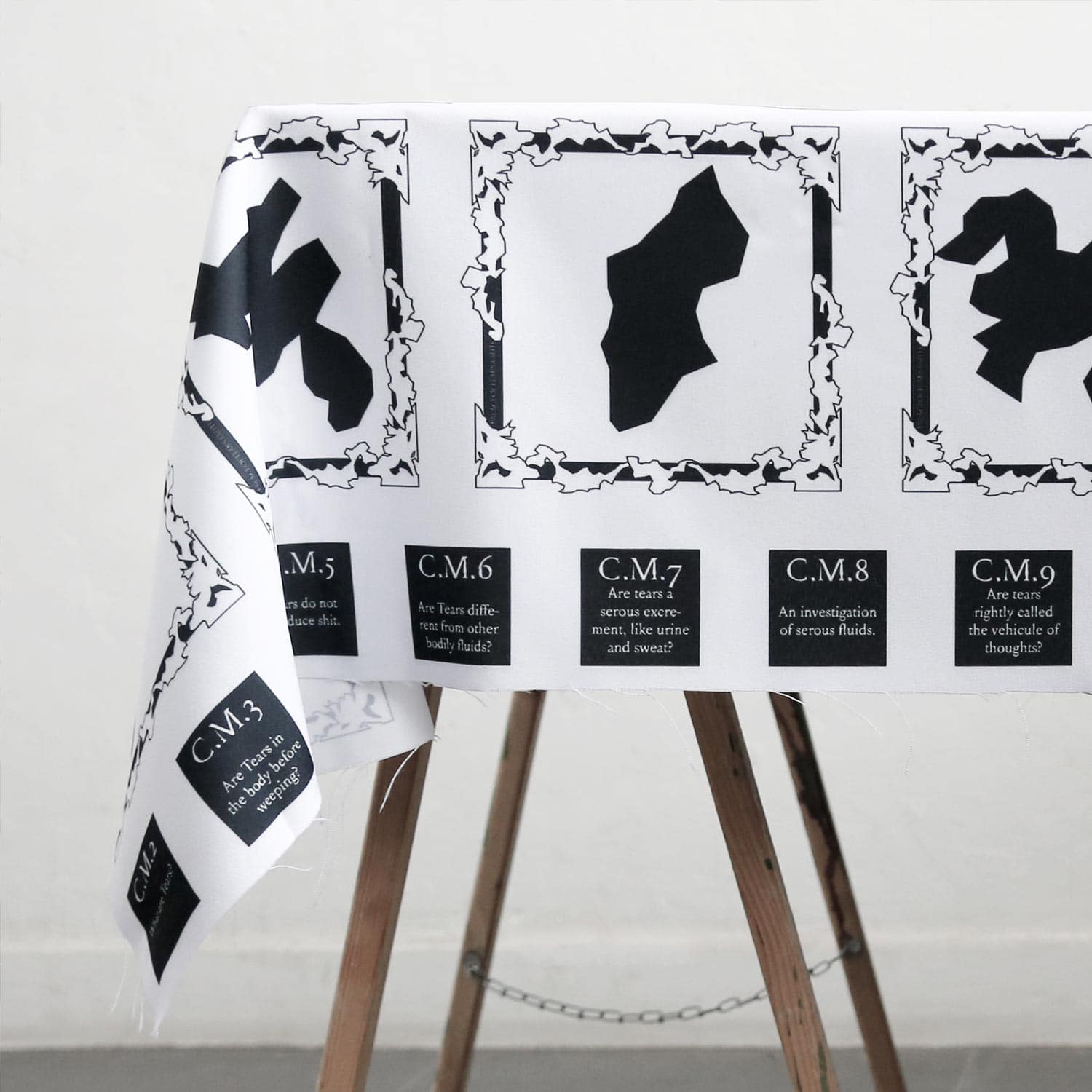
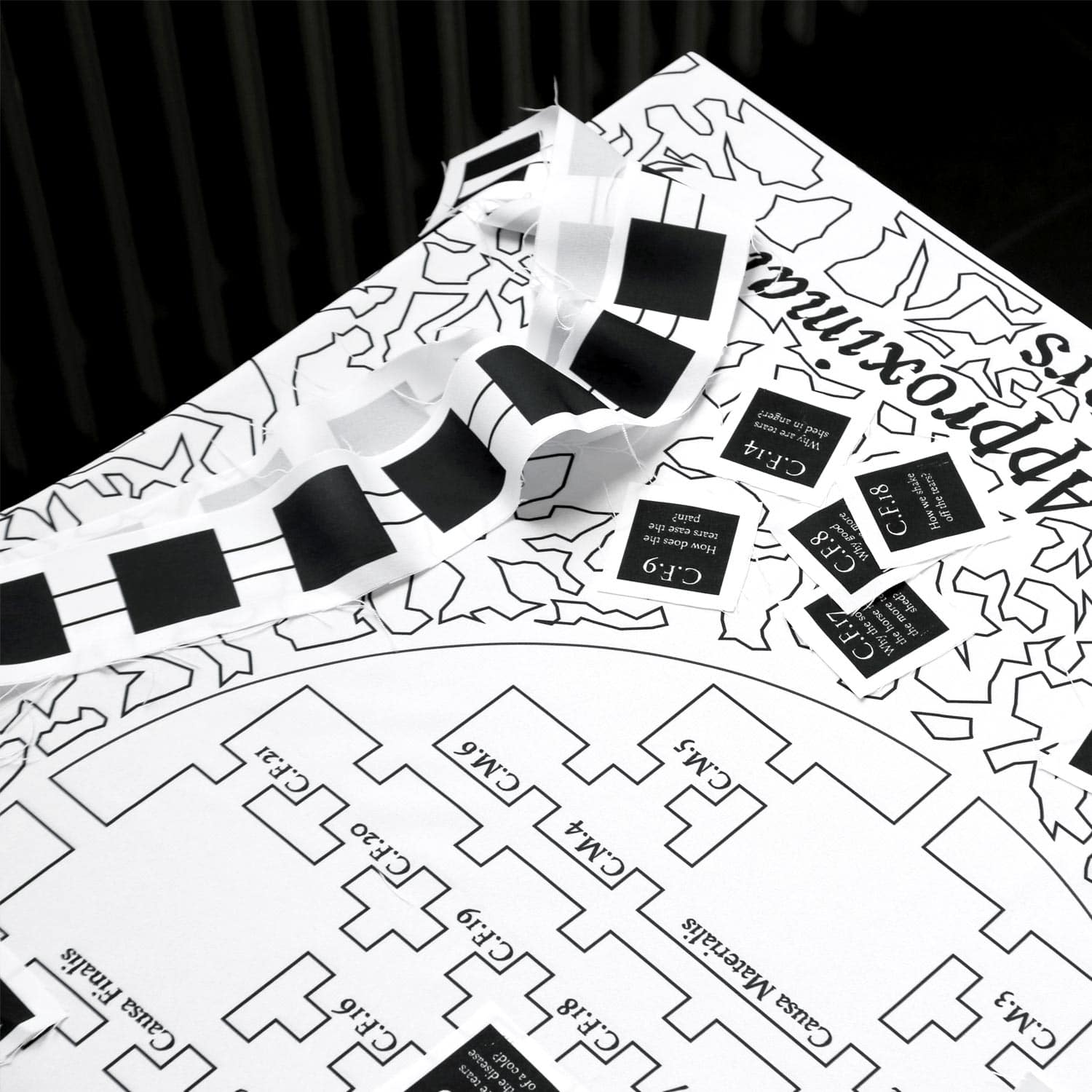
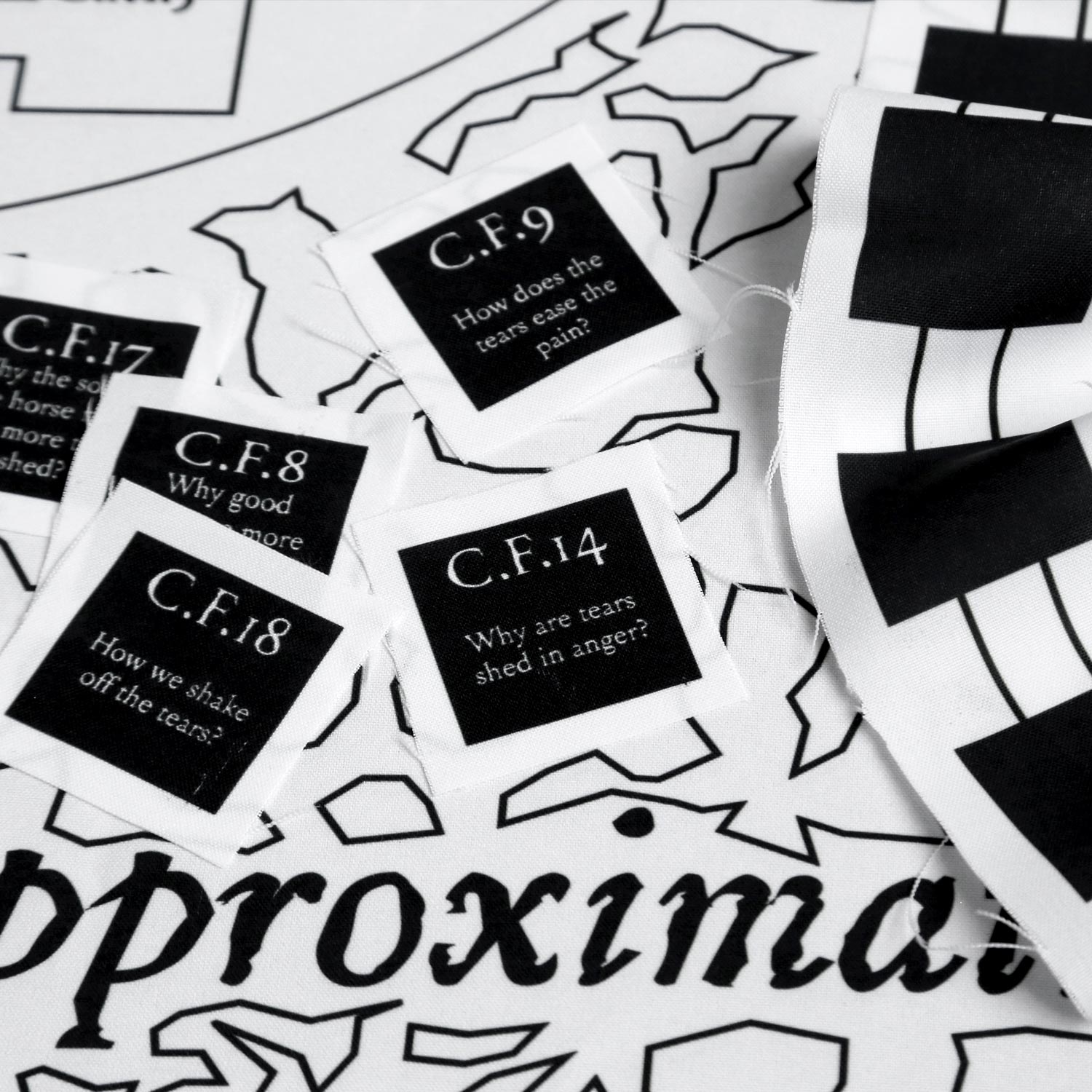
In the special collections of Leiden Library is a very unusual book: De Lacrymis Libre Tres, written by Petri Petitus in 1661. A 212-page study of tears that combines literary, philosophical, medical and poetic sources. The text is divided into three parts and forty sub-parts, each attempting to answer a question, such as why do we cry? Or, can tears flow without suffering? Taking this text as a starting point, De Lacrymarum Regia proposes a reflection on the reactivation of individual and collective archived knowledges through an embodied and performative practice of the archive.
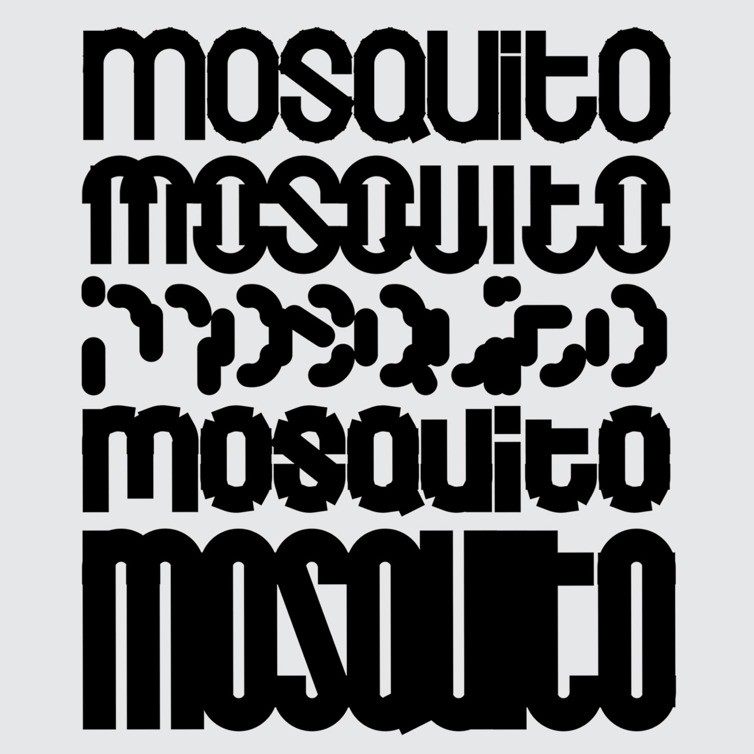
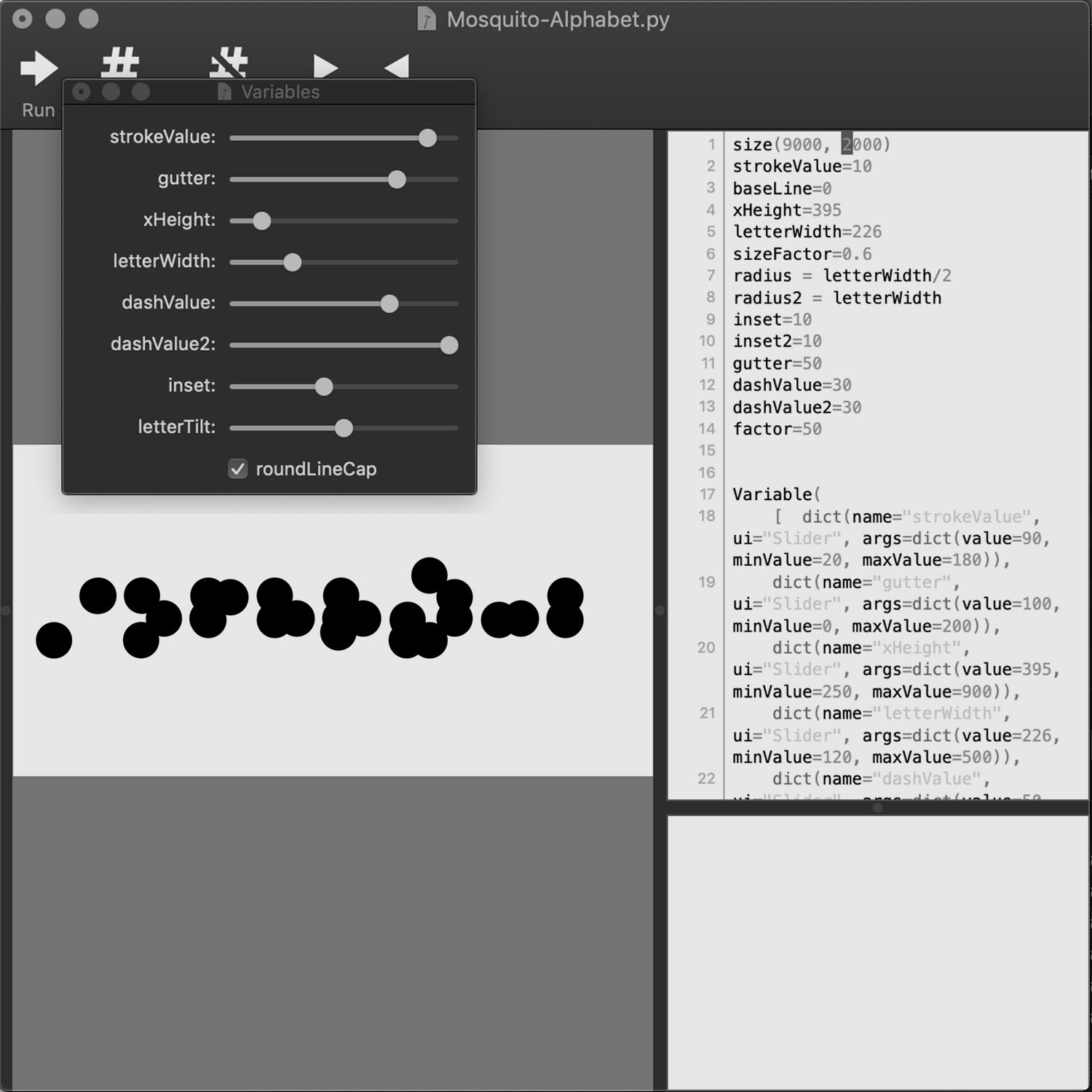
The Mosquito Newspaper
Identity/ Editorial Design/ Typography
2021, 32 pages, 210 × 297 mm
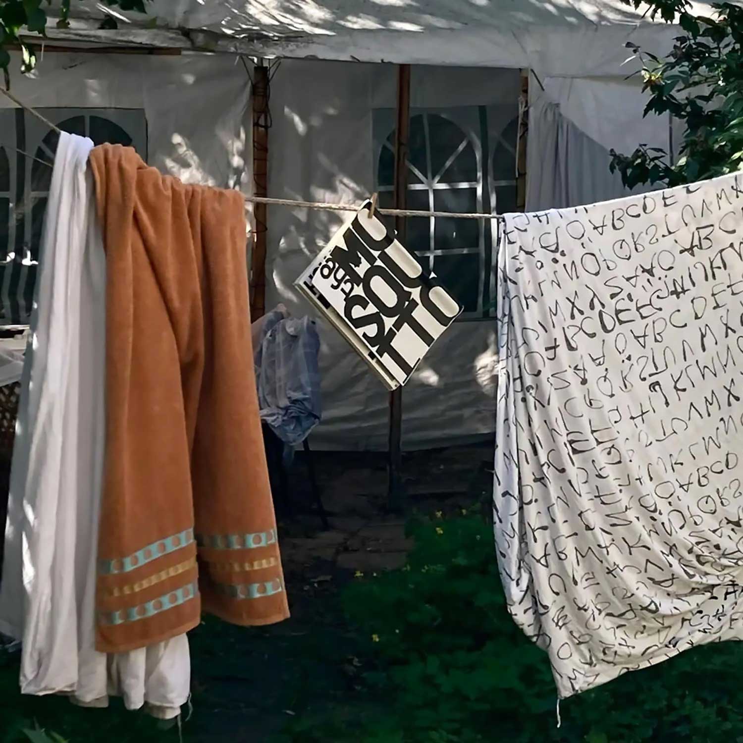
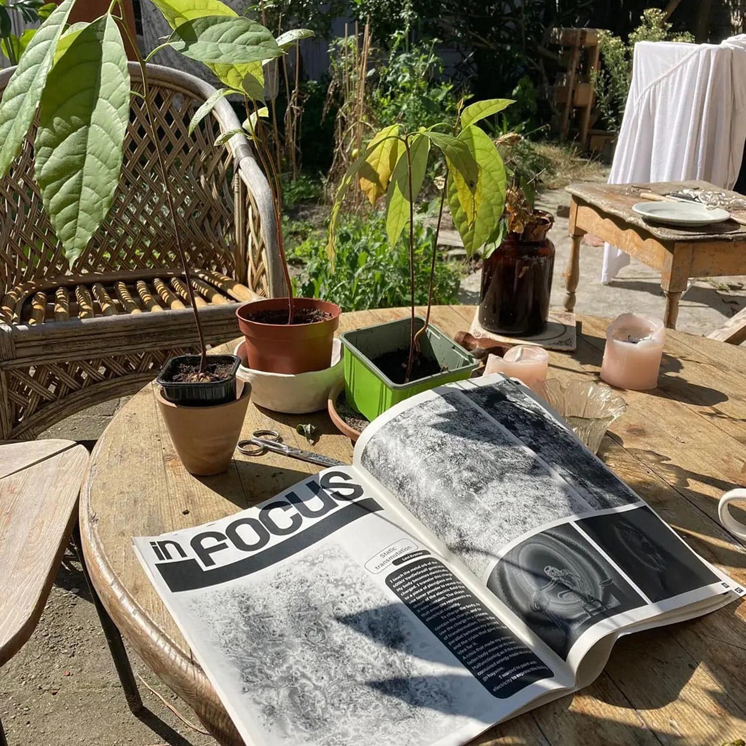
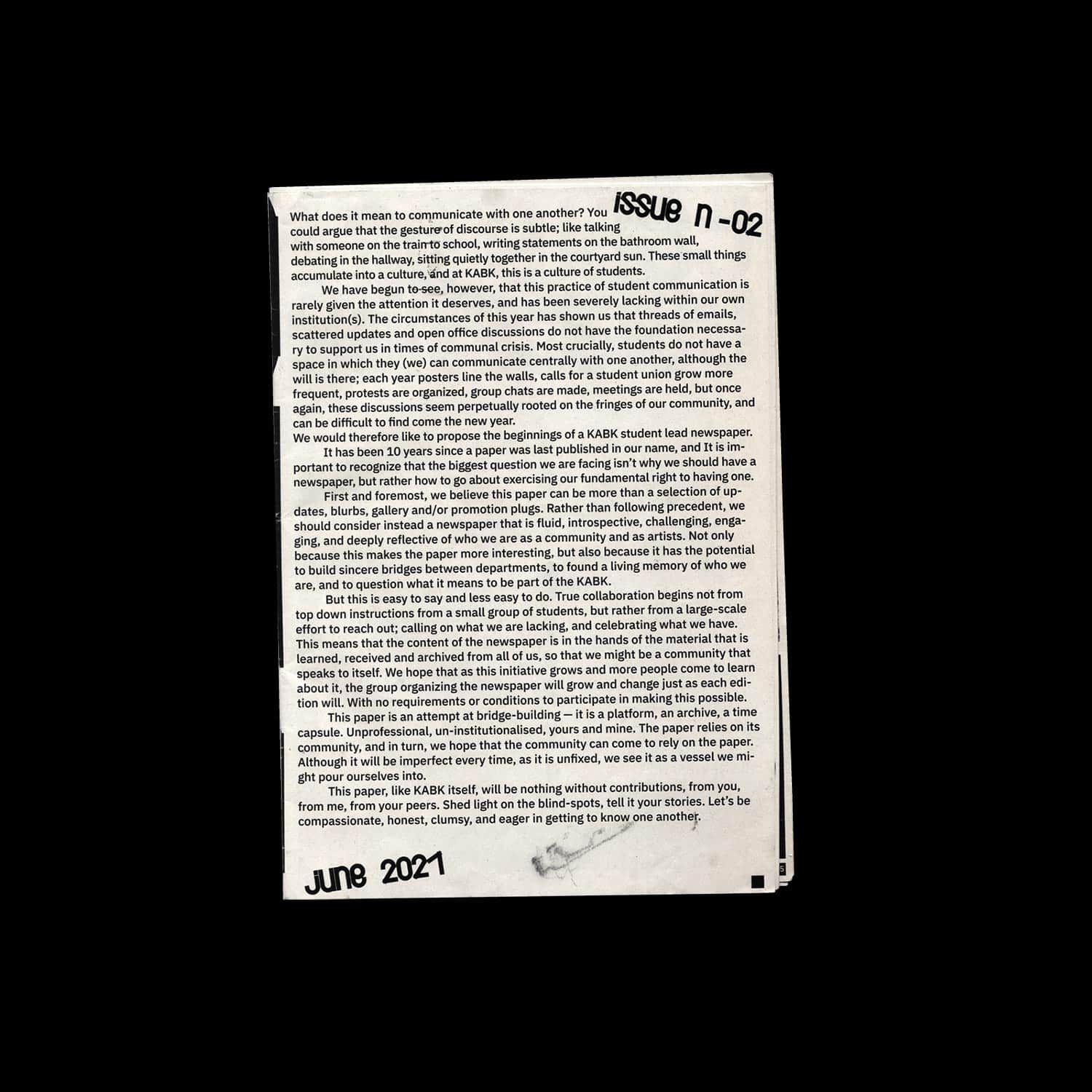
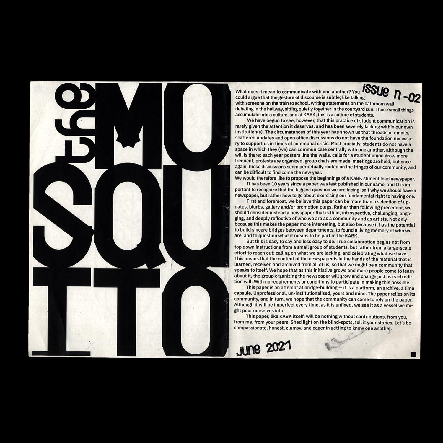
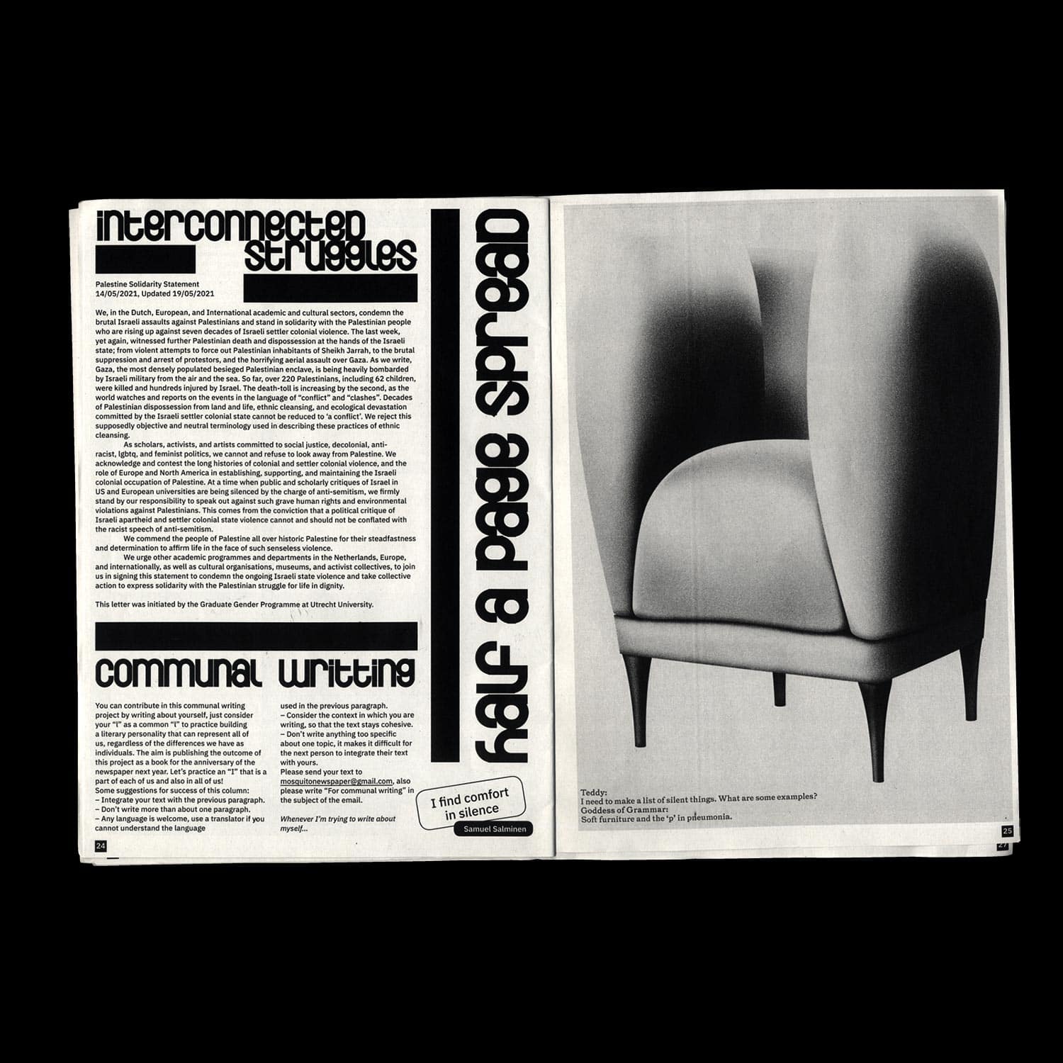
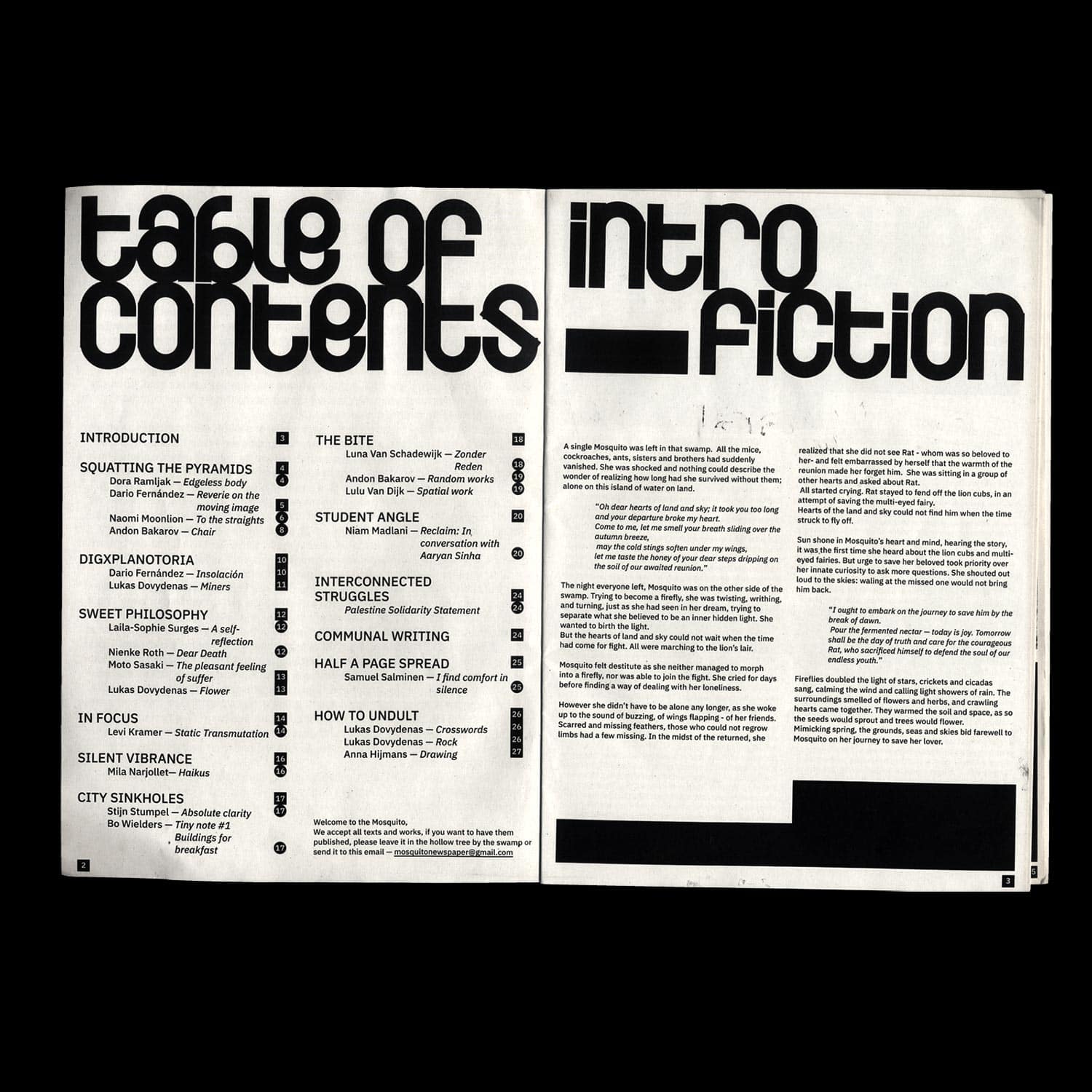
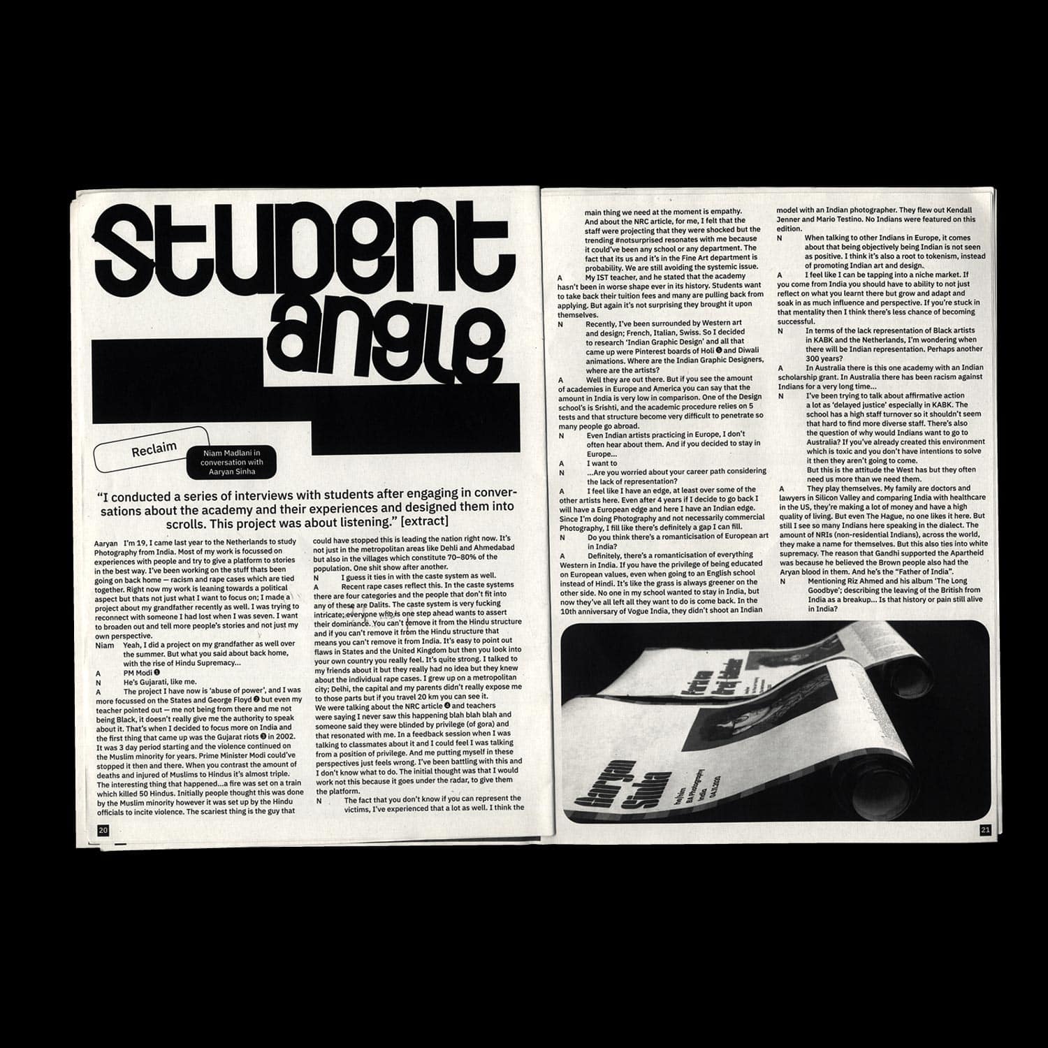
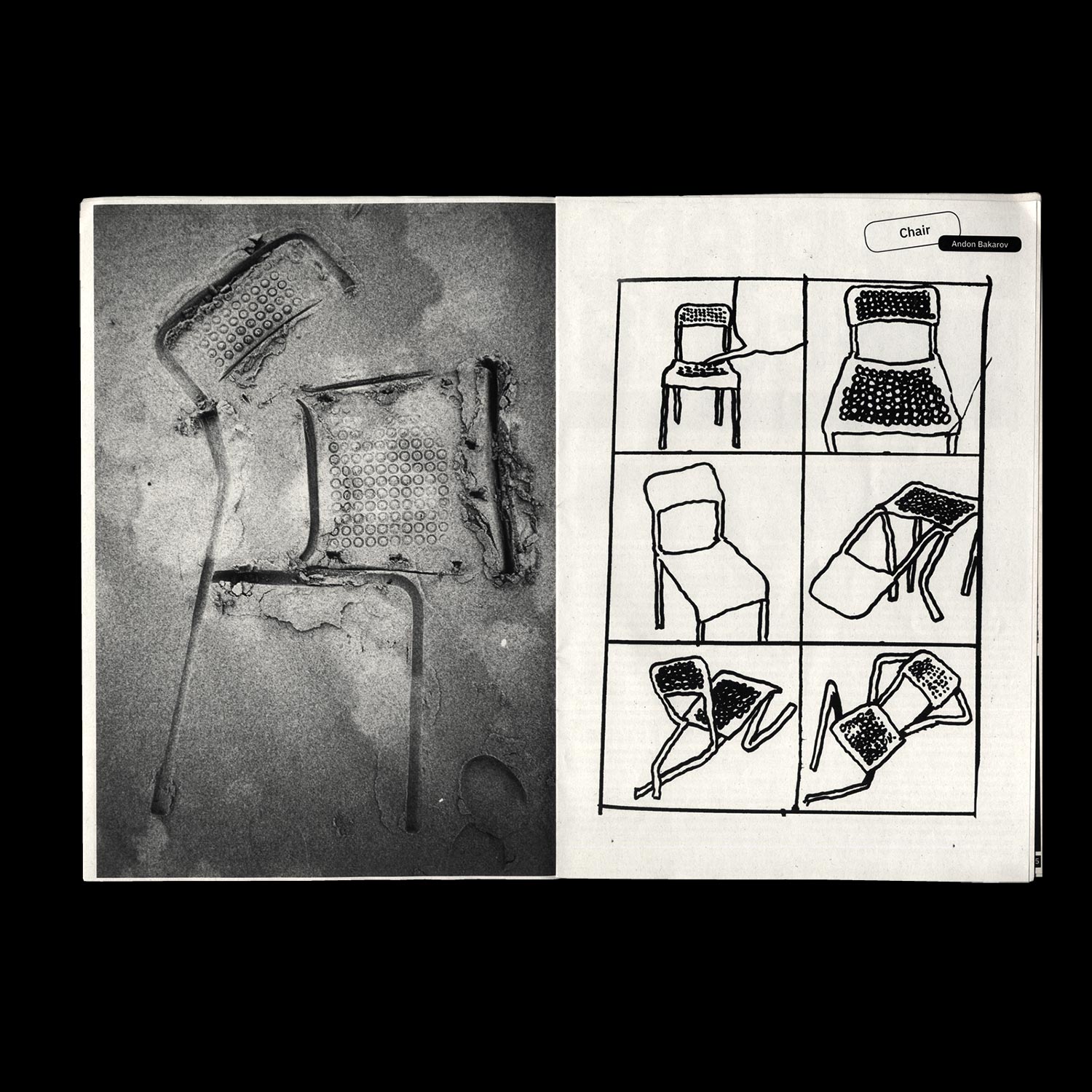
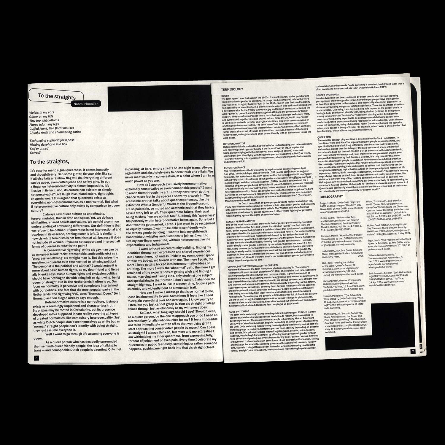
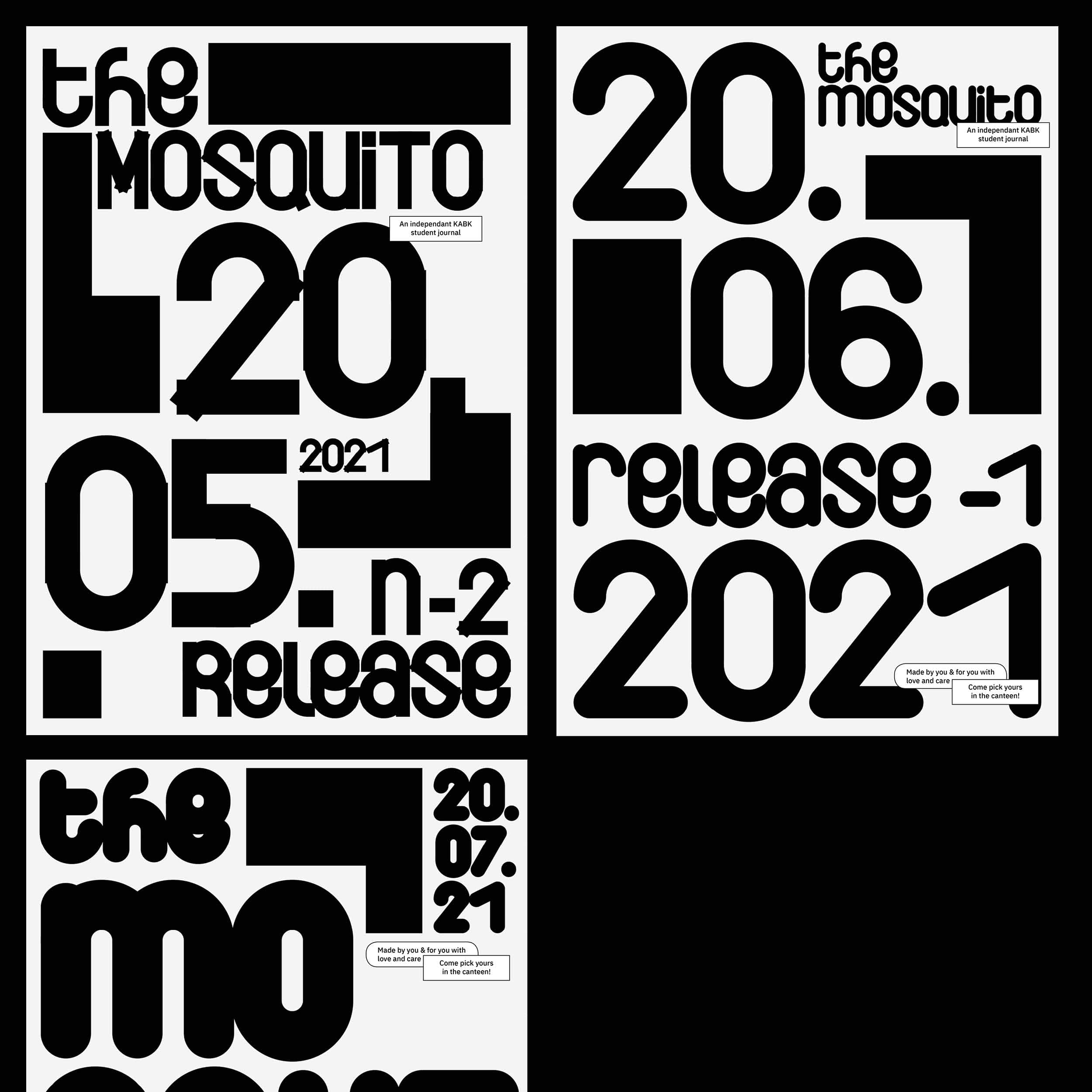
An open-ended and open-source identity for KABK's (Royal Academy of Arts The Hague) independent student
newspaper. Flexible, collective and collaborative rather than authoritarian and restrictive, this protean
identity intends to leave space for interpretation and evolve through time, along with the groups of
students constituting the Journal team.
Who is afraid of the Witch?
Editorial Design/ Editing
2021, 262 pages, 130 × 180 mm
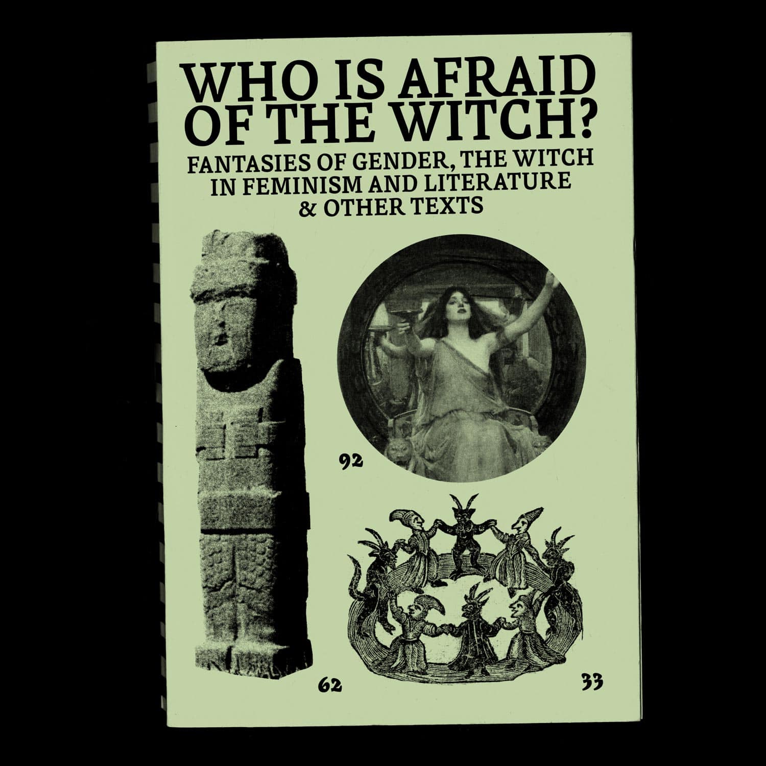
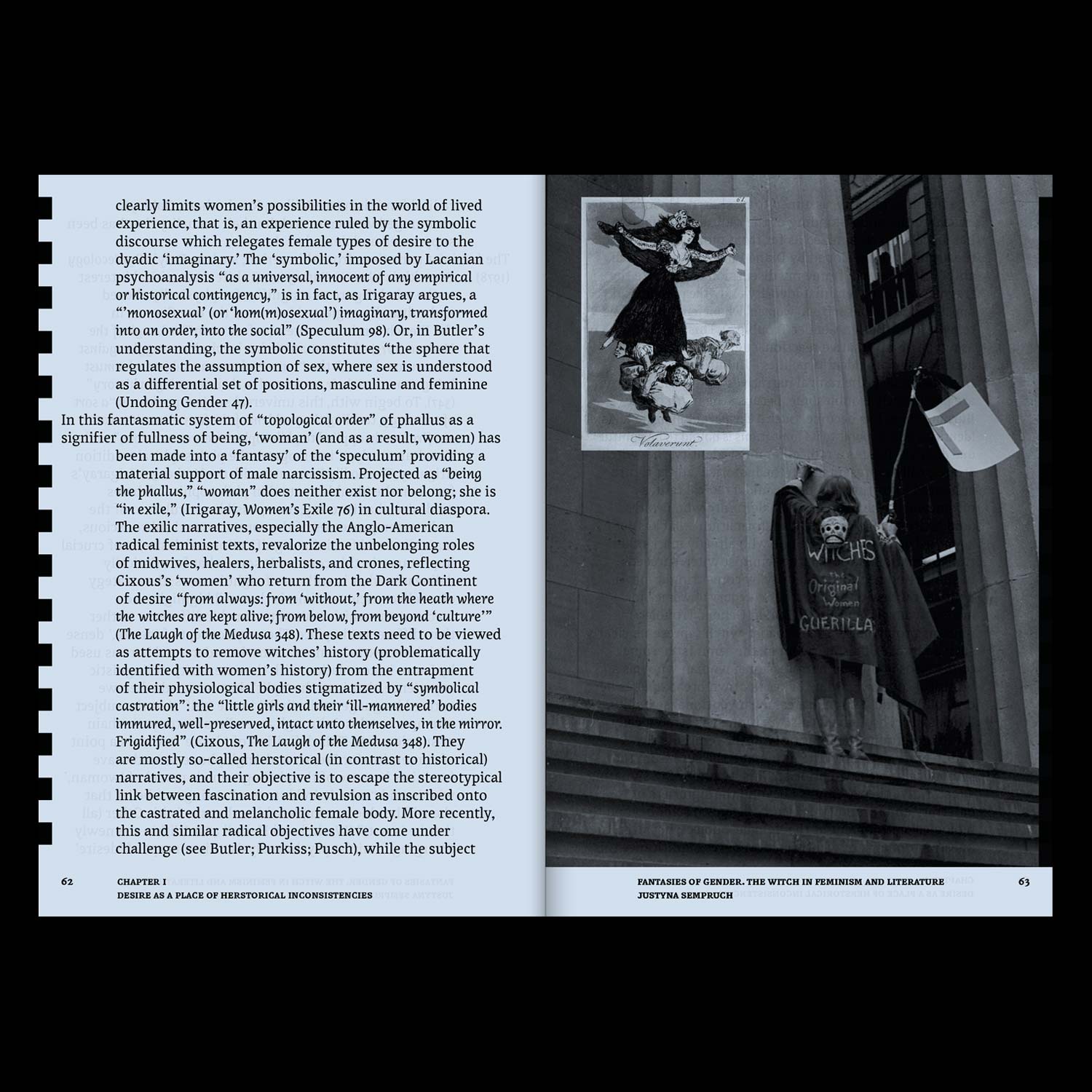

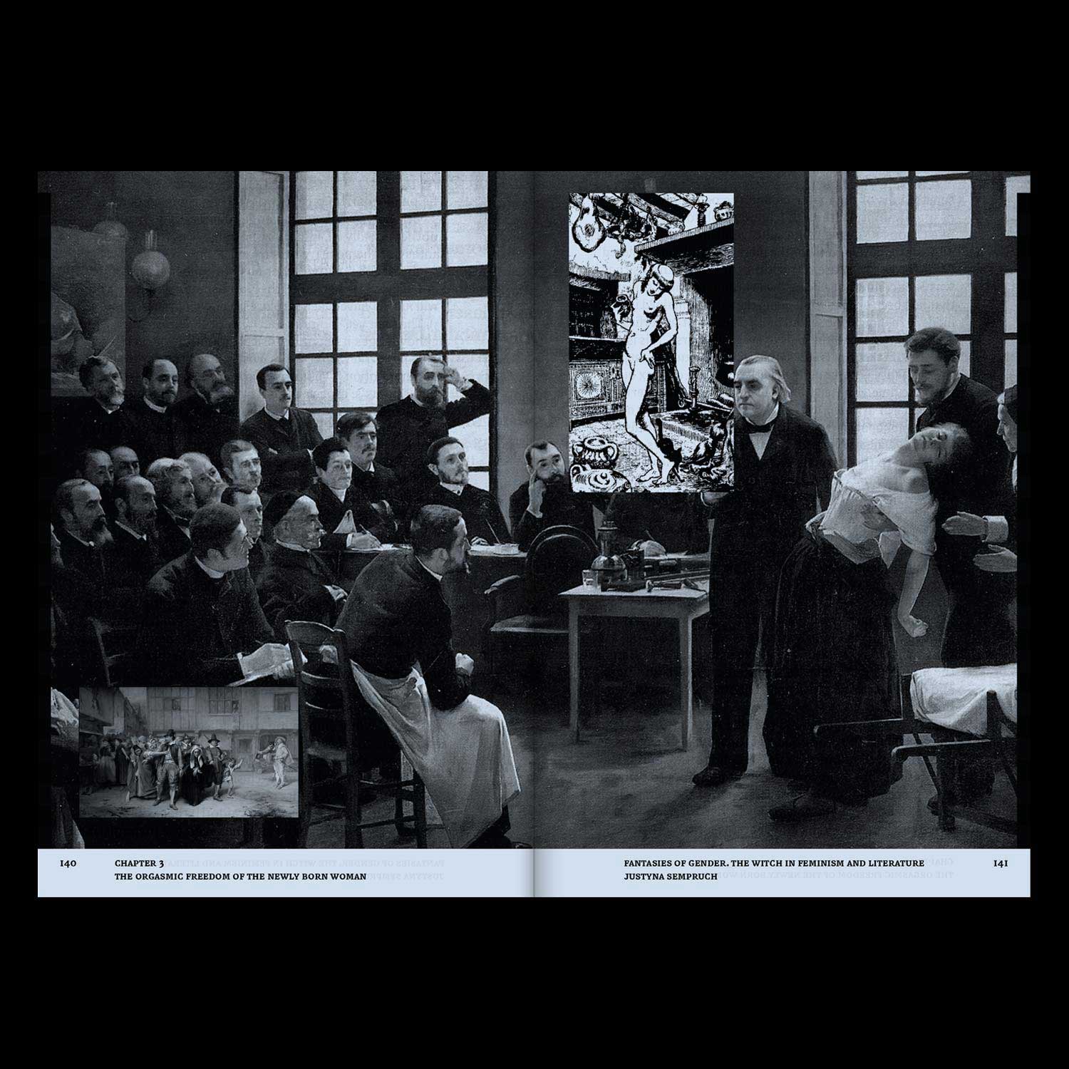
*Who is afraid of the Witch?* is an editorial project articulating academic writing, articles and iconographic materials, all dealing with the figure of the witch in feminist movements and in literature.
Vernacular Photography in Conversation
Editorial Design/ Editing
2020, 56 pages, 10 × 29,7 cm
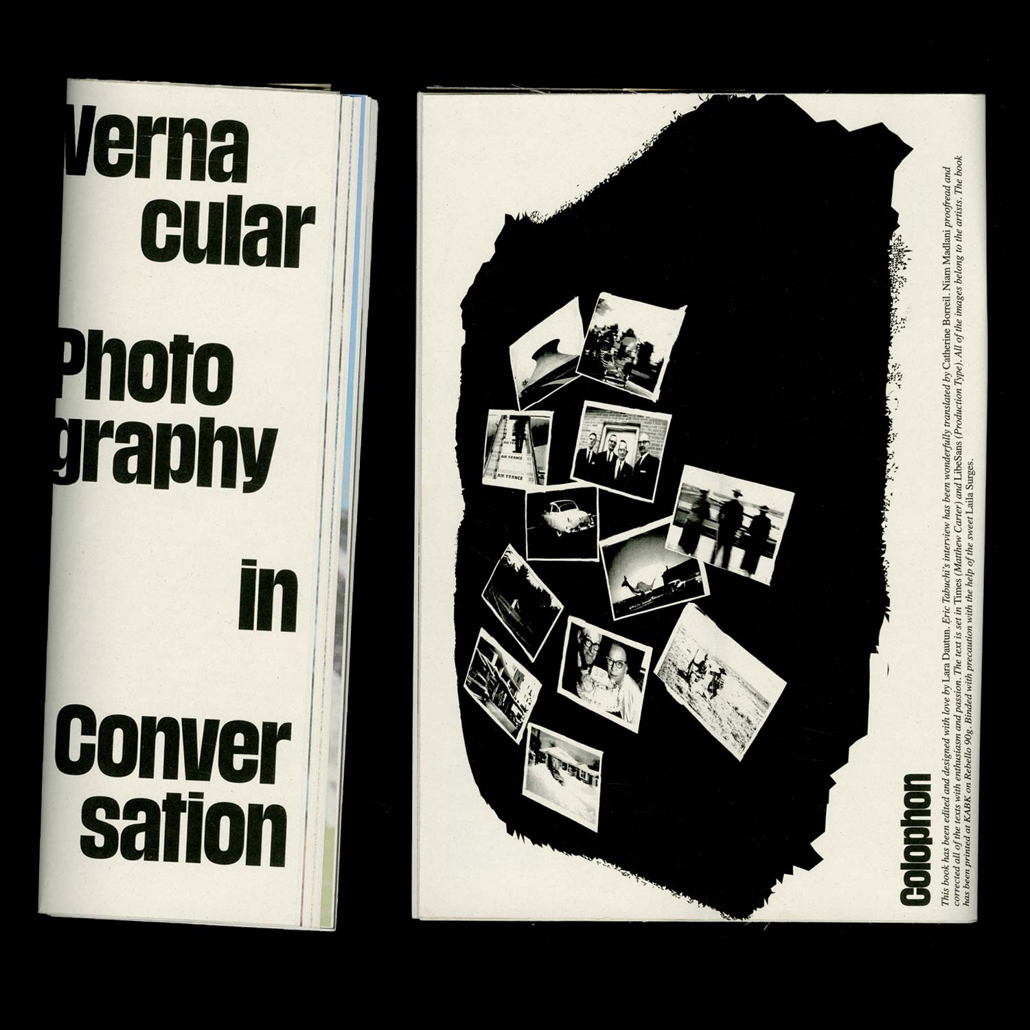
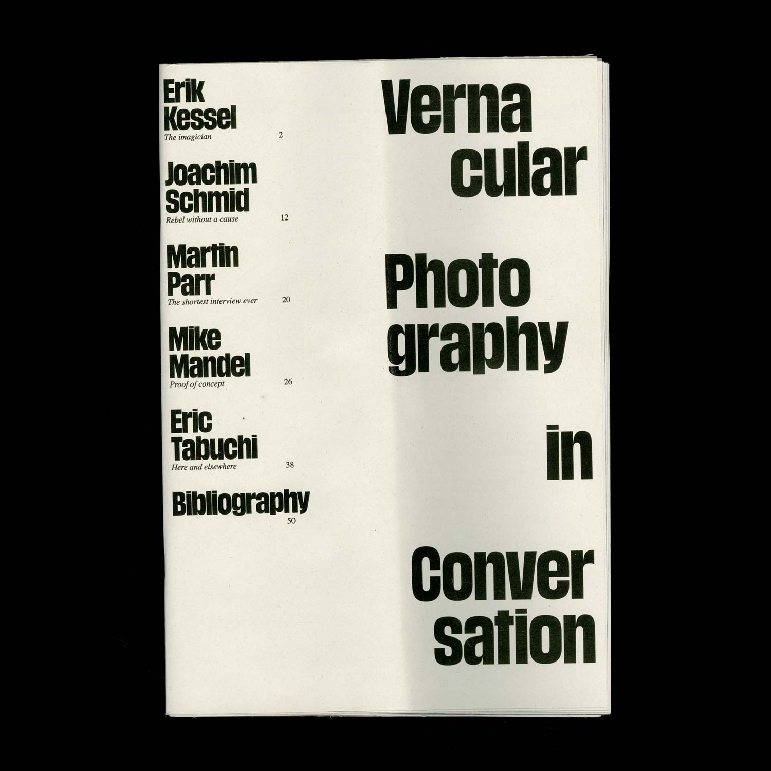
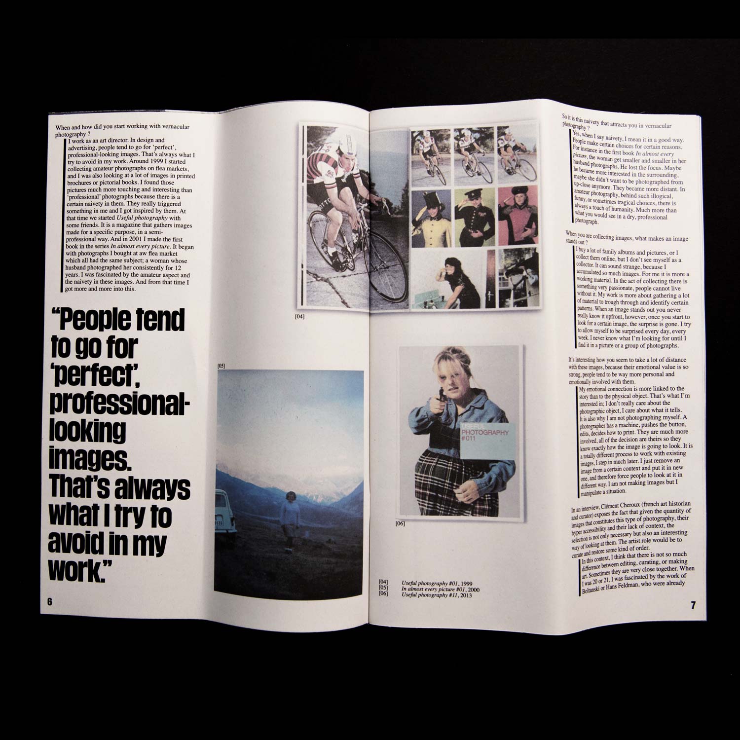
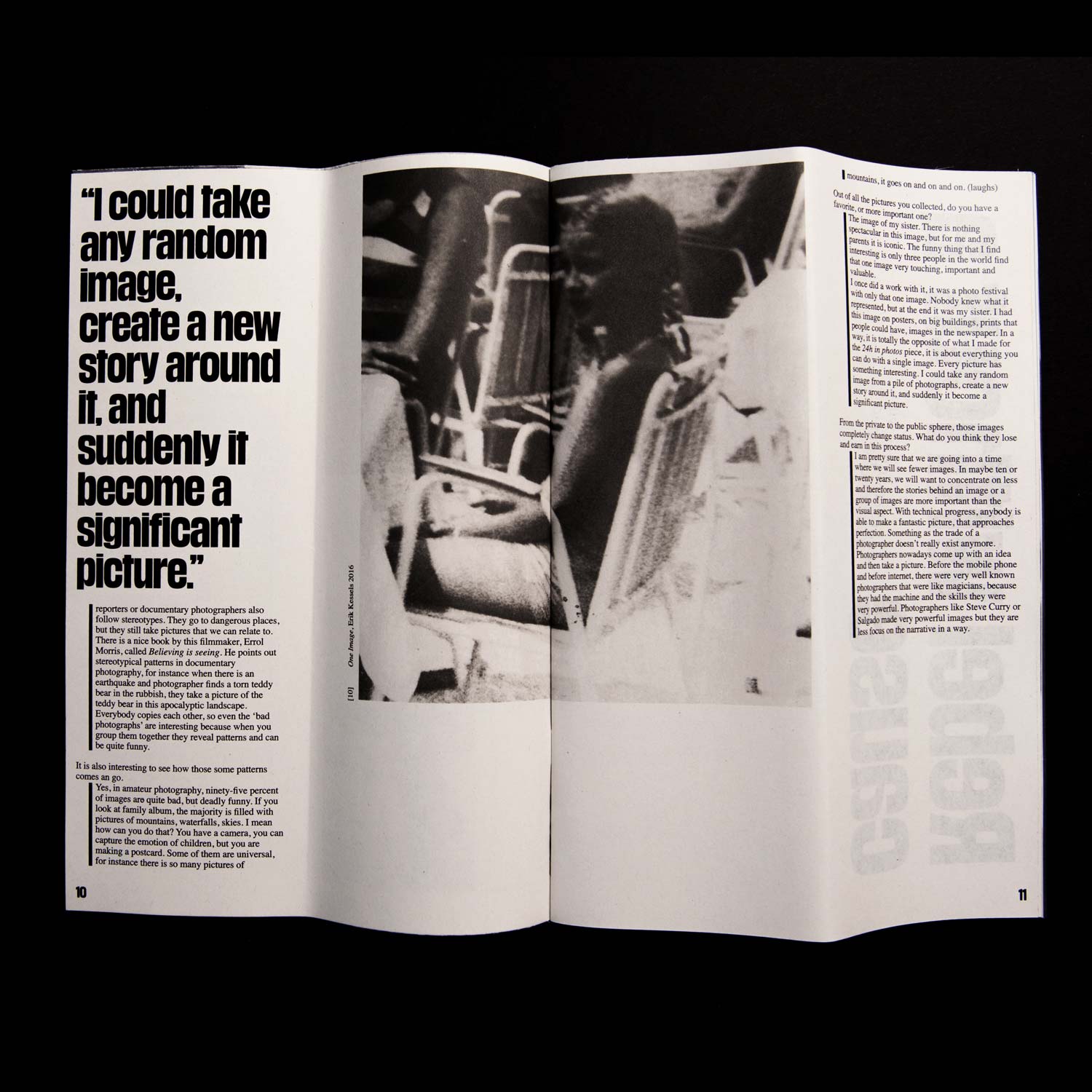
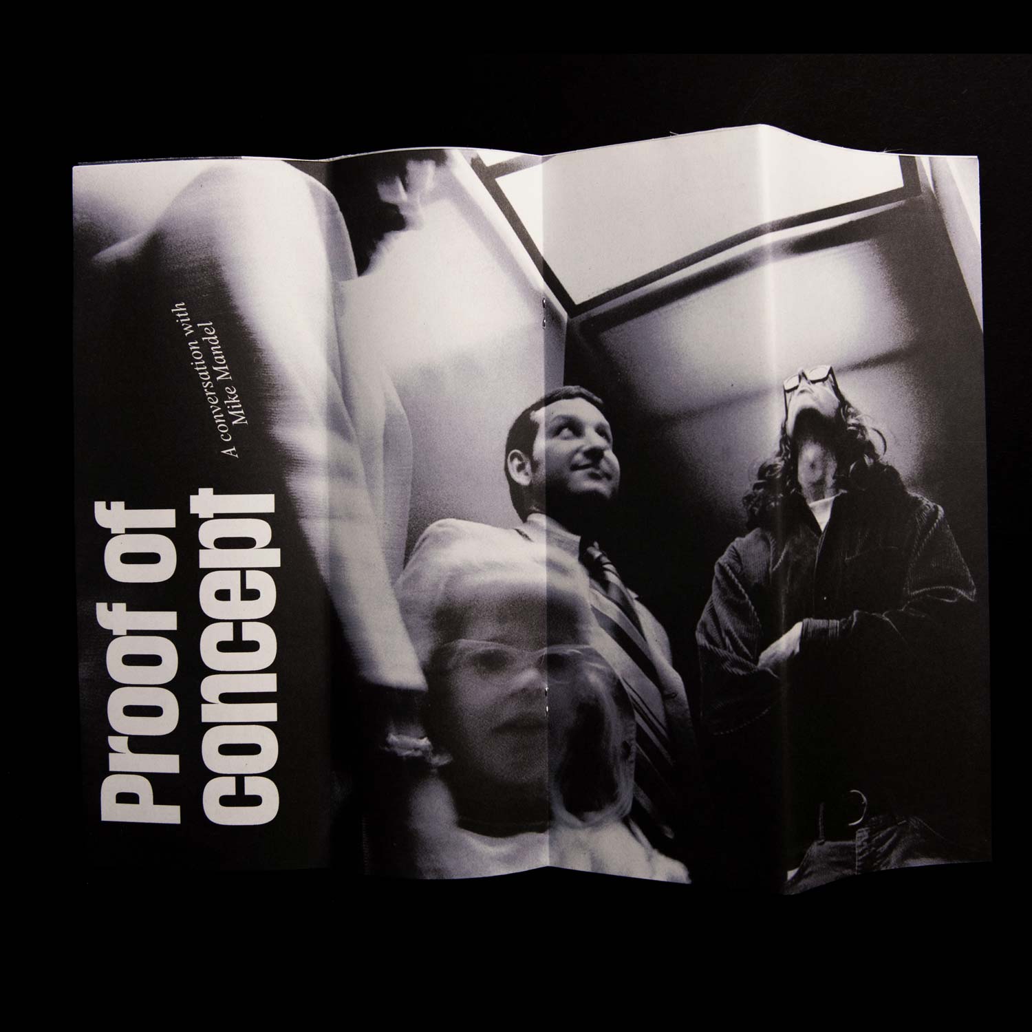
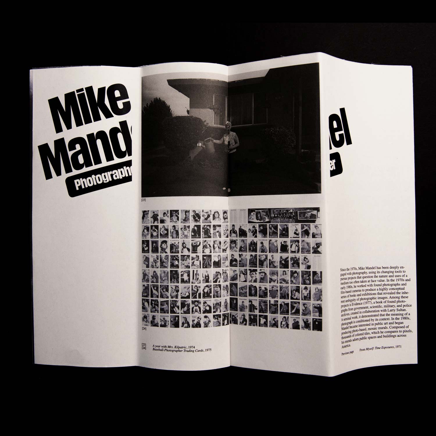
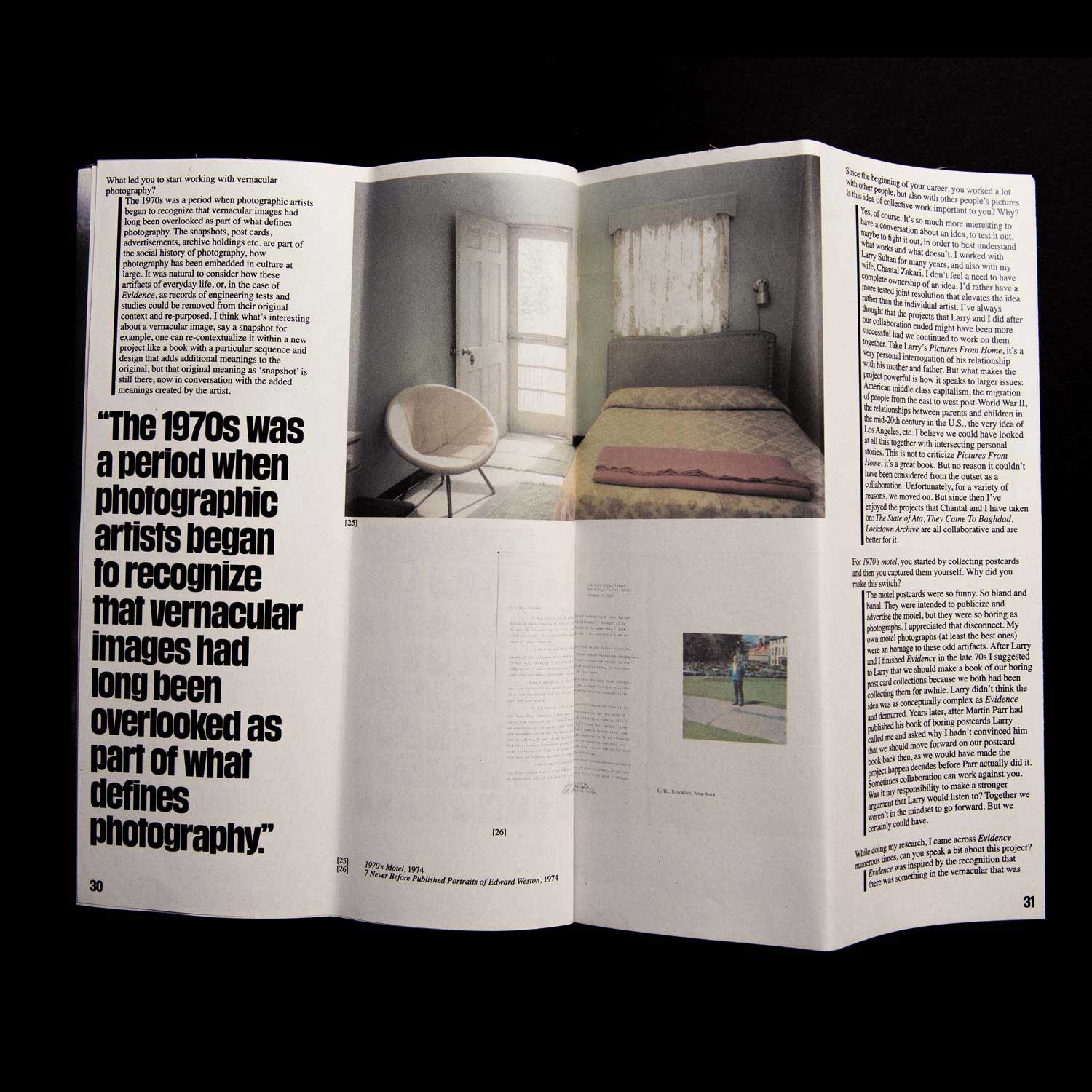
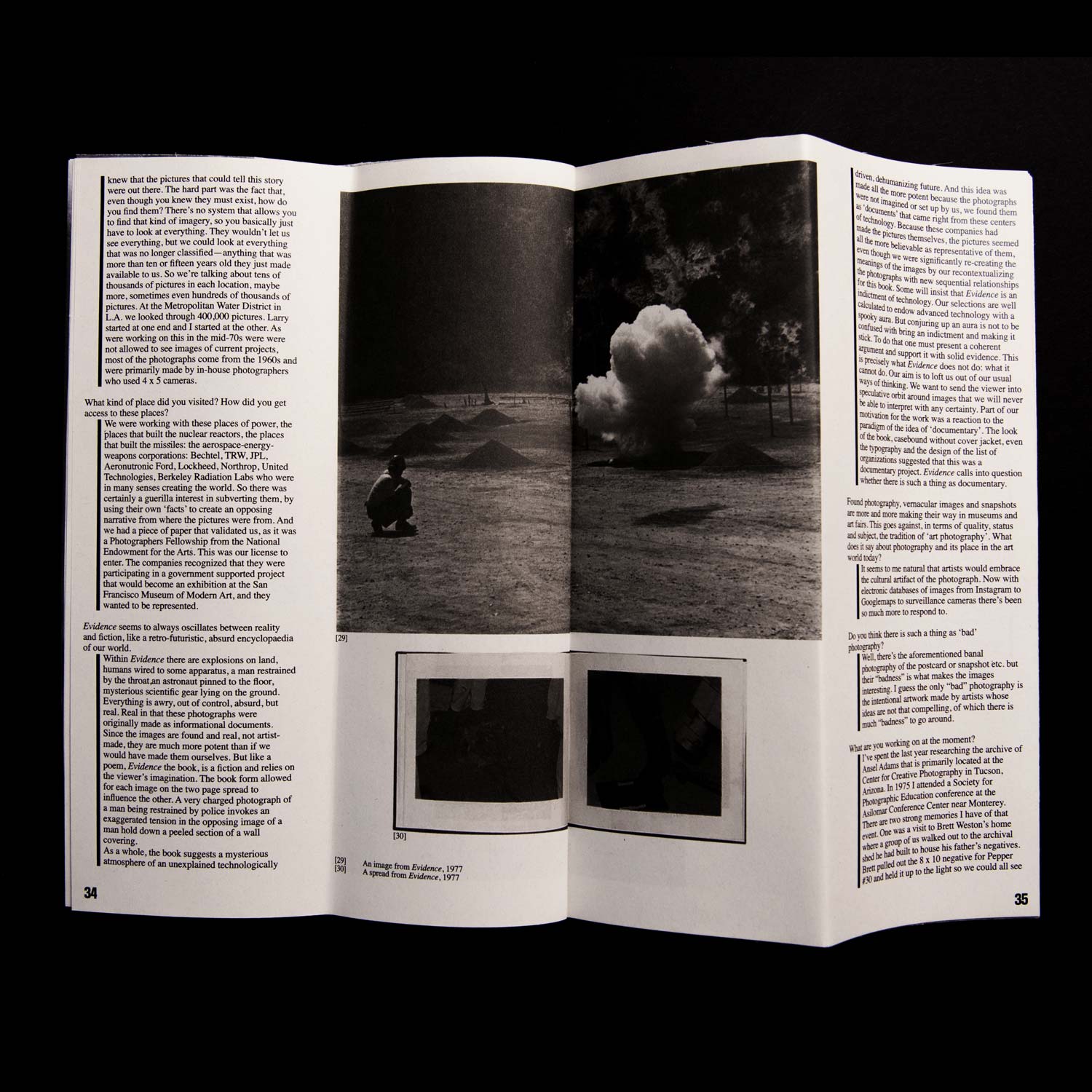
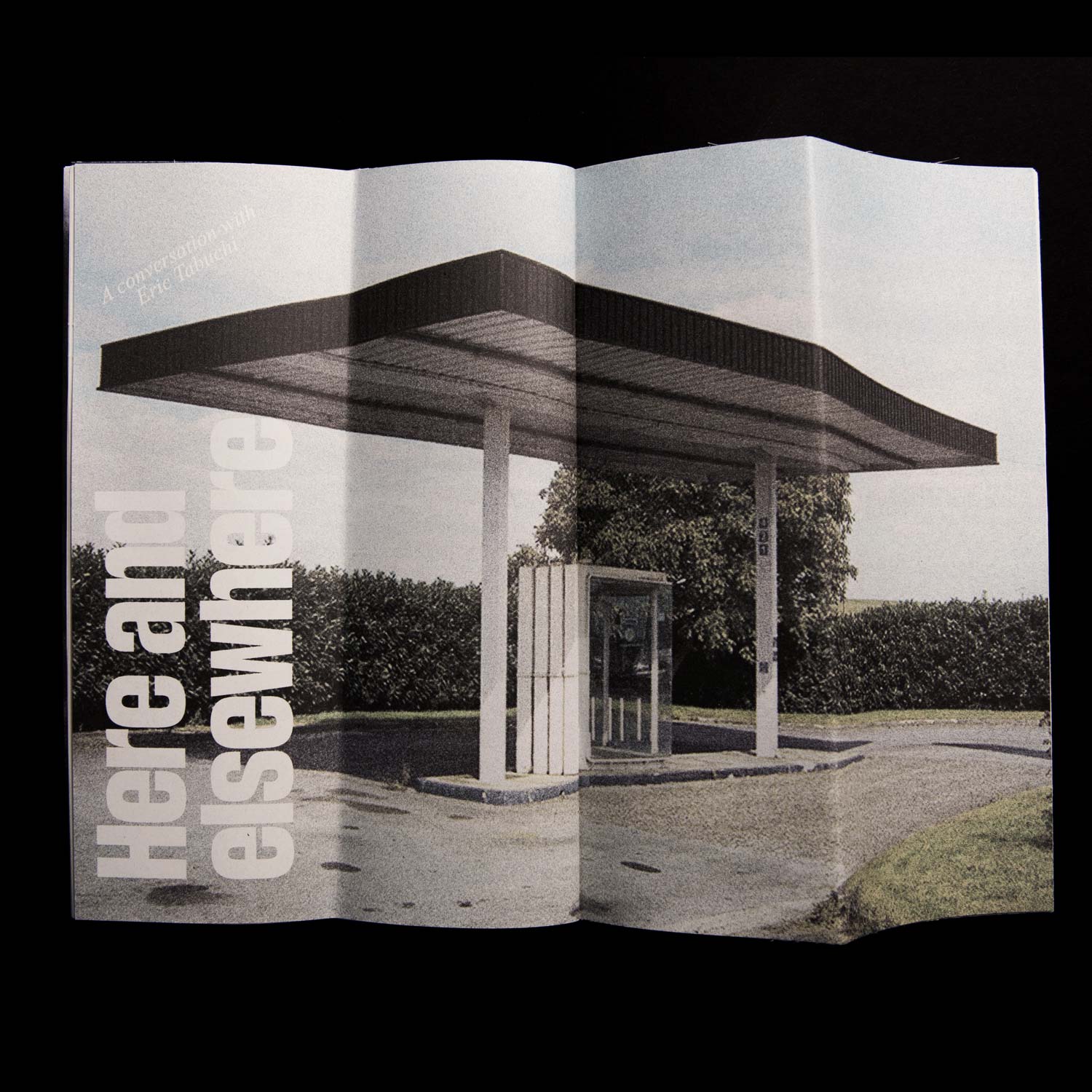
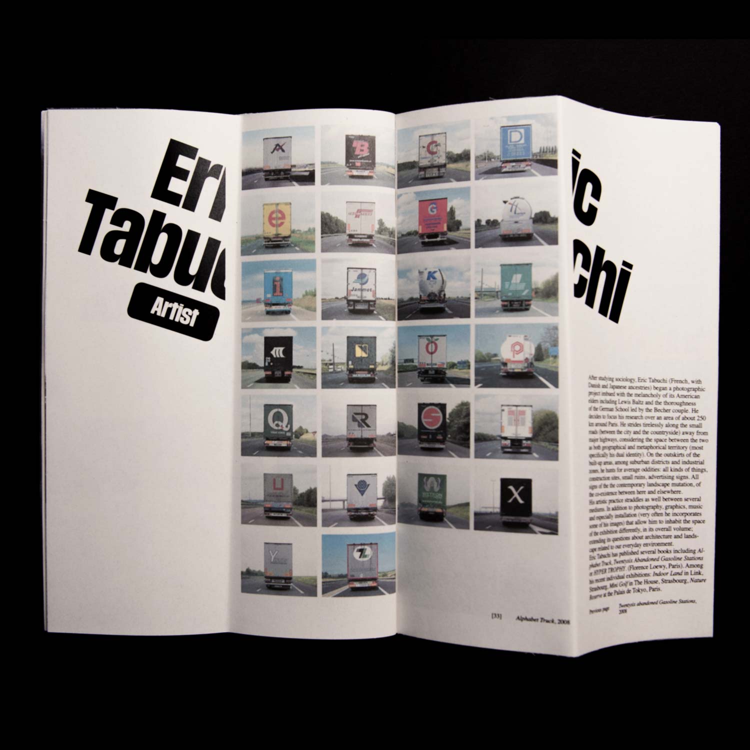
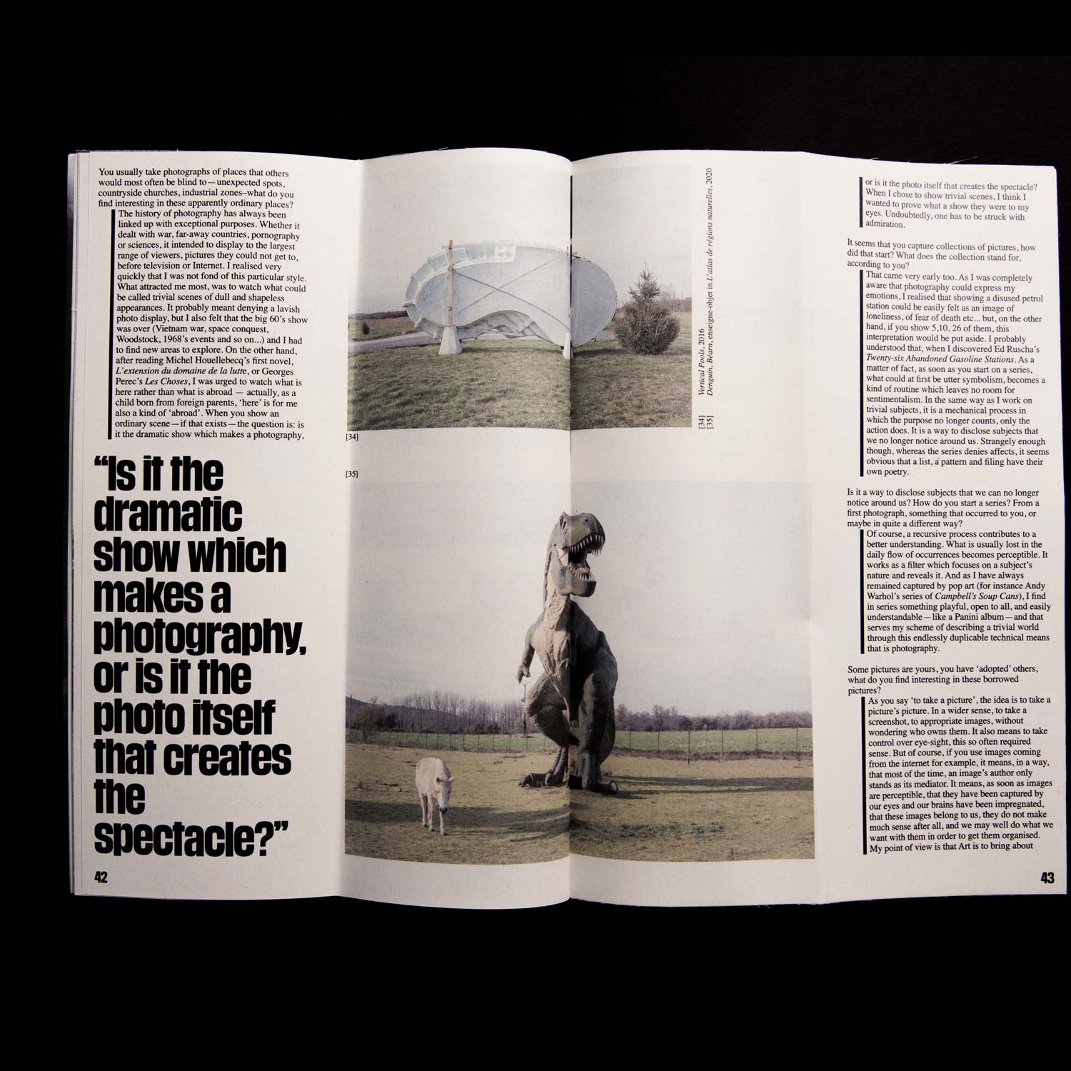
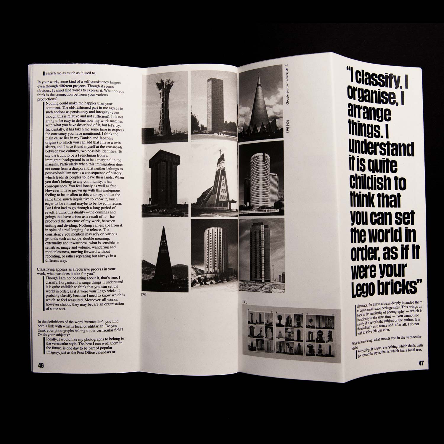
A study of vernacular photography, through a series of interviews with the ones who make it and/or use it as
an artistic medium. All of the interviews were prepared, conducted and transcribed exclusively for this
publication.
Hieronimus
Type Design (Revival)/ Research
2020–, in collaboration with
Barbara Strzeżek and Samuel Salminen
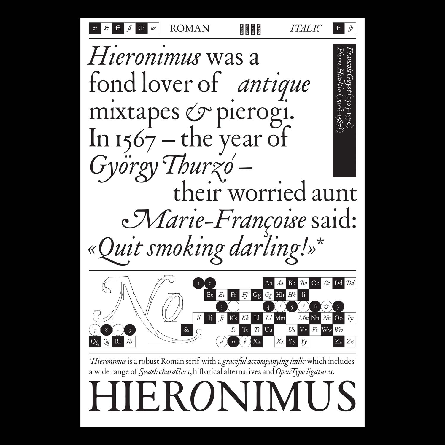
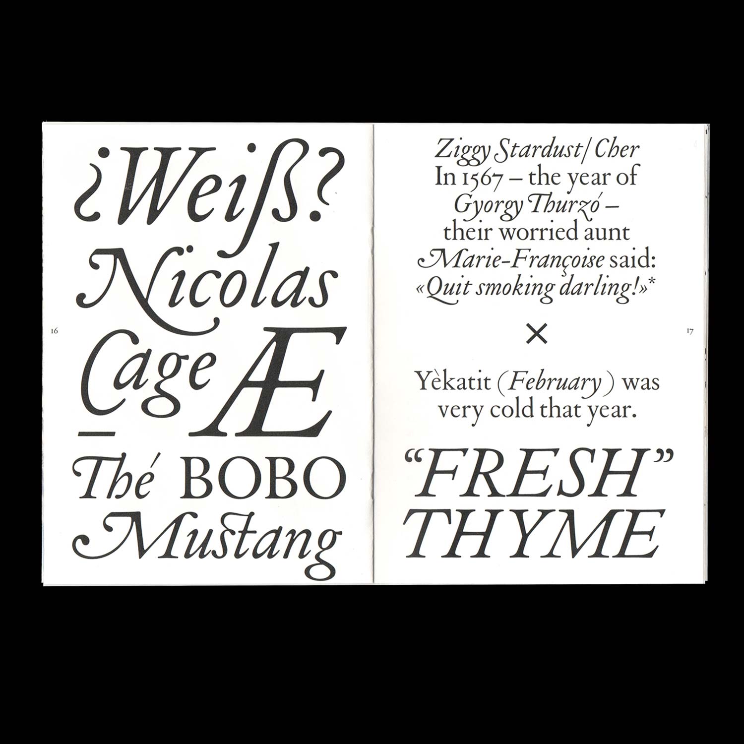
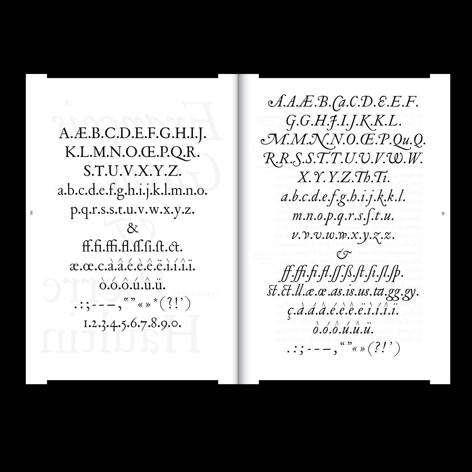
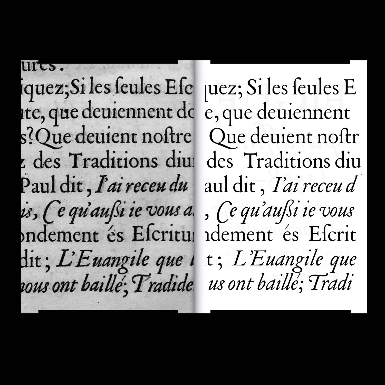
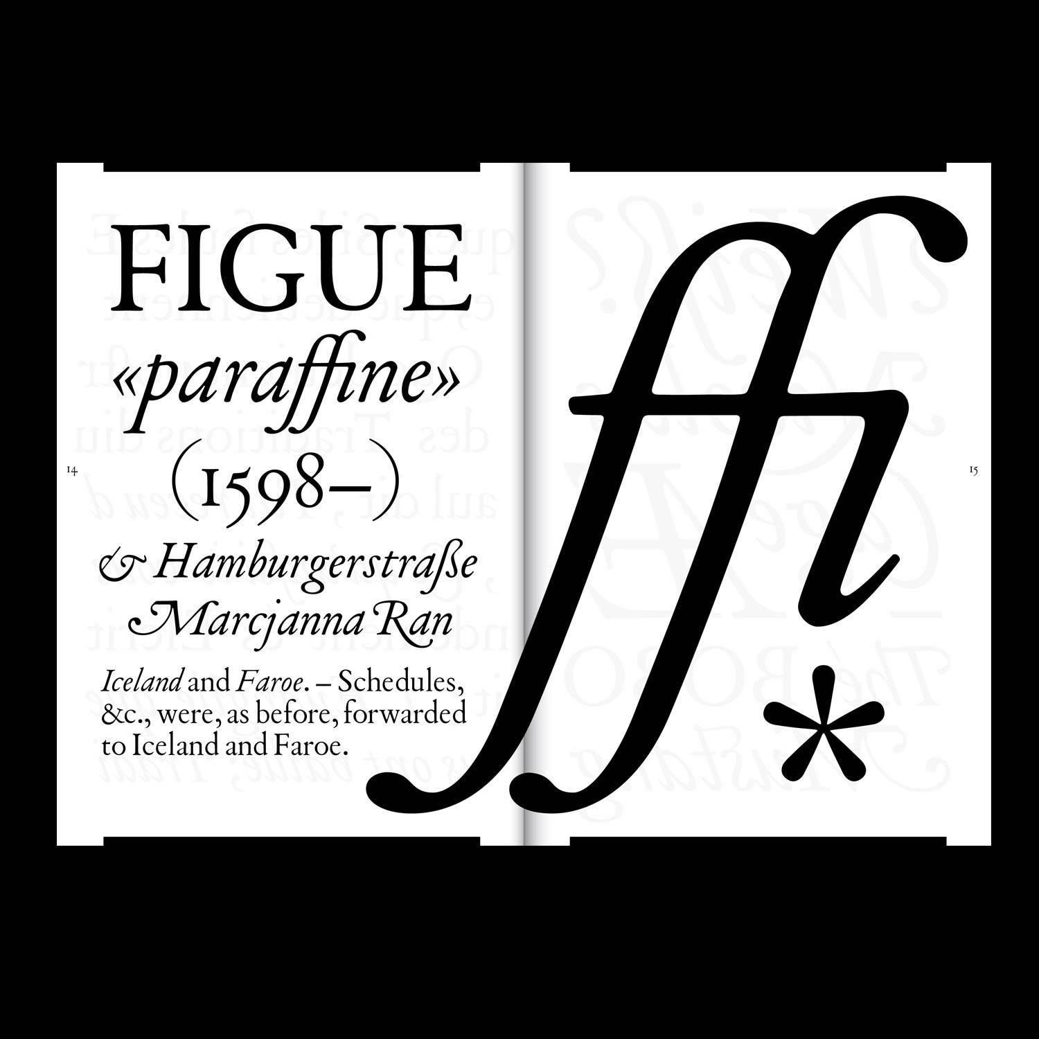
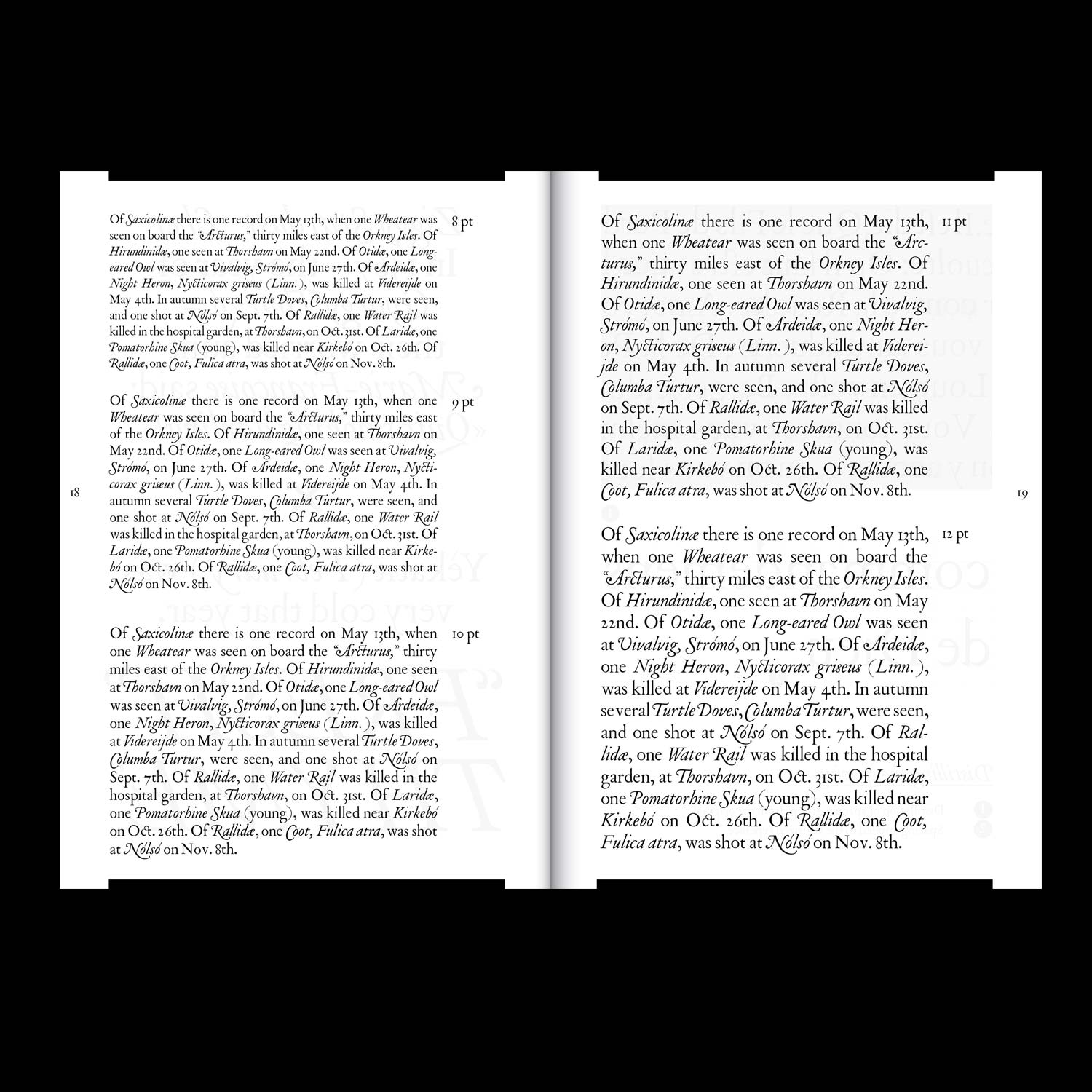
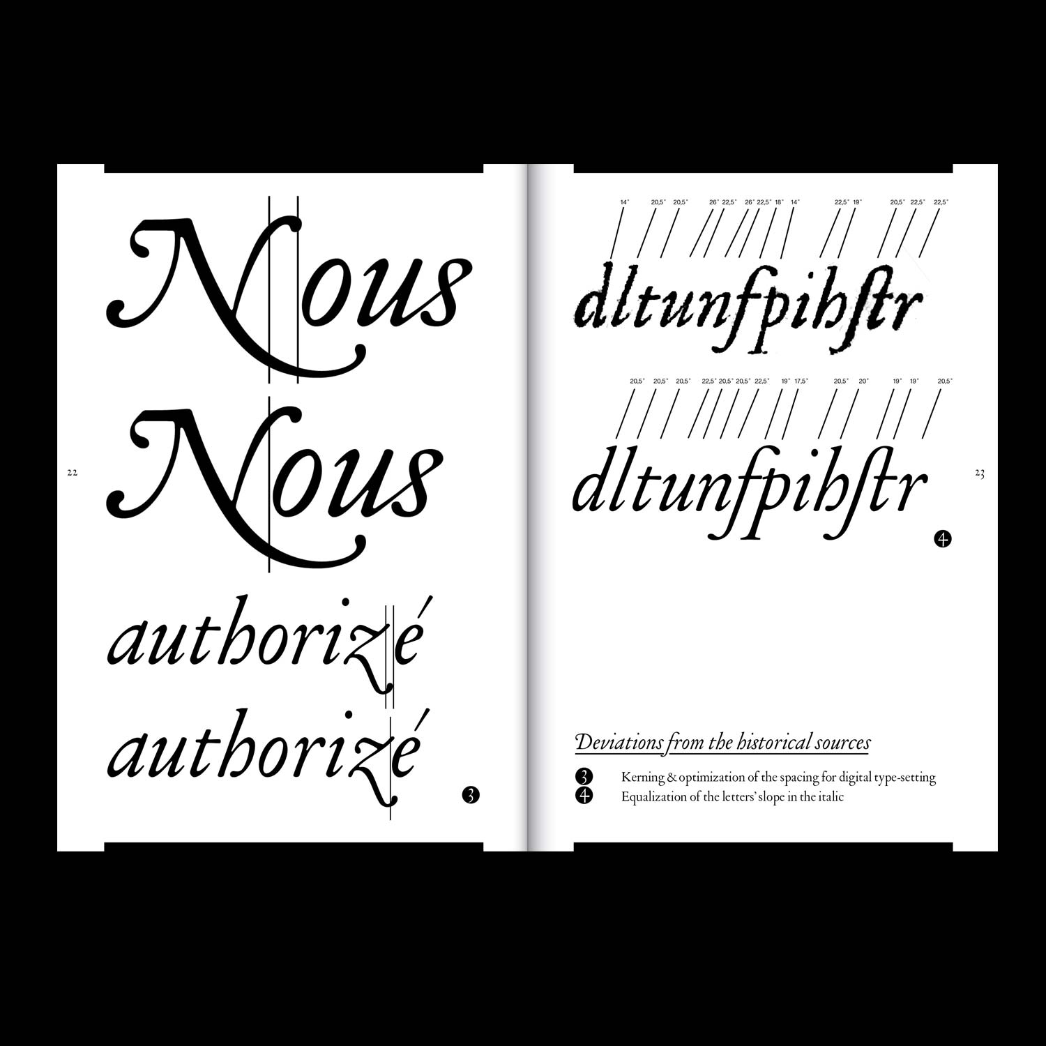
Hieronimus is an in progress, year-long, research-driven process of reviving Renaissance types, conducted in
collaboration with Barbara Strzeżek and Samuel Salminen.
Two Colours: A Risographic Exploration
Editorial Design/ Printing
2021, in collaboration with
Barbara Strzeżek, 243 pages, 78 × 136 mm
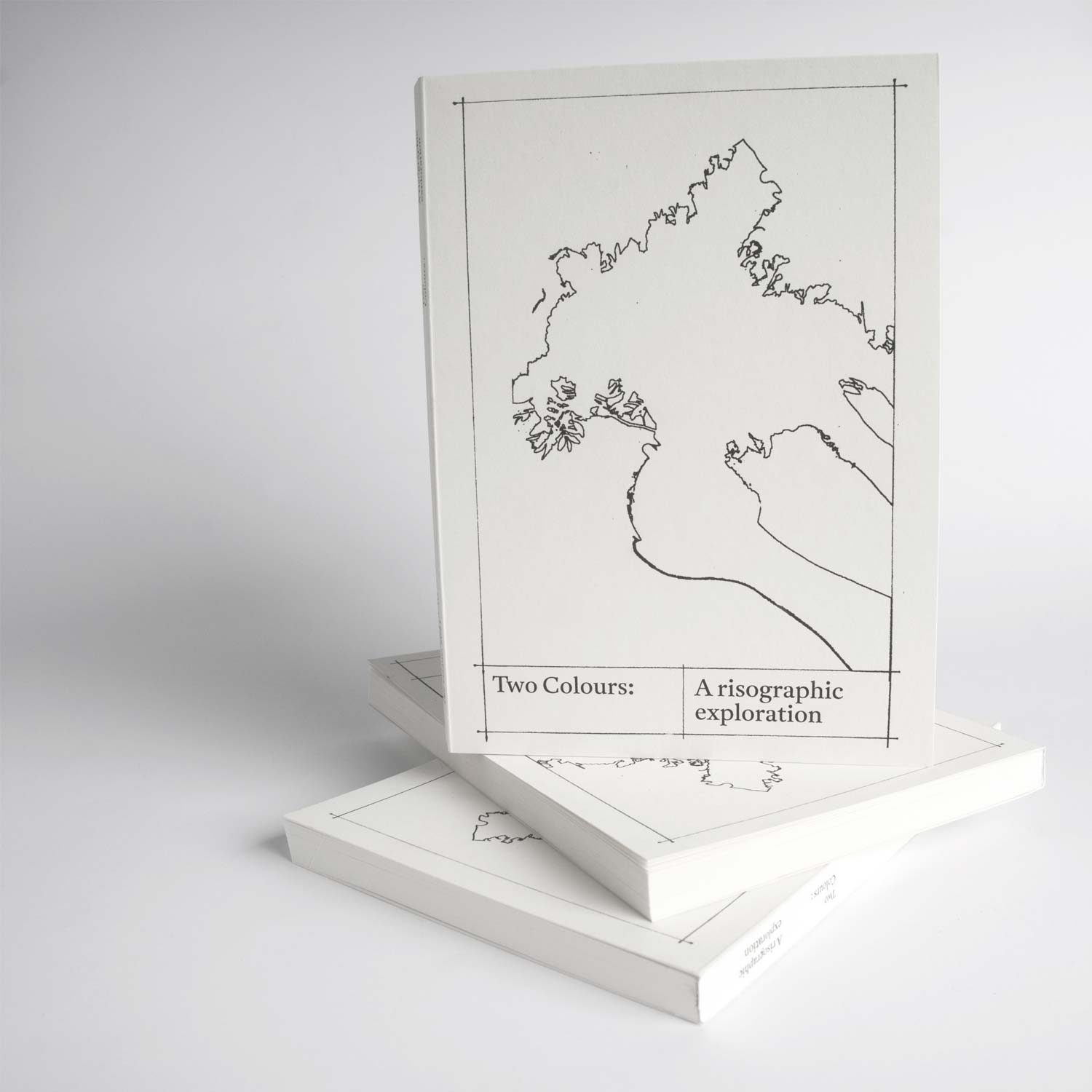
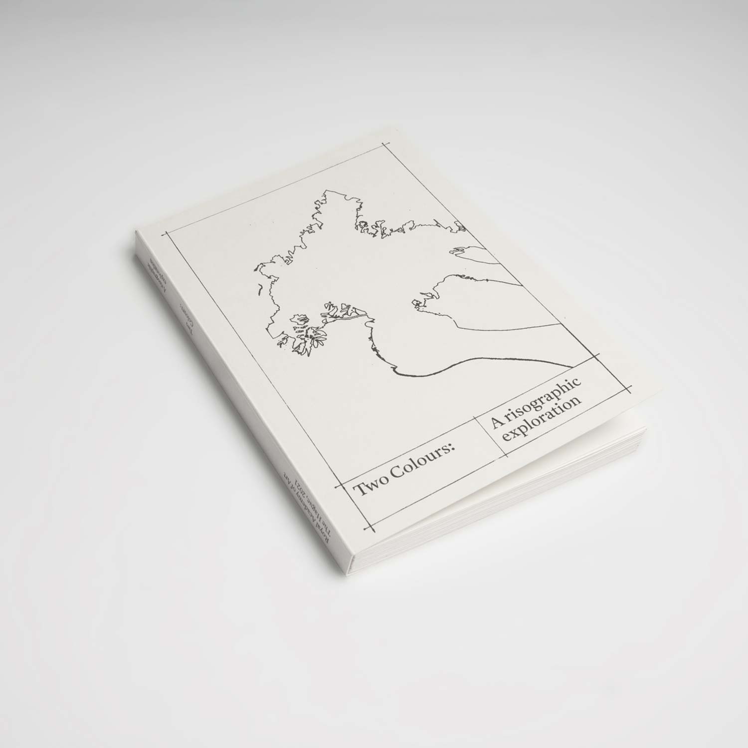
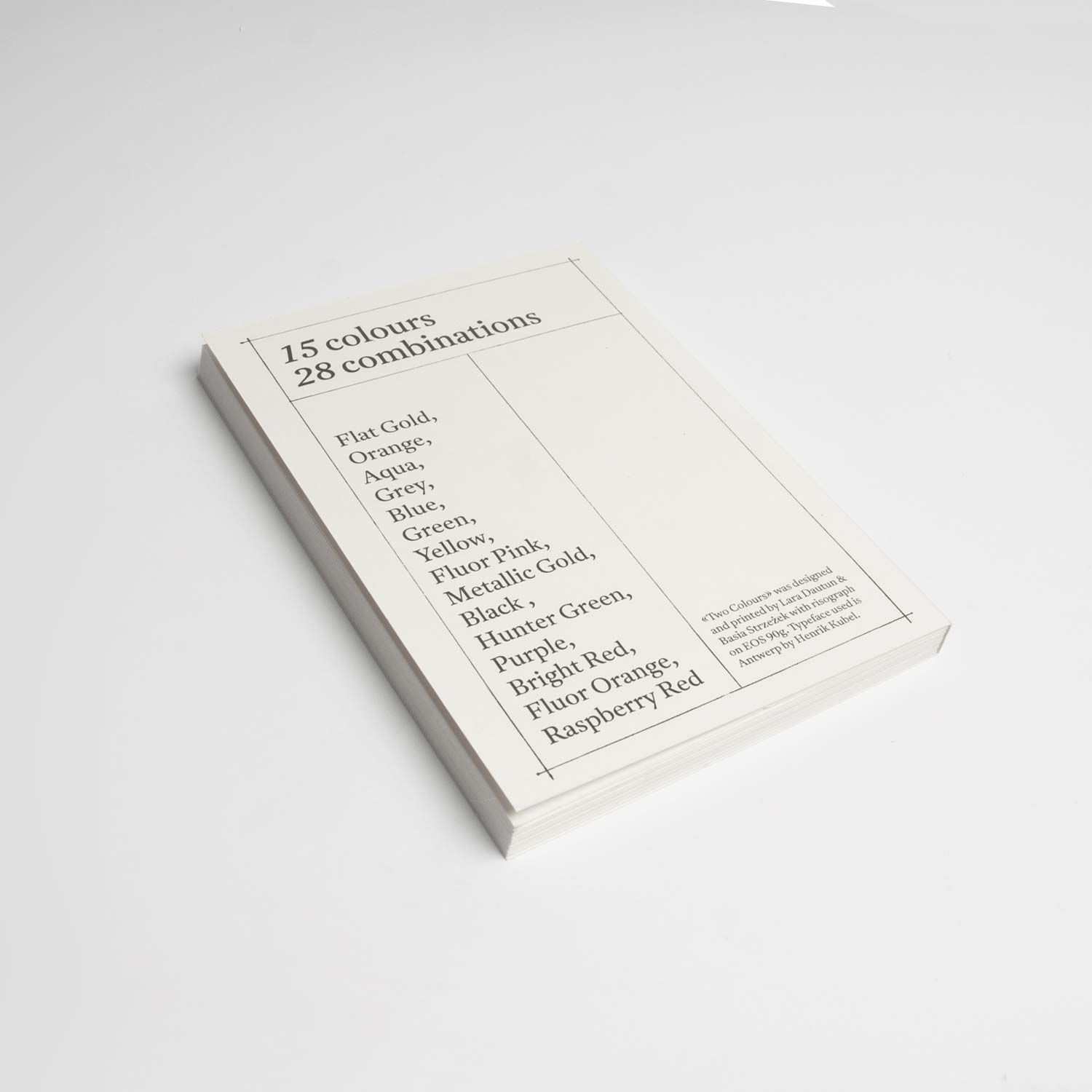
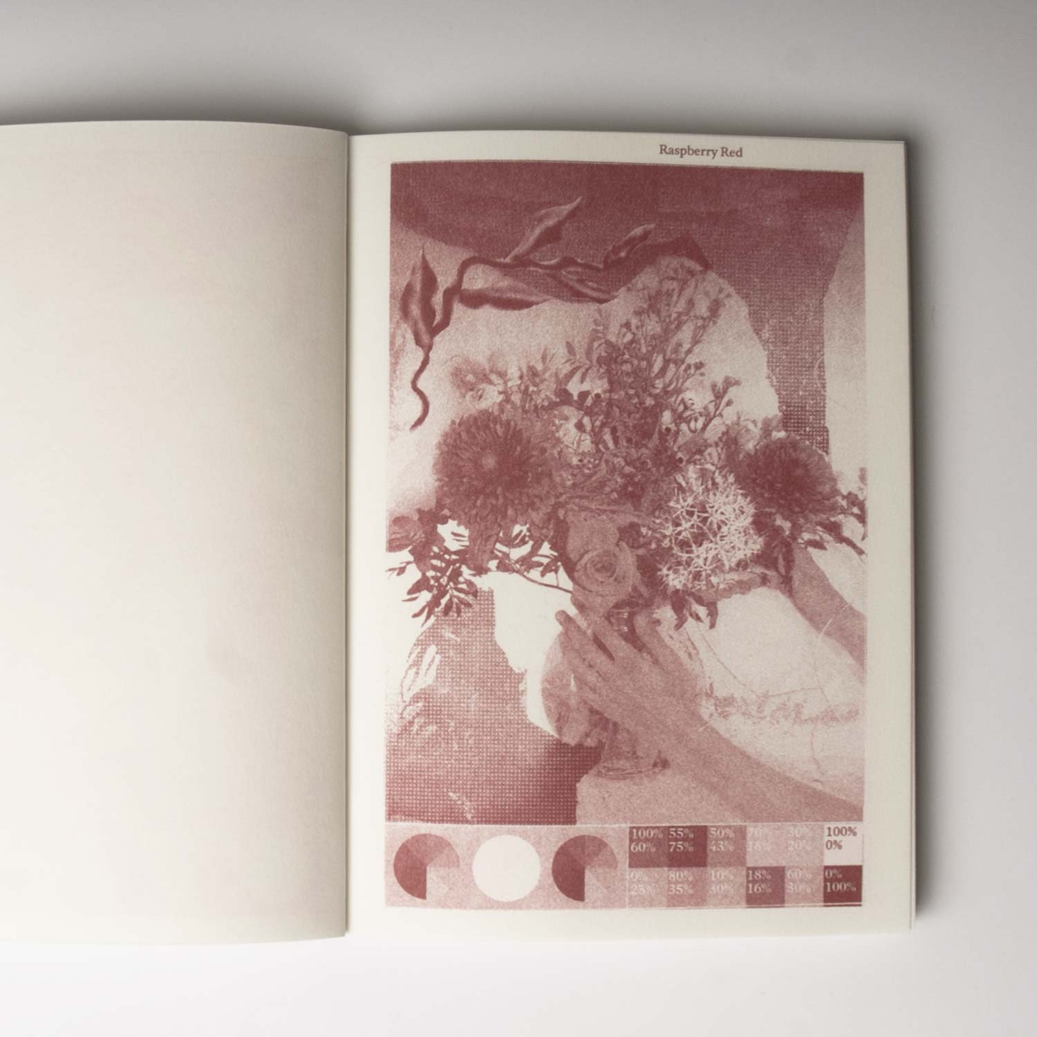
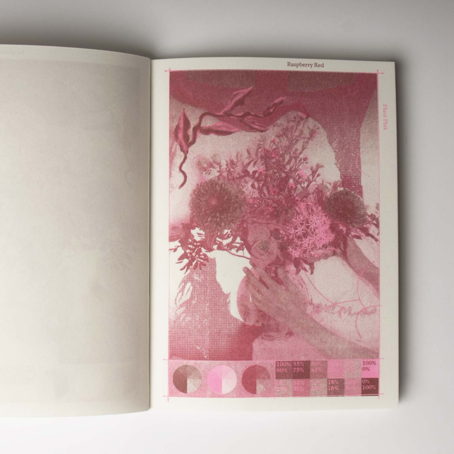
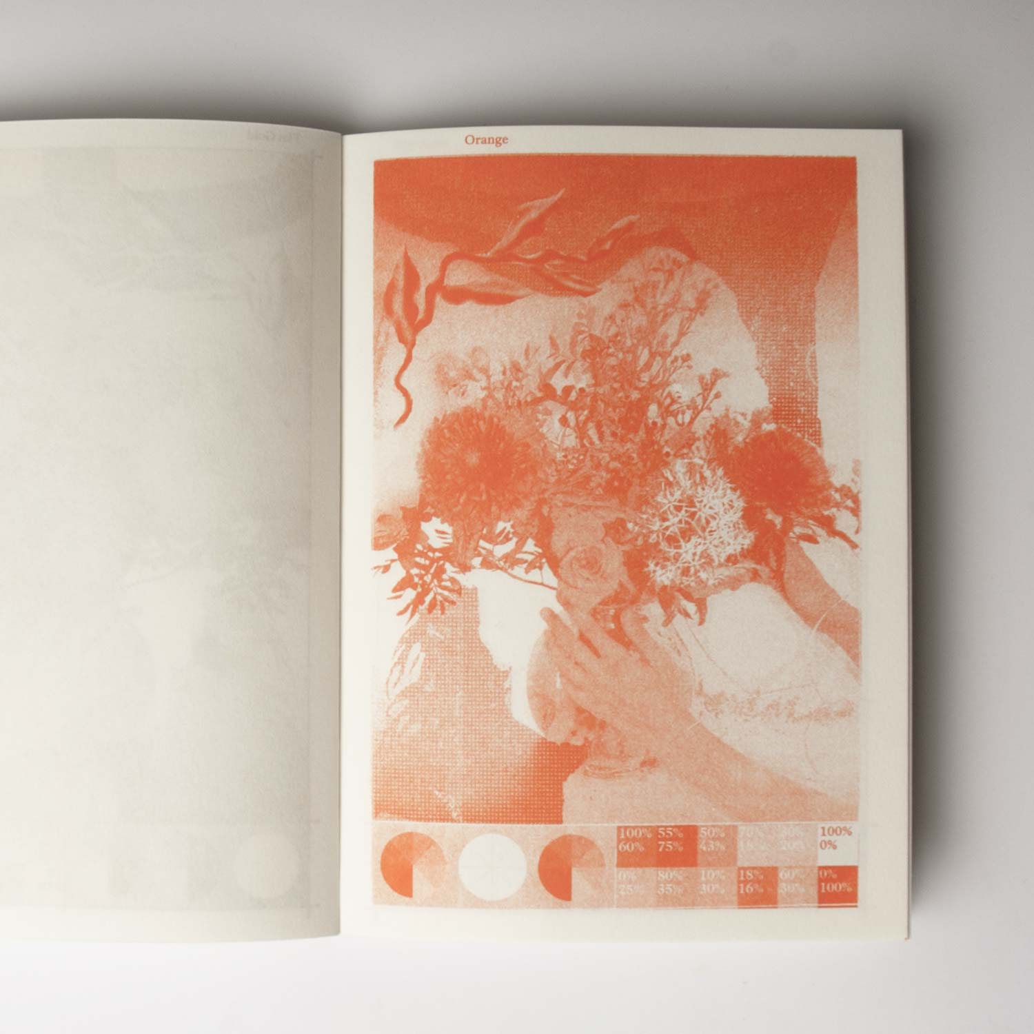
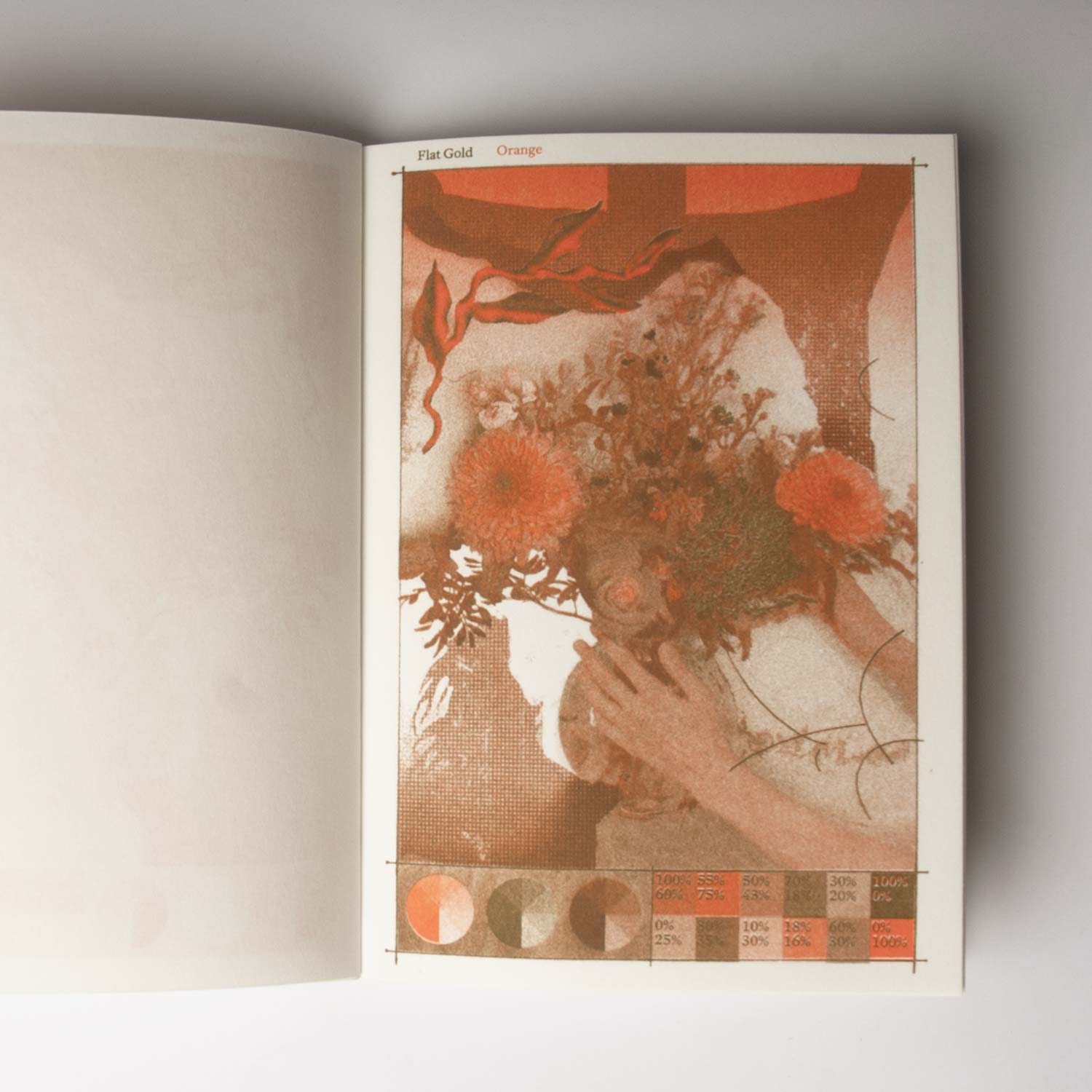
15 colours, 28 combinations, and a good dozen of hours spent with the Risograph. Imagined in collaboration
with Barbara Strzezek, Two Colours is a technical and chromatic guide exploring colour associations and (a
part of) the range of visual potentials specific to this technology.
Hiterto
Editorial Design/ Editing
2021, Collaborative publication, 32 pages, 210 × 297 mm
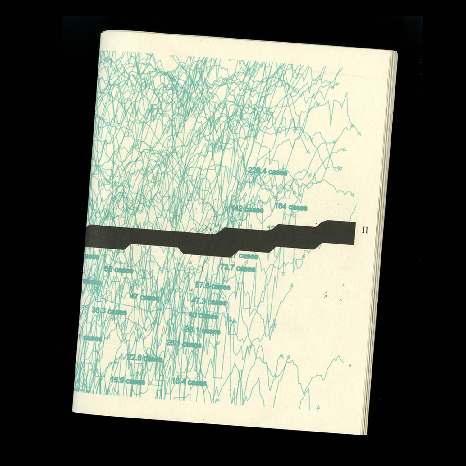
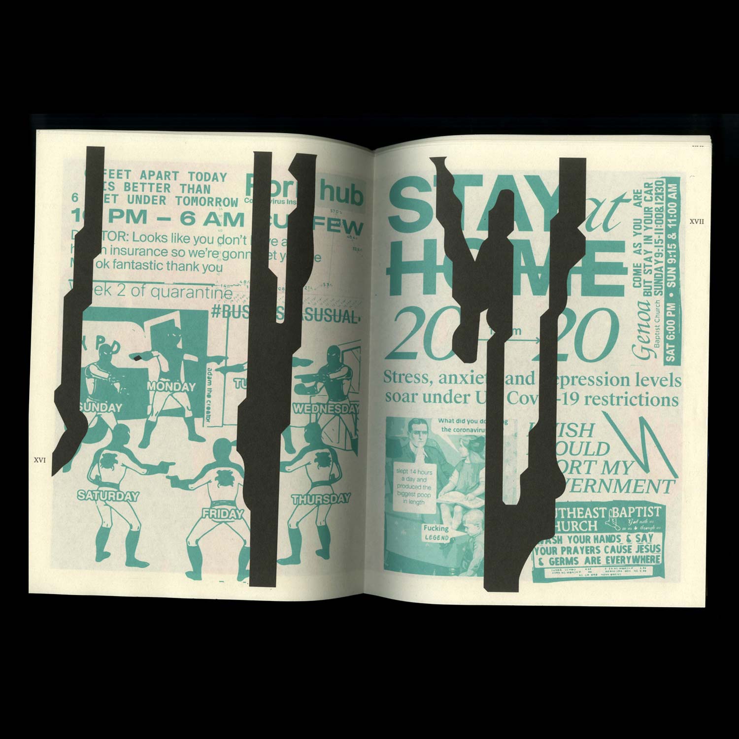
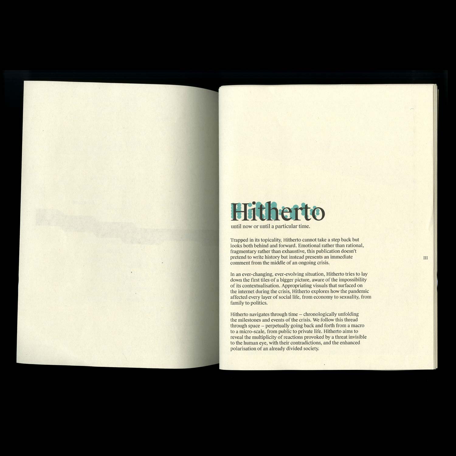
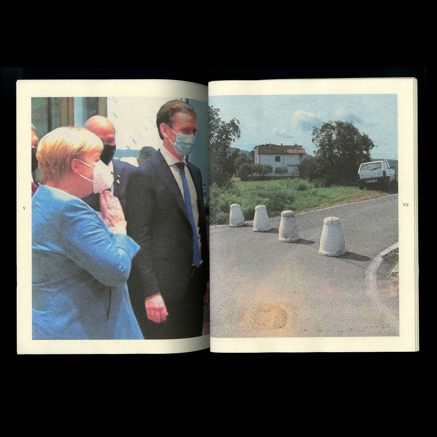
Hiterto (until now or until a particular time)
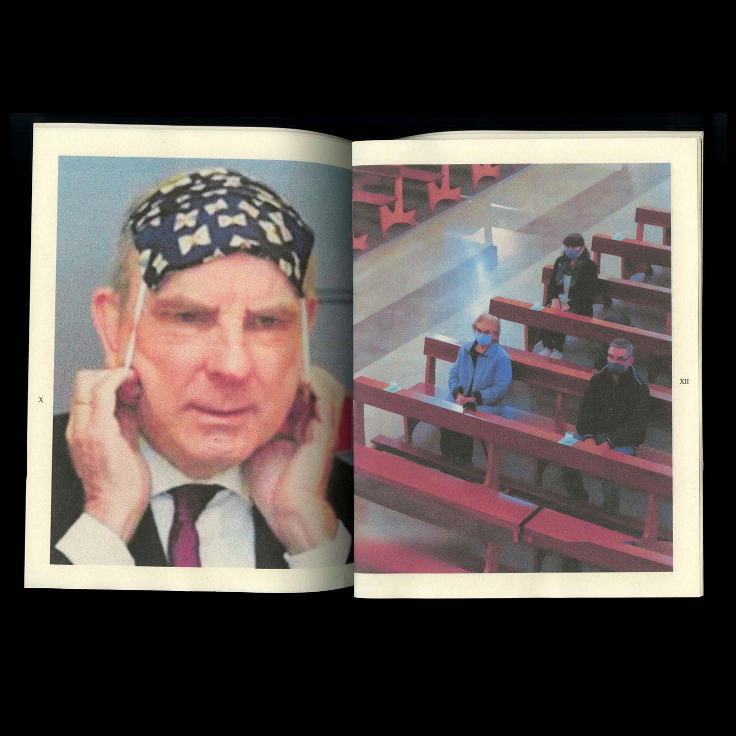
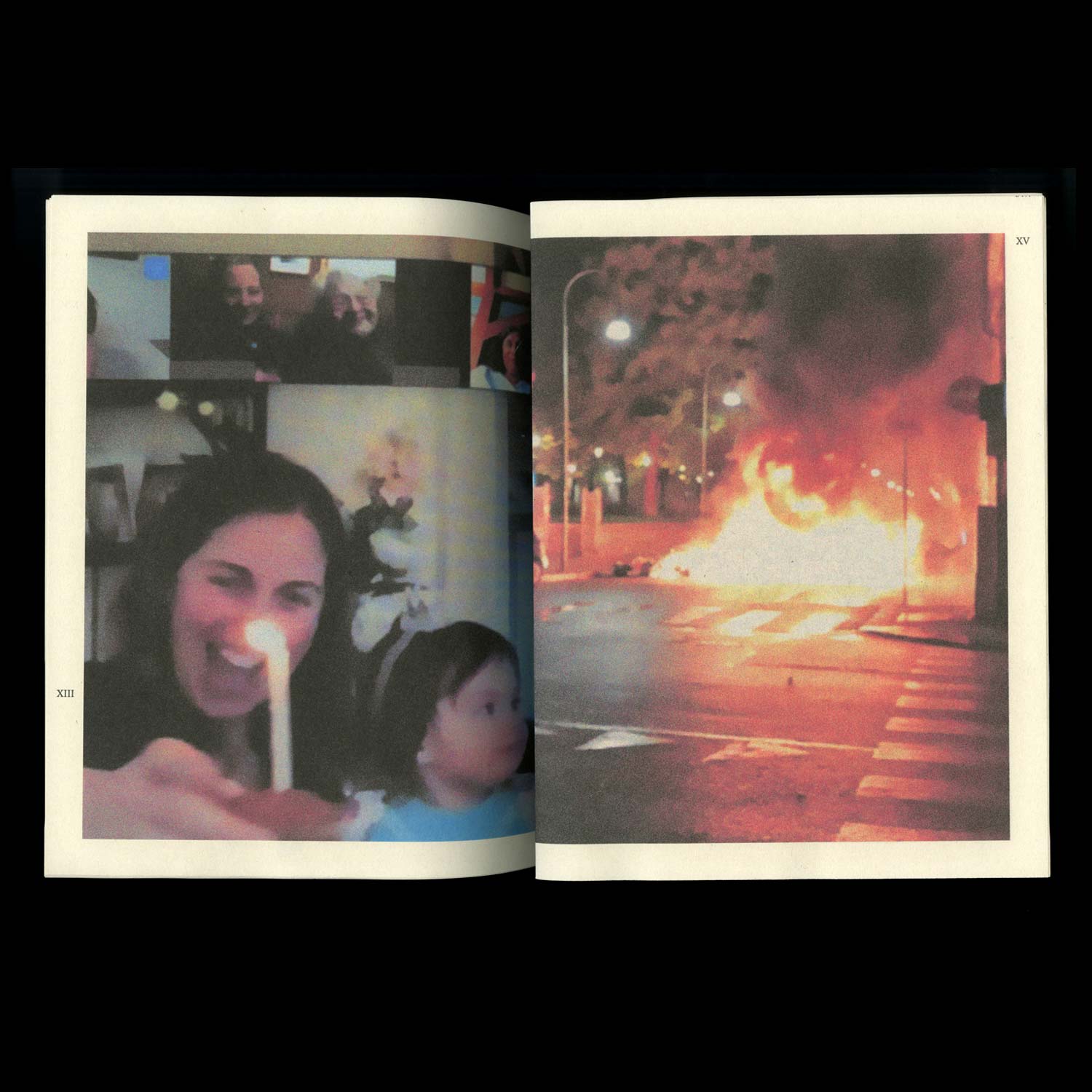
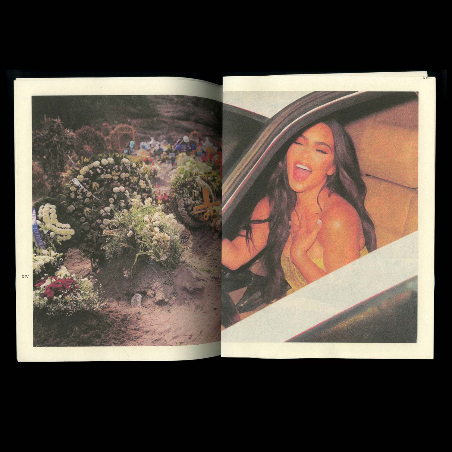
This collective publication — created in the midst of the first lockdown — explores the multiplicity of reactions provoked by a threat invisible to the human eye, with their contradictions, their complexity and the enhanced polarisation of an already divided society.
This collective publication — created in the midst of the first lockdown — explores the multiplicity of reactions provoked by a threat invisible to the human eye, with their contradictions, their complexity and the enhanced polarisation of an already divided society.
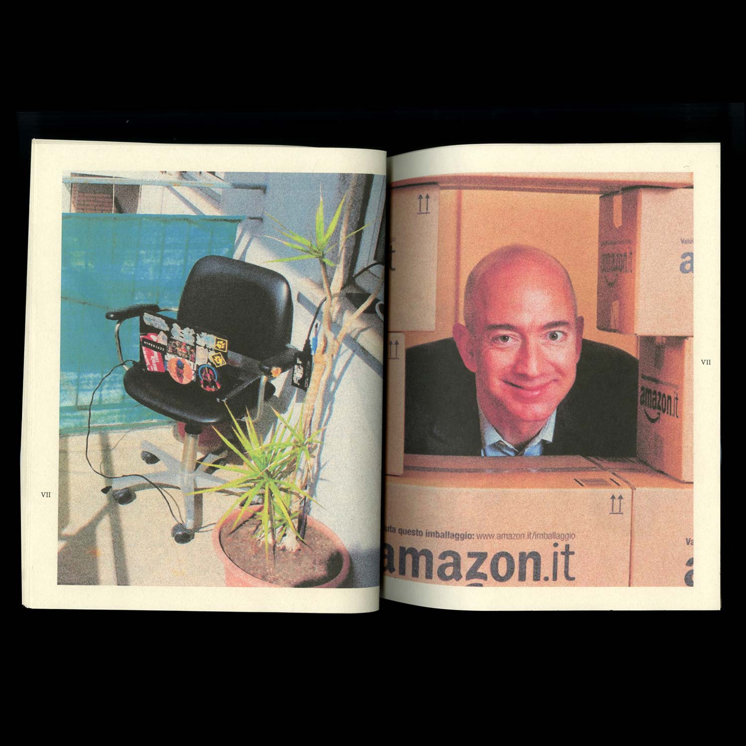
Colour Block
Image/ Writing
2021, 180 × 75 cm
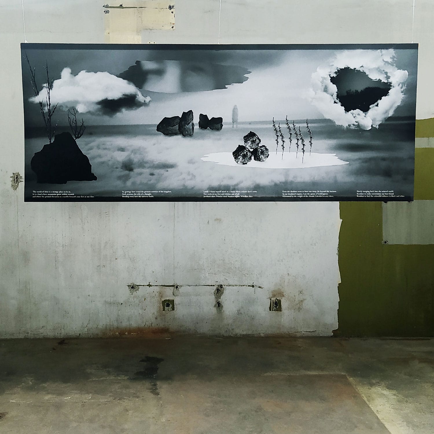
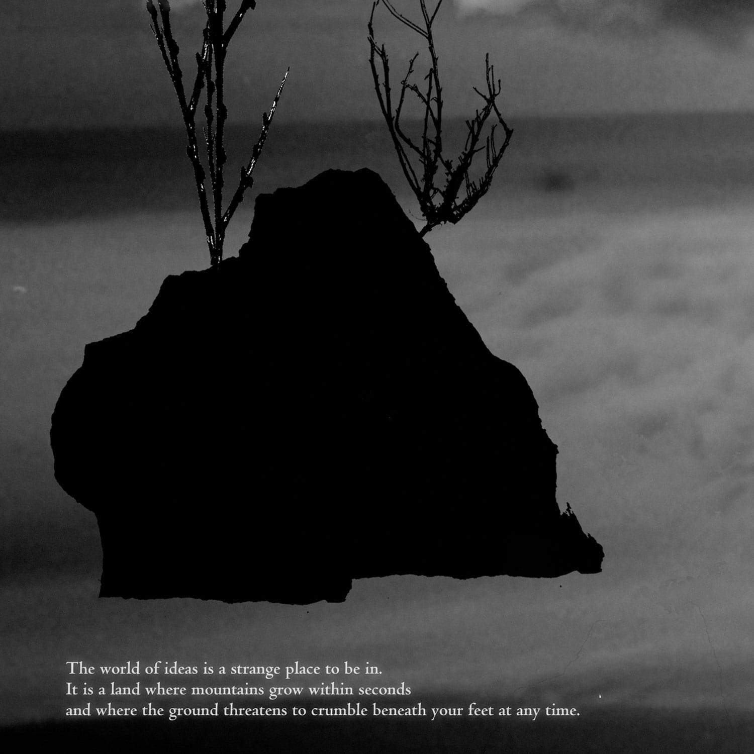
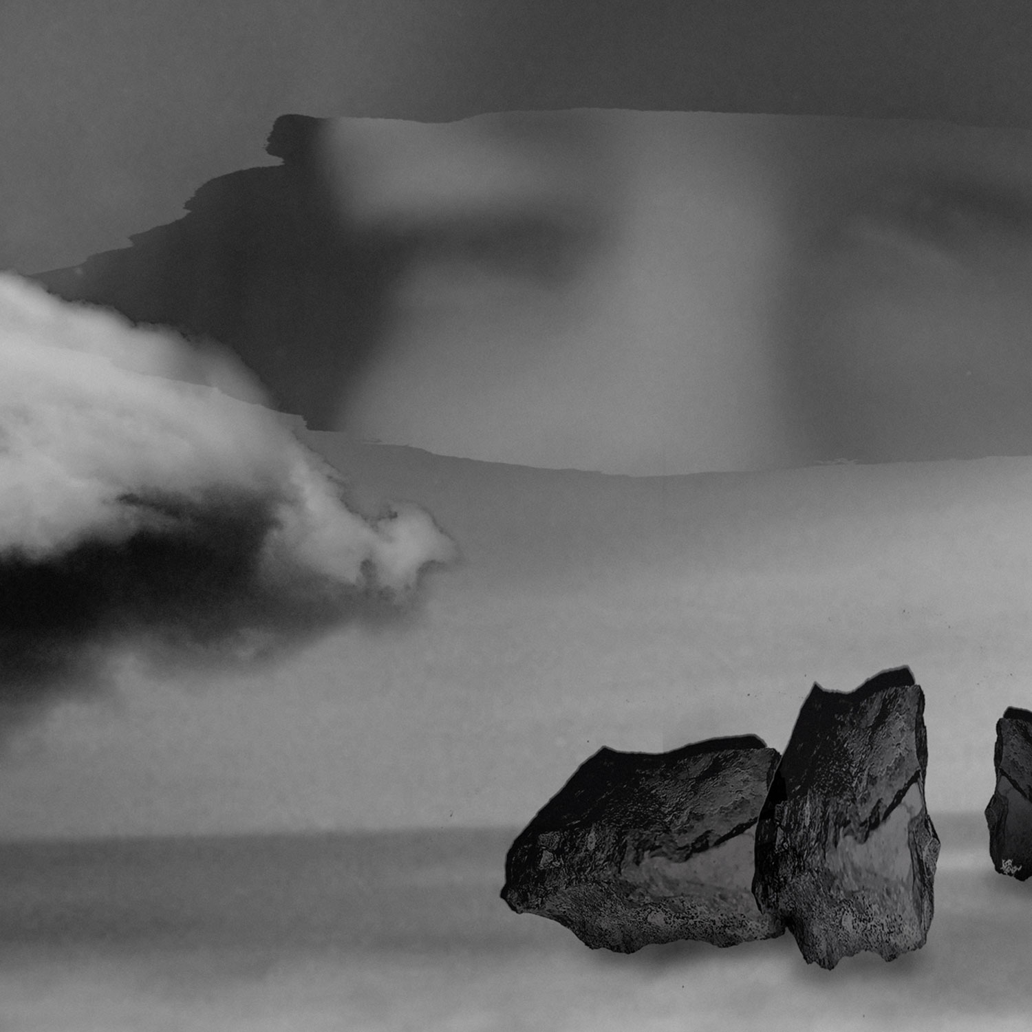
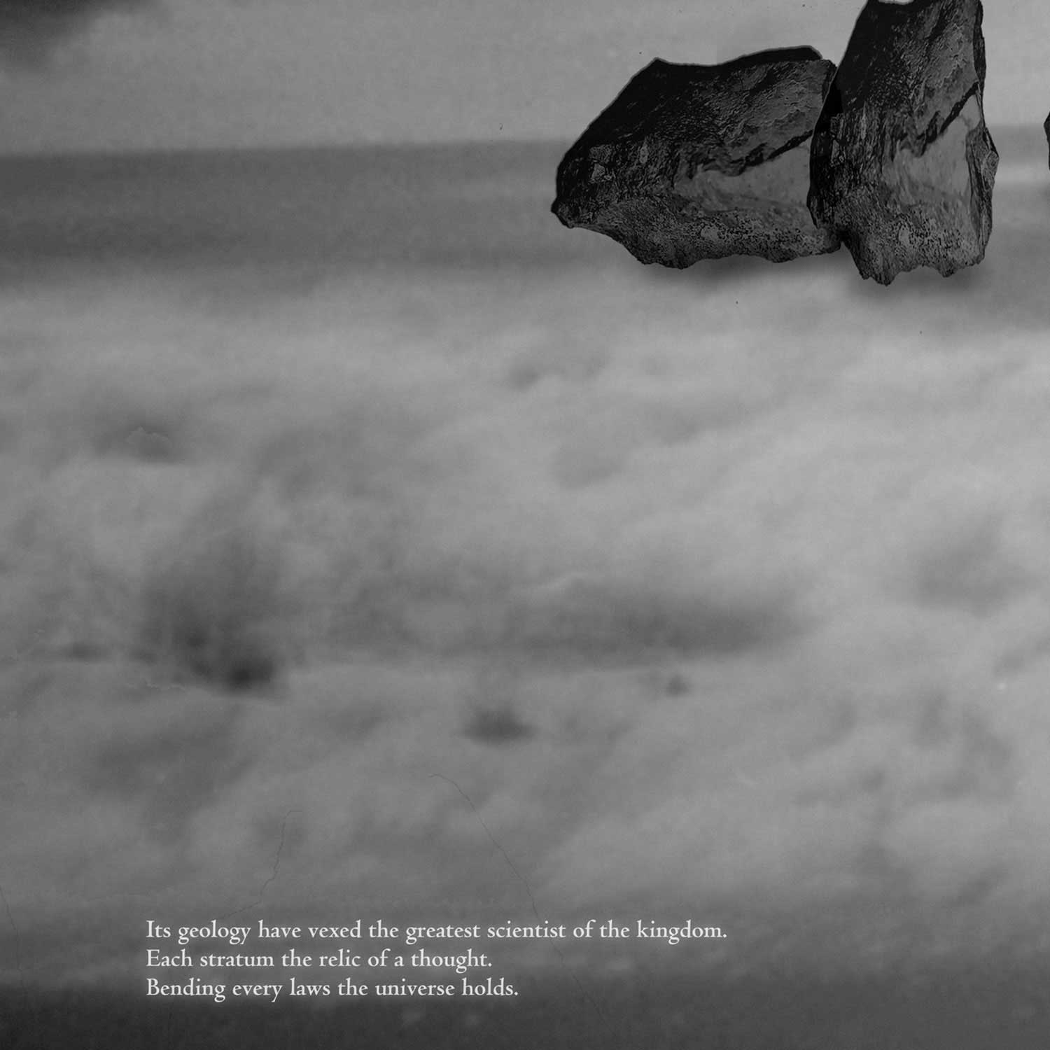
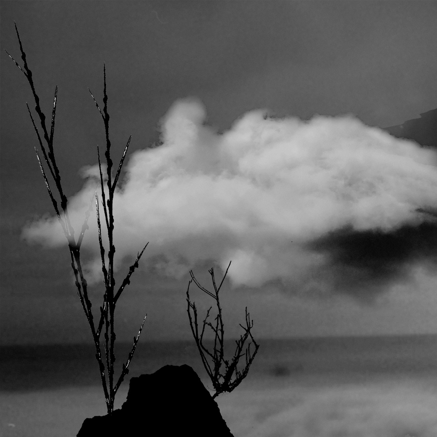
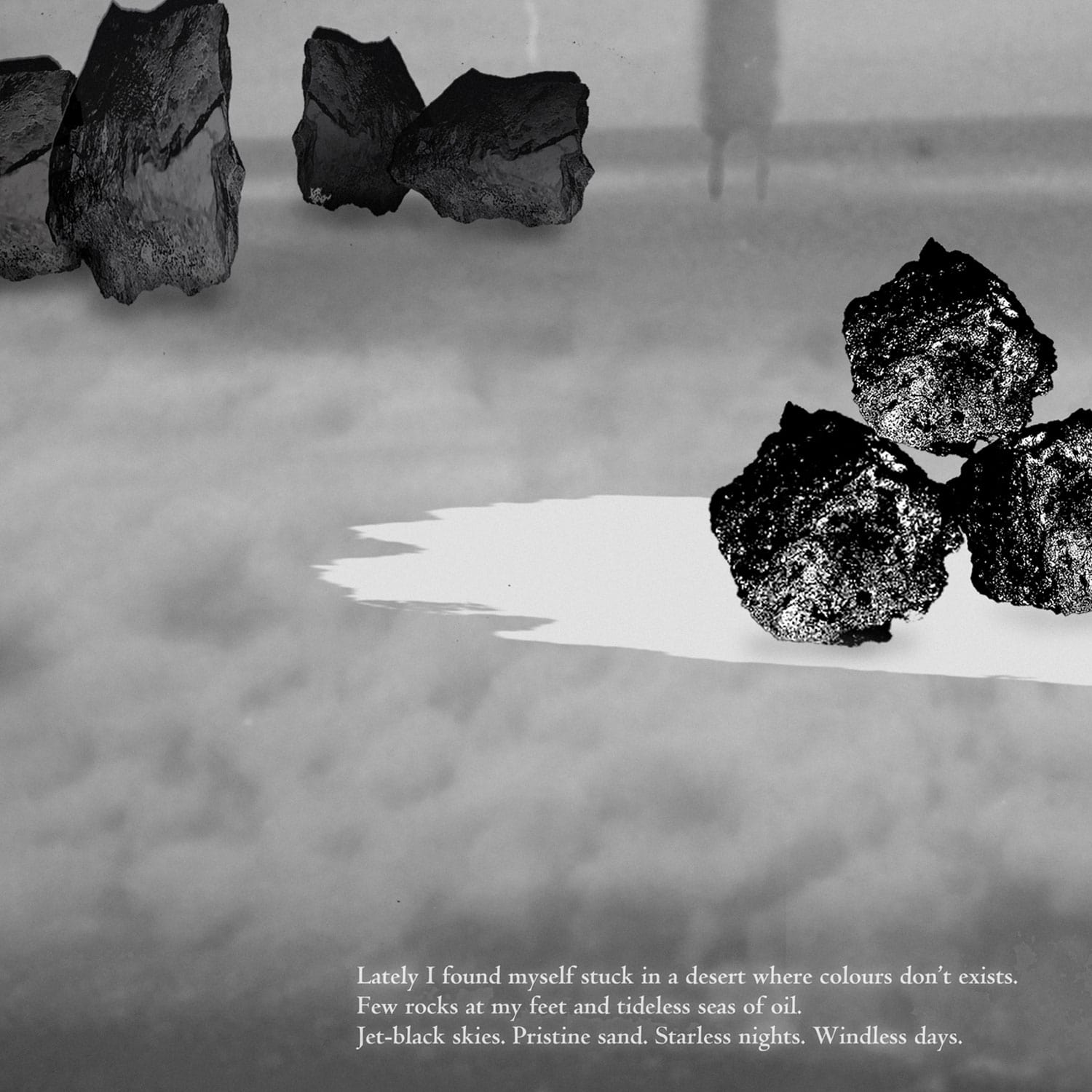
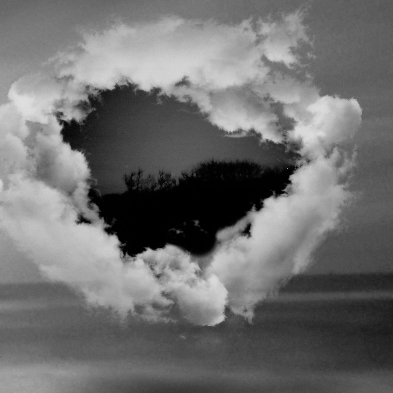
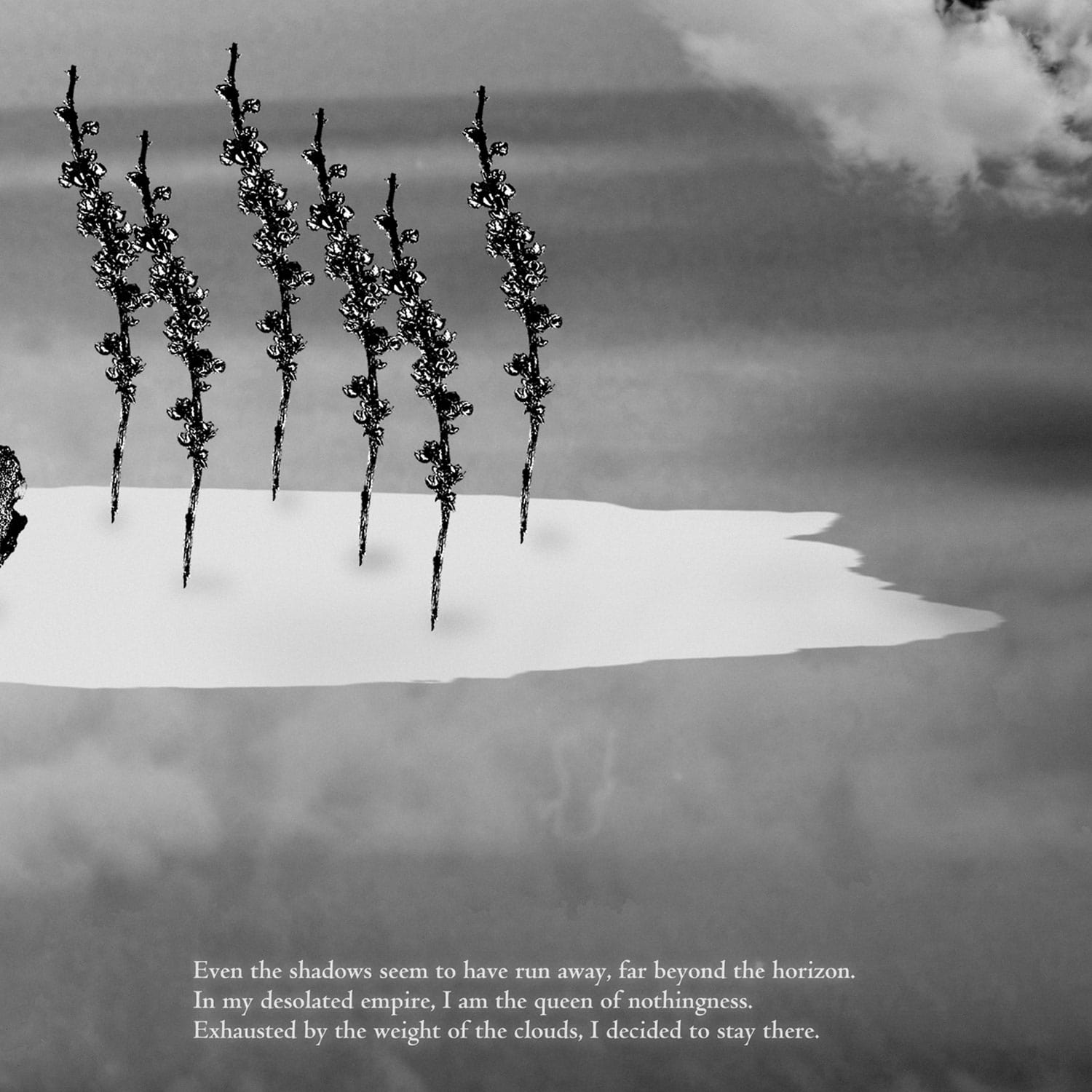
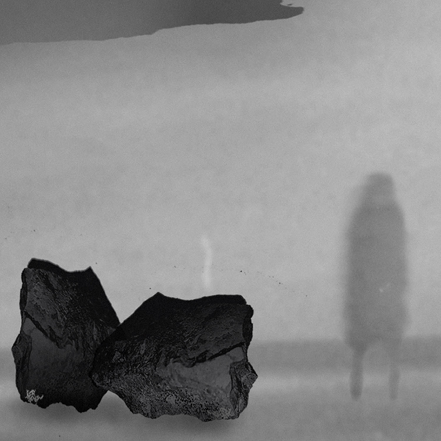
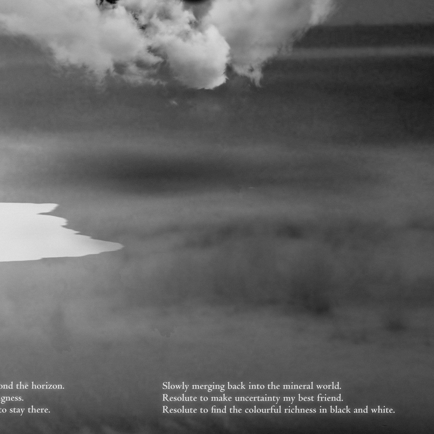
A journey in the dry and ominous landscape of a creative block.
What happens when ideas dissapear, when they become elusive, volatile, out of reach? A tale about feeling
lost, being stuck and other internal struggles related to creation.
Letters From the Sublime
Image/ Writing
2021, 11 riso-printed postcards
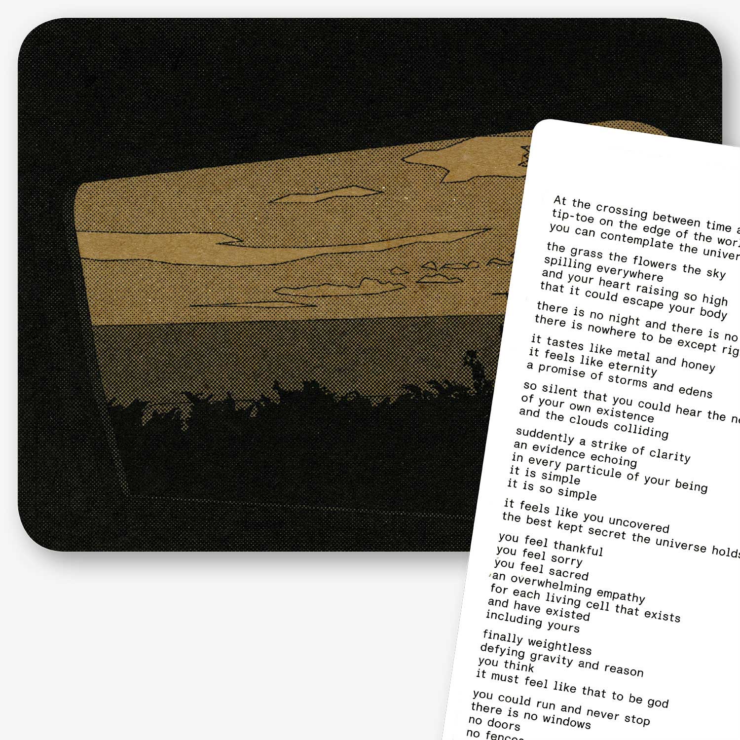
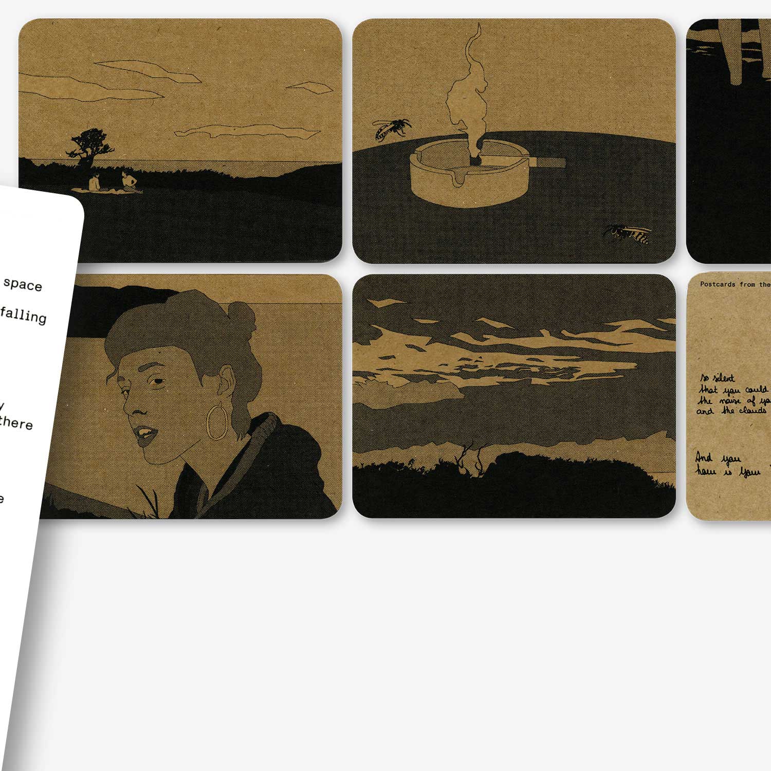
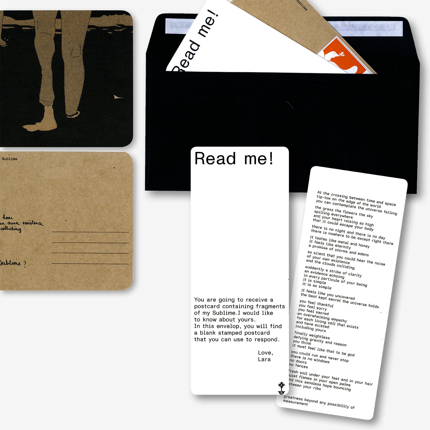
A literary and visual dissection of my Sublime. 11 envelops were sent to 11 persons, asking them about their
Sublime.
Inside Out
Image/ Video
2020, 4:59'
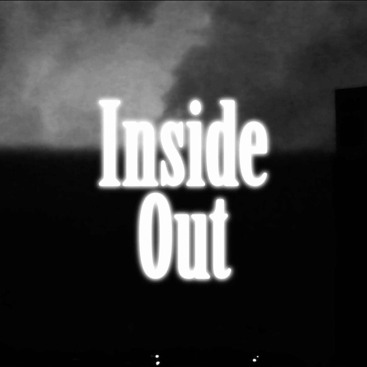
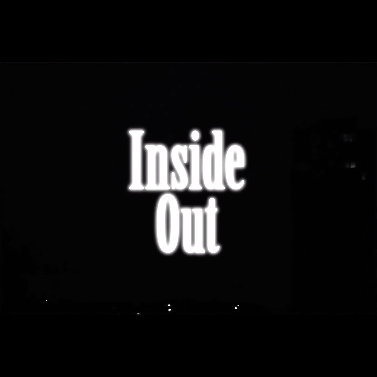
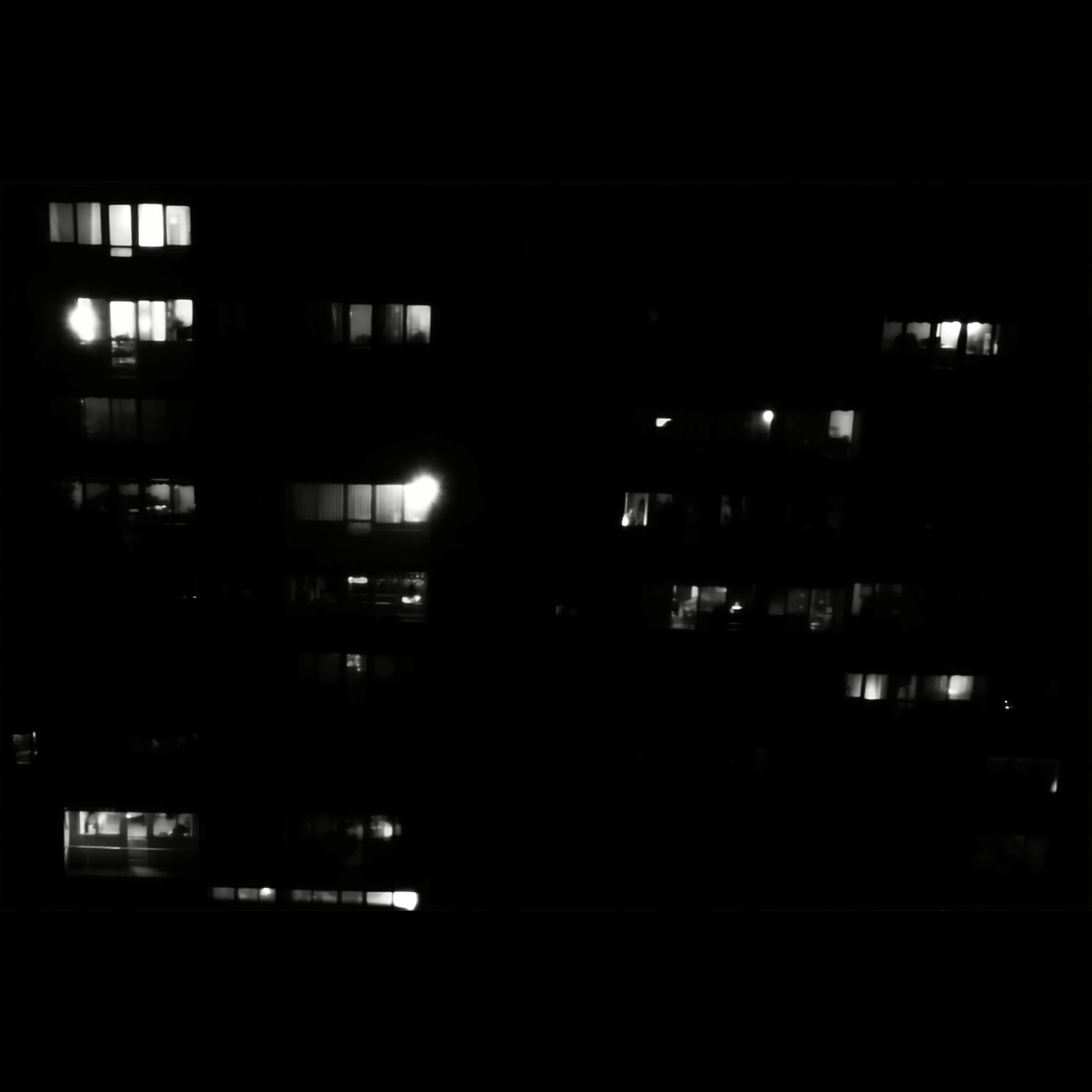
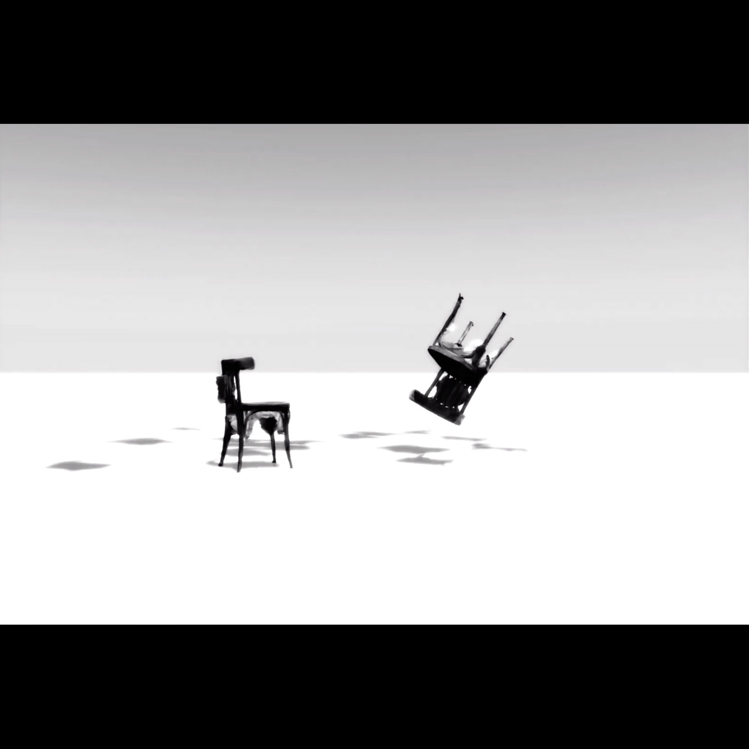
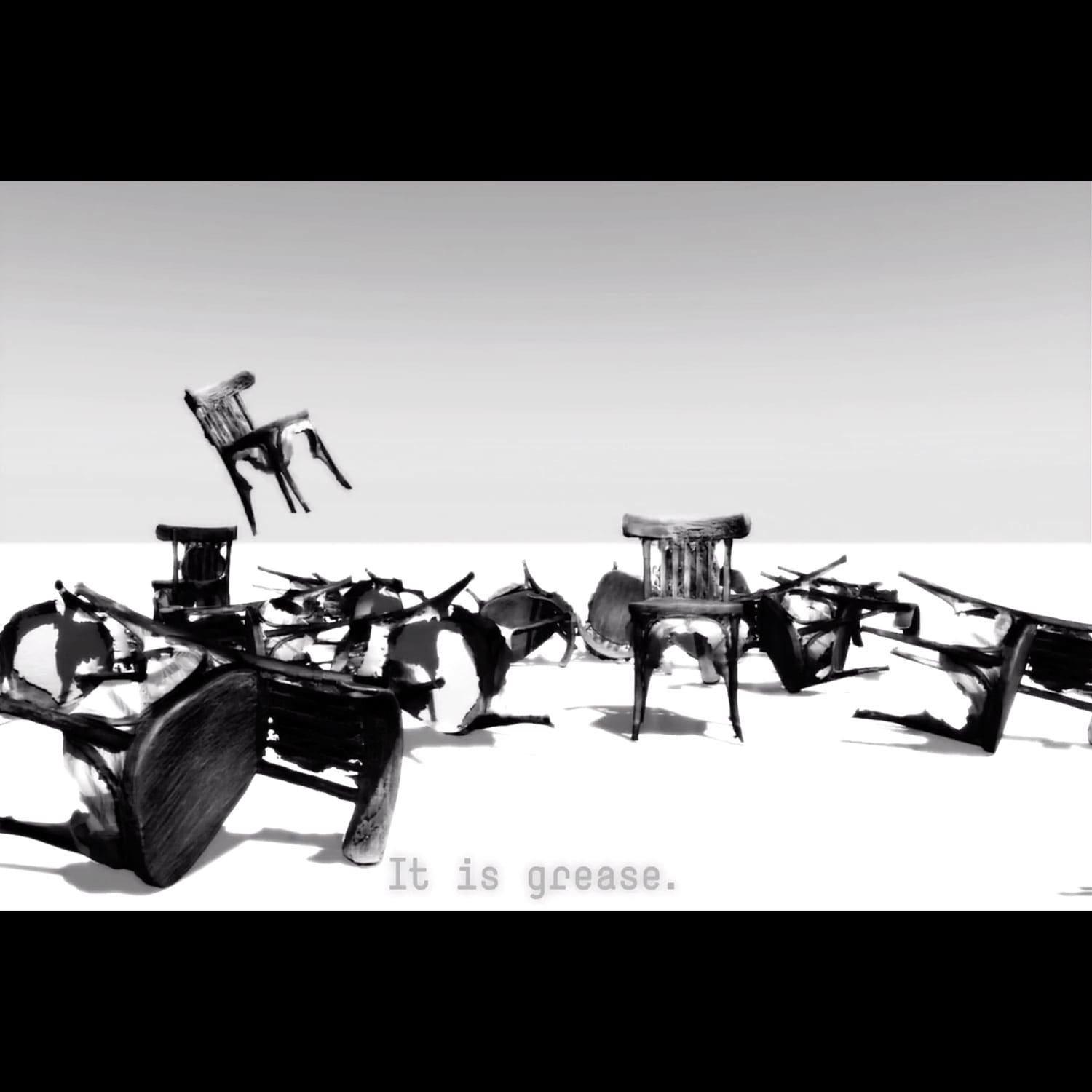
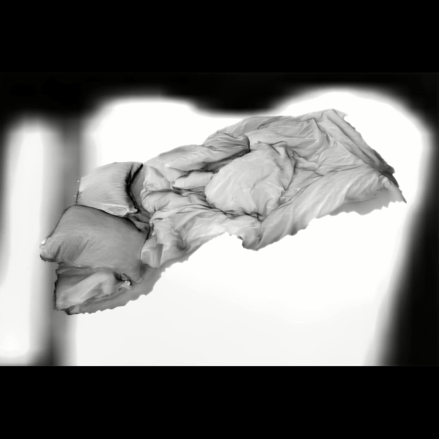
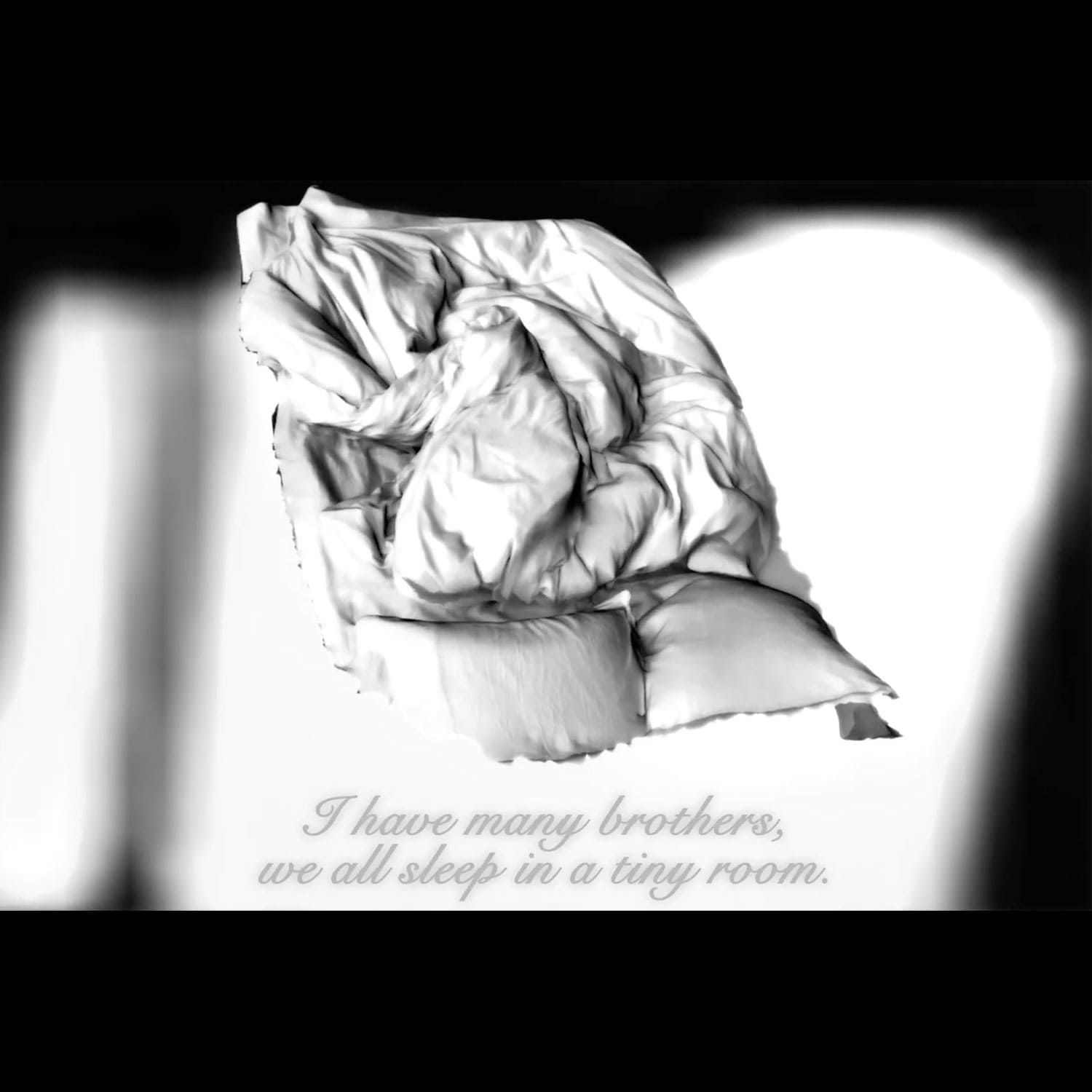
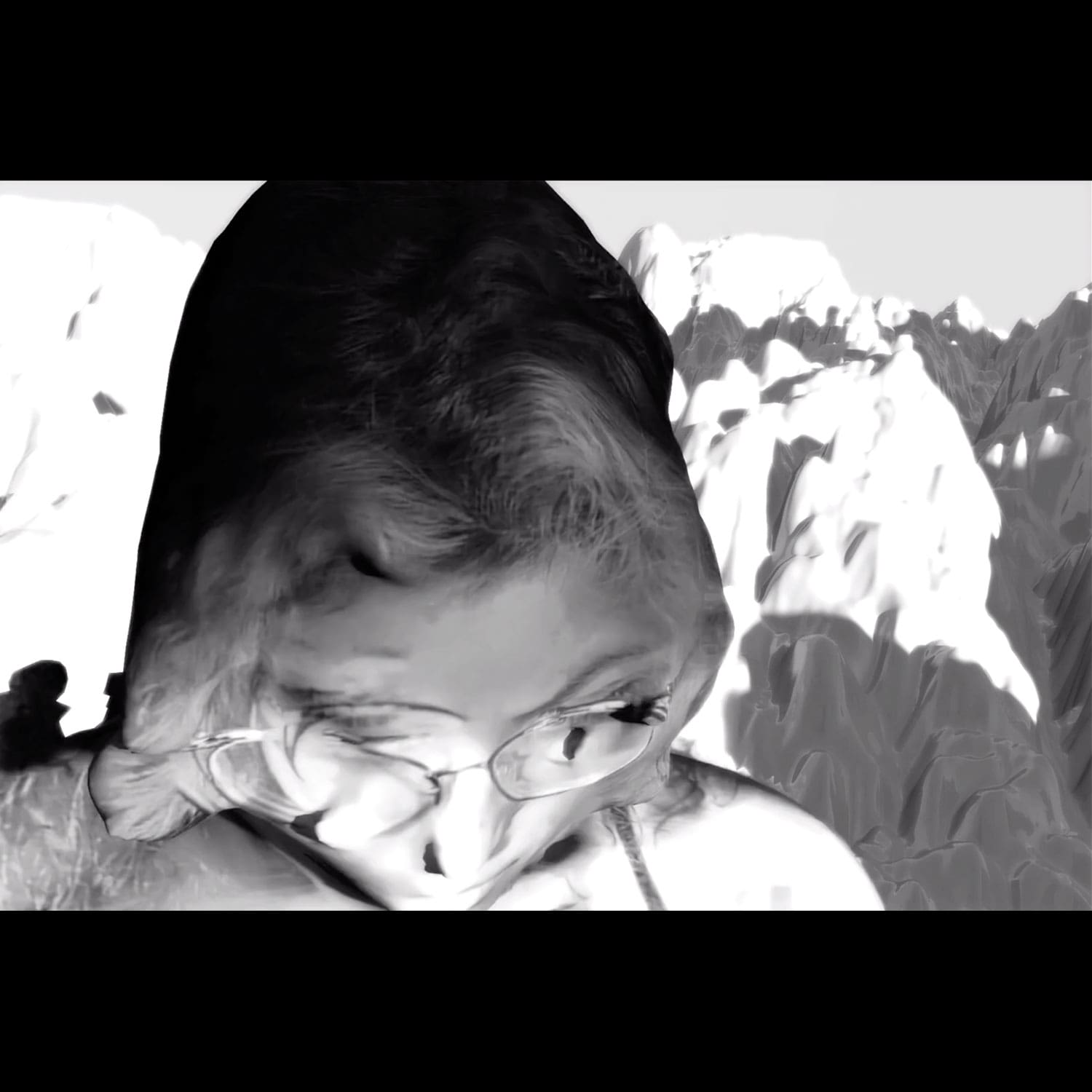
A nightmarish immersion in the dreams of a brain in lockdown.
Hulk
Type Design/ Coding
Typographic experimentations in Python
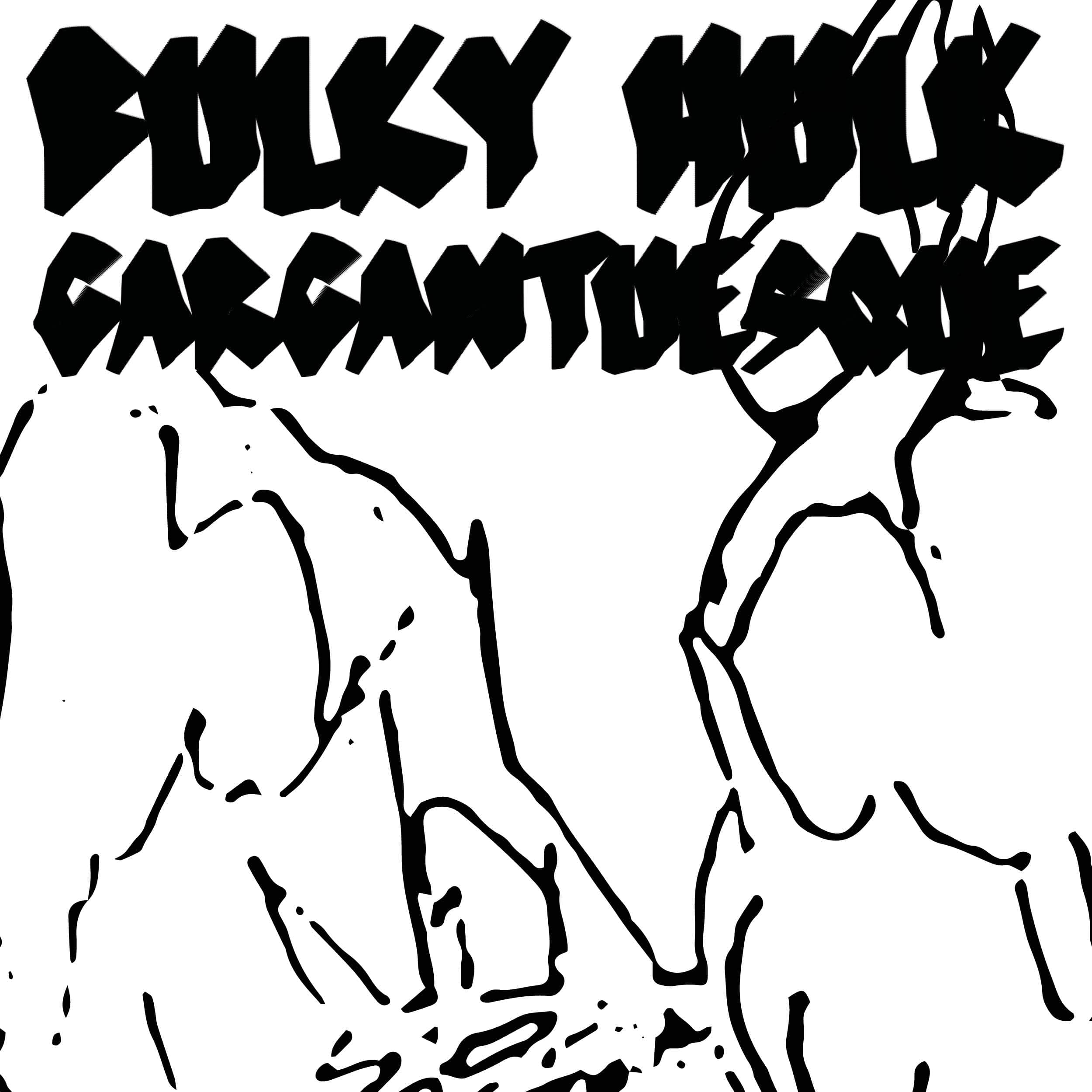
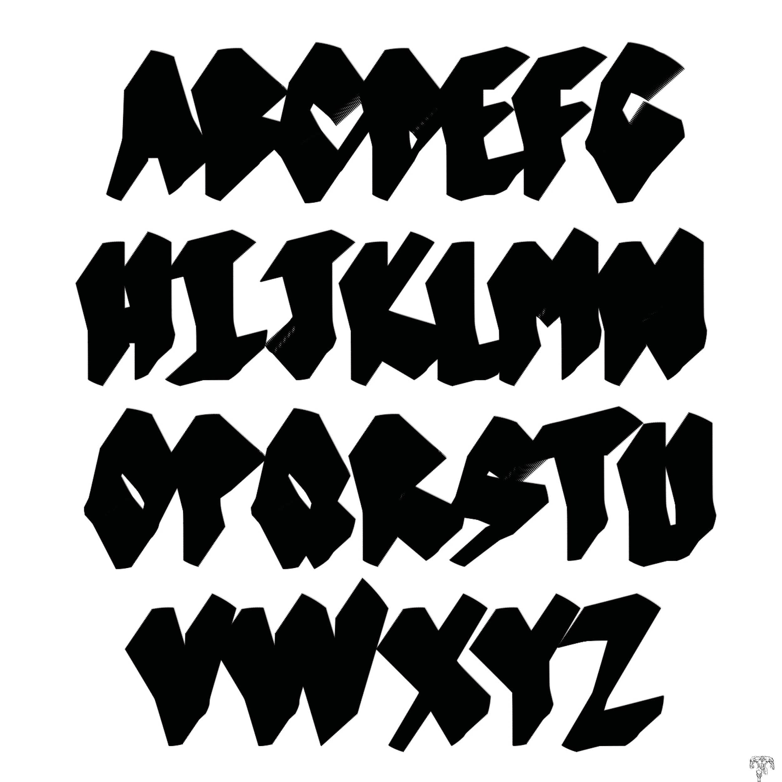
Hulk is a bulky font programmed in Python (Drawbot), using the creative potential of non-standardised tools
to invent new shapes.
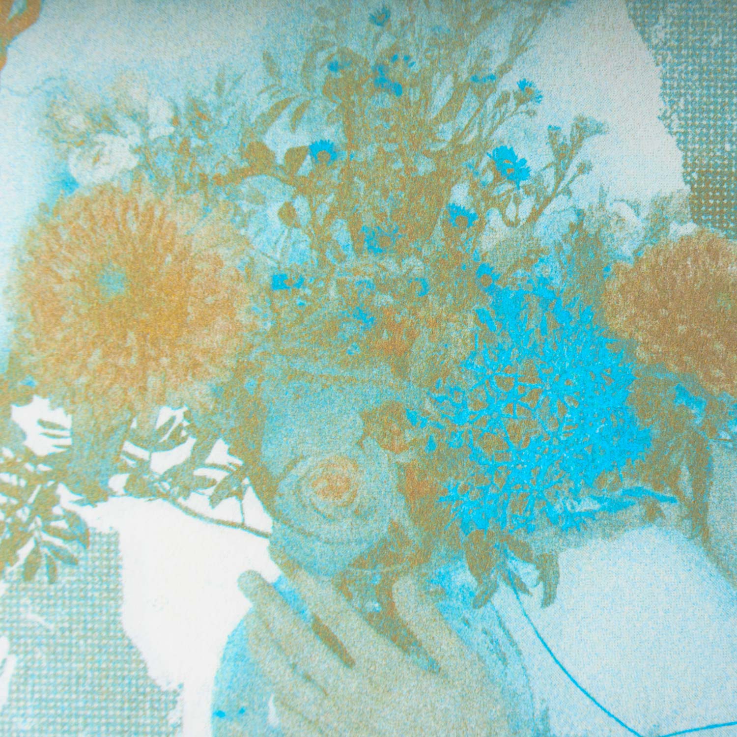
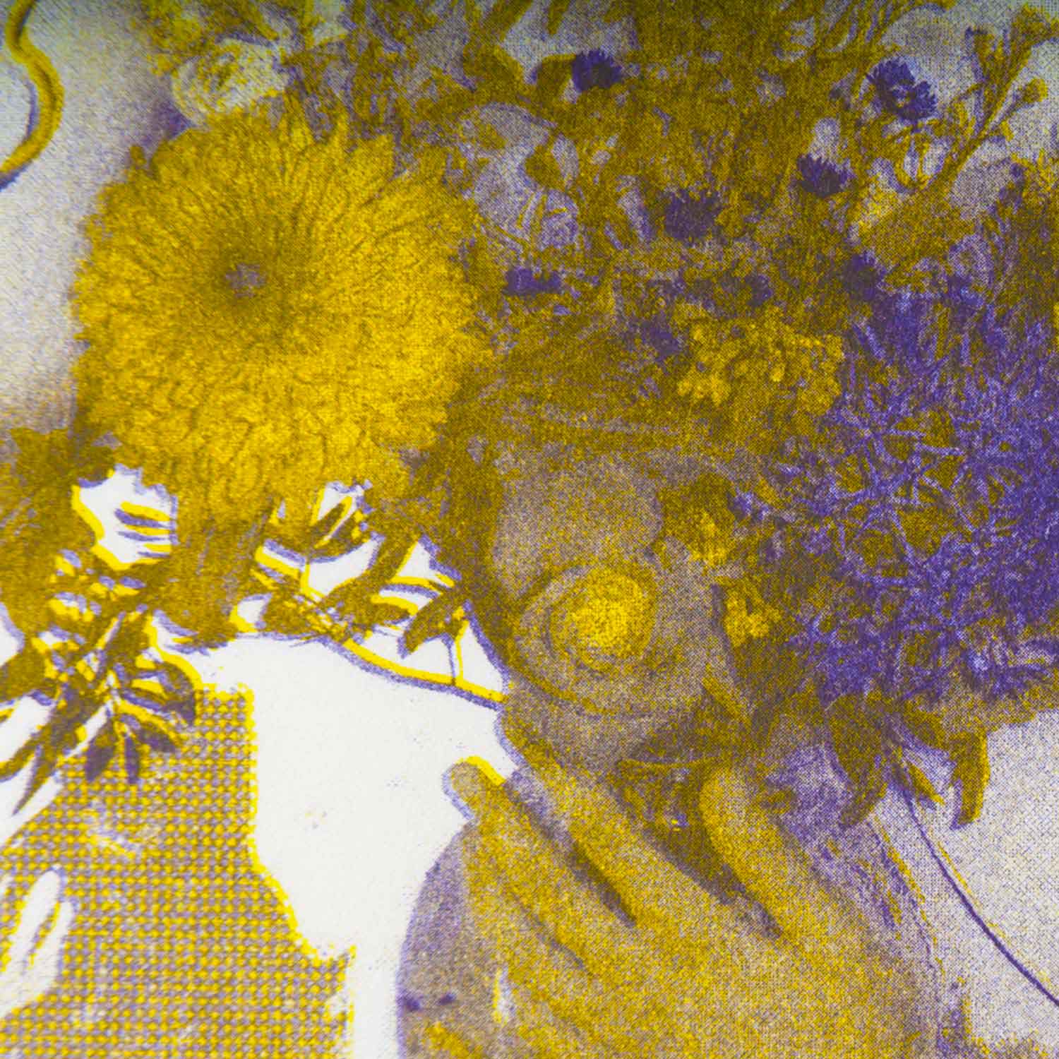
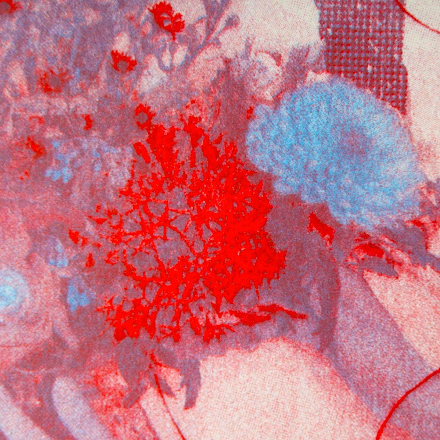
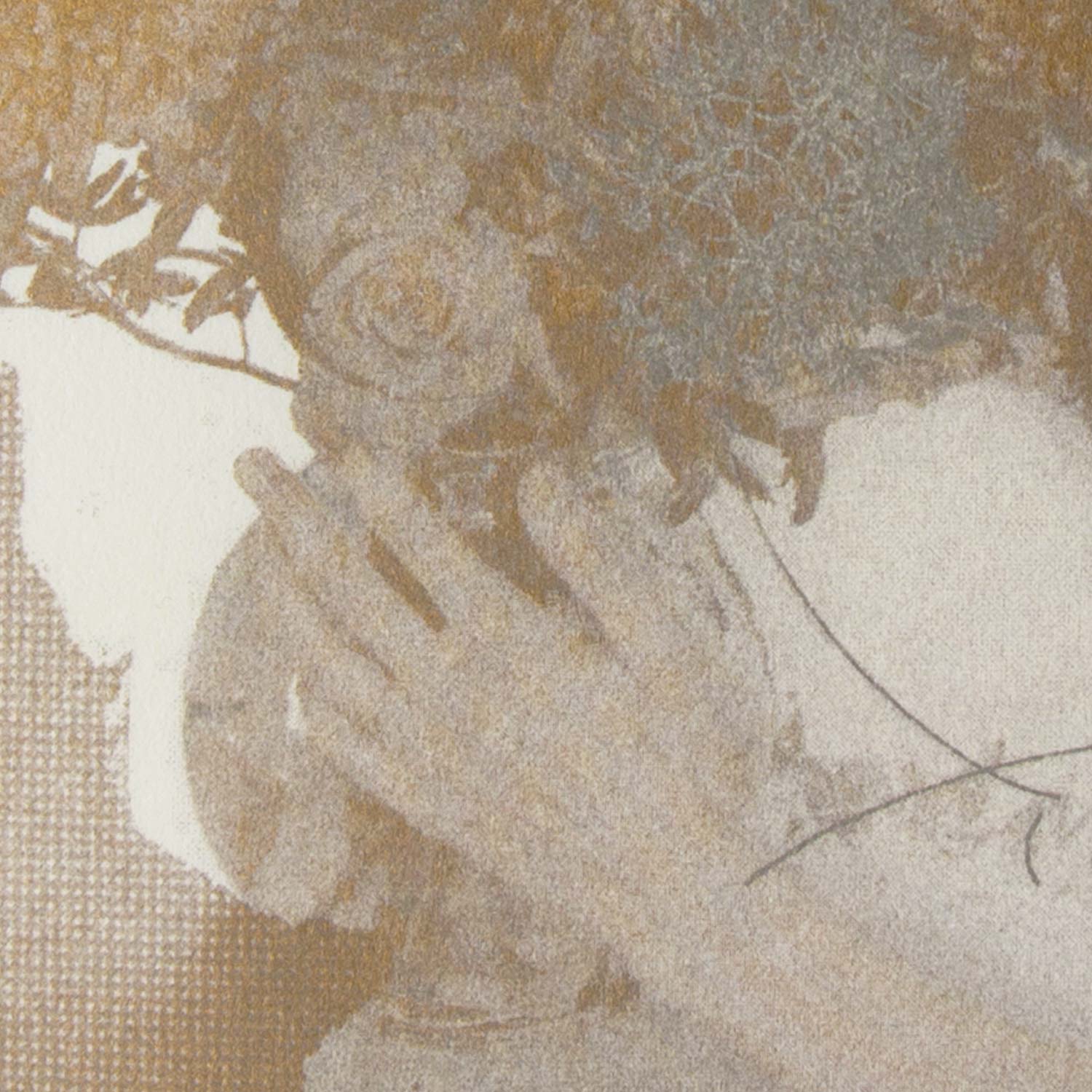
Red
Image/ Editing
2020, 70 pages, 290 × 594 mm
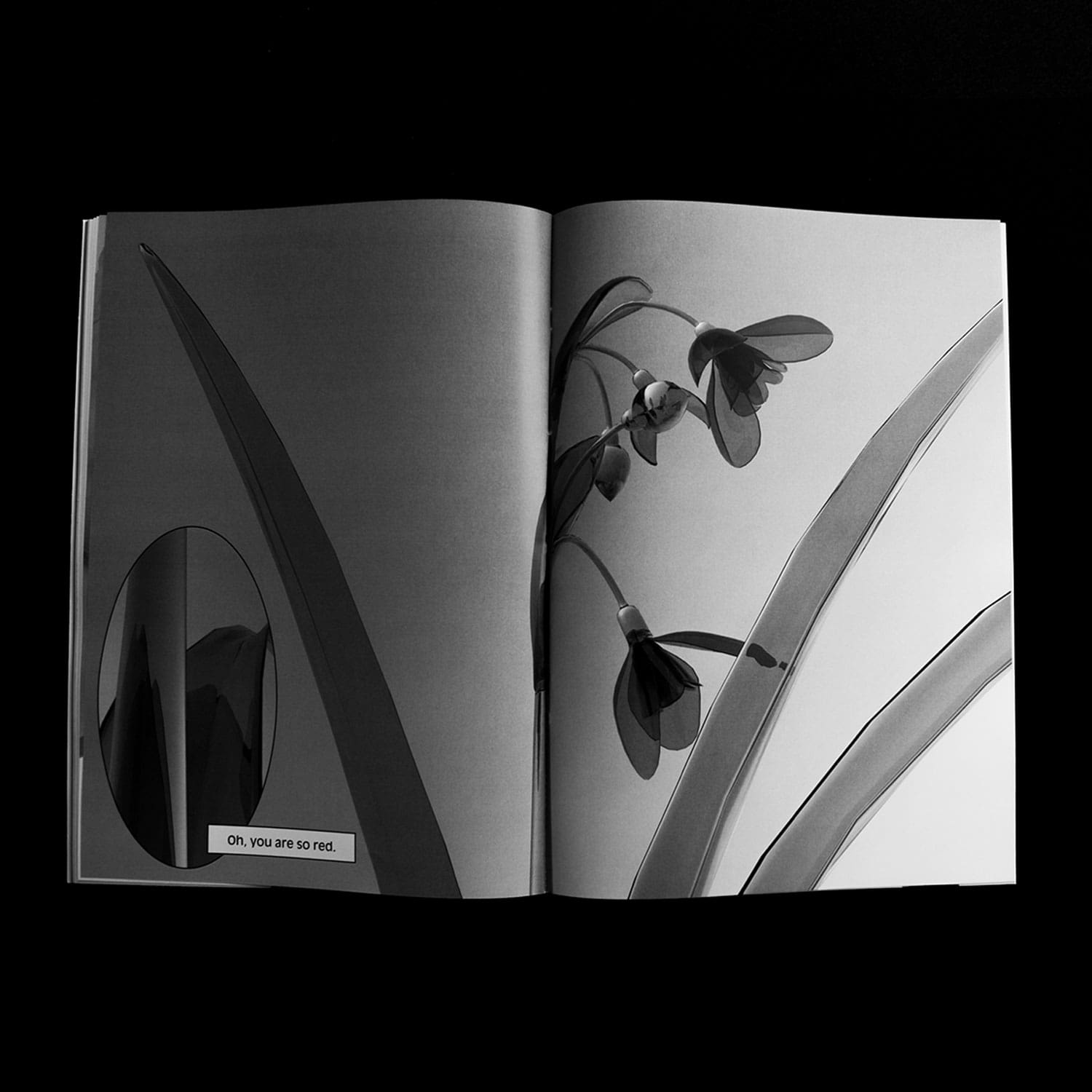
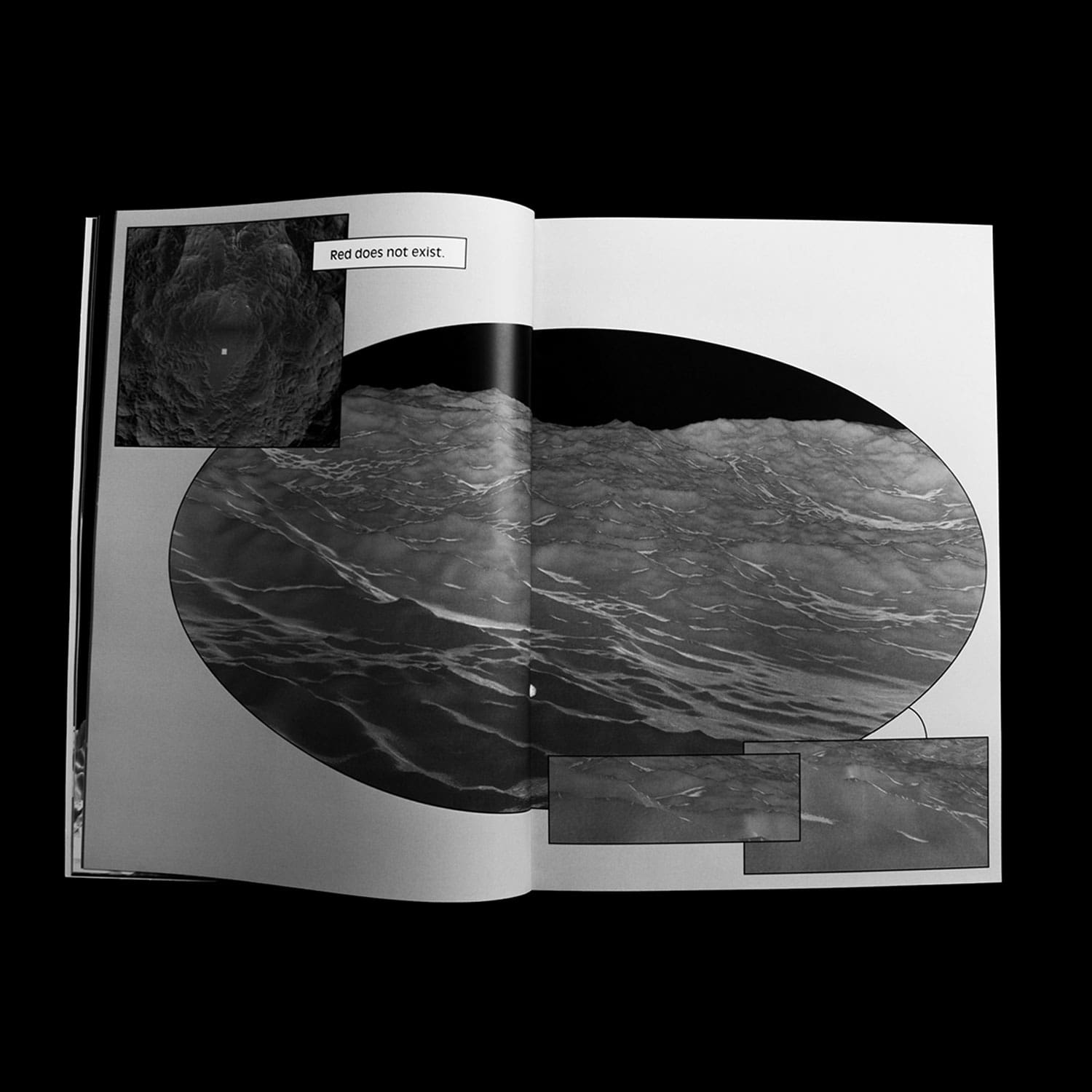
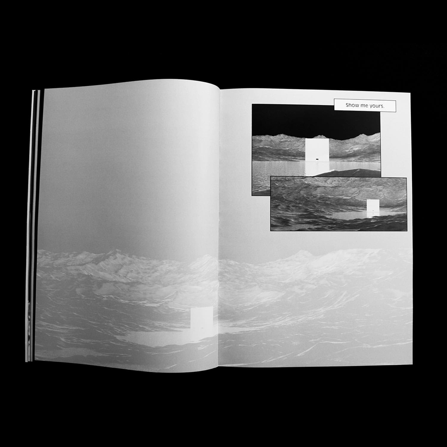
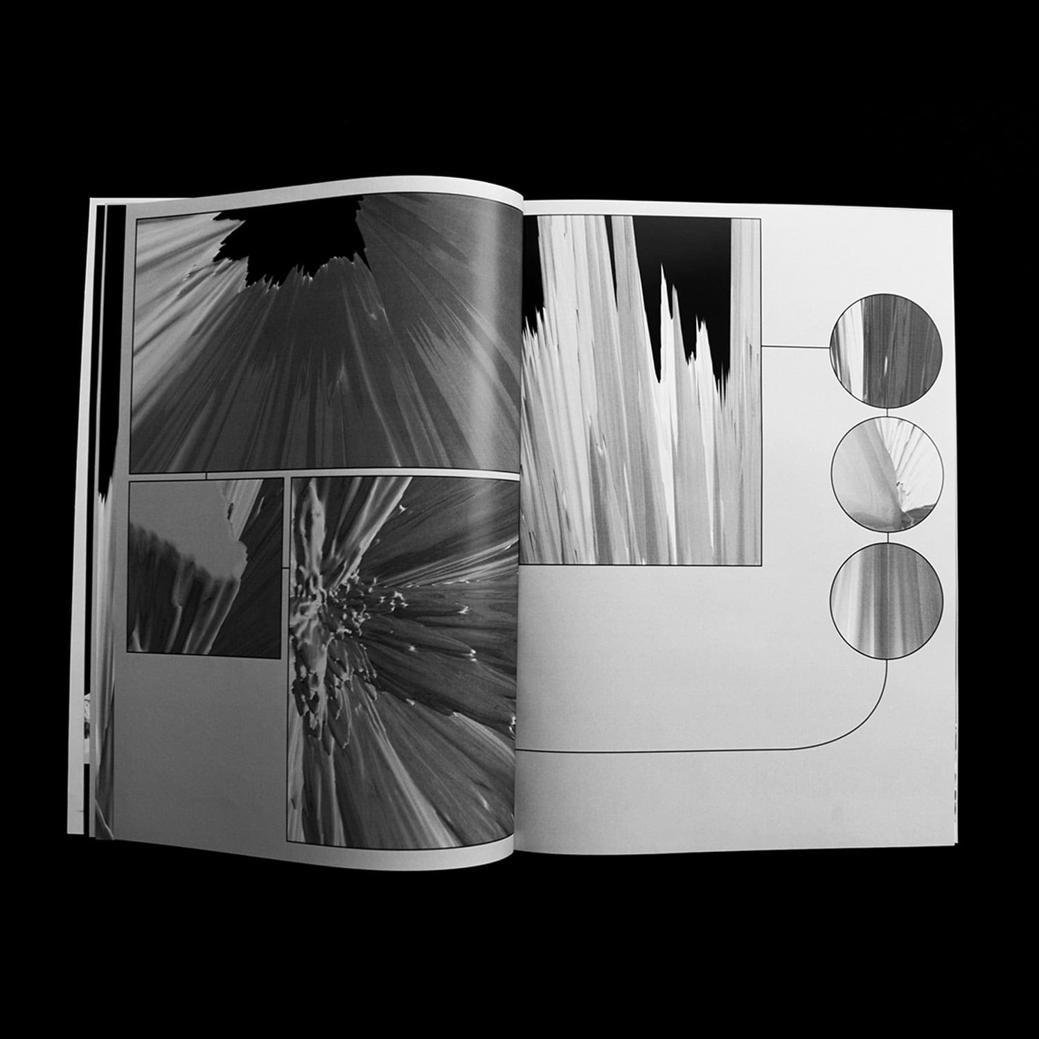
If colours are qualia (individual instances of subjective, conscious experience) — and thus escape language
by nature — can images fill the gap between speech and perception? A perceptive exploration of the colour
red.
Choreographer Portraits — Lucinda Childs
Editorial Design/ Type Design
2019, Publication, 135 pages, 220 × 285 mm, Collection of 12 signs and Posters (400 × 600 mm) in
collaboration with Hugo Le Corre
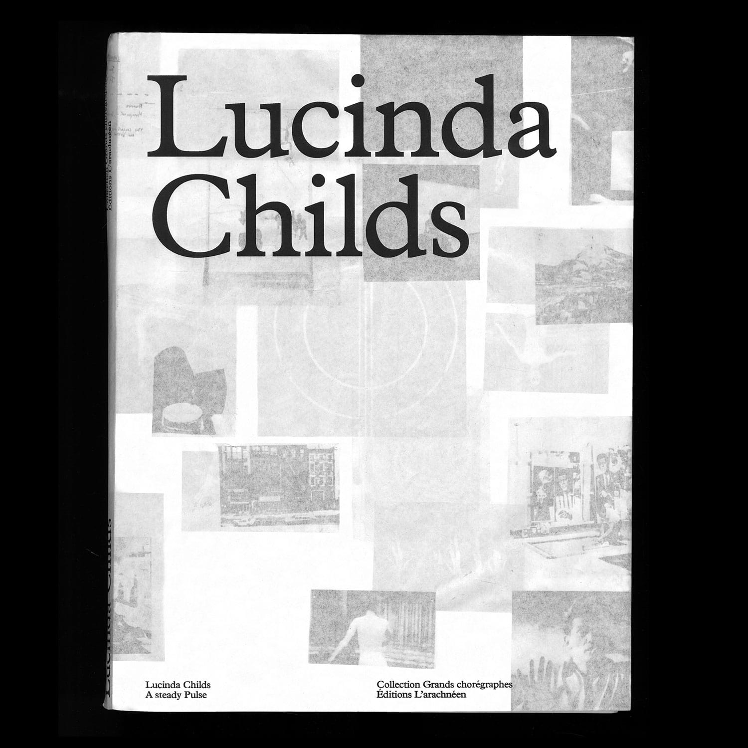
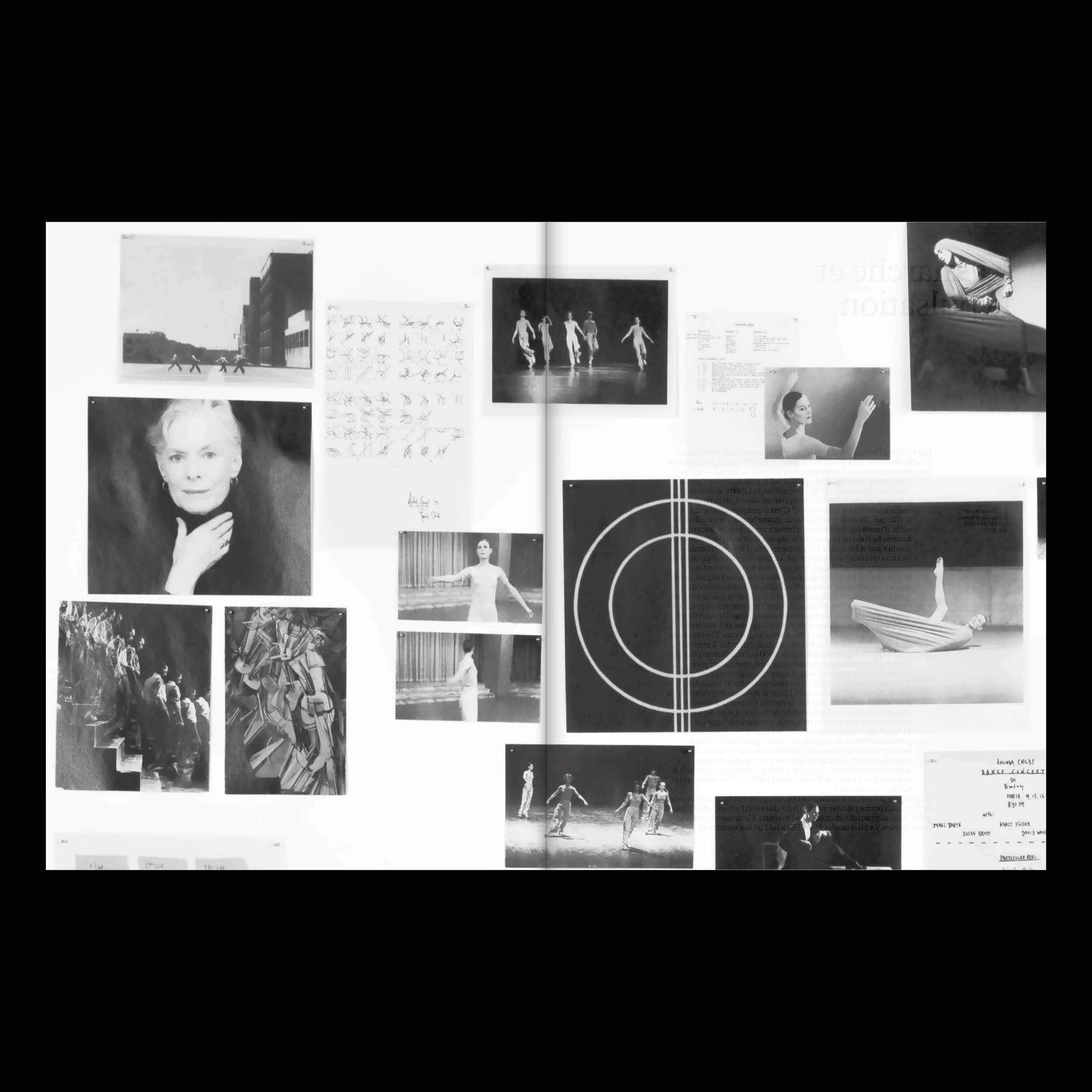
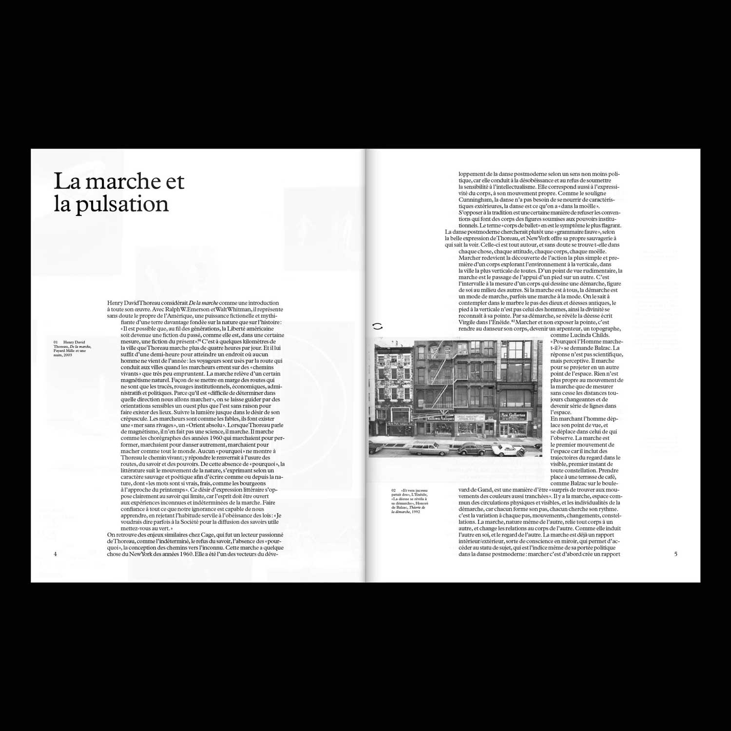
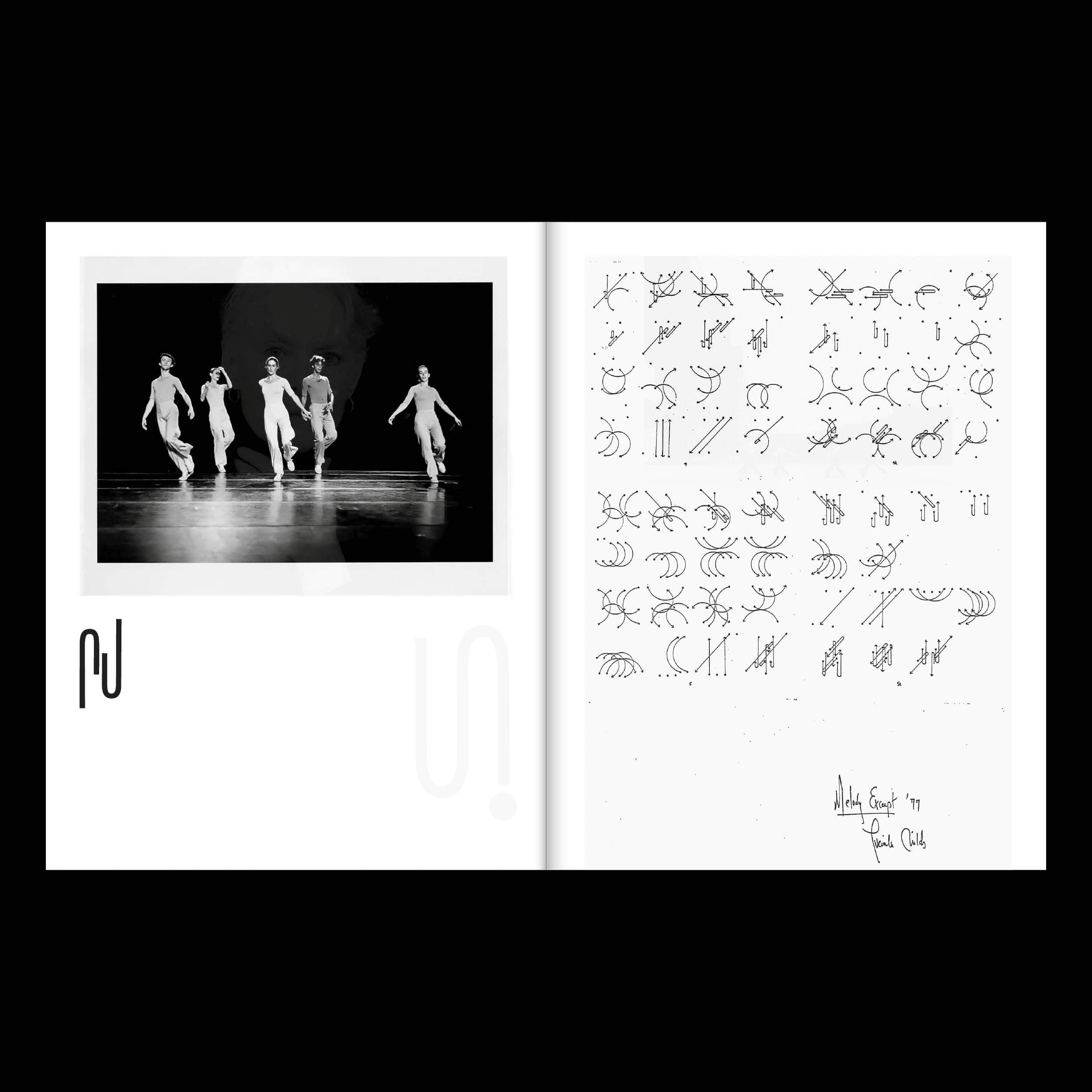
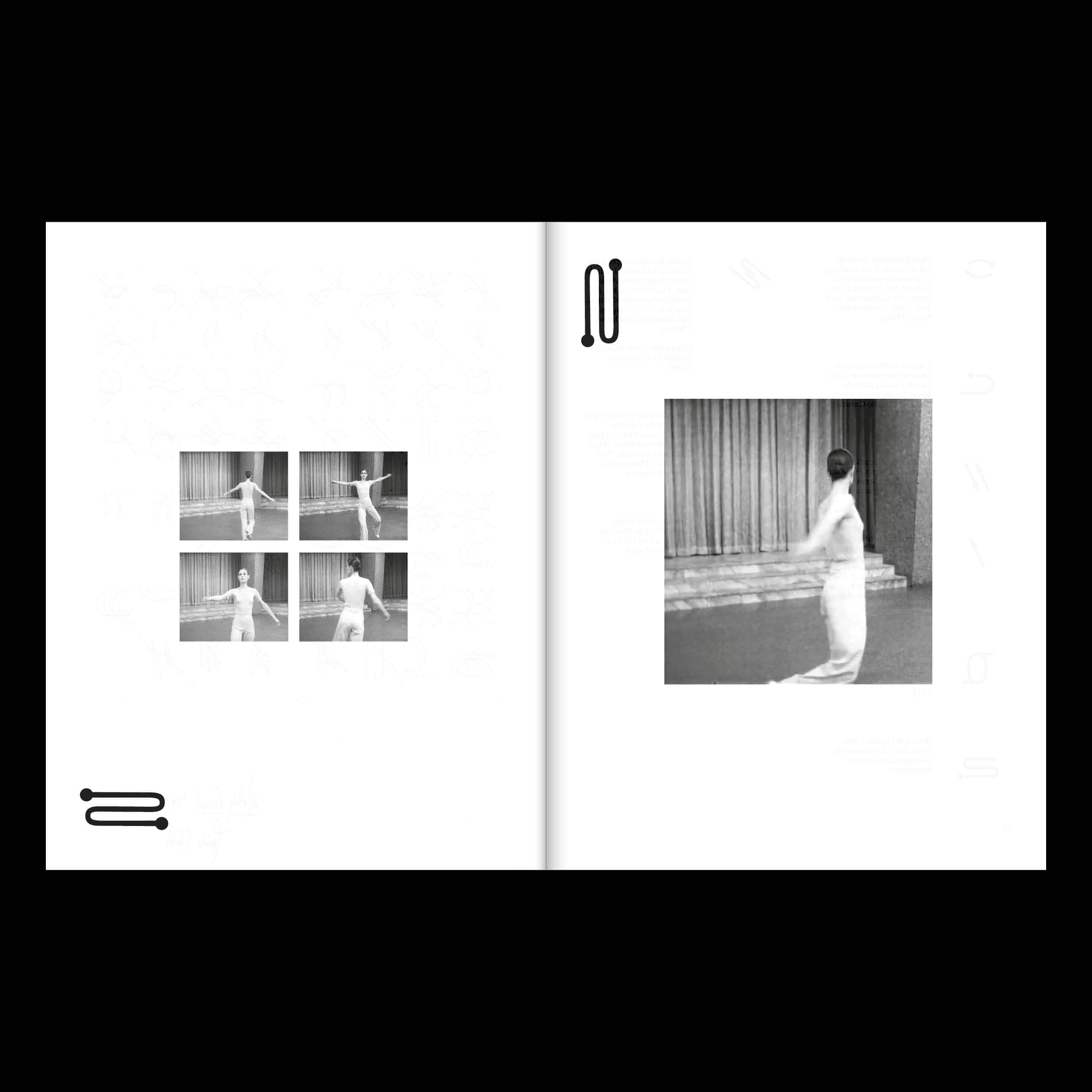
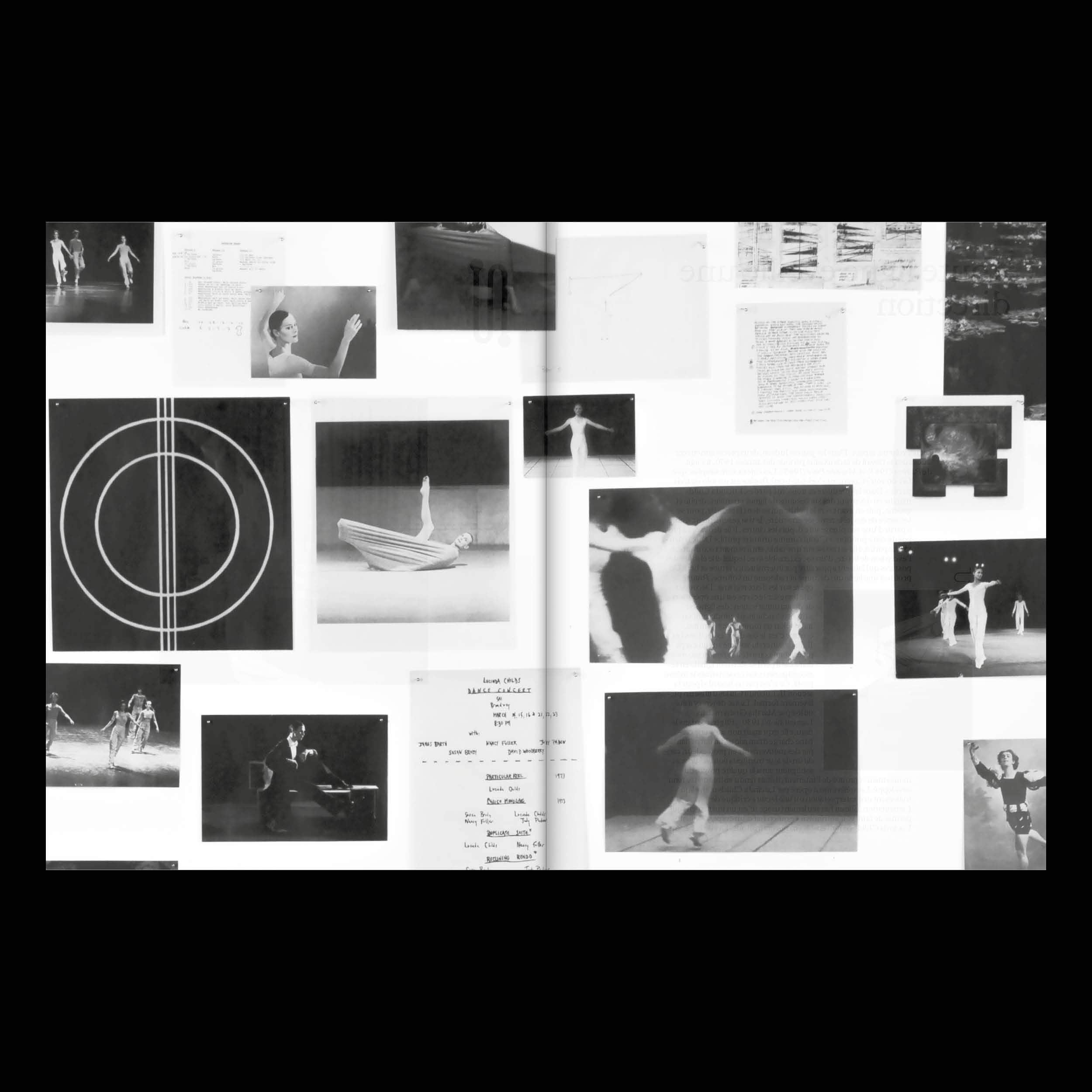
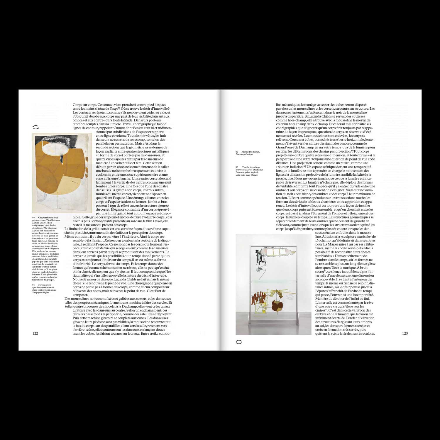
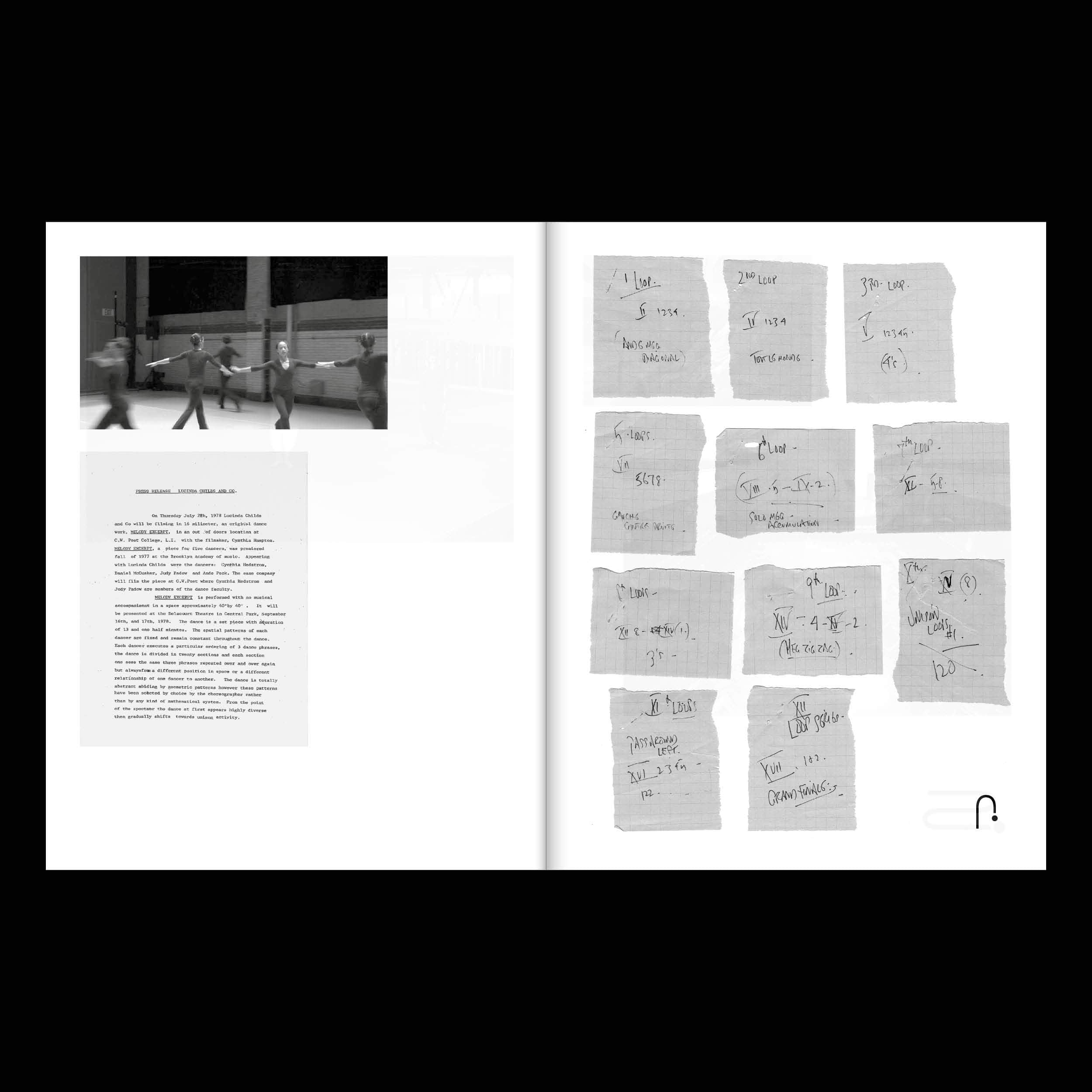
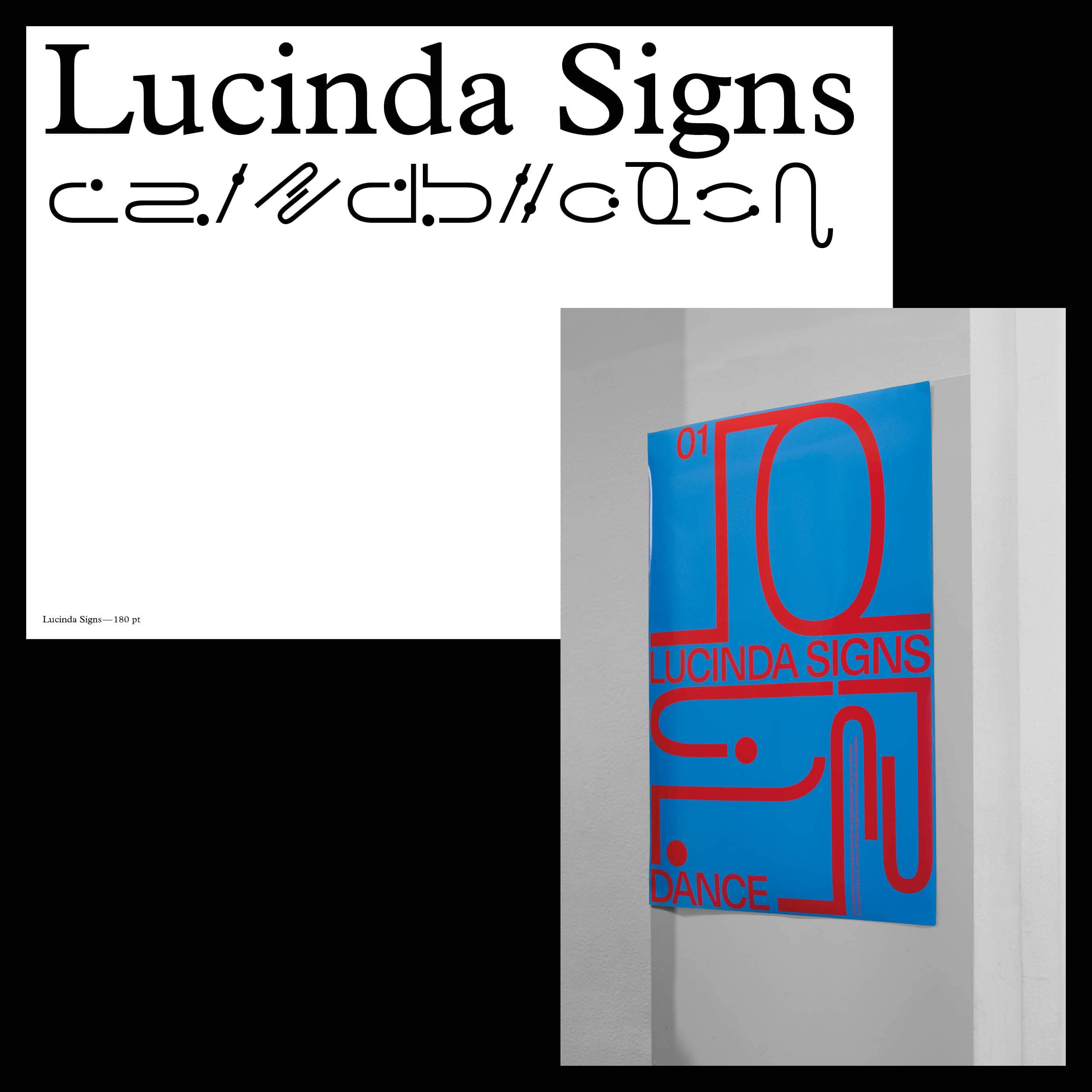
First piece of a collection dedicated to great choreographers of the late twentieth century, this
publication focuses on Lucinda Childs' life-long work and collaborations.